

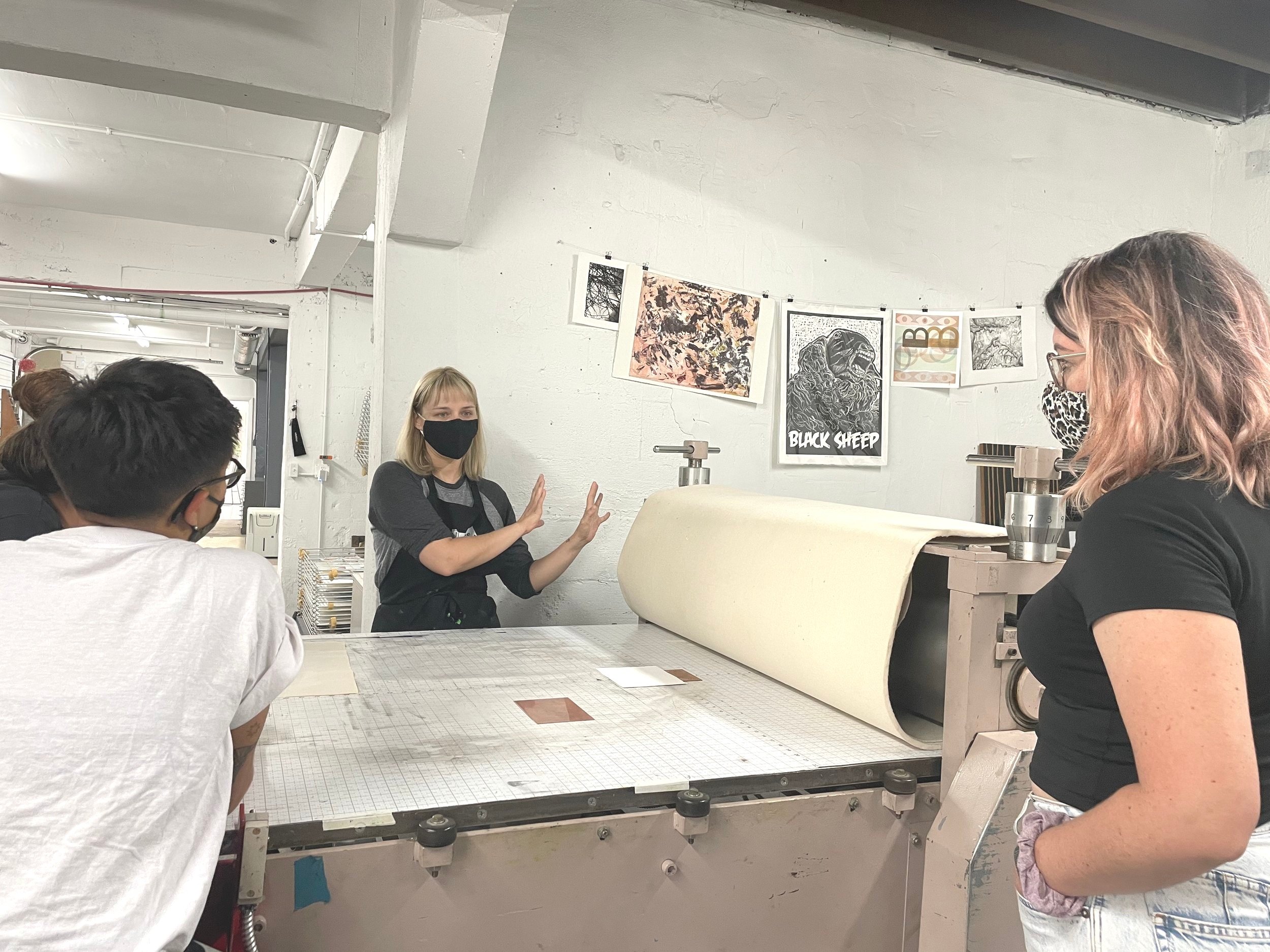
Editioning Crash Course
Editioning prints is not for the faint of heart! Standards vary dramatically by where you learned, when you learned, who you learned for, and which things you learned along the way resonated with you or didn’t resonate with you at all. There are very few one-size-fits-all answers about editioning your prints, which means it can be a really hard thing to get satisfactory answers about quickly.
We figured it would be helpful to clarify some of the vocabulary surrounding editioned work in the print universe and offer a quick and practical style guide to editioning the way we do it here. Please remember that this is not meant to be an exhaustive review. This is just meant to guide you through some of the practical basics!
Miami P&Pr Editioning Crash Course
Key Terms
Edition (noun) Tate Art Terms states that “It refers to a series of identical impressions or prints made from the same printing surface, but can also be applied to series of other media such as sculpture, photography and video.” In the case of work being made in conversation with print/book/paper world, works which are a part of an edition are typically visually indistinguishable from one another — nearly identical to the trained naked eye.
If you are planning to produce an edition of, for example, 50 screen prints on paper, you are planning to produce 50 screenprints of the same design, using the same process and colors, on the same type of paper, with no obvious variation caused by errors in printing or decisions made to change directions while printing the edition.
Varied Edition/Variable Edition (noun) A varied edition offers you a little more wiggle room. In a varied edition, there will still be some very clear repeated elements, but instead of aiming for a stack of identical prints, an artist embarking upon producing a varied edition is often interested in a more iterative process. Arsty tells us “That could mean that [the works which compose a varied edition] are on different surfaces, are made of different materials, are colored differently, or use slightly different techniques.”
Ultimately, the works in a varied edition have more commonalities than differences. In a printed varied edition, the most common variations tend to be things like changing the ink color, hand-applying ink (monoprint inking) on the fly, and printing on different paper colors or various found materials. Usually, this would still involve printing from the same matrix or the same process.
For example, a varied edition of 50 could be:
Screenprinting the same image onto 50 different cereal boxes that you had collected over time
Hand-coloring 50 identical drypoint prints with watercolor paint after they’re printed
Printing one carved linoleum block 50 times, and varying the ink color and placement on the paper throughout the edition
Throwing 50 rotten tomatoes at 50 sheets of paper
Editioning (verb): In the print universe, the verb form of the word “edition” is usually used to describe the task of numbering, titling, and signing the edition, as well as “curating” it (doing any final clean-up/touch up work.) Artworks which are a part of an edition typically include edition information somewhere on them or with them. Depending on which medium the work is made in closest conversation with, the editioning norms will vary a good amount. Within each medium-specific set of editioning norms, there will often be additional variations usually relating to where an artist is printing or who they learned from.
Where do I sign?
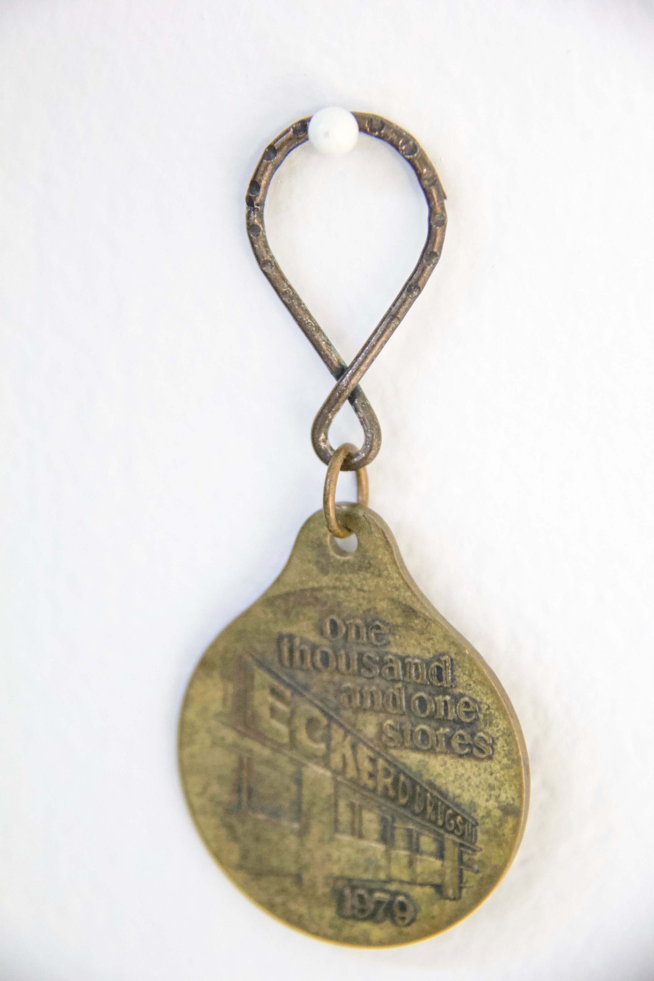
Where you place your edition information is going to be determined mostly by how your work it laid out. These two prints were produced for the Under the Sun portfolio exchange.

Left: 23023 by Christian Feneck, Right: Plait Platz by Sammi McLean
The print on the left is a bleed print, meaning that the image goes all the way to the edge of the paper. The artist, Christian Feneck, consequently elected to sign his prints on the back (“en verso.”) He could alternatively have chosen to sign and edition his work on the front, finding an unobtrusive place to sign within the printed image area. Some artists sign and edition within their printed images in more inventive/obtrusive ways, and we aren’t opposed to that, if it’s what’s really best for a particular work or artist. Be warned, though: Adventurous editioning can be polarizing among print people.
The way the print on the right is signed and editioned is fairly standard for prints with blank margins surrounding the printed area. Although there are blind debossed elements all the way to the edge of the sheet, the artist, Sammi McLean, elected to sign her work on the front.
How exactly do I edition it?

Here at Miami Paper & Printing Museum, our standard layout for edition information is exactly what we see in McLean’s print:
Bottom Left: Edition number (ex. “1/50”)
Center: Title (This is optional! You could leave it blank.)
Bottom Right: Signature (and year, if desired. Year is also optional.)
The numbers: Edition vs. Varied Edition
Okay, so lets say you have promised to produce an edition of 50 prints. You have to produce 50 prints that look all alike, edition them, and then submit prints 1/50 through 50/50 to whoever it is that you owe that edition to.
The first print in an edition of 50 would be labeled in the bottom left corner like so: 1/50
The second print would be “2/50”, the fourteenth print would be “14/50” and so on.
What you need:
Sharp graphite pencil: Graphite is an archival material and very difficult to imitate, visually. Many inks are not archival, which means they could damage your print or other materials over time just by touching them, and pen marks are easier to imitate than pencil.
Your completed edition or varied edition
Clean, dry hands

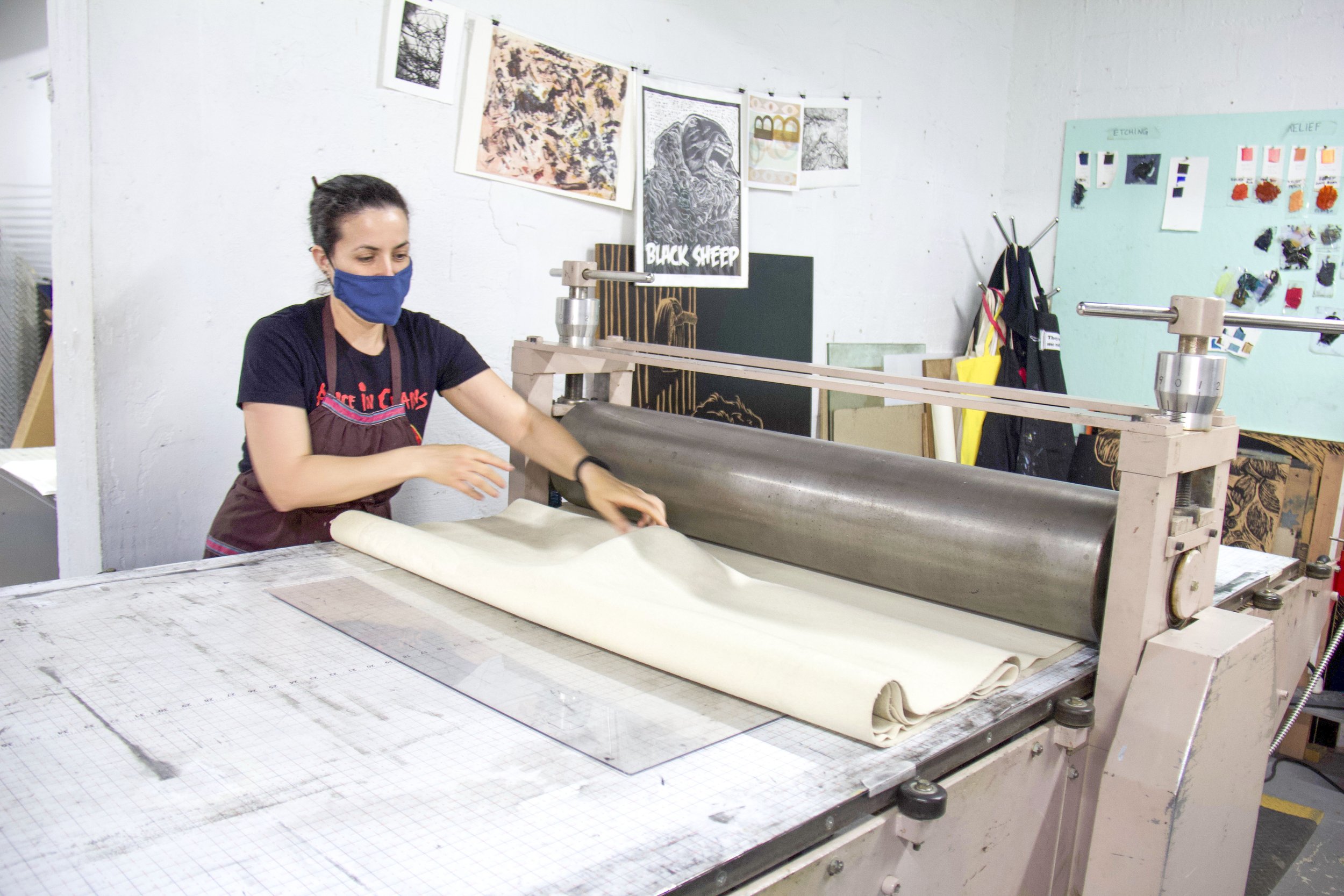
How to actually edition your prints:


In this example, I am adding all of the edition information to this edition of five prints. I gathered my prints together into a neat little stack, with print 1 on top, and print 5 (the last print in my edition) on the bottom. I spaced my stack of prints out enough to expose the blank area I want to write my edition information in. Stacking them like this while I add the edition info means it will be much easier to ensure the information lands in the same approximate place on each print.
Editioning a varied edition:
We often represent varied editions on our prints by putting the letters “V.E.” in front of the edition numbering. Print 3 in a varied edition of 5 would be numbered in the bottom left as “V.E. 3/5" as you can see in the image below.
Here’s a quick YouTube video walking you through editioning prints, in case you need to see it in motion!
Proofs: One to keep for yourself and how to label it
For lots of reasons that have to do with the conventional print shop processes that lead to fine art print editions (that’s a story for another day), it is also very common for artists to produce proofs in addition to their numbered edition.
A print that is made for the artist to keep for themselves is often called an Artist Proof, and is often labeled as “A.P.” in the bottom left corner where the edition number will go on all the prints in the actual edition. The Artist Proof is NOT one of the 50 prints in the edition. An edition of 50 prints with one Artist Proof would amount to 51 prints total, and the artist would keep the Artist Proof for themselves, and then sell/give away/consign/whatever they want to do with the edition of 50 prints. There are some guidelines for how many Artists Proofs and Printers Proofs it’s considered appropriate to produce, but these vary a bit and are complicated. There are other kinds of proofs and labels, too, but that’s also a topic for another day.

Art Week 2024: the Miami P&PR Guide
There’s a LOT to see during Miami Art Week — something for everyone, for sure. If you want to make time for the work that will be on view from the artists and collaborators we work with here at the studio, you’re in luck: This blog post is your friend. Save the link, share it with your pals, and maybe refresh it once or twice. If we have anything to add to the list from our community, you’ll find it here.
Where to see Miami P&PR during art week:
At the studio:
Miami Paper & Printing Museum Open House (Sunday Dec. 1, 4-6PM) Explore the museum, enjoy light refreshments, and make plans for Art Week with friends.
Visit the Museum by appointment only during art week by emailing info@isprojectsfl.com. (Mon, Dec. 2-Sun, Dec. 8) Please give us at least 24 hours to process your request.
Where to see work by current staff and residents:

Feria Clandestina (Party Thurs. 6-10PM, Fair Thurs, Dec 5 - Sat, Dec 7)
There are friends of the studio in many of the rooms (see who else is showing here!), but Room 224 has the most direct and abundant connections to the Miami Paper & Printing Museum.
Curated by Luna Goldberg (who was an O, Papermill Fellow at the studio last spring), Room 224 features the following artists, who have been in a critique group together for several years:
Harumi Abe
Jen Clay (Existent Books Artist — Nearing)
Jenna Efrein
Christian Feneck (Existent Books Artist — The Unmade Room)
Brooke Frank (Miami P&PR Education & Artist Relations Manager)
Donna Haynes
Luke Jenkins (In Bloom Studio — Fabrication collaborator for Existent Books and other studio projects)
Ingrid Schindall (Miami P&PR Founder & Director)
Additionally, Room 226 is a duo-show featuring work from Loren Santiesteban and Mary Larsen. Mary Larsen is one of a handful of Miami-based book artists whose work we represent for sale in our studio and when we travel to fairs. Her one-of-a-kind hand-painted artists’ books are some of our all-time favorite altered books and one-on-one artists’ books, and we can’t wait to sneak over to 226 to see what she’s brought while we’re watching over 224.
Unveiling Power: Examining Influence at Green Space Miami (Wed, Dec. 4 - Sun, Dec. 8, 12-6PM)
Current Key Holder resident Ọmọlará Williams McCallister is one of ten recipients of the 2024 Green Space Miami Open Call Award, all of whom are featured in this exhibition, and some of whom have worked with us on a project or two at some point.
Spectrum Miami (Party Wed., Dec. 4, Fair Thurs. Dec. 5-Sun. Dec. 8)
Current Key Holder resident Chee Bravo and her husband, painter Juan Bravo have booth 809 to themselves. The Bravos have got the hook up for Collector Passes, too. You can claim your pass for free by clicking through to the event here! The pass also gets you into 9 Miami Museums.
Also not to be missed:

Jennifer Basile, Loop Road, 2023, color reduction print on Japanese rice paper (edition of 1 + 1 AP) 78.5 x 131 inches.
Pinta Miami (Thurs. Dec. 5-Sun, Dec. 8)
Jennifer Basile’s massive one-of-one four-panel reduction woodcut prints can be found in LnS Gallery’s booth (B2) at Pinta Miami. These wildly ambitious, prints were pulled at the studio with a little help from us!
Each tightly registered layer of these prints was a labor of love. This work involved carefully applied opaque and transparent inks, and a couple of highly strategic blend rolls. Reminder: this is a reduction print. After printing each layer, Basile carved into that same woodblock to create the image to be printed in the next layer. There’s no going back and there’s no room for error, and in this case, there’s only one print and one artist’s proof of each panel. This serene image was a high-wire act to produce.

Untitled Art Fair (Wed. Dec. 4-Sun, Dec. 8)
Jen Clay’s work will be prominently featured in Emerson Dorsch’s booth (C52) at Untitled Art Fair.
Clay has been a dear friend of the studio for a long time, and her first artists’ book, Nearing, was published with us through the Existent Books project in conjunction with her interdisciplinary textile and performance-based project of the same name that year.
Clay has been working with Emerson Dorsch and last year’s booth was bangin

Our own Amber Frank with her relief print on turkish towel, printed via steamroller at SPF. Amber is standing in front of a print on Fabric by Jacoub Reyes.
Beach Towel Art Show (Sat. Dec. 7, 2-5PM)
Brian Butler has tipped us off — BYO Art Beach Towel and hang out with friends in the sand. This is open to all, free to attend, and guaranteed to be good vibes. Come take a break from the hot mess of the fairs in the warm sand and cool breeze. Make a really cool art towel. Bring it to the beach. Lounge with your pals. Admire the other towels. Enjoy!

Shop Show and Tell with SAMMI
Welcome to the fourth installment of ‘Shop Show & Tell’; a blog series dedicated to sharing our favorite stories, projects, and even objects from the studio. This month, we’re checking in with former Education/Gallery Manager and current teaching artist, Sammi McLean!

Welcome to the fourth installment of ‘Shop Show & Tell’; a blog series dedicated to sharing our favorite stories, projects, and even objects from the studio (Check out our last post). This month, we’re checking in with Sammi McLean.
Sammi joined the studio in 2017 with a passion for teaching monoprinting and intaglio techniques. After graduating with her MFA from Florida Atlantic University, she learned letterpress and book arts through our summer internship program before joining the team as our Education and Gallery Manager. After nearly five years, Sammi is taking a step back from her daily role, but staying on as the studio’s lead Print Club instructor in Miami.
Sammi McLean is an artist and printmaker based in Boynton Beach, FL. She investigates sculpture, photography, and collage through a printmaker’s lens. Embracing chance, her imagery is often fragmented, layered, and collaged to create misrepresentations of information that oscillate between memories and documented experiences.
Check out a few of Sammi’s works below and visit
https://www.sammi-mclean.com/ for more info.
Which project have you learned the most from?
I tried, but I really can't choose just one. I learned so much from collaborating with the Society of the Four Arts on their exhibition, Rembrandt: The Sign and The Light and coordinating the Extra Pulp Exchange Portfolio.
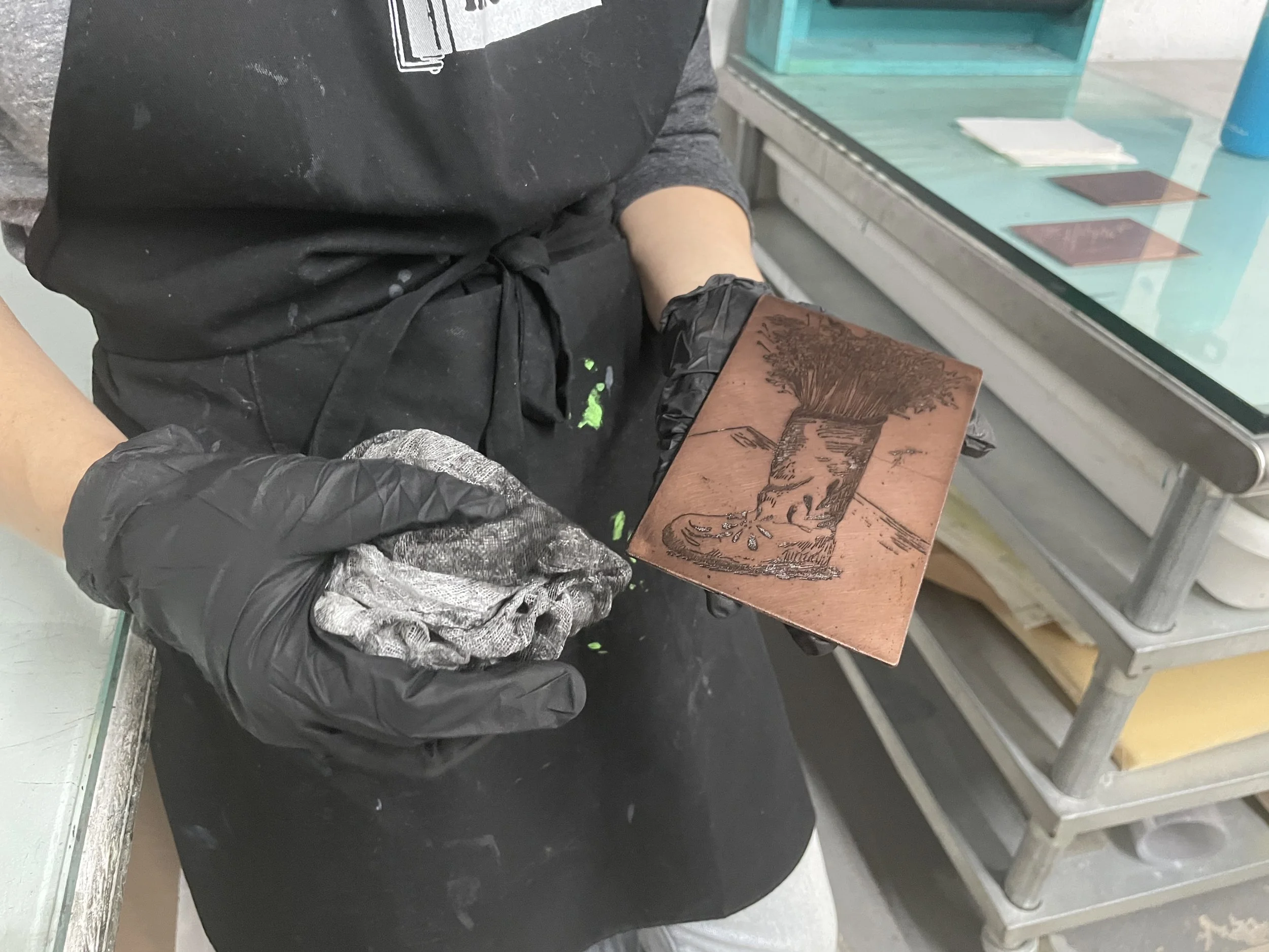
Rembrandt: The Sign and The Light was a dream project for me as an intaglio printmaker. It was the most ambitious project I've been a part of to date and it allowed me to really lean into all things intaglio. At the end of the project, I got to edition this beautiful etching by Anton Merbaum for select museum-goers.


Extra Pulp allowed me to expand my understanding of papermaking. I thoroughly enjoyed all the research that went into curating the fantastic group of participating artists and the pure amazement that came from opening each package of submitted paper artworks. The cherry on top was getting to write an article highlighting the portfolio for the Winter 2021 issue of Hand Papermaking Magazine.

What’s your favorite press?
Terry! As an intaglio printer I never expected to fall for this press, but I love how easily it travels and that it frees me up to play with type and image cuts without too much fuss. It's been a great press to introduce into workshops and I love seeing students get to explore more experimental approaches to letterpress with it.

Terry
What’s your 'MVT' (Most Valuable Tool)?
I'm in love with this 18 inch tear bar. I can easily spend hours tearing down paper without complaint and this particular size is so cute and handy.

What's your favorite image cut from the letterpress collection?
Since day one, I've always had a special affection for this rose cut.

What's your favorite IS Projects program?
Print Club, hands down. Print Club has been my baby since it’s conception in 2018. It’s the perfect program for creatives who want to get involved in the studio but don’t know where to start or printmakers that are out of practice and/or searching for community. I’ve loved seeing lasting friendships formed between Print Club members over the last four years and I look forward to meeting a new batch of printers in the Miami area.

A Closer Look: Land of Sunshine by Angelica Clyman
Land of Sunshine is a solo exhibition by Angelica Clyman that offers a view of South Florida that is at once sentimental and apocalyptic, real and imagined, comforting and ominous. As a painter and sculptor who is heavily influenced by growing up in Broward County and the accelerated changes it continues to experience, Clyman’s work maps a search for home in a place that no longer exists. It is through this ‘Closer Look’ that we more intently explore Angelica Clyman’s solo show and take a brief tour through South Florida nostalgia.
Land of Sunshine is a solo exhibition by Angelica Clyman that offers a view of South Florida that is at once sentimental and apocalyptic, real and imagined, comforting and ominous. As a painter and sculptor who is heavily influenced by growing up in Broward County and the accelerated changes it continues to experience, Clyman’s work maps a search for home in a place that no longer exists. Her fascination with local structures, aesthetics, and commercial enterprises dethroned over time is realized through six oil paintings accented with sculptural elements and found objects which reinforce the fractured worlds within Land of Sunshine.
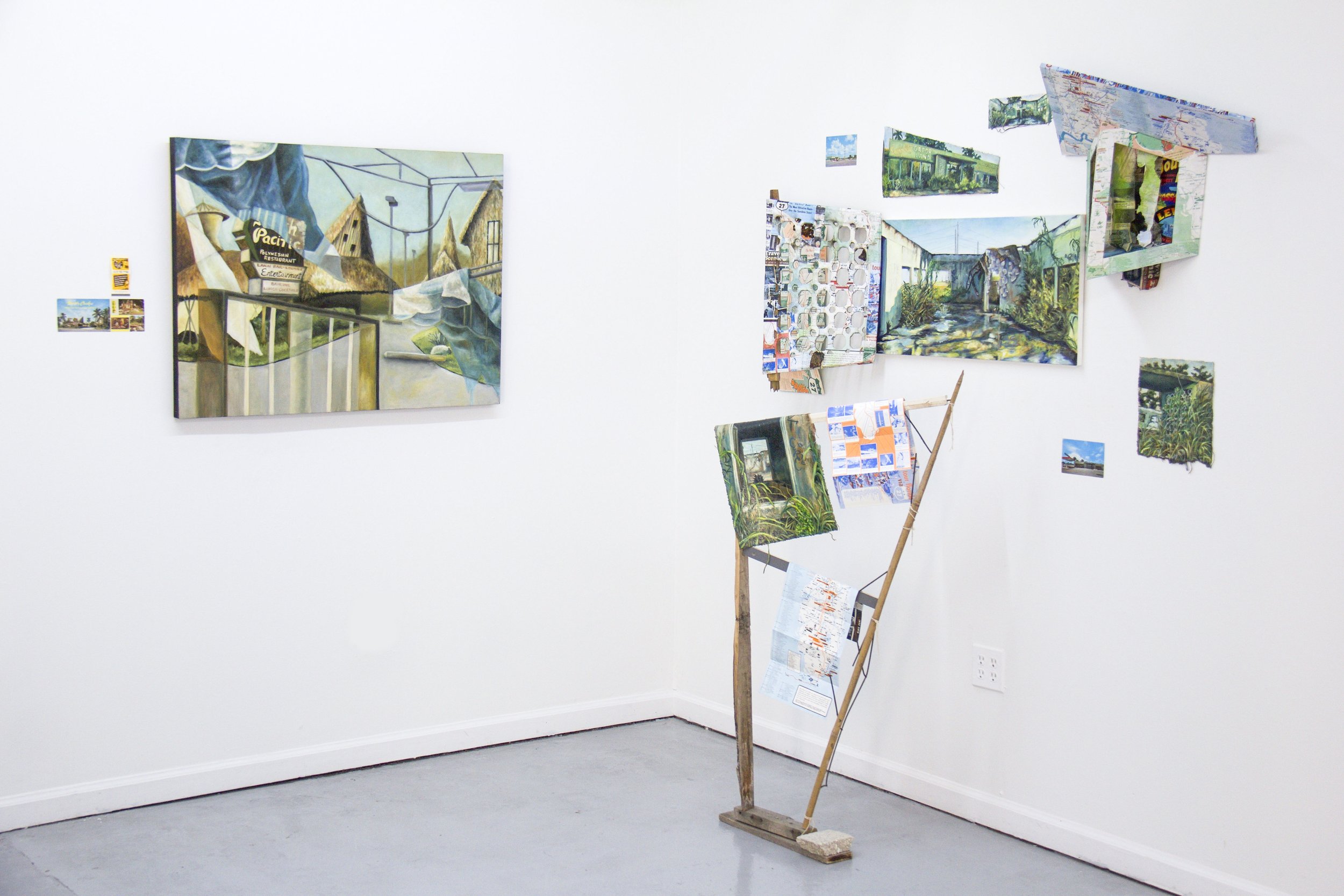
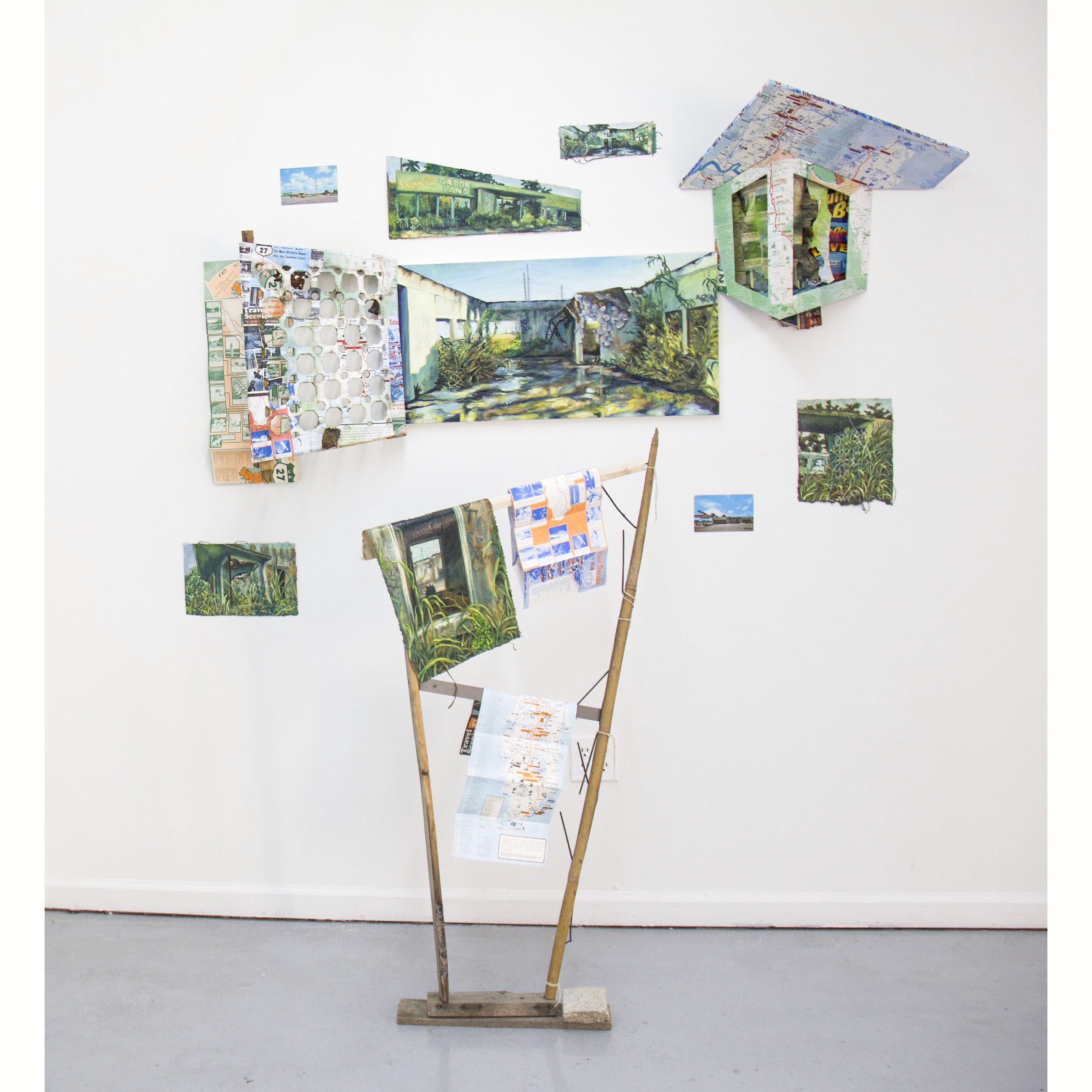
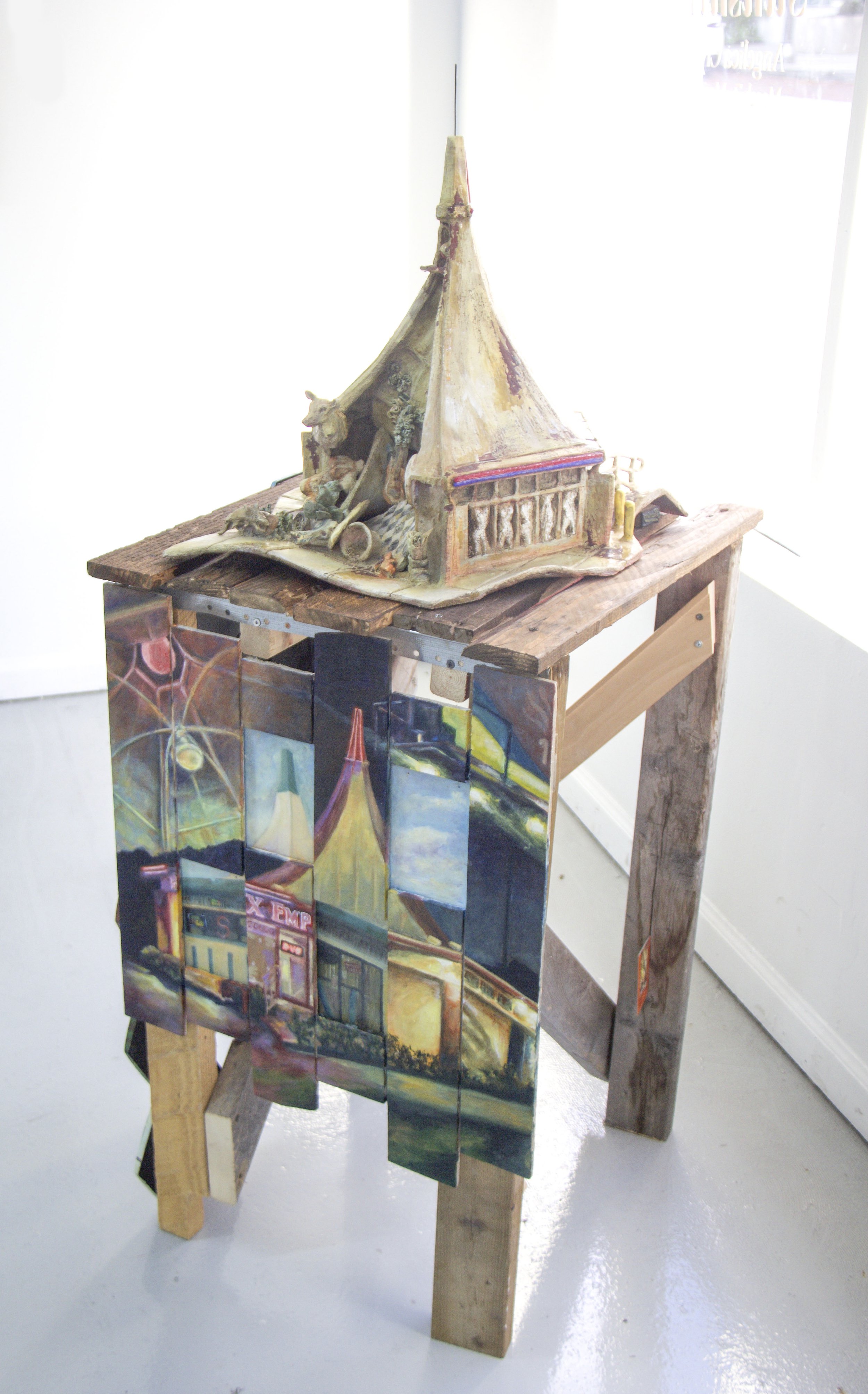
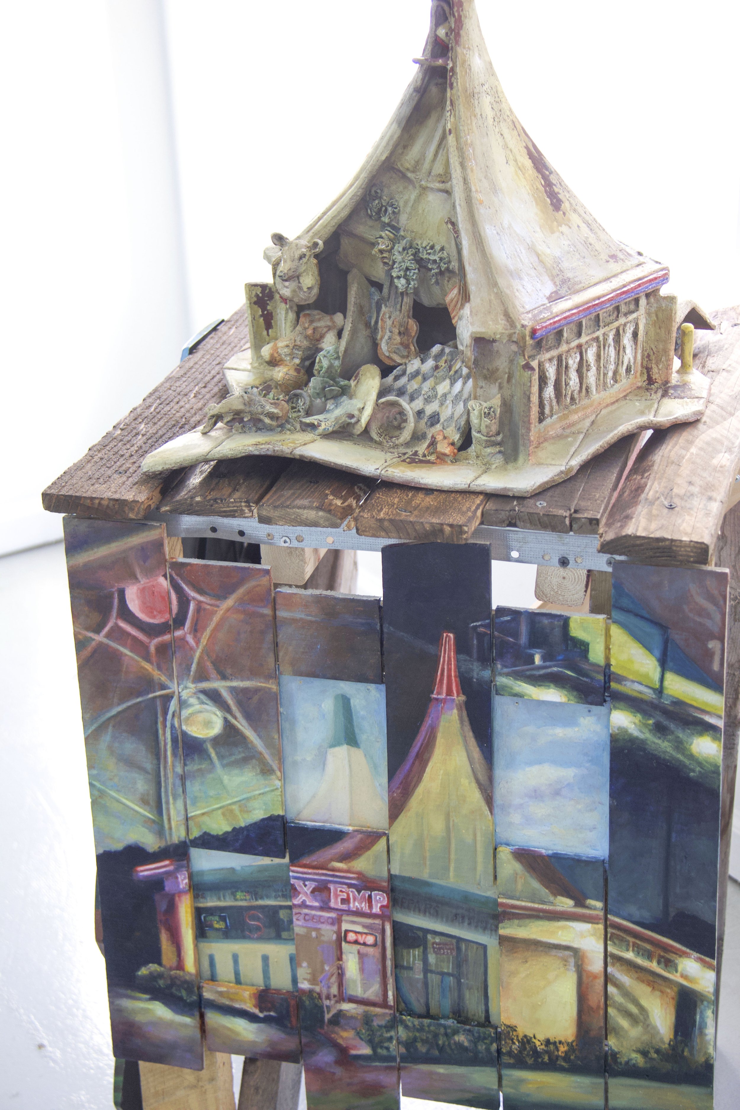

This body of work was born from a series entitled Elegy, where Clyman explores the unseen previous life of a place. Clyman states that her interest in the history of seemingly mundane spaces began at a young age, “I’ve watched my hometown of Hollywood, Florida change so dramatically over the years. The place where I grew up is unrecognizable at times, and it also seems so far removed from the location of my parents’ stories from before I was born. I started this series with the intention of giving these forgotten places back their history and remembering them with dignity, but over time it’s given me more understanding of my surroundings and more of a sense of belonging to this transient environment.”
Appropriately, Clyman’s process begins with an expedition. She visits the site she intends to paint to thoroughly document it and her first impressions. However, in most cases, the present day locations she’s still able to access are not indicative of their often rich, unseen history. Therefore, Clyman’s practice includes in-depth research as she builds an archive of photographs or ephemera she finds from scouring all corners of the internet. She explains, “For most of these works, I find the composition by piecing together vintage images I’ve collected with photographs I take while exploring the site. It’s very important to me that I find the exact spot where the previous site once stood, so I get a feel for the location. Those impressions inform the artwork I’m about to make. I also collect ephemera associated with these places that I’ve begun incorporating into the work.”
Land of Sunshine offers a unique perspective into Clyman’s work as she invites the audience to explore her personal archive. Ephemera such as postcards, novelty souveniers, maps, and advertisements from each location’s bygone era is displayed in conversation with her paintings. Viewers become active explorers within the gallery as they make crucial observations and connections between past and present.
What follows is a unique tour of South Florida shared through insights on each work from the artist…
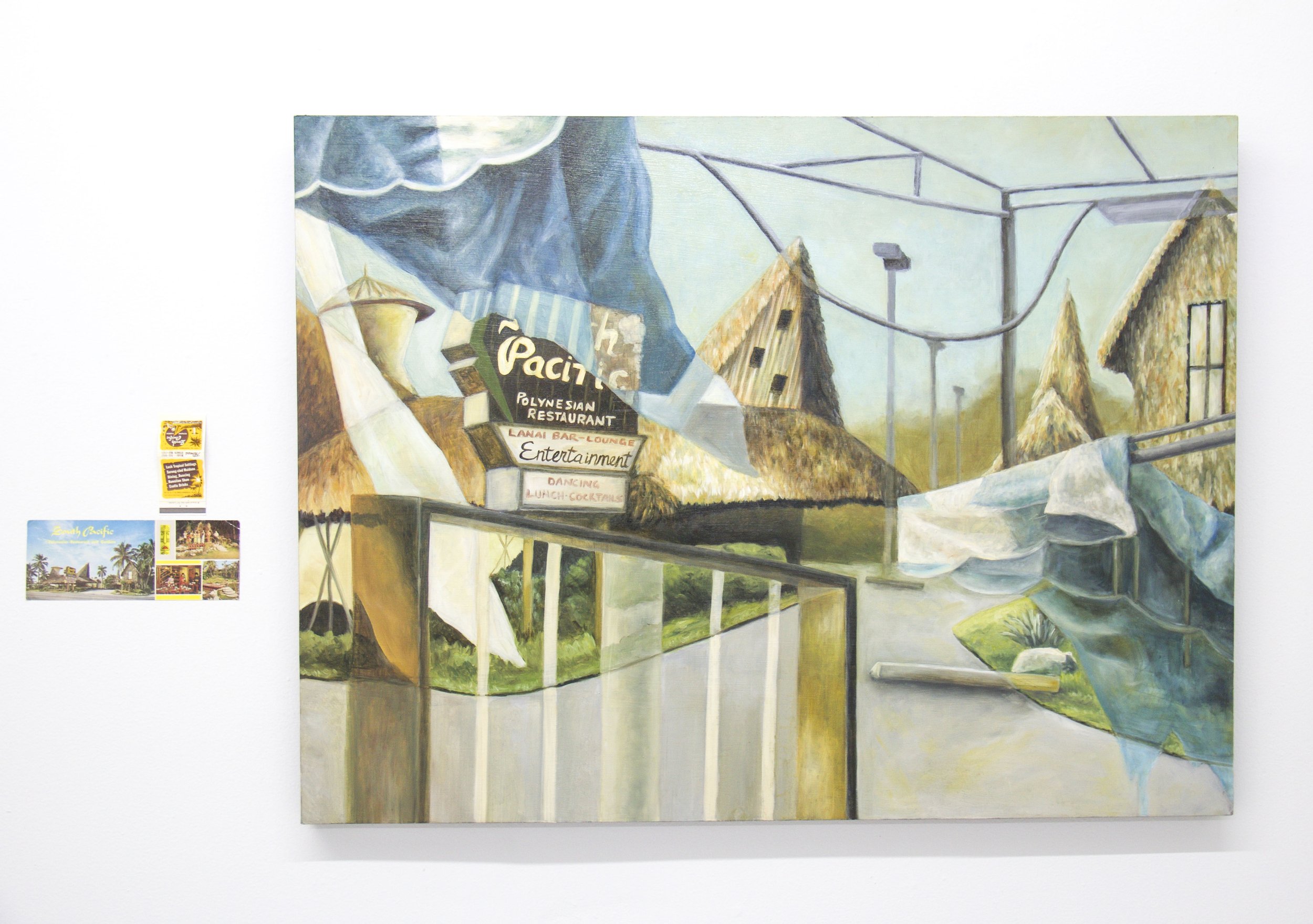
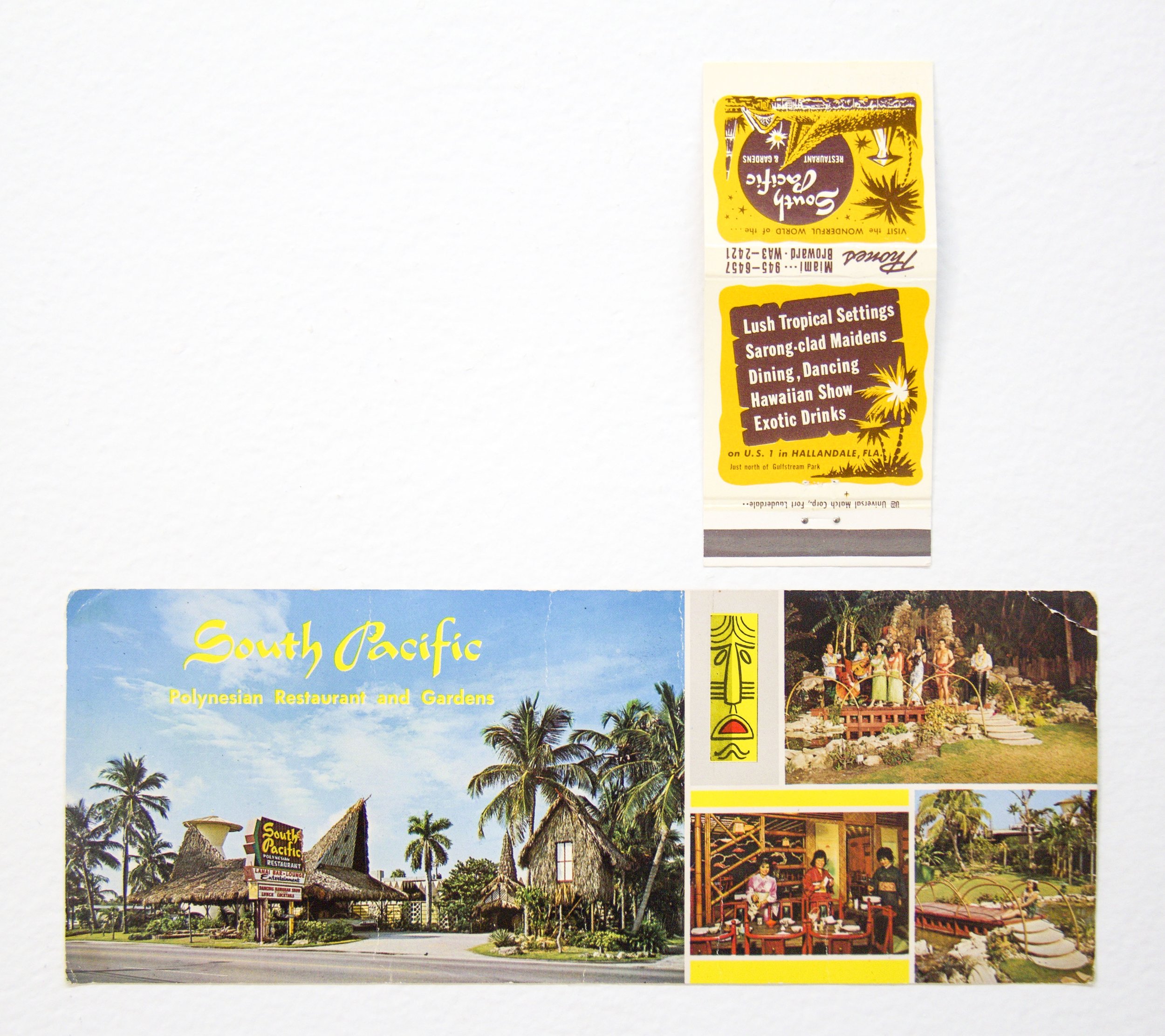
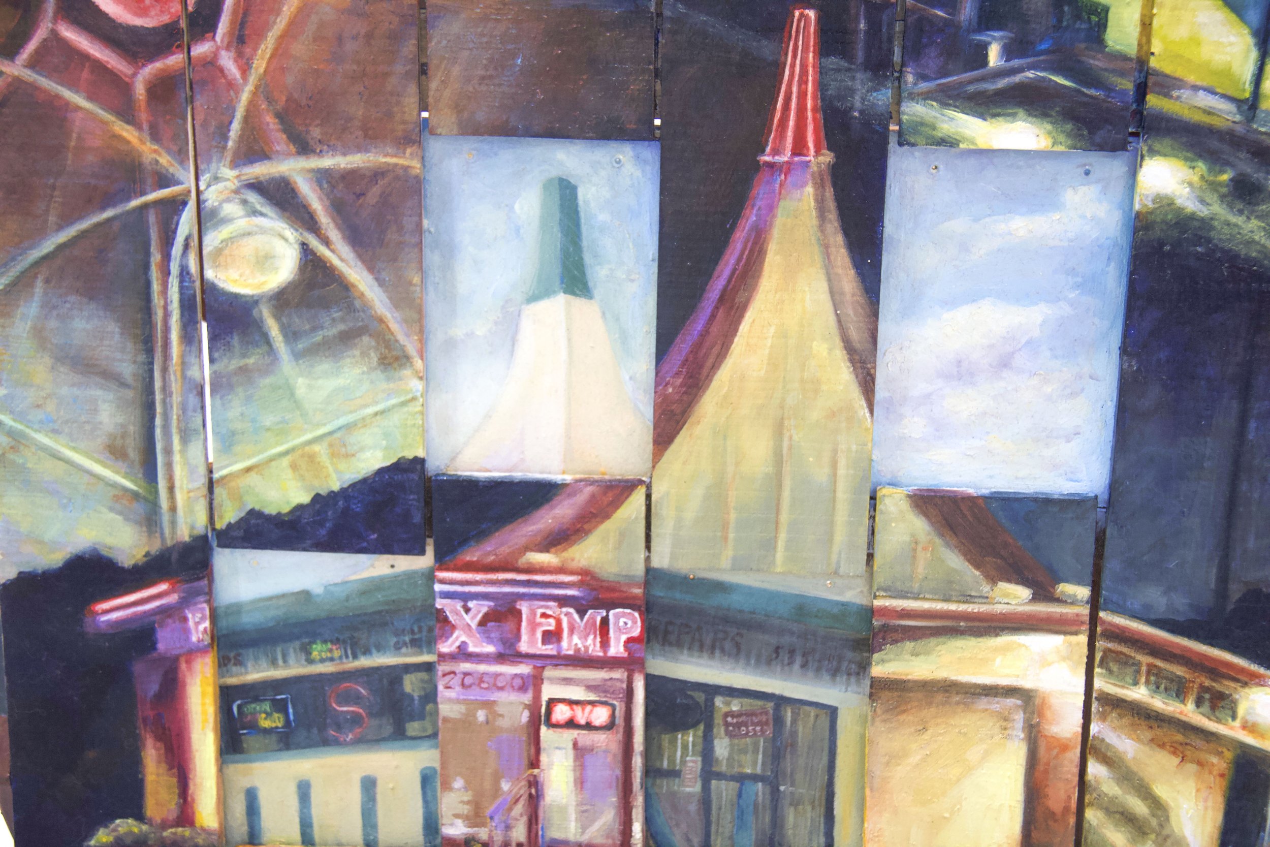
The South Pacific


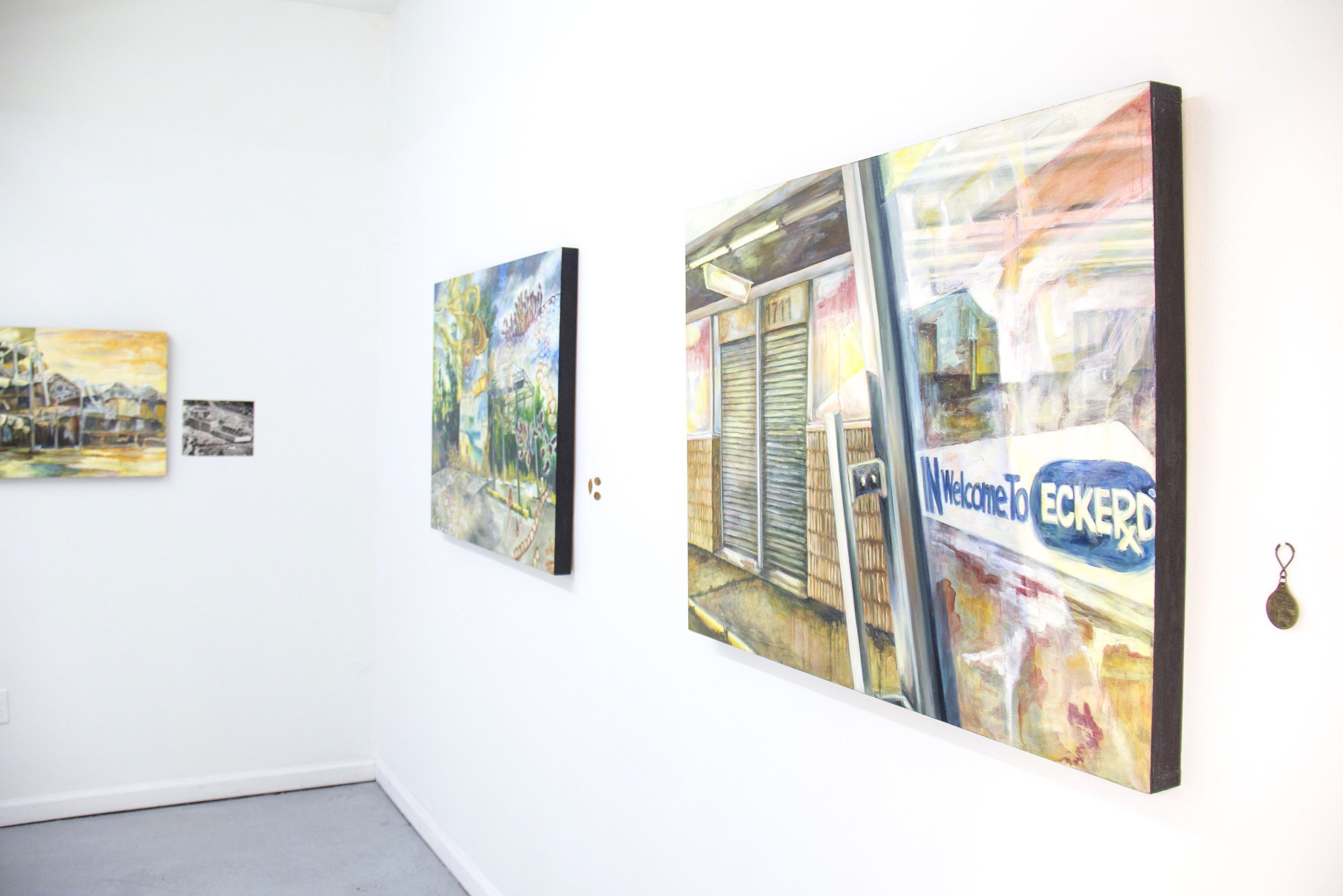
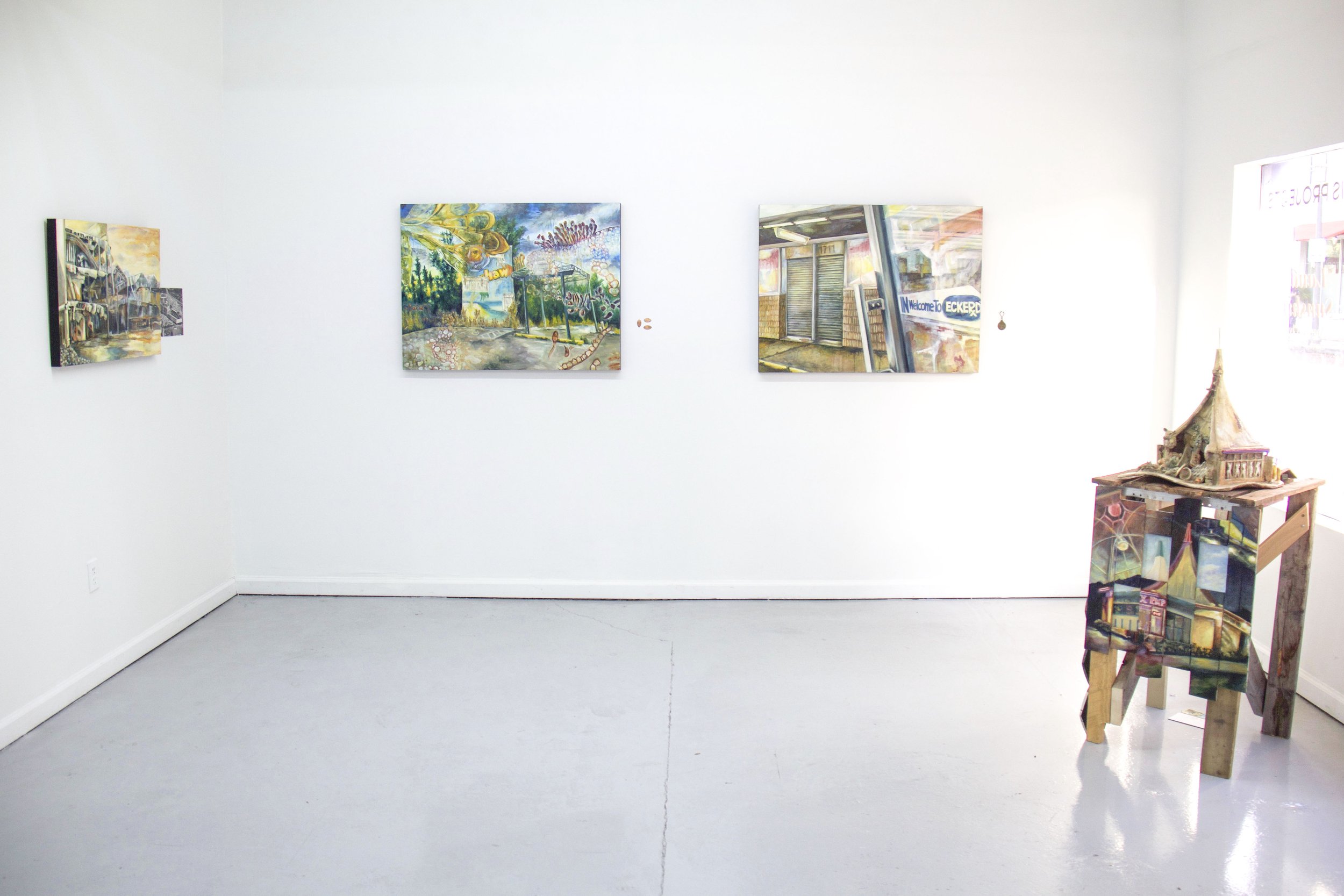
“The South Pacific was the second piece in this series. This is a good example of the work starting out as intensely personal – my parents met at this restaurant in the 70s, when they were both working as servers. Although it was demolished before I was born, I was intrigued by their stories surrounding this place because for me it symbolized the South Florida they described me to, the one I never met. This Polynesian restaurant featured live entertainment, like many of the exciting and unique themed restaurants of the time. Located on US-1 south of Pembroke Road, by the time I painted this work it was an abandoned parking lot of a defunct car dealership, but now it’s even more unrecognizable as part of the newly constructed Atlantic Village shopping center.”
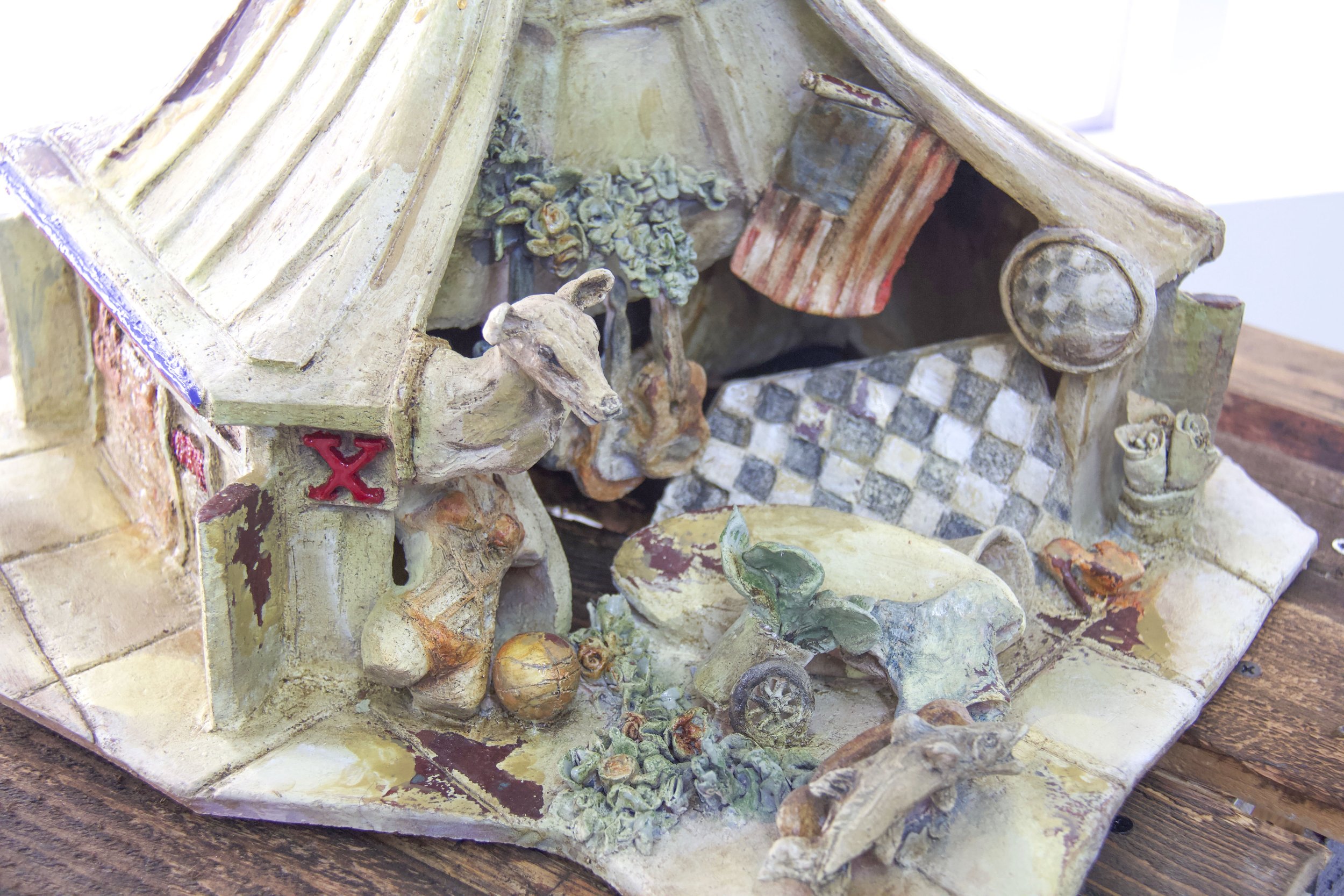
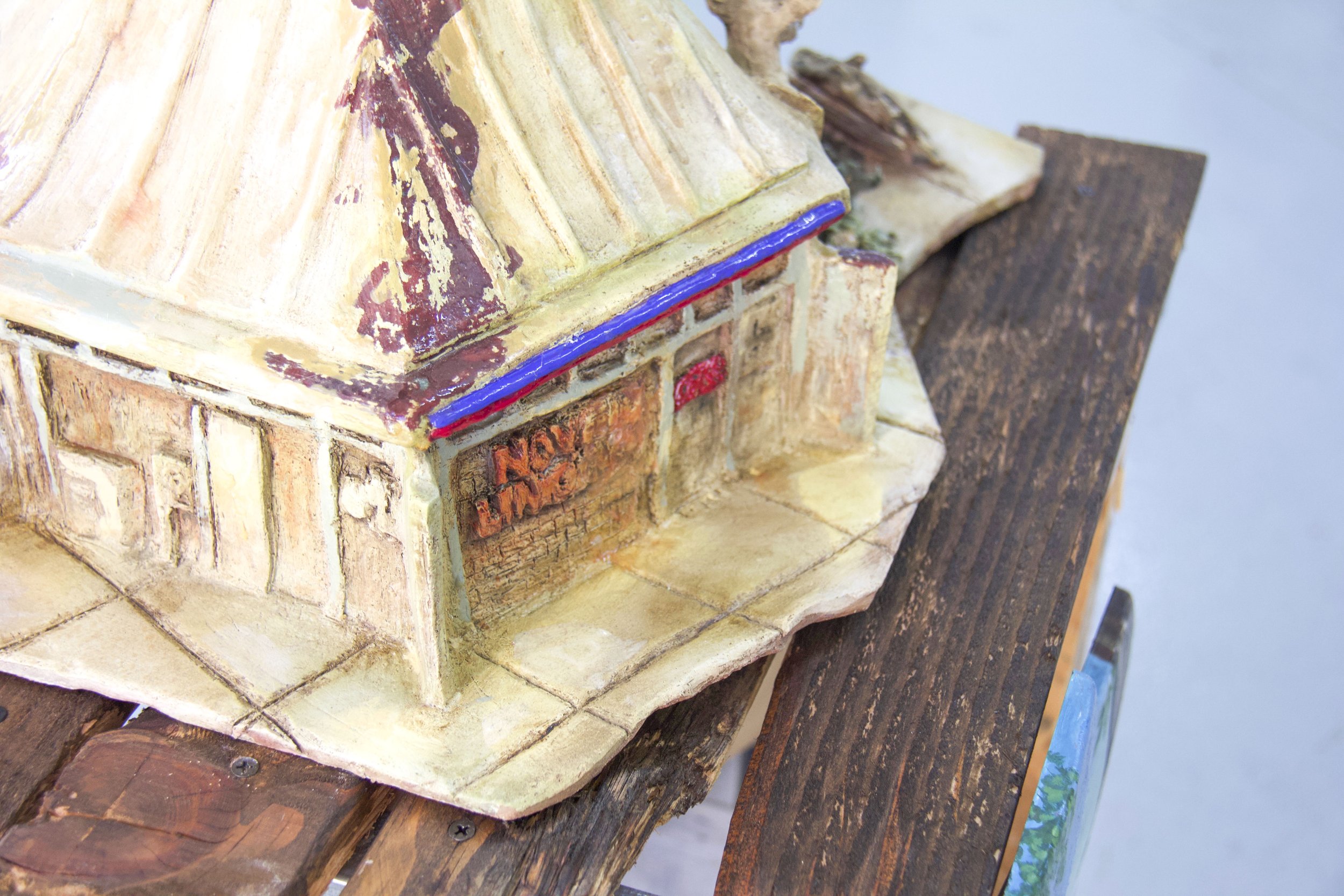
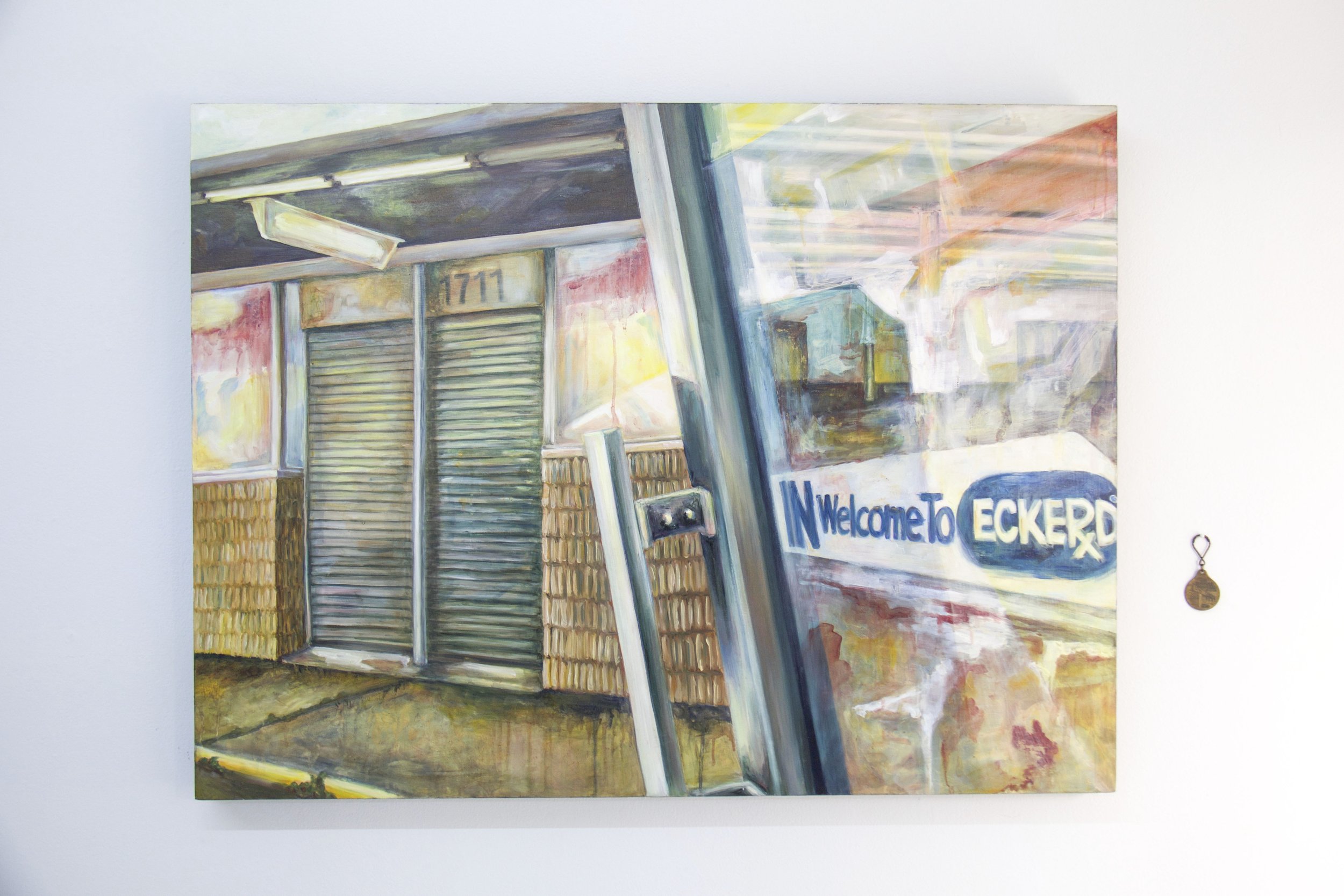
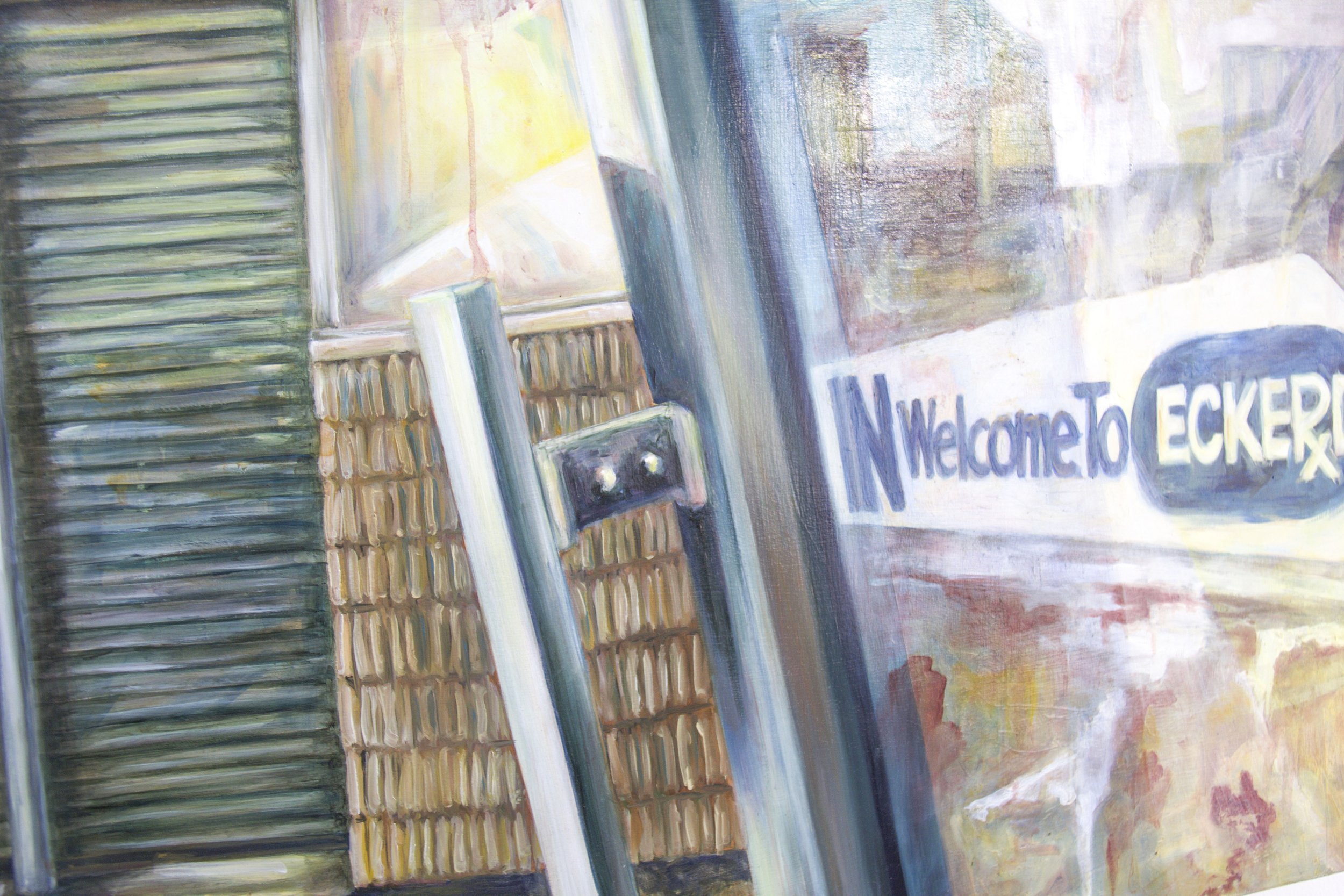
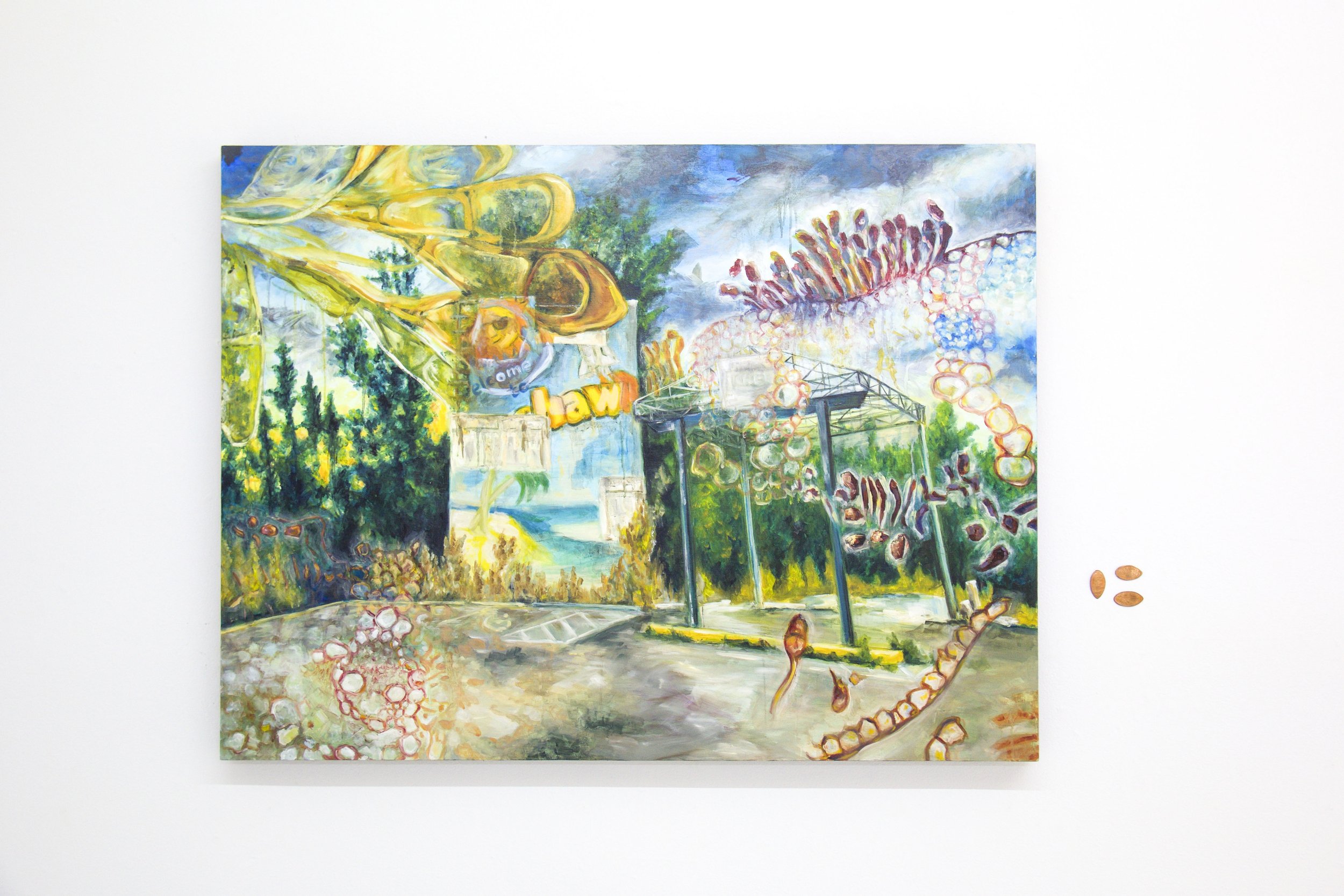
Eckerd


“Eckerd was a little different, as it was a drugstore chain with many locations and a place I experienced in my lifetime. This subject interested me because it began in Florida, and due to my childhood experiences, it evoked a sense of nostalgia for me. In the early 2000s, the chain was sold to CVS and Rite Aid, and soon remodeling began that made the stores unrecognizable as former Eckerd locations. I was surprised when I found this store off of Andrews Avenue, south of downtown Fort Lauderdale, in an abandoned state, but still retaining the appearance many Eckerd’s possessed in the 1980s. Although much of my interest in forgotten places centers around unique stores or entertainment locations, the complex rise and fall of defunct chain businesses also fascinate me. With large companies, what forces form their life cycles are layered and intricate – it is usually not just one factor that leads to their successes and ultimate demise. Late nights reading about their histories is a part of my artistic process!”
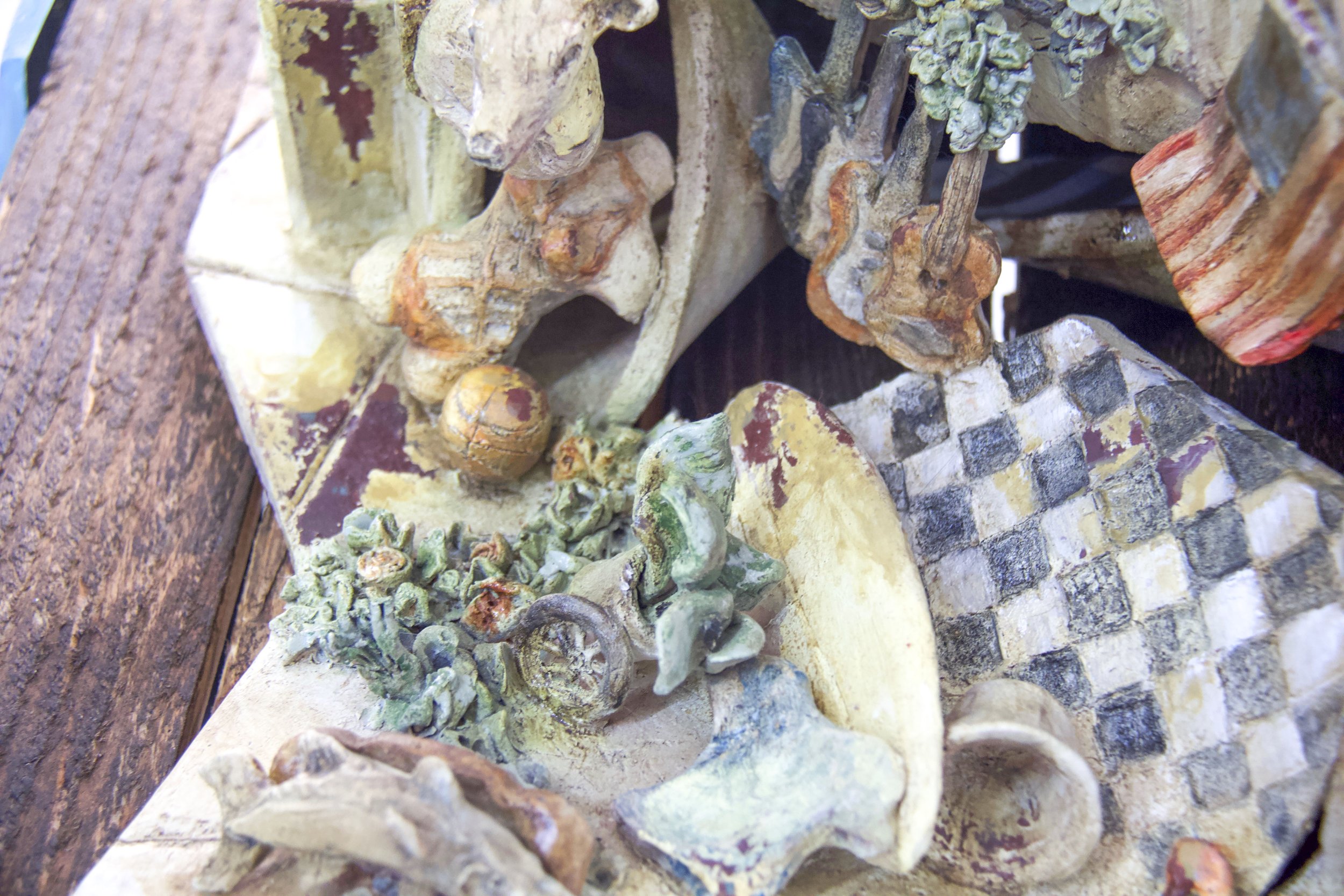
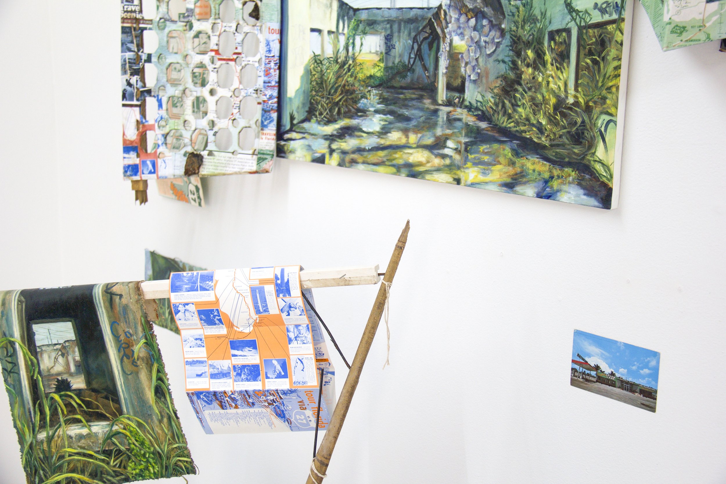
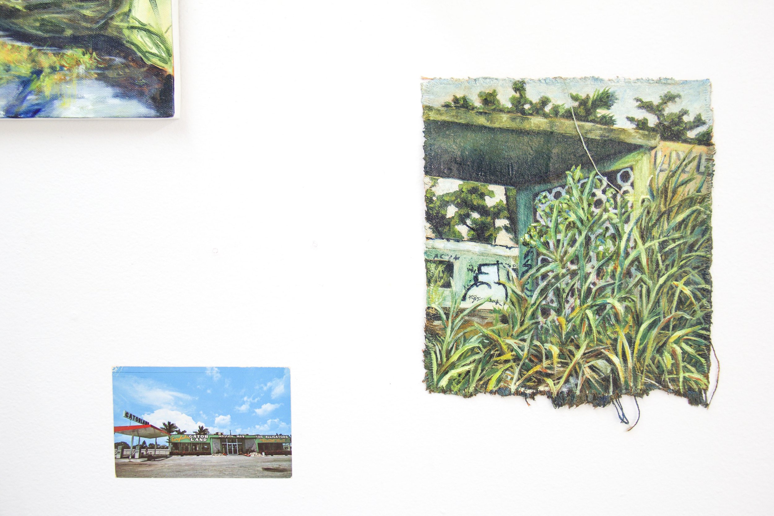
Everglades Gatorland
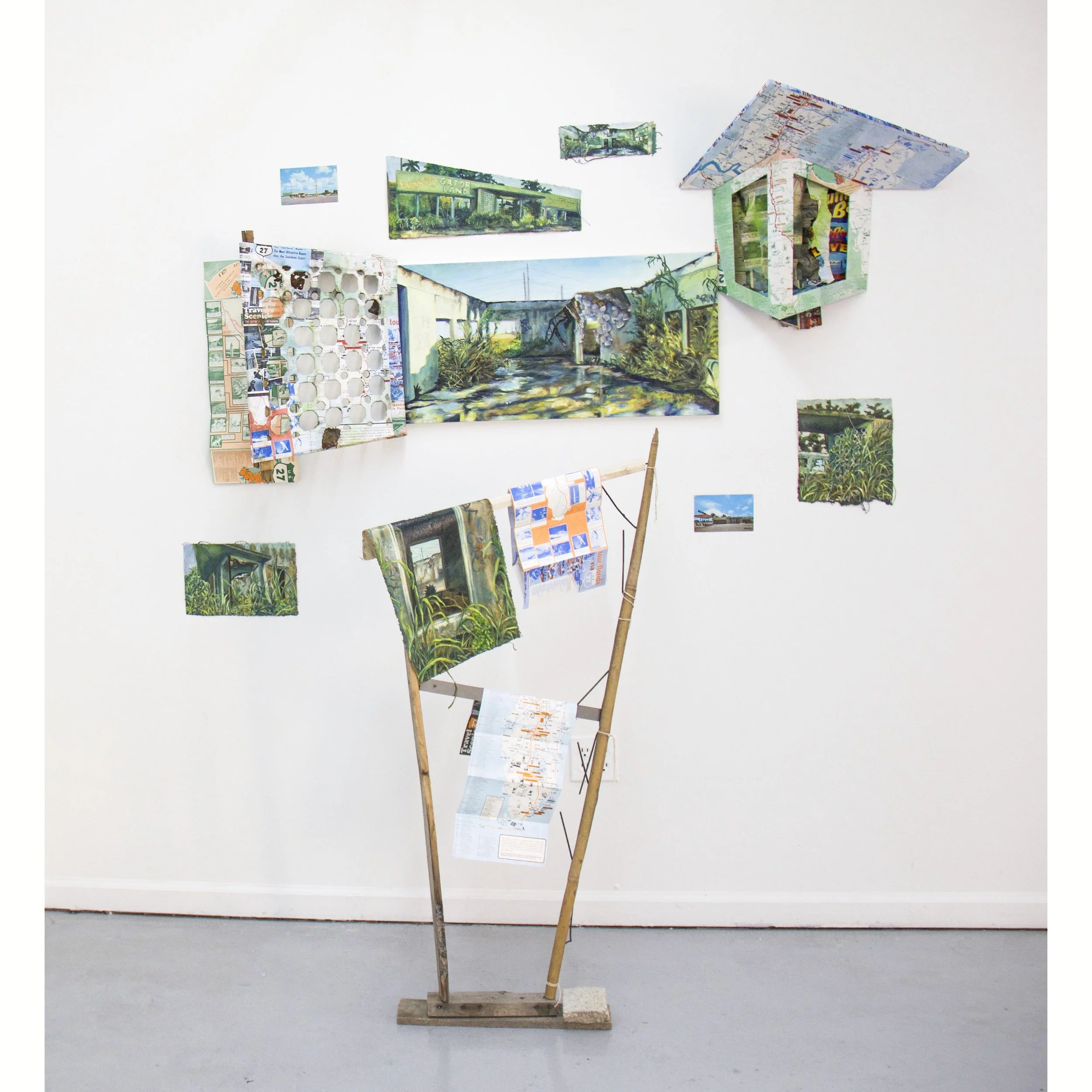

“Everglades Gatorland was the first time I began actively incorporating ephemera and sculptural elements into the work, as well as multiple paintings. This roadside attraction was located on US 27 at the edge of South Bay. Before Disney World forever changed the tourist landscape of Florida, US 27 was the visitors’ highway. Many roadside attractions captured the imagination of travelers along this route, but eventually, it became the road less traveled. This little roadside zoo opened in 1959 and held on until the 1990s. A friend of mine who is a talented nature photographer happened upon this abandoned place and surprised me by sending me striking photos. I knew I had to explore the place myself. This experience was a turning point for me. I knew I wanted to paint this place as a ‘portrait’, including my impressions of the surrounding area. This is how the work transformed from a simple painting to a small installation. Like many of my works in this series, the place evolved again soon after painting it – it has since been demolished.”

Plantation Fashion Mall


“Plantation Fashion Mall was painted simply because it was so beautiful. I didn’t have a deep emotional connection to this place, but I did visit it a few times in my adolescence. Driving by this mall on University Drive, I was struck by the unique forms created by the destruction of this shining monument. I had to pull over and photograph the demolition in progress. I have a promotional photograph of the mall while it was being built, so it seemed appropriate to document its destruction.”
Yeehaw Junction

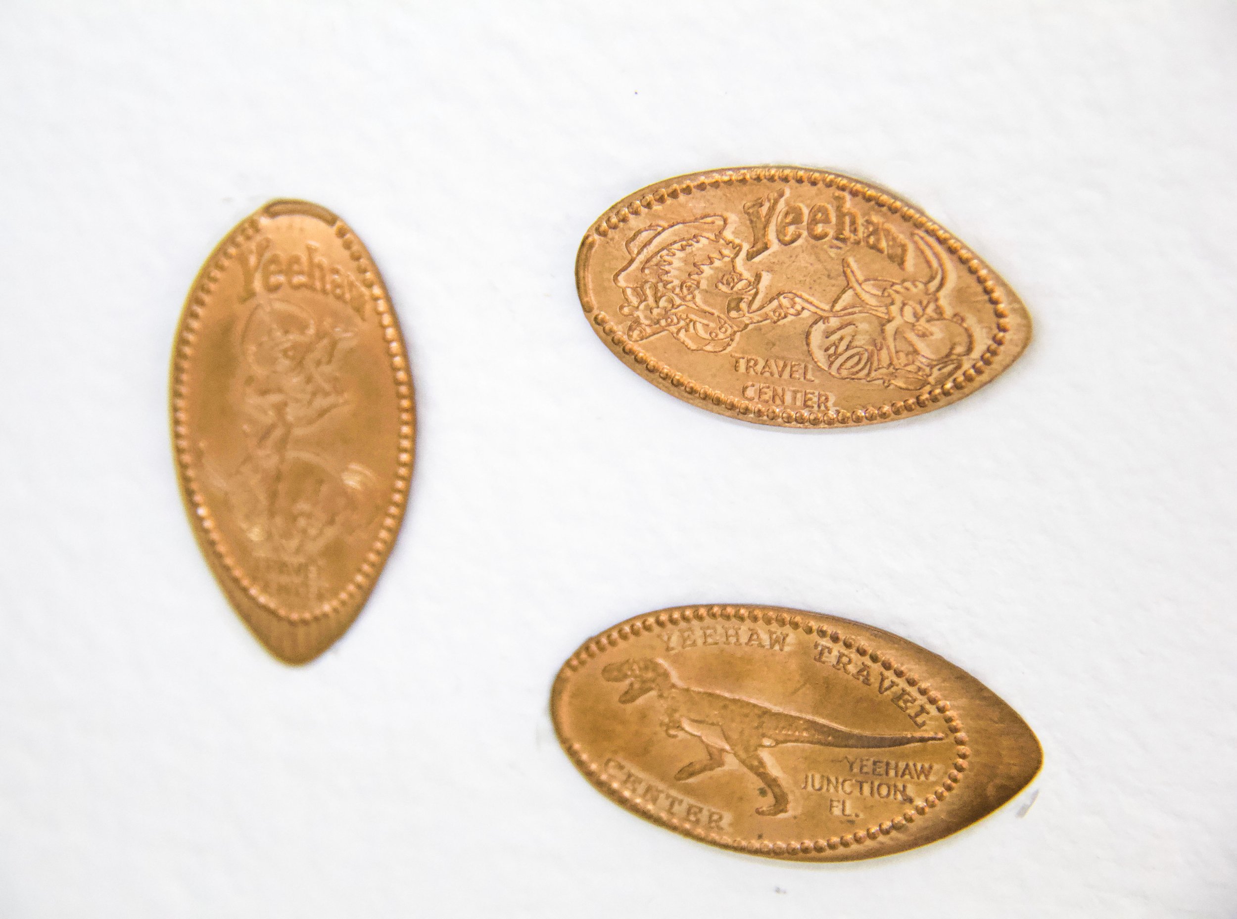
“Yeehaw Junction is a painting about the small town located where State Road 441 and the Florida Turnpike meet, west of Vero Beach. This the first work I made in this series that depicts a site outside of South Florida. I associated this place with the Yeehaw Travel Center, where visitors could purchase discount tickets for Orlando’s theme parks (before the dawn of the internet made this less necessary). As a child, I remember the billboards advertising this mysterious-sounding place. On a recent family vacation, we happened through this exit and I saw this iconic sign in a state of abandonment. After exploring and photographing the location, I learned that Yeehaw Junction was the site of a biological warfare experiment in the late 1960s. In the painting, I include images of the Stem Rust Agent used in this experiment.”
Buning the Florist


“Finally, Buning the Florist documents what’s left of another Florida chain. Starting in Fort Lauderdale in 1925, this floral business expanded through the state and beyond, building free-standing locations with iconic swooping roofs in the 1970s. Now the chain only exists online, and few of these mid-century modern buildings remain. The only three I could find (in Broward and Miami-Dade counties) are adult stores and a pawn shop. I visited each location and spoke to the people who worked there. The gentleman running the pawn shop had purchased the location from Art Stone, the previous owner of Buning the Florist. He said the roof was designed to withstand hurricanes – and that it really worked! In this piece, I use multiple media to document what the sites once were and are today. These beautiful buildings fascinated me as a child and I wanted to capture them while they still exist.”
Exhibiting Artist Residency
Prior to Clyman’s exhibition, we informed her that the studio, and all of FAT Village, was going to be torn down and completely redeveloped shortly after her show would come to a close. After realizing that the FATVillage Arts District would soon suffer the same fate as many of the subjects of her previous works, her intentions for her upcoming Exhibiting Artist Residency were set. Clyman explains, “I wanted to take this opportunity to document the unique and rich sites that soon would be replaced by clean, towering structures devoid of history. I explored the area during quiet times, capturing the images that grabbed my attention. I transferred the photos to solar plates through the Florida sun, and overlaid the images during the printing process.”
The residency resulted in a lot of experimentation and five limited edition solarplate prints entitled, No Need for a Postcard. (Seen below)
“No Need for a Postcard is a series that describes a future that we may be creating. Are we erasing what makes an area interesting when it is finally recognized for its value?” - Angelica Clyman


Angelica Clyman’s passion for discovering and preserving the history of seemingly mundane local spaces makes every day a possible revelation and adventure. As this exhibition comes to a close over the next couple of weeks, please reach out to schedule a viewing or stop by the gallery for our closing reception and IS Projects’ goodbye party during this month’s FINAL FATVillage Artwalk on Saturday, April 30th, 6-10pm with an artist talk at 7pm. For our remote audience, we also invite you to view the works more closely through our upcoming Virtual Gallery Tour.
For pricing and additional information on the works in the show, please visit our Gallery Shop and feel free to reach out via email with any inquiries at sammi@isprojectsfl.com
For more information on Angelica Clyman and her work, visit her website.

FLAT FILE FLEX: John Risseeuw of Cabbagehead Press
Welcome to our fourth installment of FLAT FILE FLEX; a series in which printmakers and print shops from all over share a few of MVPs (most valuable prints) from their collection. Today we’re excited to explore the personal flat files of John Risseeuw of Cabbagehead Press.
Ever wonder what printmakers consider the pride and joy of their print collections? Love a nosey look inside the studios of artists? Want to learn more about print shops and meet the printmakers that run them from the comfort of your own home? You’re in the right place.
Ever wonder what printmakers consider the pride and joy of their print collections? Love a nosey look inside the studios of artists? Want to learn more about print shops and meet the printmakers that run them from the comfort of your own home? You’re in the right place.
Welcome to our fourth installment of FLAT FILE FLEX; a series in which printmakers and print shops from all over share a few of their MVP (most valuable prints) from their collection. Today we’re excited to explore the personal flat files of John Risseeuw. You may recognize John and his work from a recent installment of FLAT FILE FLEX in which Jen Ferrell of Star Shaped Press showcased John’s letterpress print (below). You can learn more about John’s work and take an inside look at his studio, Cabbagehead Press, in this Shelter in Studio Video by SF Center for Book Arts.


The Cabbagehead Press has been the imprint of John Risseeuw since 1972. Letterpress, book art, printmaking, and papermaking have been his chosen media and loves for 54 years. Now, he is Professor Emeritus of Arizona State University where he founded the Pyracantha Press, the book art imprint of ASU, in 1982 and taught all of his loves for 35 years. In 1976 he purchased a used Vandercook Model 4 for $300 and it has been his personal press workhorse ever since. His prints, books, and collaborative works, many on handmade paper, have been shown in over 450 exhibitions in 26 countries and have been widely collected. Over five decades, Risseeuw’s art has often touched on themes of political corruption, equal rights, environmental abuse, fascism, illegal wars, the proliferation of landmines, and sheer idiocy.
John shares, “I have to say the obvious here: selecting six prints from the works I’ve acquired over fifty years was not an easy task. I have prints from friends, students, and acquaintances that each has history or joy or appreciation attached and are considerable favorites for different reasons. Here are just a few.”

“Jack was my lithography professor at the University of Wisconsin-Madison for both undergrad and graduate degrees. I felt so pleased to be able to acquire this print from him — I had absolutely loved it when he first showed it to us. It has simplicity and complexity, mystery and seeming recognizability. When it is mounted on one of our walls, I can always stop and look at it, never tiring.”
Learn more about Jack Damer
Journey to the South Pole by Jack Damer
Stone lithograph
32.5” x 24.5”
1970

“Elizabeth Catlett came to ASU for an exhibition of her work in our museum and we were privileged to work with her and her husband, Francisco Mora, on some quick prints in the Pyracantha Press. She was a marvelous collaborator and it was an honor to work with her. When I suggested that there might be text in addition to the powerful image, she called her friend, poet Margaret Walker, and got permission to print a couplet from one of Margaret’s poems. This has hung in my house ever since.”
Learn more about Elizabeth Catlett
For My People by Elizabeth Catlett
Reduction linoleum print and letterpress
18” x 22”
1987

“Ken was a year ahead of me in grad school at UW and was just a master of pulling out the silkscreens, slapping down some colors, and then topping it with a litho of a collage that made it both sing and make sense. Then, he would add the screened frame and border to formalize the piece. I was so proud to trade some of my art for his. It’s definitely a print of its time but it brings me back there when I look at it.”
Learn more about Kenneth Falana
Kathy by Kenneth Falana
Screenprint and photolithography
21” x 28.5”
1972

“Jen Ferrell is a consummate master at metal typography and knowledgeable about historical printing and design, on which these three broadsides rest so comfortably. She also has a keen and biting wit that speaks truth while delivering it in visually delicious compositions. Since I am an artist who also tackles tough issues, I greatly appreciate an artist like Jen who does that so well.”
Learn more about Jen Ferrell
Suite of LADIES! prints by Jen Ferrell
Letterpress
10” x 20” each
2020

“I always like a vigorous woodcut with caricature (I have cartooning in my past) and when you add some outrageous but on-point text to further jar and poke and prod the viewer, I am all in. It’s crude, but it speaks a truth and I love it.”
Learn more about Martin Mazorra
Shit Sandwich by Martin Mazorra
Woodcut
18” x 24”

“I first met Wayne when I was a grad student and then later worked with him for some years as faculty in the Printmaking Area of ASU. Talk about a consummate master, I have heard him referred to as one of the three top lithographers in the country (Jack Damer, above, is one of the other two). Like many of his prints, this one displays both the finest facility with the details of multicolor stone lithography as well as his sly, quiet humor.”
Learn more about Wayne Kimball
Treein Potatop Timne by Wayne Kimball
Stone lithograph
11” x 15”
1981
With 50 years of print experience and collecting under his belt, we can only imagine the treasure trove of editions that live within the Cabbagehead files. We’d like to thank John for being so generous in inviting us into his studio and for the thoughtful and illuminating sentiments shared with each of these picks.
If you are a print shop and/or printmaker interested in participating in a future FLAT FILE FLEX feature, please email sammi@isprojectsfl.com for more information.

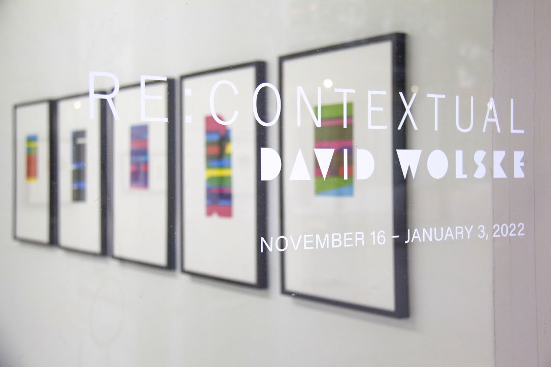
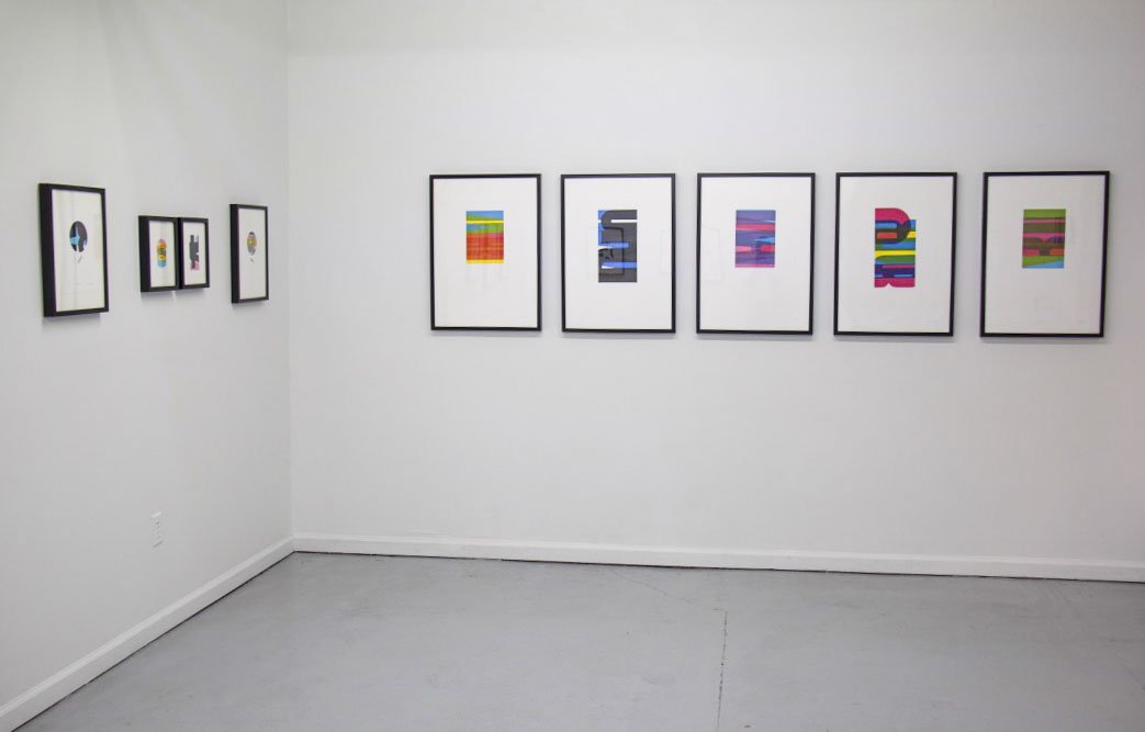
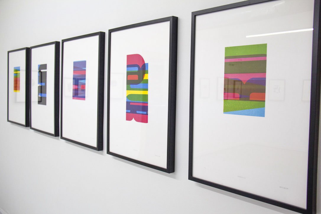
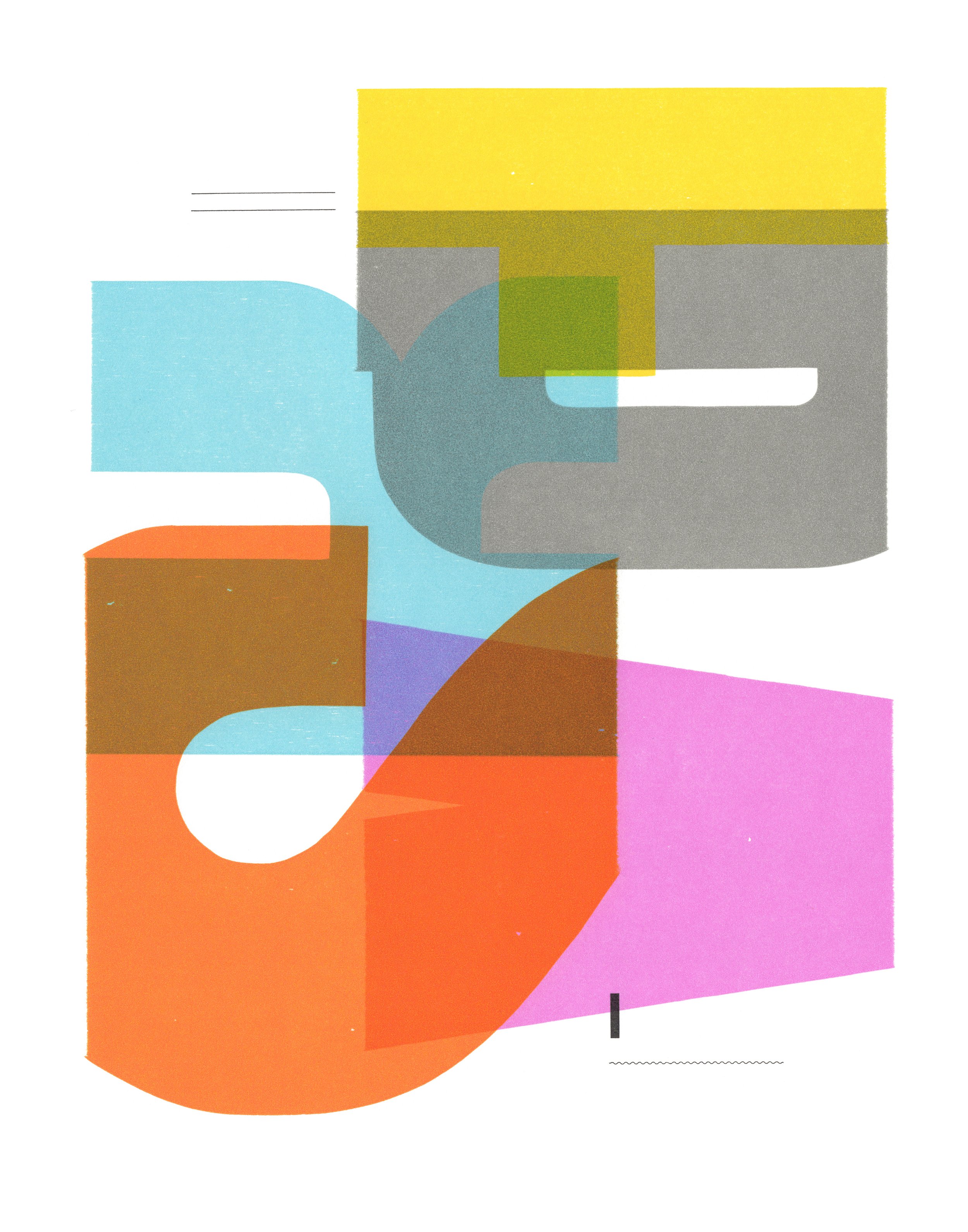
A Closer Look: Re:Contextual by David Wolske
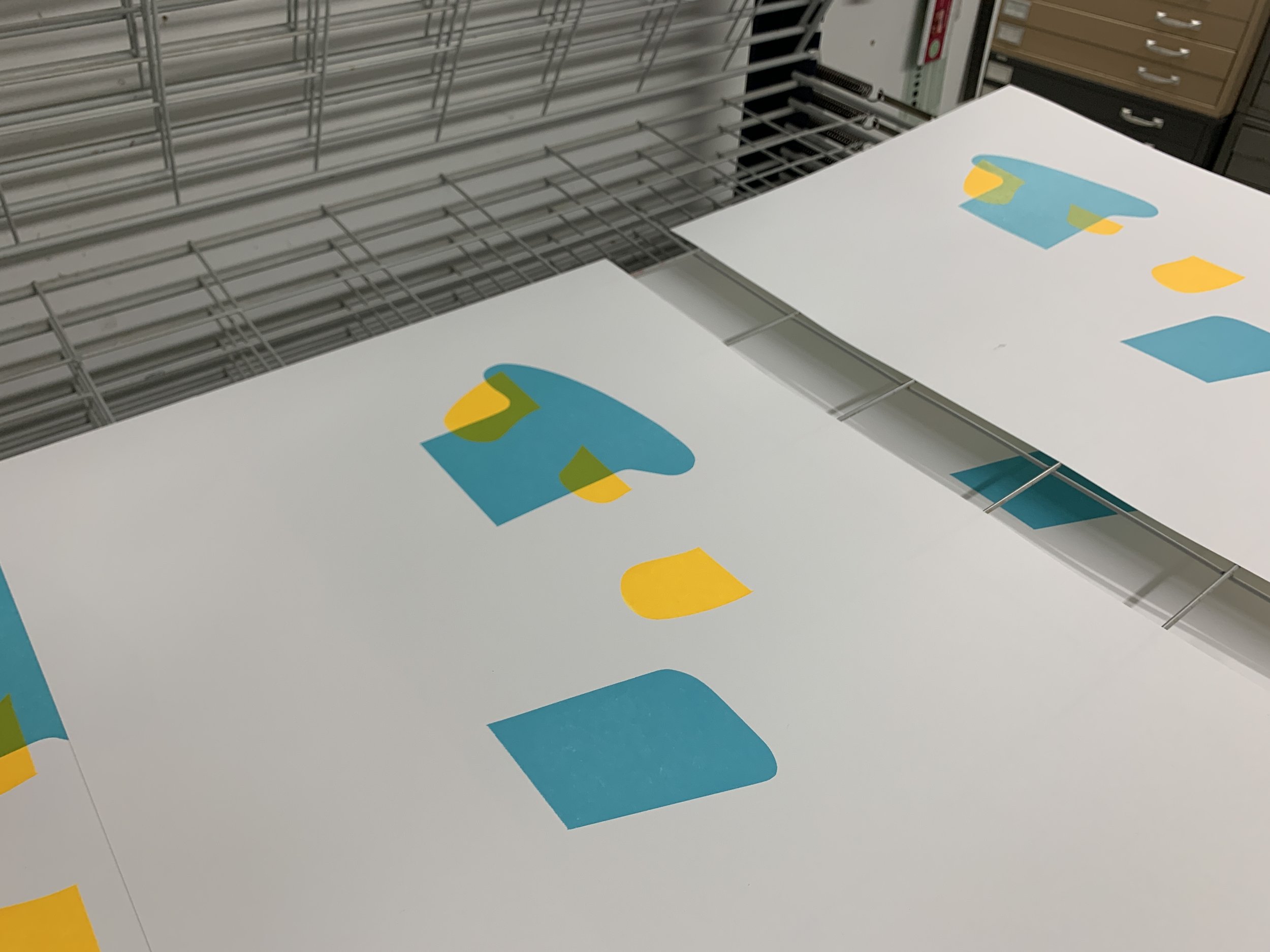
Re:Contextual is a solo exhibition by David Wolske combining contemporary and historical processes to transfigure letters, numbers, and punctuation into visual poetry. It is through this ‘Closer Look’ that we more intently investigate David Wolske’s solo show and the many iterations of his isotype printing technique.
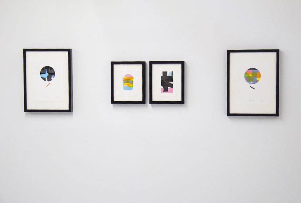
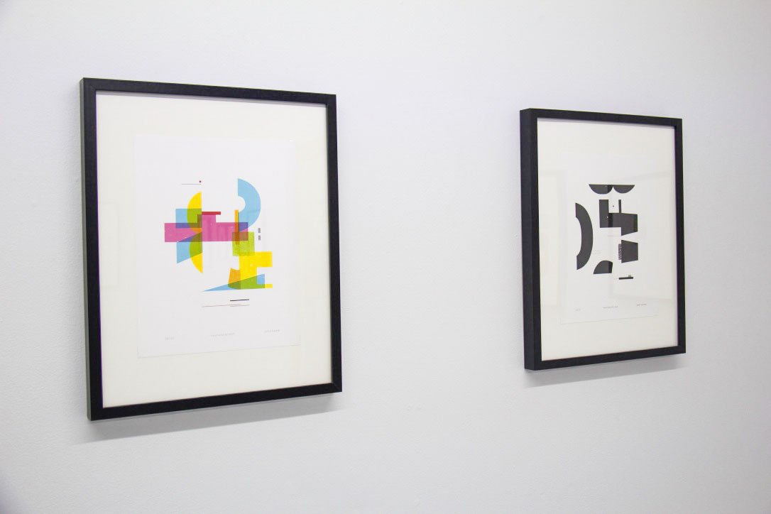
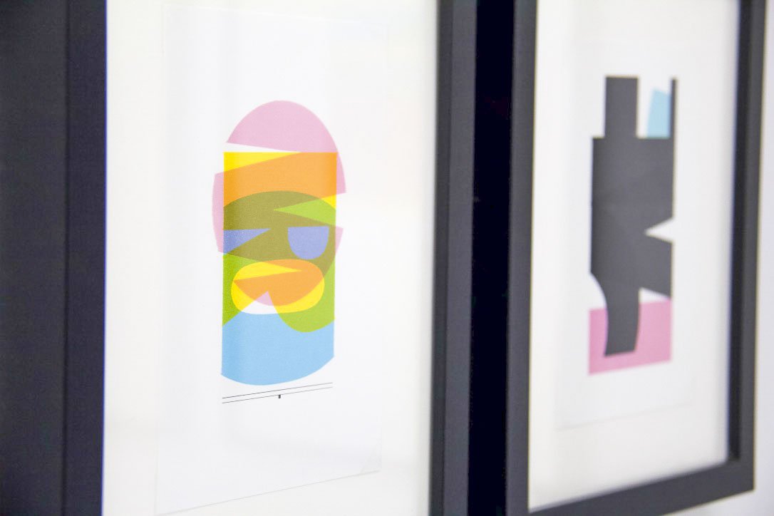
Re:Contextual is a solo exhibition by David Wolske combining contemporary and historical processes to transfigure letters, numbers, and punctuation into visual poetry. Within the gallery hangs a series of letterpress prints showcasing enigmatic compositions of deceptively simple shapes, which viewers may be surprised to learn are remixed from wood and metal type. The playful abstractions use color and negative space to communicate the more emotional aspects of written language while inviting the viewers to create their own interpretations.
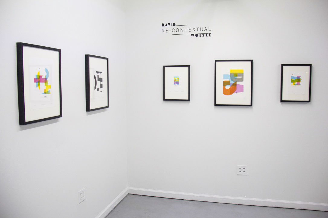
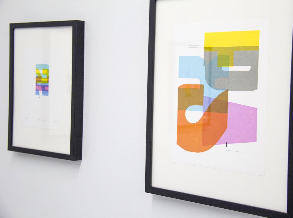
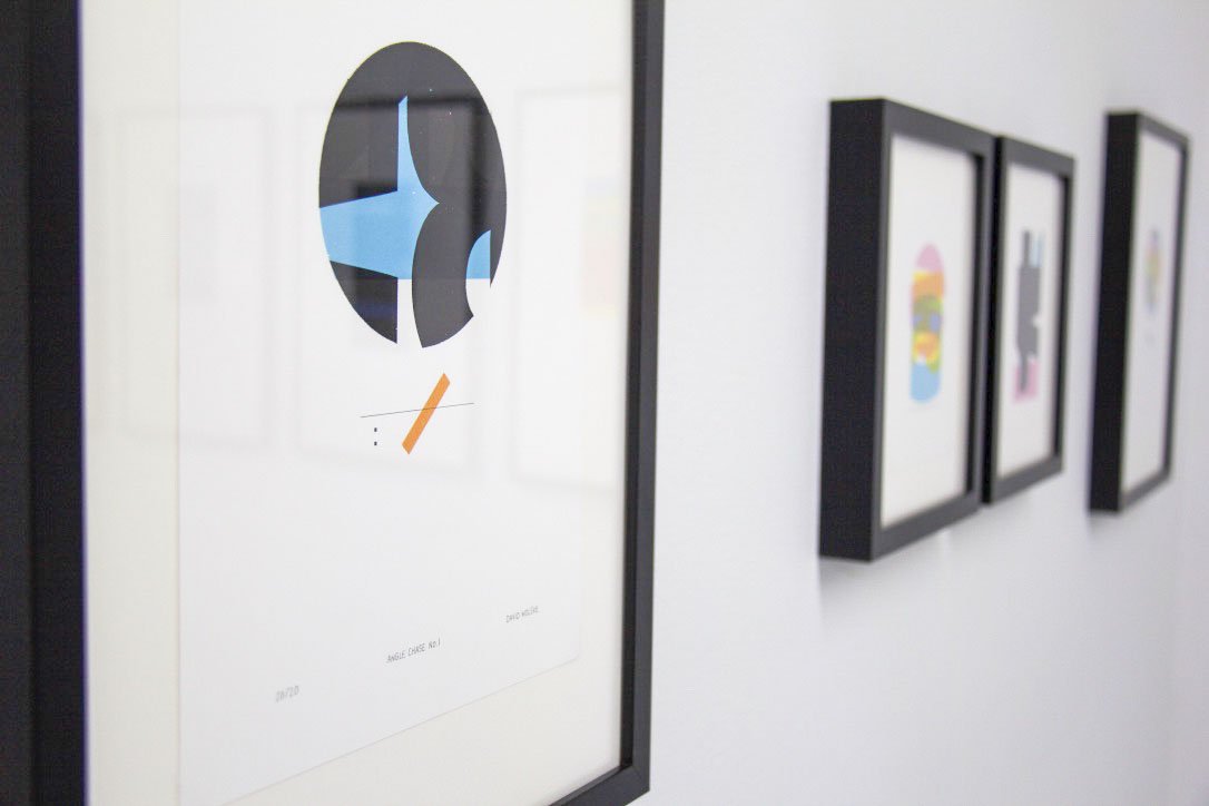
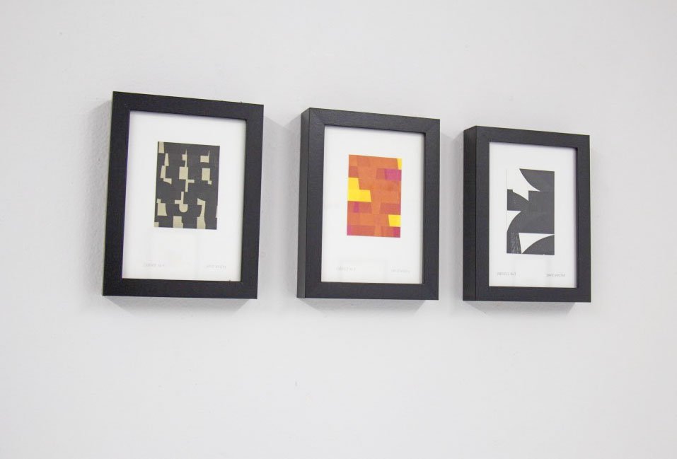
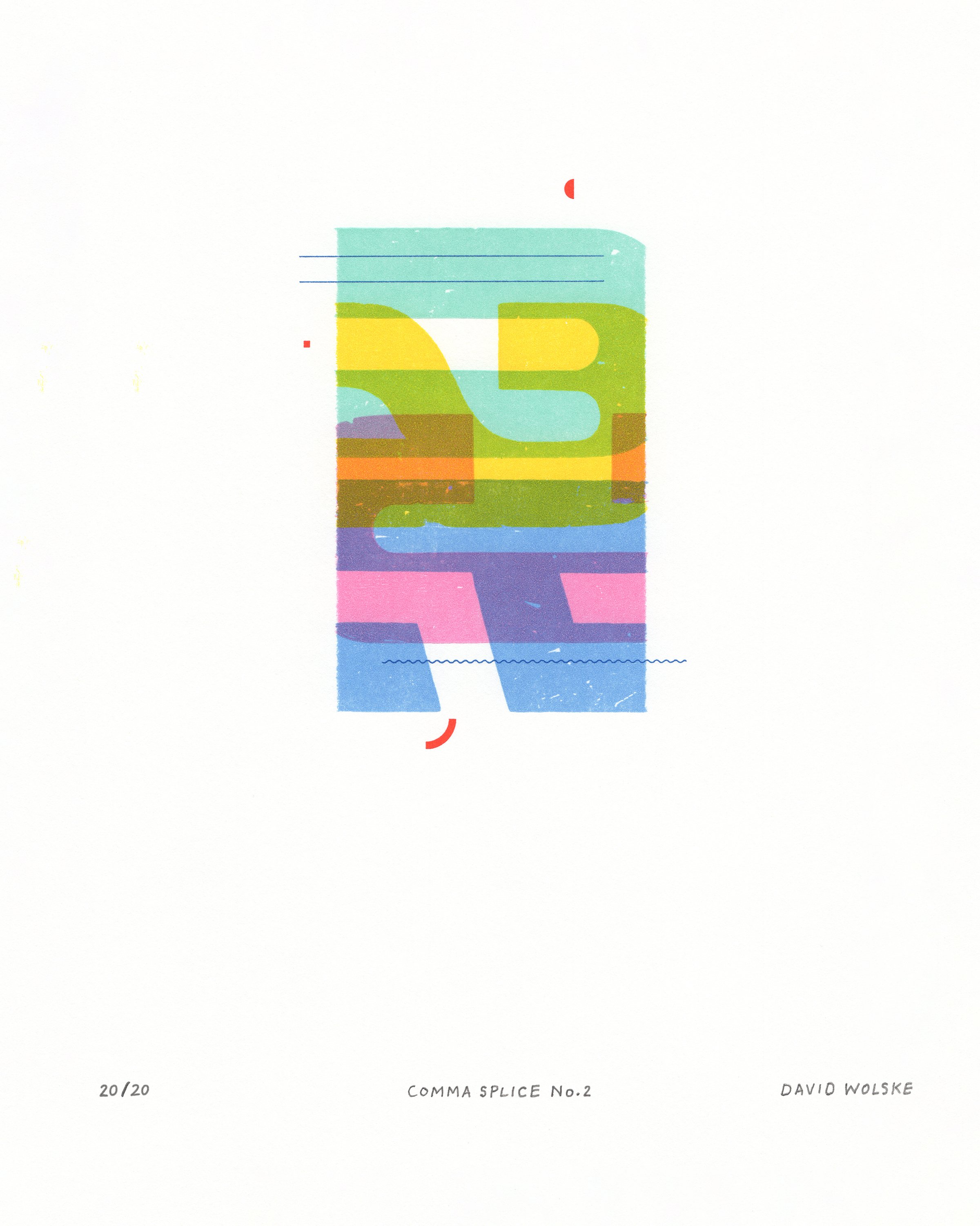
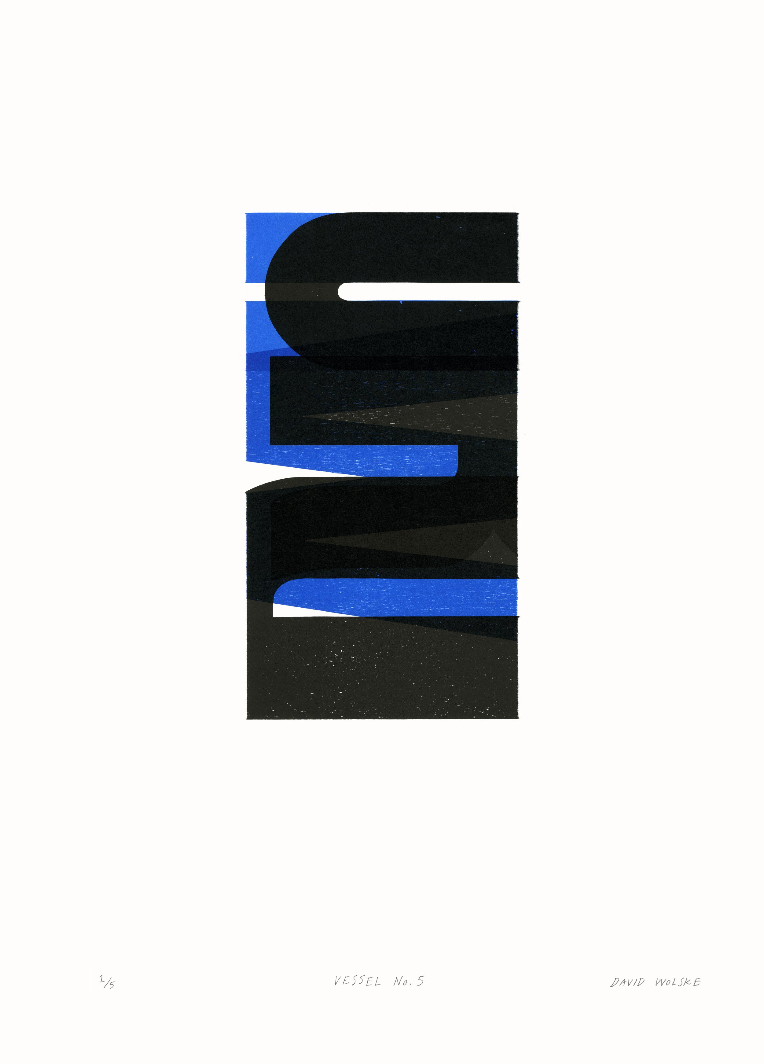
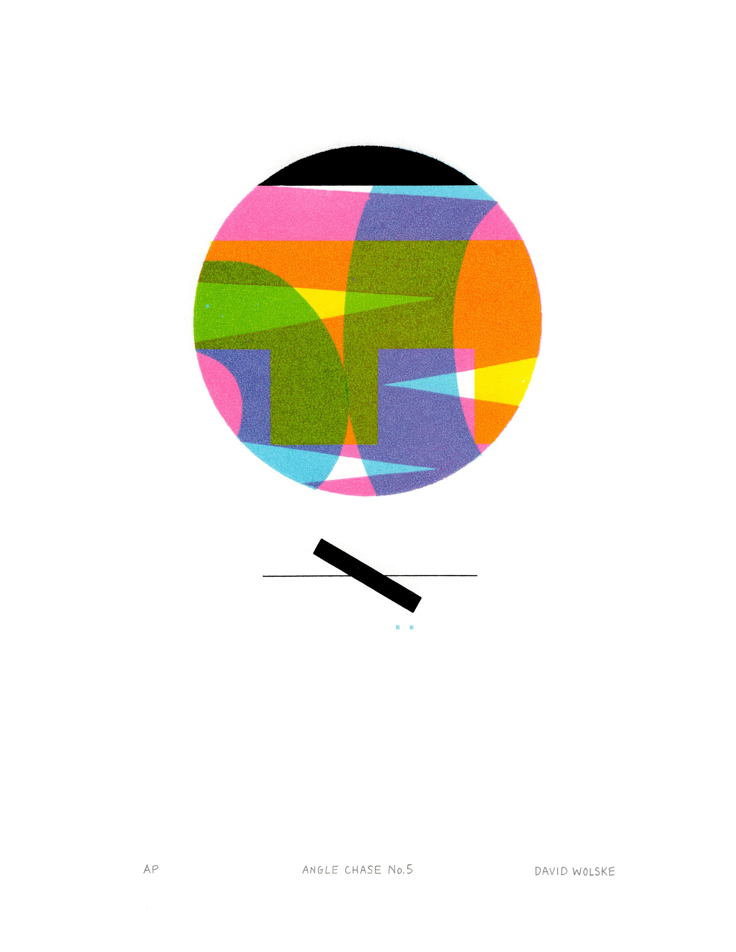
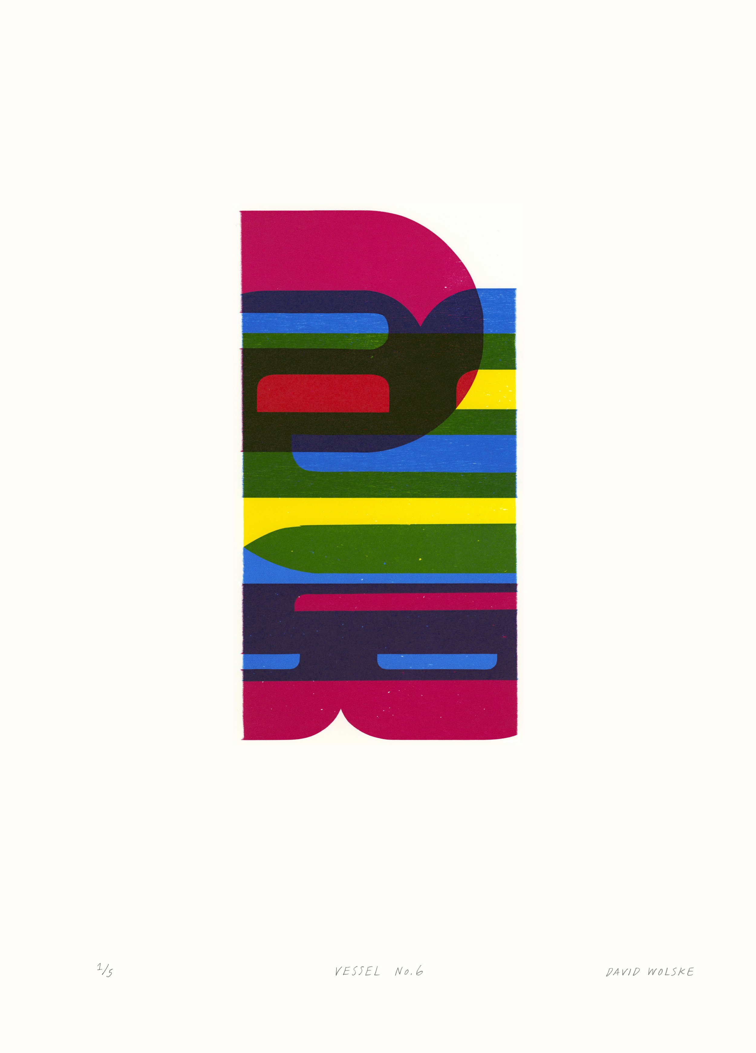
By deconstructing language to express a more visceral form of communication, Wolske's work playfully subverts the relationship between the hand and the machine. This distinctive method of subtractive letterpress printing was born out of a significant discovery for the artist in 2012. He found that if he used a series of masks and accounted for precise pressure while printing, he was able to isolate and therefore, abstract sections of type. Thus, he coined his technique, ‘Isotype printing’. Wolske elaborates, “I acknowledge that I’m appropriating the word Isotype, which already exists. I’m using it as a combination of the word isolate and type, because that’s exactly what I’m doing. I’m isolating atomic elements of the letterforms, looking for those vertical, horizontal, and diagonal curved lines. I want to isolate them and mask them, which the technique allows me to do.”

During his artist talk at the preview reception for his show during Small Press Fair ‘21, we learned that Wolske’s work thrives under creative limitations. “Whether wearing my artist hat or graphic design hat, all my work begins by defining some parameters for limitations. This helps me overcome the creative paralysis that results from the proverbial blank canvas. By limiting my choice of letters and wood type blocks, limiting my color palette and paper size, I can focus my creative energy on exploring compositional iterations. I get the most artistic joy and fulfilment from discovering new combinations from the same elements. Much like all of western music uses just twelve tones, I find an infinite variety possible in such a creative framework endlessly inspiring.”
For example, the six large-scale prints spanning the Eastern wall in the gallery showcase a series that all result from using just four letters: W, O, R, D. For about three to four years, Wolske made four or five series of prints just using these letters. “I honestly believe I could keep making work for the rest of my life using just those four letterforms, but I do have some other interests.”


In Wolske’s second series of anagrams started in early 2021, he broadens his exploration to include the letters that make up the word, SPEAR. When recombined, these letters offer the most reconfigurations to make new words in the English language, and therefore, endless potential for Wolske to conjure new compositional and color arrangments in his work. These limitations get him excited about the possibilities which live within this framework. The same can be said for his limited color palette of CMYK, which offer infinite possibilities each time they’re layered.
“the more limitations placed on me, the more creative I feel. It gives me this friction to push against and I get really excited about seeing how far I can go and how many different combinations I can come up with.”
-David Wolske
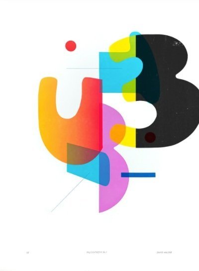
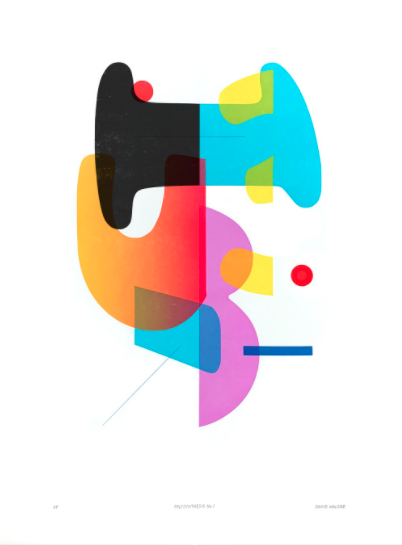
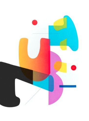
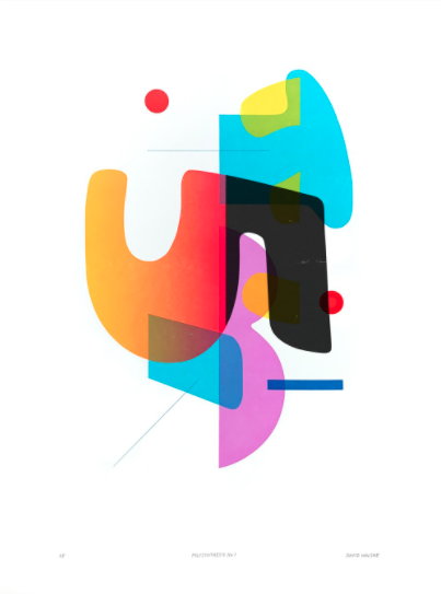
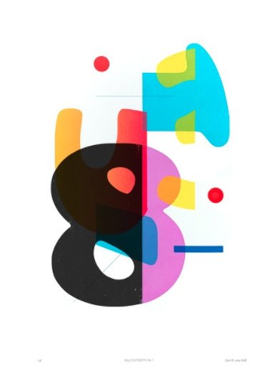
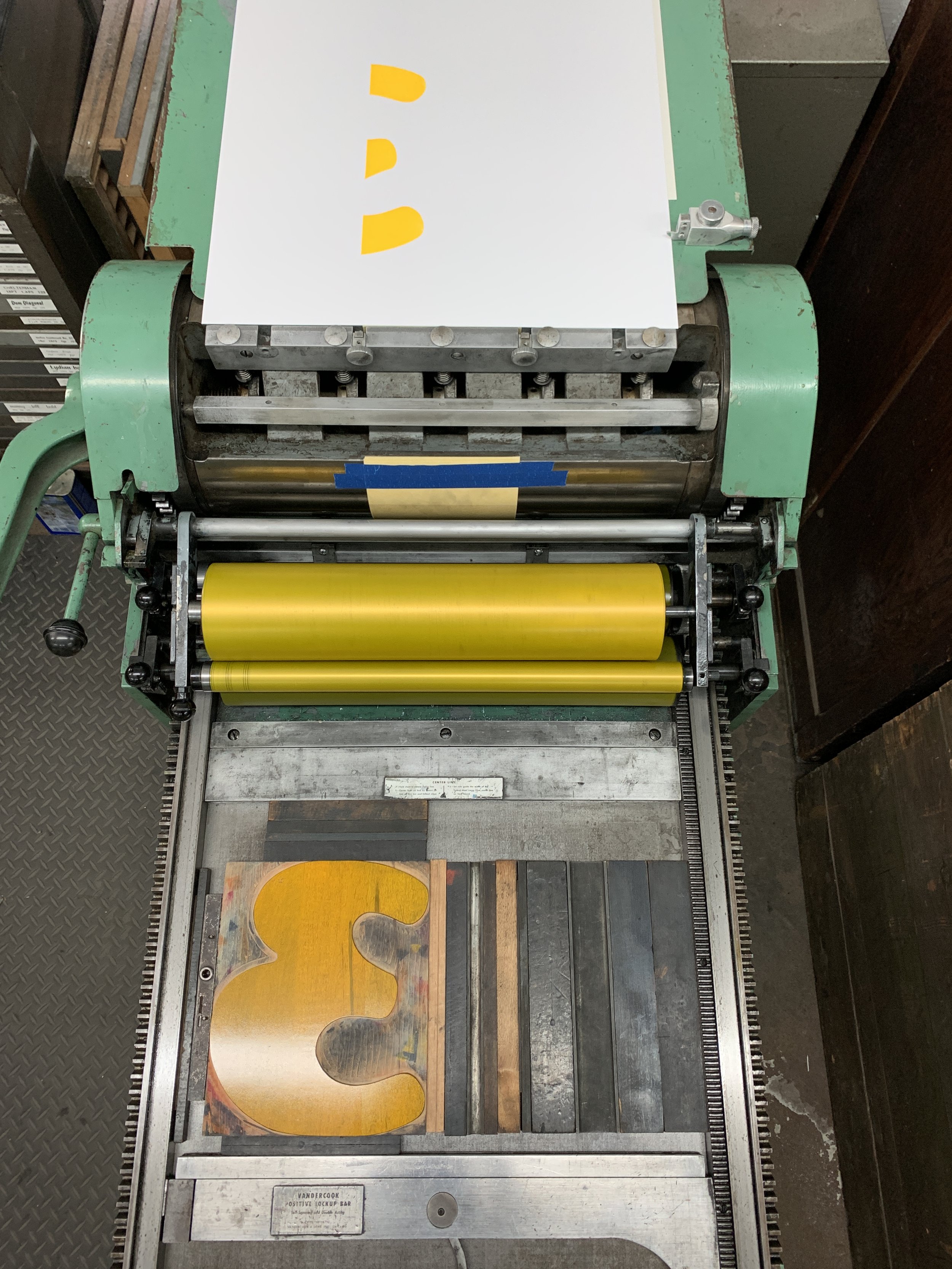
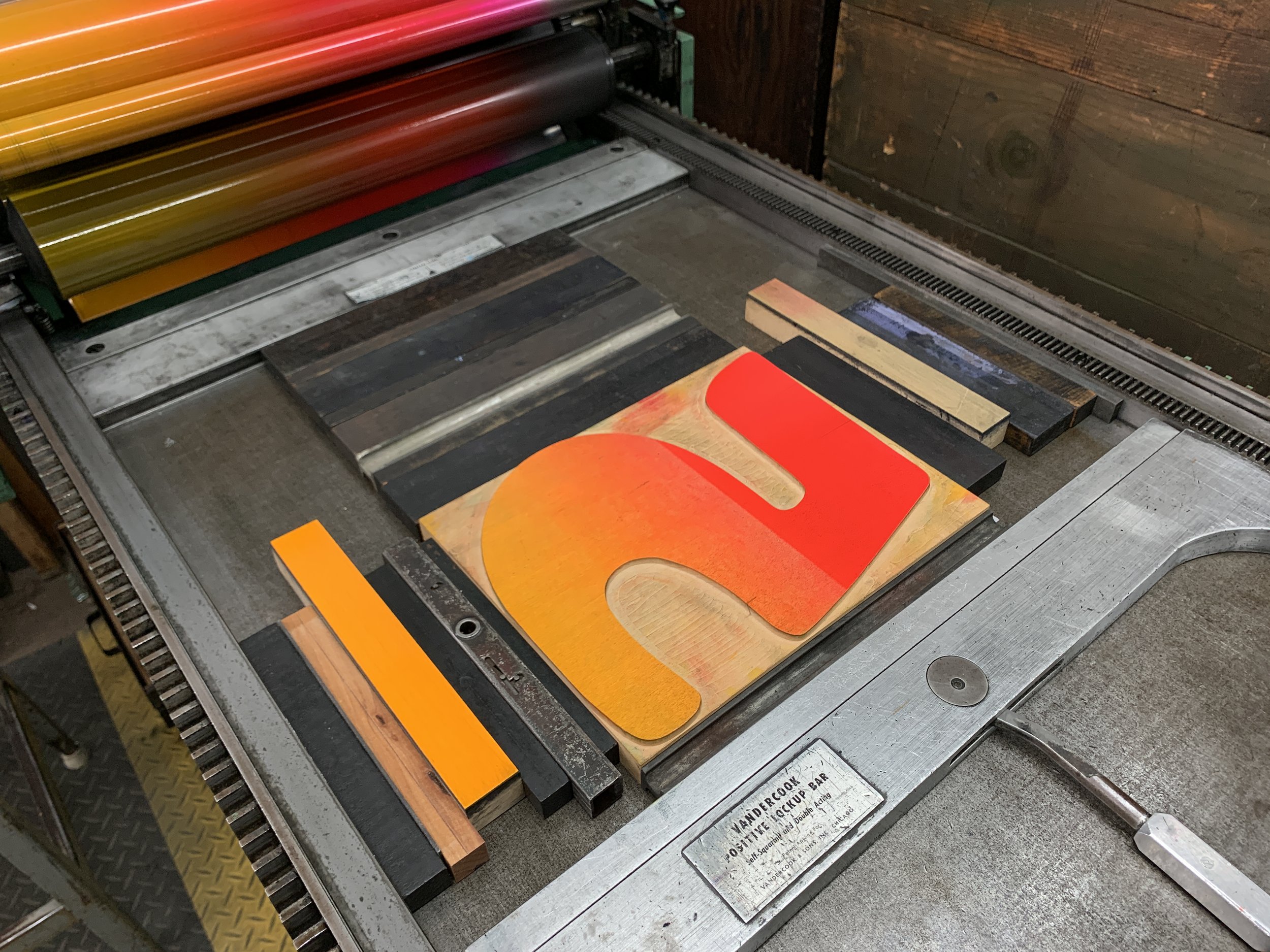
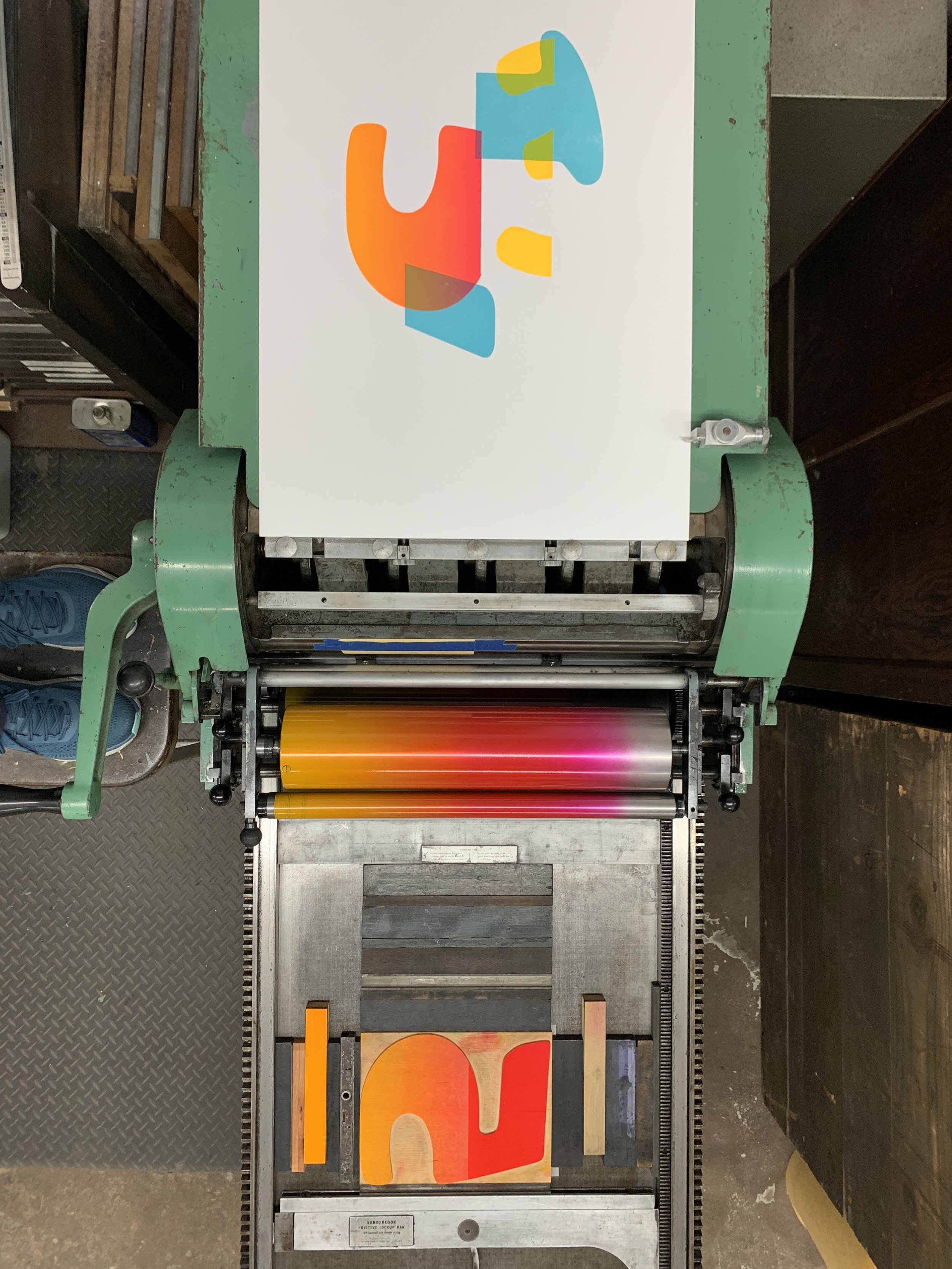
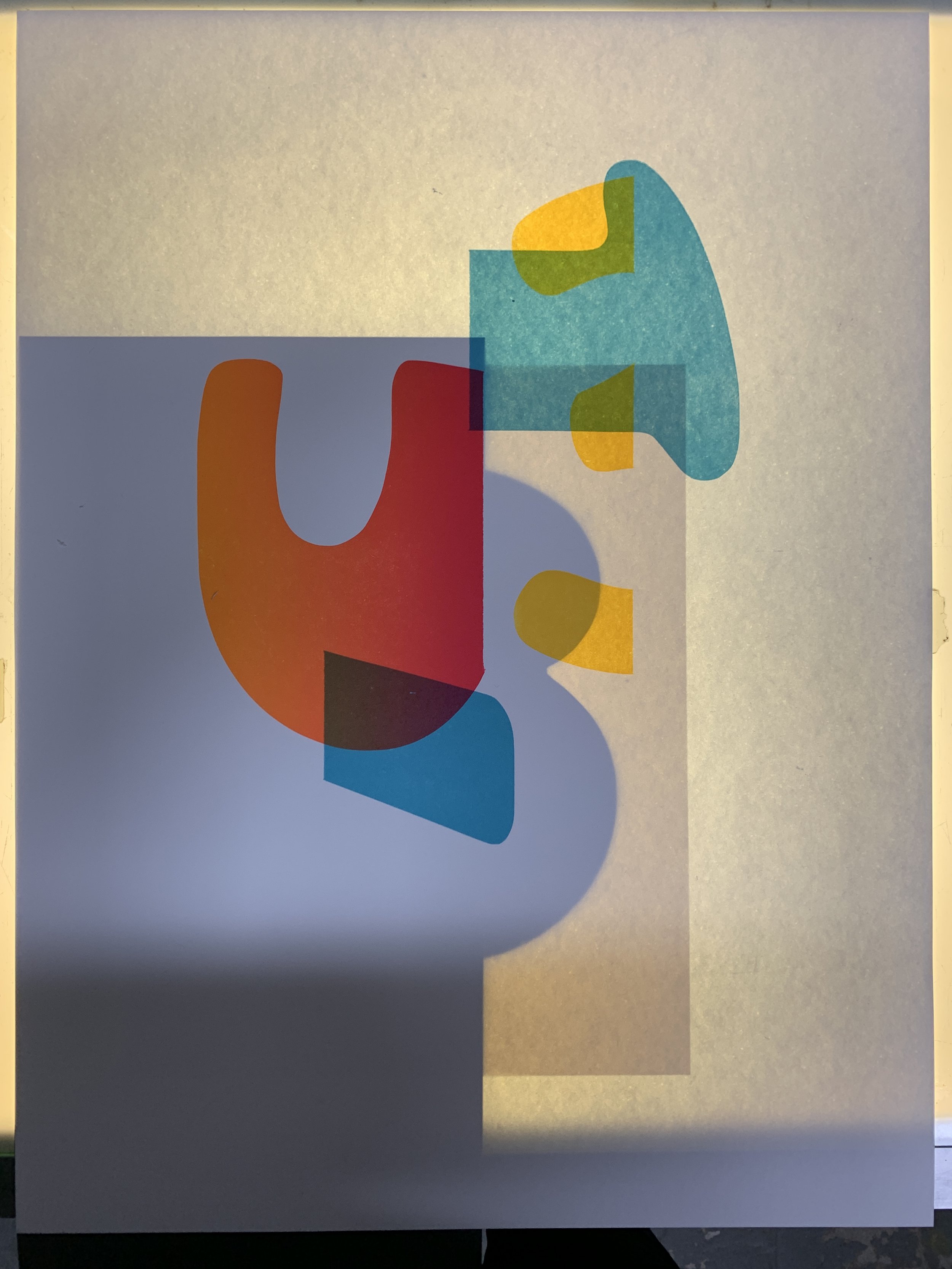
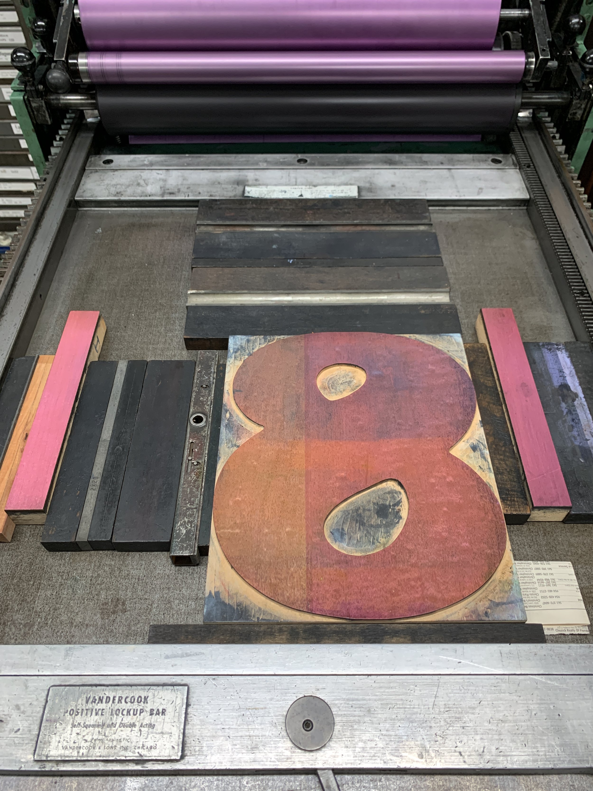
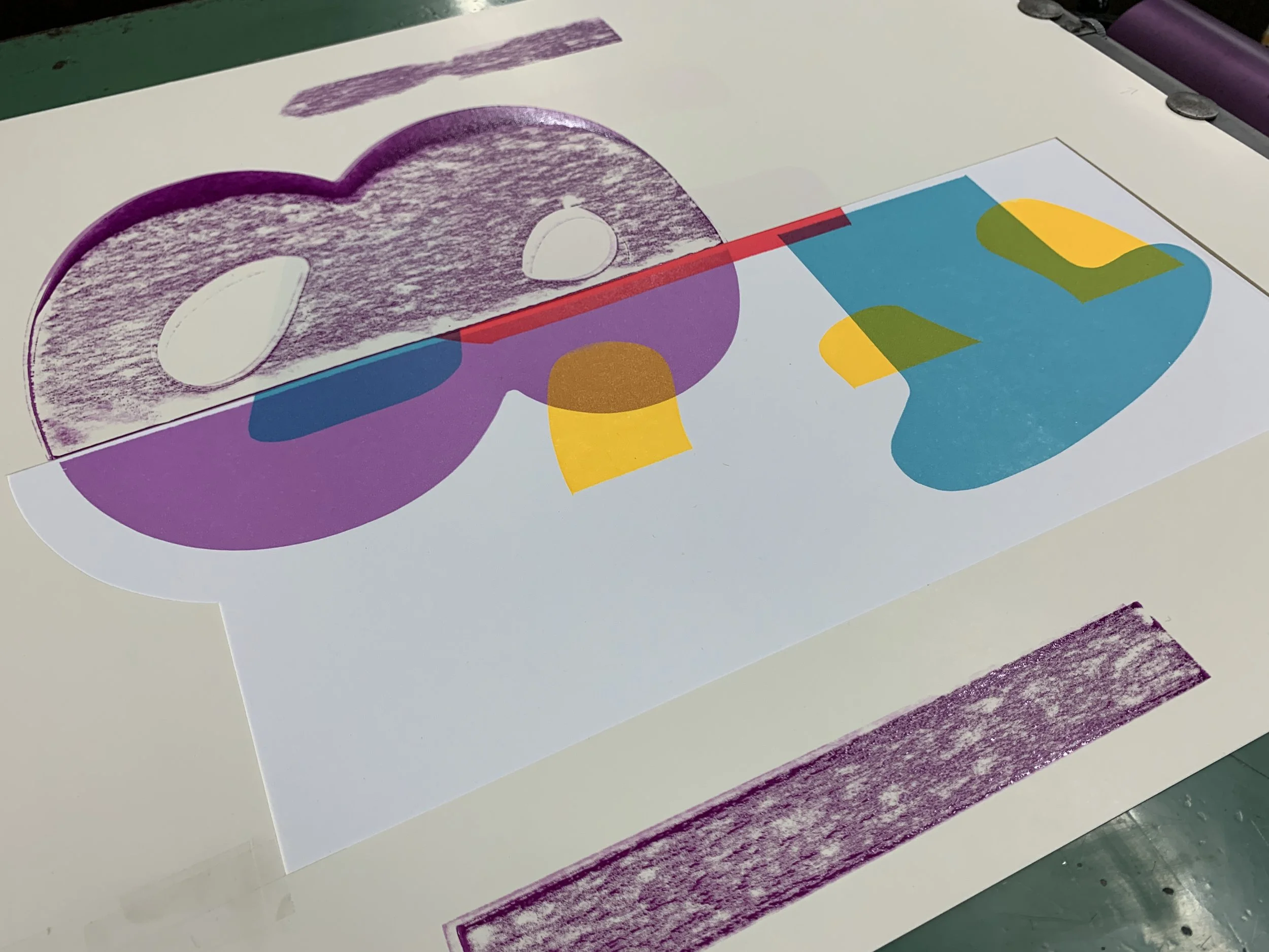
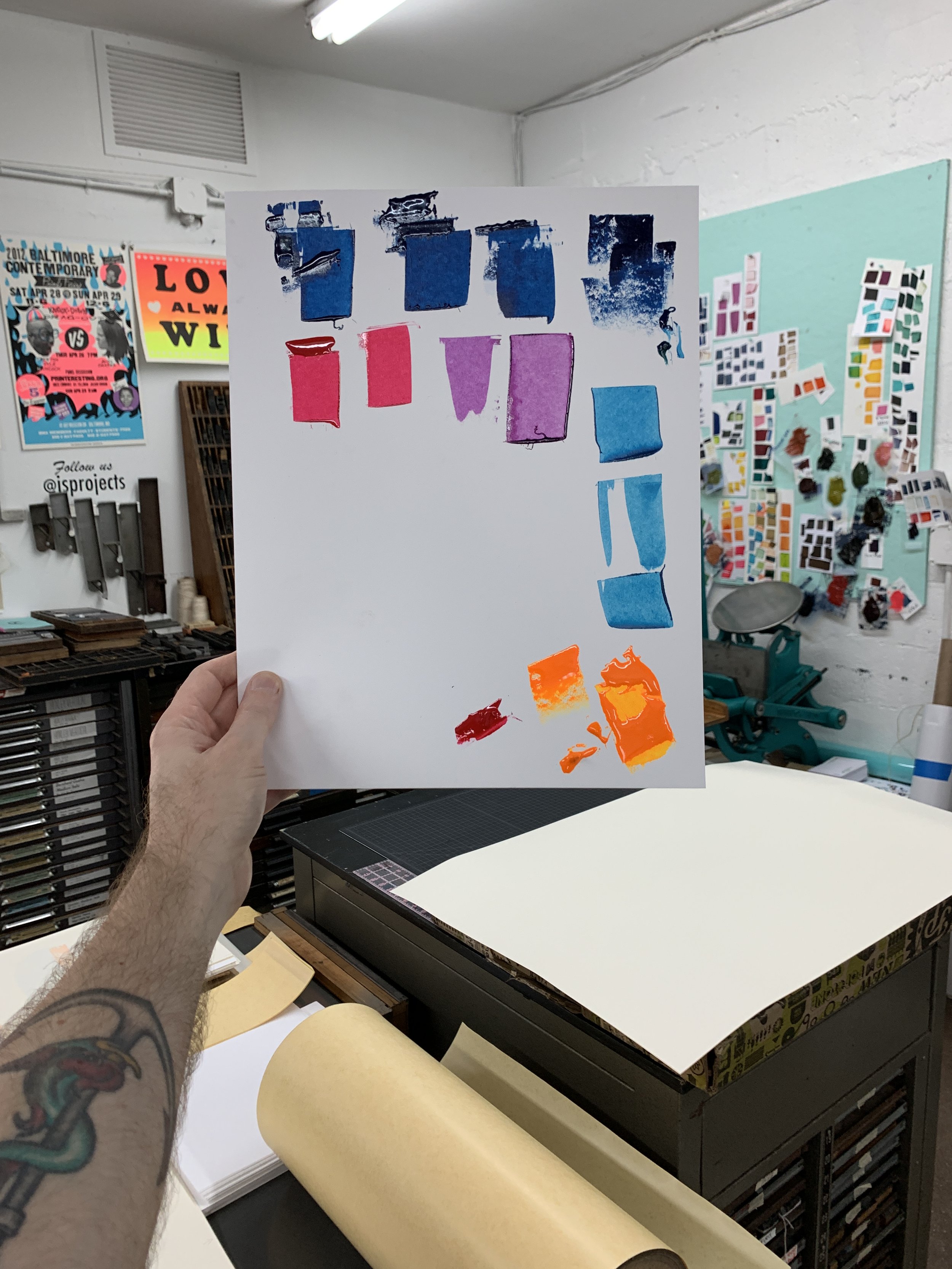
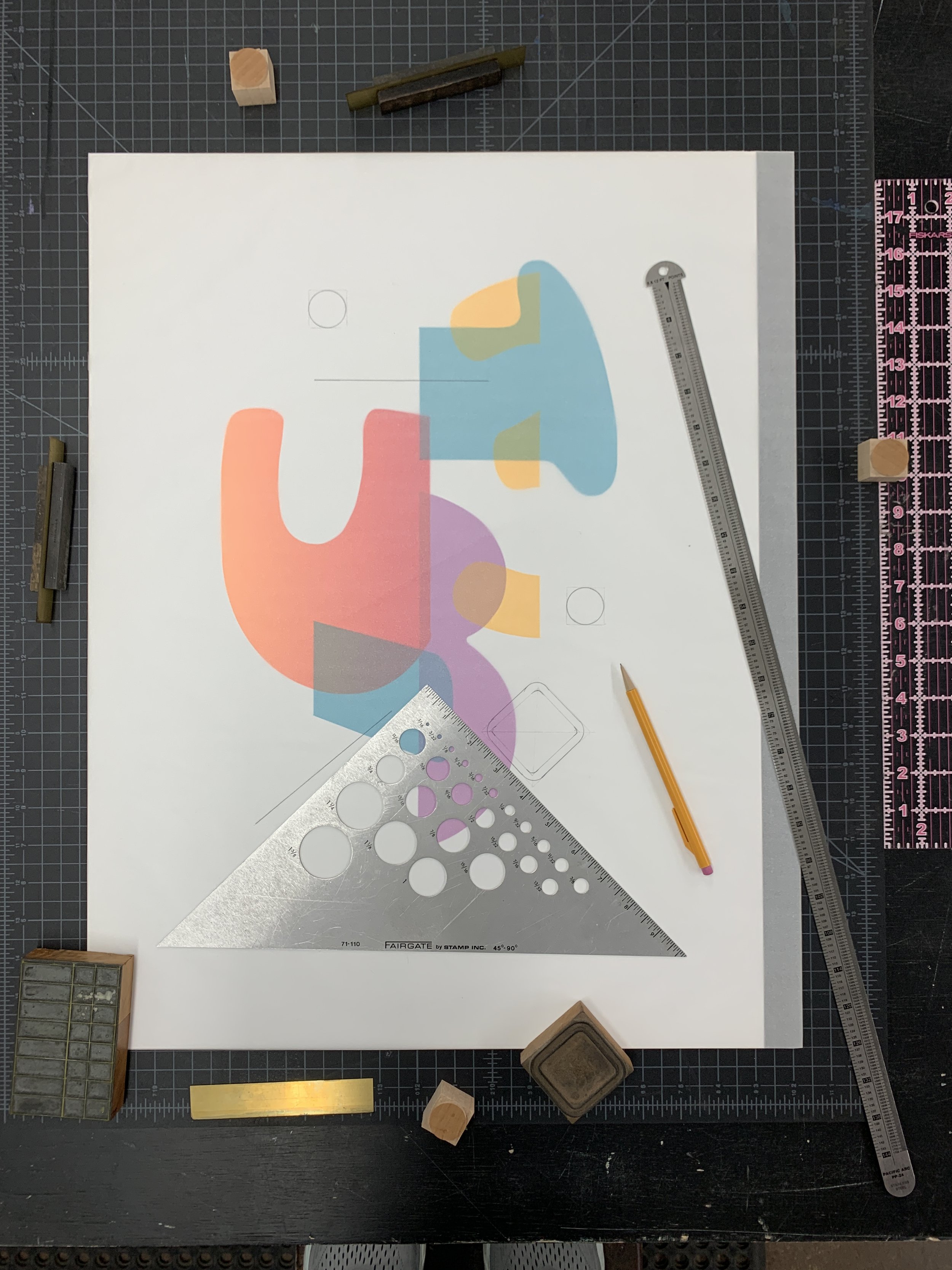
We’re happy to share David Wolske’s newest work with you, Polysynthesis No. 1, which resulted from a week-long residency at IS Projects. Printed in December 2021 during his Exhibiting Artist Residency, David found inspiration for his abstract composition “in the vibrant and abundant colors, textures, patterns, and personalities at IS Projects and in Fort Lauderdale”. While the cropped numbers are characteristic of Wolske’s experimental letterpress work, the use of rounder shapes, fluorescent inks and a gradient (aka split-fountain or rainbow roll) are exciting new additions to the artist’s unique visual vocabulary. David did all of the letterpress printing by hand using the studio’s Vandercook SP-20 and wood type from the Selikoff Collection. The edition of 12 is hand numbered and signed by the artist.

This special print prominently features 120 line Cooper Black wood type from our Selikoff Collection. These Cooper Black numbers were a sentimental staple from Vote For Letterpress, the print shop in New Jersey we acquired in 2018 after the untimely passing of designer and printer, Jon Selikoff from ALS. We aim to preserve Jon’s legacy at IS Projects through the Selikoff Collection by keeping his collection together and keeping his memory at the forefront of the conversations around the collection.

Having met Jon through a letterpress class David taught at the Hamilton Wood Type Museum in Two Rivers, WI, and remaining good friends with him throughout the years, Wolske was laser-focused on highlighting his friend’s beautiful type during the residency. Below is a small peek at how Cooper numbers were masked (demonstrated in black) to create the final edition and a gallery to illuminate some of David’s process.
While the exhibition came to a close early this month, we invite you to view the works more closely through our Virtual Gallery Tour. For more information on David Wolske and his work, visit his website.

Mantras for a Sustainable Art Practice (Vol. III)
We dreamt up this series as a way to both engage with other artists in a time when opportunities for interaction feel few and far between and seek guidance on how everyone is coping in an effort to find some much needed common ground. What follows are five artist’s mantras for a sustainable art practice in 2021. Featuring: Martin Mazorra, Alexandra Riesco, John DeFaro, Cara Lynch and Leah Roobin.
It’s been our pleasure to check in with five more artists for this series, asking them to share the mantras that have helped guide their work ethic during critical moments and offer snapshots of what they’ve been working on in their studios. While the following mantras were submitted some time ago, the sentiments artists share about making work during a global pandemic still ring true as we near the close of another abnormal year. Perhaps these insights from Martin Mazorra, Alexandra Riesco, John DeFaro, Cara Lynch, and Leah Roobin will prove useful for those of us struggling to find a direction and set intentions in our practice.
MARTIN MAZORRA
“This is stupid. I need a new Mantra.”
www.martinmazorra.net
ALEXANDRA RIESCO
“Don’t be precious”
This is something my figure drawing professor used to say to loosen us up and get us to just put marks down on paper without worrying about the result. It's always been a good reminder for me not to let fear of making mistakes stifle my practice; it's so easy to get hung up on potentially messing up a piece that you lose perspective of the whole and stop taking risks. In some ways, working in isolation was a welcome time to experiment and try new techniques without expectations. Most of my work is in intaglio printmaking, and I find allowing myself the freedom to explore without worrying about the final product is so important to creating anything worthwhile.
www.alexandrariesco.com
JOHN DEFARO
“Love and Compassion”
In 1997, I started a project called Love Paintings. The small paintings, drawings and sculptural objects all included a heart symbol set against colorful, patterned backgrounds. It was a moderately successful project for four years. Now, some 20 years later myself and the world is in crisis, and the need to demonstrate love is needed more than ever. During the month of April 2020, I decided to reignite Love Paintings.
www.johndefaro.com
CARA LYNCH
“Make things that make you happy. Don’t judge yourself for not being as productive as usual.”
www.caralynchstudio.com
LEAH ROOBIN
“Keep on trucking along”
Its easy to get put down when any plan you had for a year gets turned on its head by something you have absolutely no control over. The future is never certain, especially right now, but reminding myself to put one foot in front of the other and keep going has given me a sense of control.
ww.leahroobin.com
I’d like to thank Martin, Alexandra, John, Cara and Leah for generously inviting us into their studios. If you’re an artist who would like to share your mantra and some studio updates with us, please email sammi@isprojectsfl.com to be featured in this series.
Make work and be well,
Sammi

FLAT FILE FLEX: Joseph Velasquez
Welcome to our third installment of FLAT FILE FLEX; a series in which printmakers and print shops from all over share a few favrorite prints from their collection. Today we’re excited to explore the flat files of a friend to the studio, masterful woodcut artist, and educator, Joseph Velasquez.
Ever wonder what printmakers consider the pride and joy of their print collections? Love a nosey look inside the studios of artists? Want to learn more about print shops and meet the printmakers that run them from the comfort of your own home? You’re in the right place.
Welcome to our third installment of FLAT FILE FLEX; a series in which printmakers and print shops from all over share a few favrorite prints from their collection. Today we’re excited to explore the flat files of a friend to the studio, masterful woodcut artist, and educator, Joseph Velasquez.


If you’re a fan of The Outlaw Printmakers, woodcuts, or have spent any time in the South Florida print scene, then you’ve probably run into Joseph Velasquez. Joseph’s practice has focused on community outreach, education, and activism. He co-founded Drive by Press, a completely mobile printmaking studio built to promote the growth and democratization of art through printmaking. To date, Drive by Press has traveled over 200,000 miles across the country and has been to 145 Universities spreading the good word of print.
Velasquez currently lives in South Florida and is Assistant Professor and Head of Printmaking at Florida Atlantic University where he teaches Bookmaking, Relief, Screen Printing and Intaglio. In his own words, “As a Latino Veteran of the US Armed Forces, I have lived in California, Texas, Wisconsin, and Florida, and these diverse geographic locations have shaped my experiences and my expression. Printmaking as activism and as a tool for both educating in the classroom and in the public, continues to fuel my practice – I find inspiration in sharing the fragmented combination of my life experience. The power of the multiple and the ability to share techniques and their histories are also major influences in my practice to continuously explore expression and connection.”
Below are some hard-hitting intaglio and lithograph highlights from Joseph’s collection, gathered while touring as Drive By Press.
“This is a multicolor stone lithograph by Kathryn Polk. Kathryn has an amazing drawing style and way of building her narratives. Her color application and style of color lithography is both unique and compelling. More of her work can be seen on Instagram @onechair”

“Michael Krueger is a painter and printmaker who teaches at Kansas University in Lawrence Kansas. His Intaglios and etchings have such delicate line drawings and, coupled with his color choices, they make his narratives so unique. This image is from a suite of prints about Quantrell and the history of the Wild West in Kansas. More can be seen on Instagram @Michael_krueger_studio”

“This is a four color etching by Tom Huck. Tom is super well known and regarded as one of the greatest living woodcut artists. Few people have ever seen this etching and it was published and printed by Theresa James of WhiteWing Press in Chicago. His crosshatching and linework translates so well to etching. Zoom in on the details and you can really see his great style and drawing ability. Toms woodcuts can be seen @evilprints”

“This Fred Stonehouse lithograph is a highlight to my collection because of my knowledge of Fred’s work as a painter. Fred is super well known as a painter and this color Lithograph was editioned at my Alma Matter, the University of Wisconsin Madison by the UW Print Club. Check him out at @fredstoney1960”
What an all-star lineup of intaglio and litho works. Knowing Joseph, these prints just scratch the surface of a personal collection jam-packed with print powerhouses. We’d like to thank Joseph for inviting us into the FAU print studio and his print collection. If you are a print shop and/or printmaker interested in participating in a future FLAT FILE FLEX feature, please email sammi@isprojectsfl.com for more informaiton.

2021 Existent Books Residency: An Interview with Carol Prusa & Elia Khalaf
Our 2021 Existent Books residency continues this year with some notable expansions thanks to the generous support of The John S. and James L. Knight Foundation through the Knight Arts Challenge Award we received in 2019. While our Existent Books project has been developing steadily for the past six years, the added grant funding enabled us to offer a residency stipend for our artists, Carol Prusa and Elia Khalaf.
Our 2021 Existent Books residency continues this year with some notable expansions thanks to the generous support of The John S. and James L. Knight Foundation through the Knight Arts Challenge Award we received in 2019. While our Existent Books project has been developing steadily for the past six years, the added grant funding enabled us to offer a residency stipend for our artists, Carol Prusa and Elia Khalaf.
Both artists were invited to IS Projects in order to experiment with fine art printmaking and book binding techniques. Over a two week Summer residency, Prusa and Khalaf designed artists’ books inspired by our collection of historical letterpress type and/or new printmaking techniques learned with the support of staff and the project’s lead collaborator, Ingrid Schindall.
Carol Prusa’s book, unknowing, is available for pre-order now and will be officially released on October 18th through IS Project’s virtual booths at the E/AB Fair (Oct 18-31) and Vancouver Art Book Fair (Oct 18 - 26). What follows is an interview with both artists reflecting on their experiences during residency while sharing some crucial insights into how their projects came to fruition. More information and a pre-sale for Elia Khalaf’s book, Infinite Seasons, will be released later this Fall.

What are the overarching themes and concepts driving your Existent Book book project?
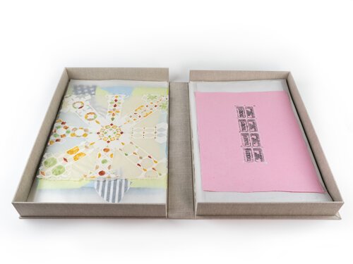
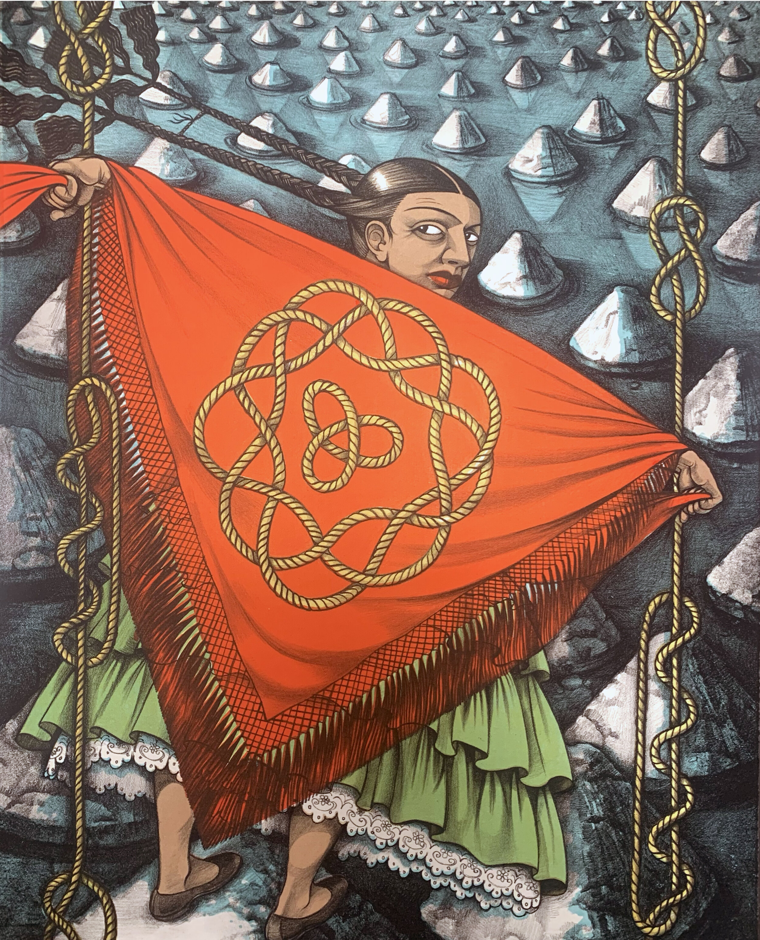
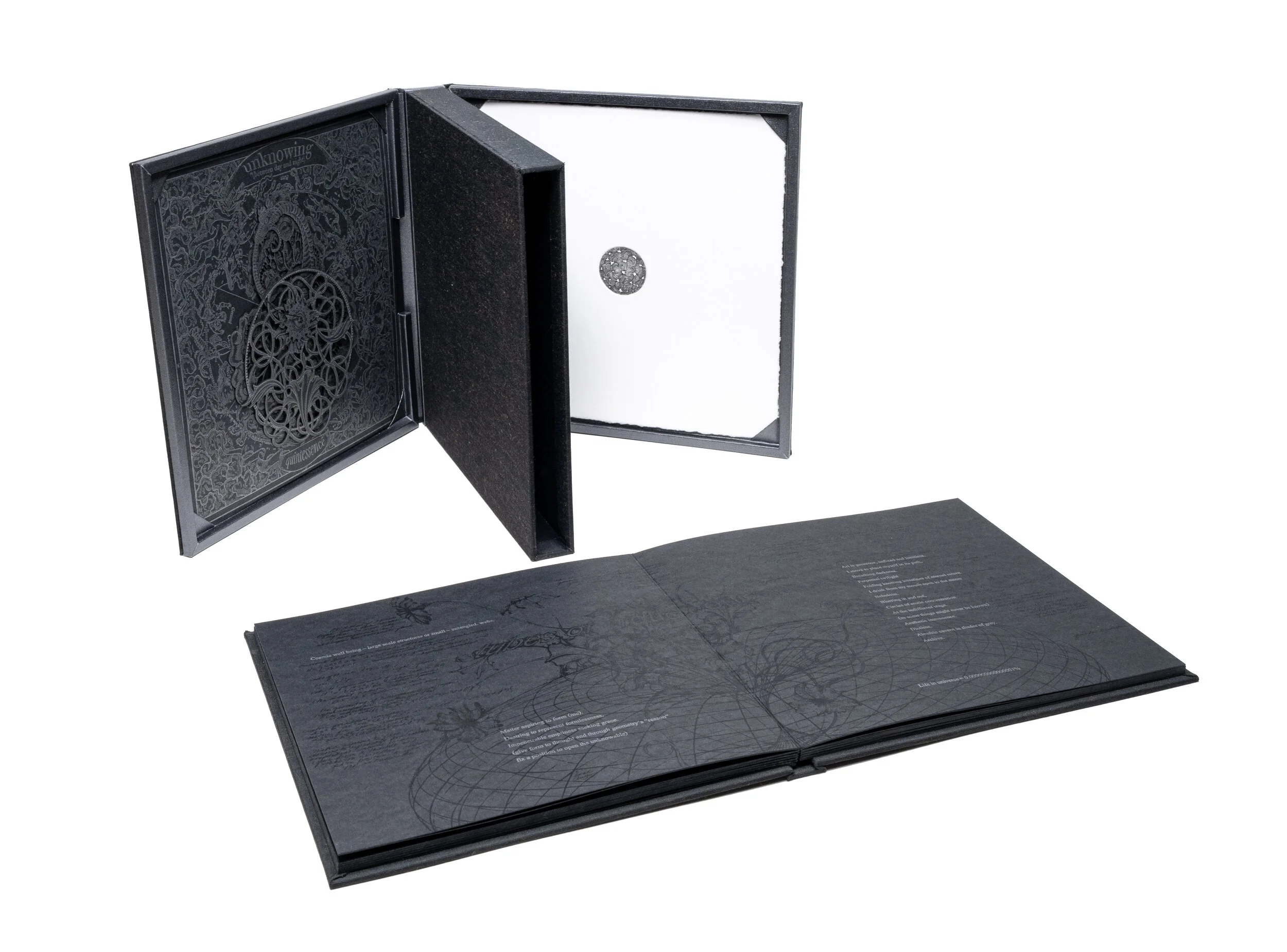
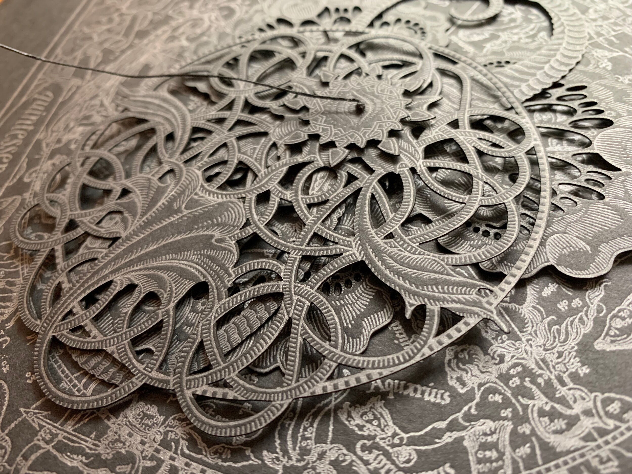
Carol Prusa (CP): unknowing offers a liminal experience between knowing and not, calling on scotopic vision (night vision) to peer into darkness. I am known for symbolically charged work responding to liminal locations, using graphite pours and silverpoint drawing in an exchange between known and unknown to create erotically charged portals to new possibilities. unknowing (between day and night) articulates emergent forms, offering insight into the mystery of our existence while embracing the magnitude of the universe with the lawlessness of imagination to distill the sacred. This book is a download of what I know, at least for the moment, before it resolves as something else. The book is accompanied by a volvelle; a paper computer with rotating parts, that functions as an instrument to point to confluences that might provide insight into the unknown. unknowing contemplates the mystery of our existence and the possible worlds we divine to construct meaning. A possible world is tucked inside in the form of a copperplate etching on white paper. The three parts (tri-via) are housed in a tri-part case.
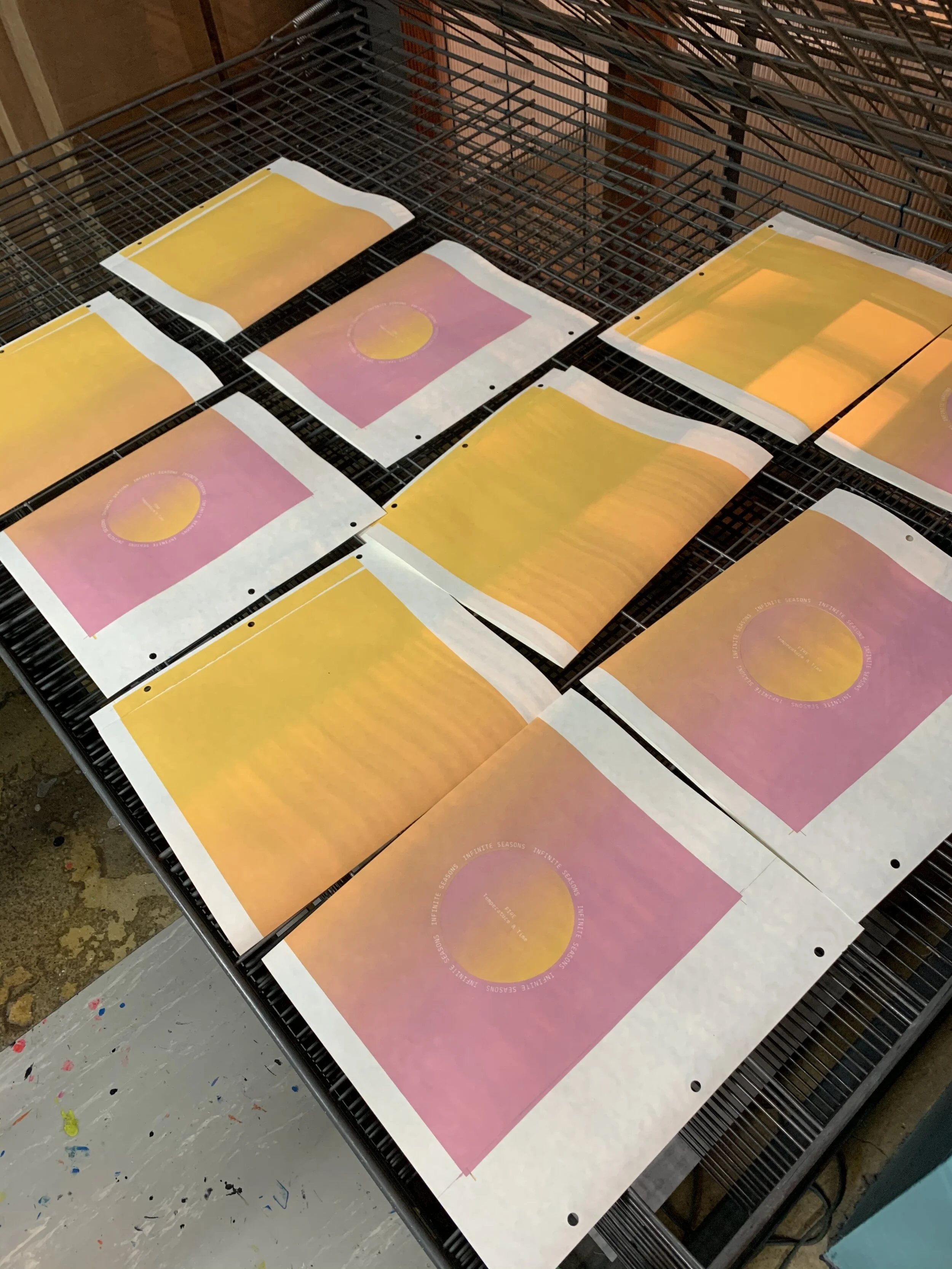
Elia Khalaf (EK): My book is titled Infinite Seasons. The project is an immersive book and poetic calendar, fostering connections between mind, body, and nature to explore seasonal indicators that often go unnoticed. The project debunks the myth that there are no seasons in South Florida! It increases mindfulness and intuitive engagement with the cycles of nature, from everyday subtleties all around us to larger environmental changes. Infinite Seasons includes interactive circular imagery and instructive poetry ranging from humorous insights to meaningful recollections. The book stands as a cycle with each end marking a new beginning as the four chapters rotate to represent the elements: fire, wind, earth, water.


Have you pursued artist book publishing previously and if so, did you encounter any limitations?
CP: I have made several artist books before, by hand, but never anything this ambitious or professional. And, never with letterpress and with such expertise directly the making. My only limitations were my lack of experience with books and printmaking materials and methods, limiting my vision. However, my reach was extended by the depth of knowledge offered by Ingrid Schindall and her staff, so that in the end the book could be resolved perfectly. Thank you Ingrid for making it work!
EK: In the past, my practice mostly included zines and print projects. I’ve also collaborated with other artists and organizations to design community-based artist books. However, Existent Books has given me the opportunity to create my own project and produce it with the help of the awesome printmaking team at the IS Projects studio.
Why is it important that this project be a book?
CP: Housing my thinking in a form outside my experience allowed me to think in new ways. I read a lot and think about lots of things but my work is quite abstract, although symbolic, and veils much of that thinking/meaning. So, vulnerably disclosing my work more directly through a book was an important challenge.
EK: Infinite Seasons takes shape as an artists’ book for many reasons. First, I see books as intimate objects that subtly engage each participant with their own senses. We all know exactly what an old book smells like. That’s why Infinite Seasons uses the book format as a tool to activate the senses. Second, books are mobile! While we engage in nature, we can move with the book from inside spaces to the outdoors and back. One more reason is that books are flexible. Artists’ books can kind of be like a sculpture that you can change into different shapes. That’s how I envisioned Infinite Seasons, a book that can sit in one way and stand in another.
What new knowledge (technical or otherwise) was gained through working in artists’ books and printmaking?
CP: I had peripheral knowledge of printmaking and book arts and certainly have looked at the stunning artist books at FAU housed in the Jaffe Book Collection as well as Existent Books. As an artist, I am used to figuring out and making everything by myself. What I learned is there is a world of expert support out there from laser cutters to artist quality laser printers to polymer plate makers to book box makers and binders, so I now appreciate I can continue to envision books and hire those intensely skilled to do this work to physically make the project. I wouldn’t have comfortably known how to navigate that before. I don’t have a lifetime to learn printmaking and bookmaking as my established practice is in painting but can now reach out to those that have that deep knowledge and experience. I am sure this isn’t my last book as I already have something blooming in my head.
EK: OOF, a lot. I learned how to apply printmaking techniques, how to use letterpress and die-cut processes, how to use cool brushes on photoshop, and more! This residency also increased my confidence exponentially in my own skills and vision, and in the power of bookmaking!

What techniques did you include in this project and what drew you to them?
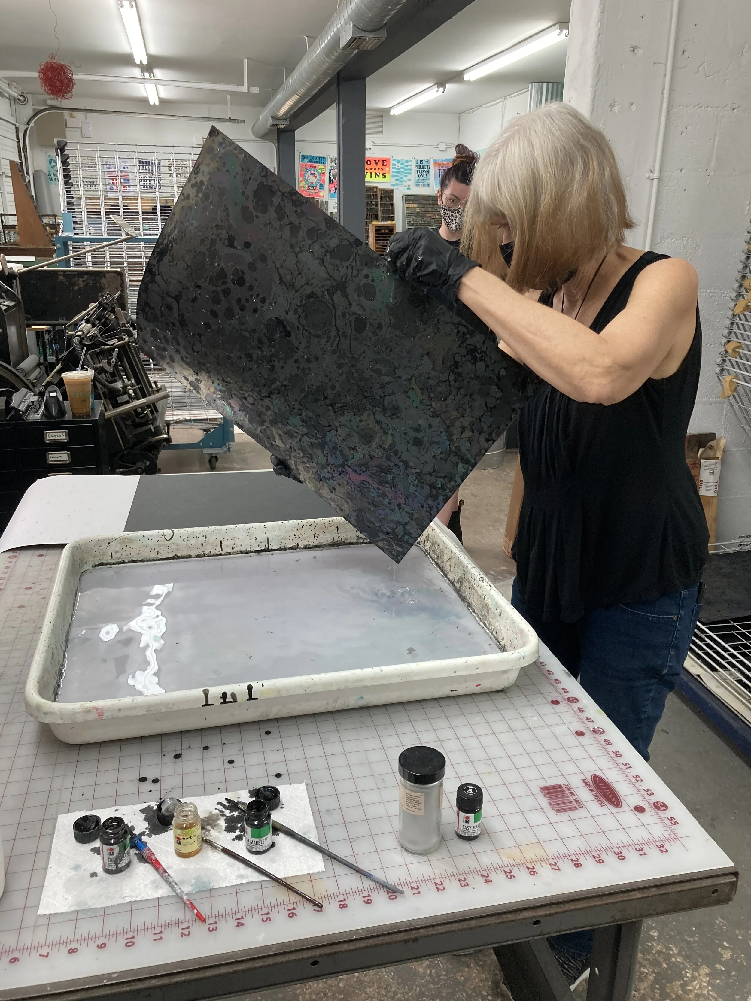
CP: My fellow artist-in-residence worked with screen printing (and amazing color and papers) and while I was drawn like a moth to his work, I am clearly situated in the etching/letterpress world and am enamored with traditional bound books with contemporary extensions. Laser cutting has the level of precision that I bring to my silverpoint drawing. As a painter I am versed in the historical materials and methods of painting like egg tempera and metal leaf and am drawn to the history of bookmaking and love looking at old astronomy atlases and etchings in scientific texts, including volvelles. I used a Durer print for the starfield in my volvelle as a jumping off point, ringed with historic reference, causing me to work with hatching lines that connects to those historic sources. I hatch lines in my silverpoint paintings so hatched lines naturally extended into the hardground etchings and inked drawings made for letterpress. I wanted to make an image for the end pages of the book that felt like the structure of the universe; walls, voids, filaments and clusters. IS Projects set me up to do paper marbling for that – something I had never done before. It worked perfectly and incorporates the uniqueness of chance yet the emergence of structure.
EK: Some of the techniques included in Infinite Seasons are letterpress, die-cutting, gradient color screen printing, drum leaf binding, and more. I was drawn to these techniques since they lend themselves so well to sensory explorations, creating enticing textures and visuals.


What was your experience like collaborating with IS Projects staff?
CP: Everyone I worked with was positive, supportive and generous with their engagement in my project. I tend to get caught in my own head and my vision can exceed my ability to make but in this case, everyone stepped up to the vision and problem solved it elegantly. The depth of knowledge the collective held concerning paper, printing and books is inspiring. The complexity and demand of my project didn’t seem to diminish anyone’s enthusiasm. I believe they love challenges and problem solving so it was a complete delight working at IS Projects. While I held a somewhat determined vision, the expertise and guidance of the artists/printers/bookmakers/designers at IS Projects propelled the project to beautiful solutions and highly skilled outcomes. This residency was an exhilarating experience that has exploded my mind with so many new ideas and ways of making it could occupy a lifetime (I think in my next life I will be a printmaker/poet).
EK: Collaborating with IS Projects staff was an absolute pleasure! I love how different members of the team have their own unique areas of expertise. Whether I needed help choosing typefaces, figuring out how to do digital halftones, or testing screen prints, I was supported and empowered to experiment, play, and learn! And honestly, beyond the book making aspect, I felt like I can be myself there. IS offers a truly inclusive and safe space y’all.
Is collaboration a normal part of your artistic practice? If not, how did it inform this work?
CP: I mostly work alone in my studio and it is a world I delight in. However, periodically I have sought out opportunity to make outside of what I know to open new ways of thinking and making. This has led me to residencies like Kohler Artist in Industry Residency where I worked in ceramic and Berengo Glass Furnace on Murano/Venice which manifest in glass sculptures. Recently I worked with Ground Printmaking/Kim Spivey to make copperplate etchings. All these experiences opened up new worlds and were challenging, refreshing my practice. Being supported to envision and make by experts who have deep skills working in community has opened new possibilities to my thinking.
EK: A big part of my artistic practice is community-based and so it is collaborative by nature. This collaboration informed my work not only in the process of making the book, but also in the final result. This book offers opportunities for ‘readers’ and participants to start dialogue, ask questions, and reach out to connect with nature, with animals and with other humans.
What was something unexpected that came from the residency?
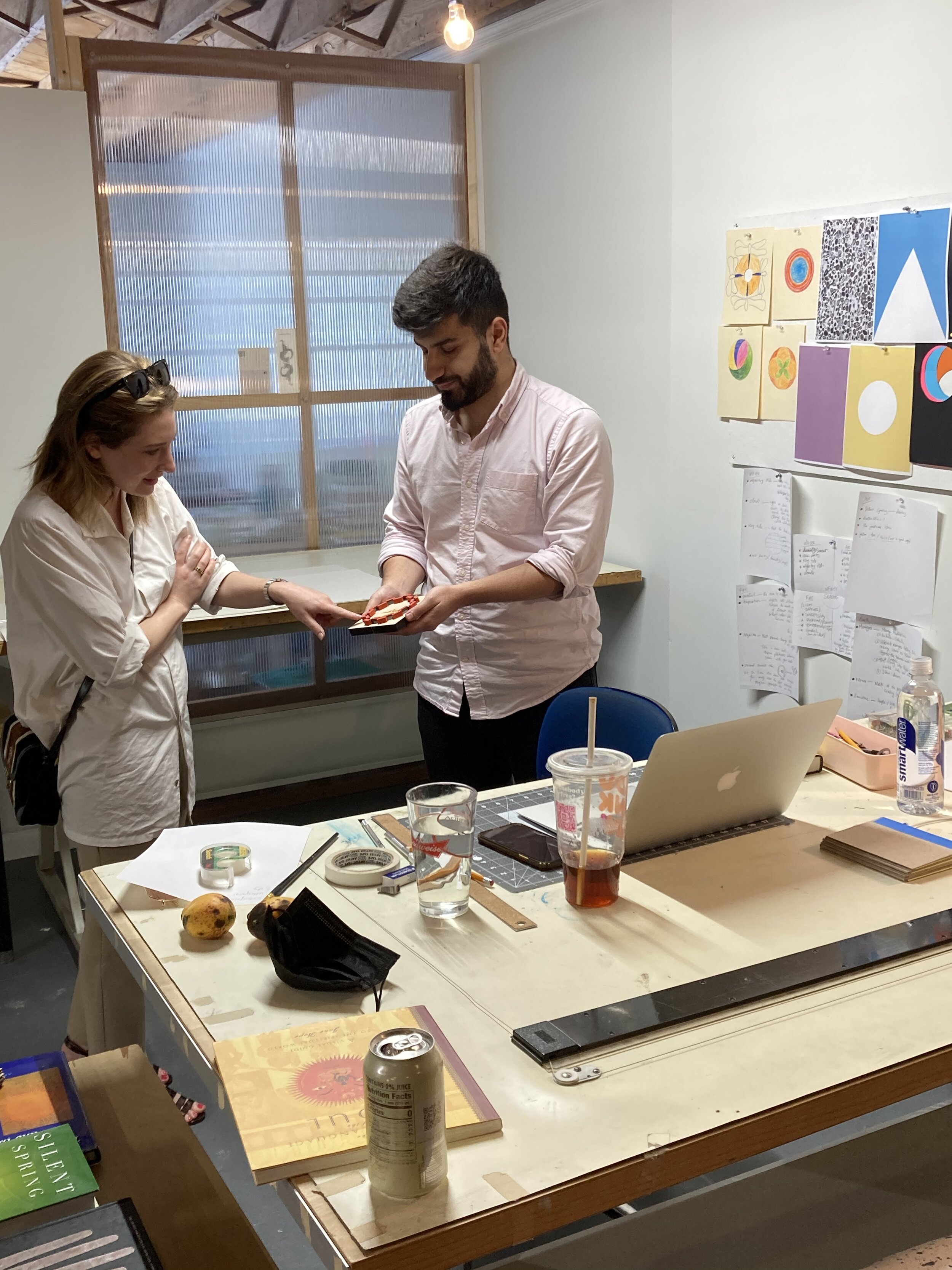
CP: I had envisioned the book housed in a clamshell box yet couldn’t figure out how to elegantly hold the volvelle and etching. I thought of the project as three roads/tri-via so wanted each part to have its place. Ingrid had an epiphany that pulled up a source from her well of knowledge of books structures on the last day of the residency and solved the structure beyond what I could have done. The solution is stunningly beautiful. (actually, the real surprise was when I learned I didn’t have to put all the parts together and build/bind the books myself as I had envisioned patiently sitting day after day doing that and was nervous about having the necessary skills although thought I could rise to the task)
EK: An unexpected and wonderful aspect of the residency was the camaraderie I developed with the one and only Carol Prusa. It was so inspiring to work on my project alongside her impressive artworks. We shared tips, jokes, and everyday Carol came into the studio with a freshly plucked fruit from her own tropical garden. Those mangoes and pineapples were fantastic ways to start every day in residency. *chef’s kiss* (AND the Into The Fold showcase was a terrific group show. I did not expect to see my work at the Coral Springs Museum of Art this year!)
Would you have made this book without this residency?
CP: I would not have initiated this intensive of a book outside this residency. Once I was offered the residency, I dug in and researched a lot about artist books and structures and deeply considered my ideas and poured myself into the project even before getting on site. So, if the residency hadn’t in the end materialized, I would have figured out a way to make this book, somehow – as I was committed to it. But, IS Projects/Existent Books magically and optimally facilitated my vision and the outcome is now beyond what I would have produced.
EK: This residency provided everything I needed to make this book. From early brainstorming meetings with bookmaking mastermind, Ingrid Schindall, to a print shop stocked with print gadgets, screen printers, and ink galore, to mentoring visits by noted curators in the field of art in South Florida while the book was in the design stages.
Anything else you’d like to add? (final thoughts and musings, etc.)
CP: I also worked with a wonderful graphic designer, Leah Roobin, whose knowledge of InDesign allowed an efficient and lovely layout of text. As well, she patiently sifted through fonts with me as I know what I like but I don’t know what is out there until I see it! Working with staff who were facile with software programs needed to create files for printing plates and laser cutting allowed me to keep my mind to my art while I observed them with awe. And, intern Abby Wang, attentively helped me marble paper and was so kind when I, in my absorption to the effort, inadvertently splattered her with ink. And, my residency-mate, Elia, whose generous energy made working there blissful. And, appreciation to the invited art professionals (Ariella Wolens, Jennifer Inacio and John Cutrone) who spent time with Elia and I to learn about our books and offering us supportive feedback. And, most of all, I want to say what a gift this residency was and how grateful I am to Ingrid and her staff for sharing their expertise and ideas and passion to make my book possible (and the Knight Foundation grant). And, a shout-out to Sammi whose supportive presence was daily reassuring as she facilitated my comings and goings, answering questions and making my book residency happen. (I will be back!)
EK: A huge thanks to Ingrid Schindall and Sammi Mclean for the Existent Books opportunity and gratitude to Leah Roobin and Caro Gutierrez for sharing their expertise.

With Knight’s support, we were also able to offer the artists critical feedback from three curators and book experts in the area; Ariella Wolens, Bryant-Taylor Curator at NSU Art Museum Fort Lauderdale, John Cutrone, Director of the Jaffe Center for Book Arts and Jennifer Inacio, Associate Curator at Pérez Art Museum Miami.

In addition to the upcoming book launch on October 18th, we also have talks planned with each of the artists. Join Ingrid Schindall for a conversation with Carol Prusa on October 21st, 6pm and Elia Khalaf in early November (date and time TBA), on Instagram live with @isprojects.
For more information on Existent Books, our semi-annual publishing initiative which started in 2014, check out our blog post, where you’ll learn about the project’s origins and previous participating artists.

FLAT FILE FLEX: Starshaped Press
Ever wonder what printers consider the pride and joy of their collection? Love a nosey look inside the studios of artists from around the globe? You’re in the right place!
Welcome to our second installment of FLAT FILE FLEX; a series in which printmakers and print shops from all over share some of their favorite prints from their collection! We're sharing this as a recurring article on the blog and are excited to explore Starshaped Press - owned and operated by printmaker, Jen Farrell in Chicago, IL.
Ever wonder what printers consider the pride and joy of their collections? Love a nosey look inside the studios of artists from around the globe? Want to learn more about print shops and meet the printmakers that run them from the comfort of your own home? You’re in the right place!
Welcome to our second installment of FLAT FILE FLEX; a series in which printmakers and print shops from all over share some of their favorite prints from their collection! We're sharing this as a recurring article on the blog and are excited to explore Starshaped Press - owned and operated by printmaker, Jen Farrell in Chicago, IL.


If you’re a self-proclaimed letterpress lover then you’re no stranger to Jen Farrell and her vast accomplishments with Starshaped Press.
Jen Farrell is the Principal Designer & Printer at Starshaped Press. In her own words, “I’ve been at the press since 1996, cutting my teeth at the venerable Fireproof Press right here in the Windy City. I struck out on my own in 1999, armed with the ideals of a Luddite and ridiculous notions of keeping letterpress as old school as possible. Educated at the school of hard knocks (otherwise known as running a small business,) I’m proud that Starshaped has stayed true to the mission of preserving the tools of letterpress printing while pushing the craft forward and contributing to the vibrant print community. My work has appeared in many books, magazines and blogs, is in many private & library collections and has been exhibited all over the world.”
Today, Jen shares a few of her favorite prints from her collection - most of which she also lives with. Many of them are available to purchase, so links have been provided should you like to add anything to your own collection. “Over my 20+ years of printing, and even before that, I’ve collected prints from around the city and the world. I’ve got hundreds living at Starshaped Press and at home, with a number of these making their way into frames on our walls. This is a very small selection of some of the prints we live with every day; I’m lucky to have so many talented printmakers in my life and continually add their work to my growing collection.”

“There are a number of DF prints framed in my dining room, on what I call the Load Bearing Wall. This one is in the middle as it’s my favorite.”
Frida Khalo by Dead Feminists
Illustrated by Chandler O’Leary and printed by Jessica Spring in opposition to racism, injustice, intolerance and walls of hate.
10” x 18”
2017
Edition of 200

“I found this print via justseeds.org a number of years ago. My late husband was a union man and a lover and cultivator of sunflowers so it is a perfect reminder of him.”
Solidarity by Roger Peet
Block print on 100lb Cranes Lettra Acid-free Printmaking paper in an ecru color
20” x 26”
Edtion of 40


“This small print is in our front window as a reminder of what’s not tolerated when you walk through the door. Rick wants white folks to pull their weight in the fight against bigotry and I’m here for it.”
Bigots Walk by Rick Griffith
letterpress print
6” x 9” or 12.5” x 19”

“I’ve always been a fan of Val’s charming linocuts but my kid, Jo, is a huge fan of bees and specifically chose this one.”
This Hive Shall Thrive by Bower Box Press
letterpress print from a woodcut image
8” x 10”
2015
“AH consistently create stunning screen prints and this one is my favorite. While I don’t think this one is still available, they have many that are just as gorgeous and they have a monthly Patreon so you can get goods delivered to your door.”
What the Sea Wants, the Sea Shall Have by Arsenal Handicraft
4 Color Screenprint
16” x 20”

“I’m a huge fan of John’s work and giggled with delight when he sent this as a gift. I love everything about it but especially the message, as I often say that spacing material is the magic in letterpress, which feels in line with the quote on this print.”
Etude dans Gillespie by John Risseeuw
letterpress print
Edition of 15
We’d like to thank Jen for inviting us into her studio and collection. If you are a print shop and/or printmaker interested in participating in a future FLAT FILE FLEX feature, please email sammi@isprojectsfl.com

From These Words Grow Flowers
From these Words Grow Flowers, a project for the 2021 O, Miami Poetry Festival by Ingrid Schindall of IS Projects, puts poems reflecting on growth and the specificities of life in Miami on postcards made of paper with embedded native wildflower seeds. The poems can be read then planted in the ground to create a future flower bed. It’s as easy to plant as burying a note beneath a shallow layer of soil, gifting flowers to yards, vacant lots, grassy medians, flower boxes, or anywhere else with a bit of dirt, sun and water. Printed in English, Spanish and Creole, these multi-lingual cards will be available at limited O, Miami events, mailed to specific neighborhoods to create wild insect corridors and available at pick up spots in Miami Dade County.

“What if a postcard sent through the mail filled minds with poetry then filled gardens with Florida’s native wildflowers? Would blossoms then remind readers of words for years to come?
From these Words Grow Flowers, a project for the 2021 O, Miami Poetry Festival by Ingrid Schindall of IS Projects, puts poems reflecting on growth and the specificities of life in Miami on postcards made of paper with embedded native wildflower seeds. The poems can be read then planted in the ground to create a future flower bed. It’s as easy to plant as burying a note beneath a shallow layer of soil, gifting flowers to yards, vacant lots, grassy medians, flower boxes, or anywhere else with a bit of dirt, sun and water. Printed in English, Spanish and Creole, these multi-lingual cards will be available at limited O, Miami events, mailed to specific neighborhoods to create wild insect corridors and available at pick up spots in Miami Dade County.”
The text above was the proposal that I sent to the O, Miami Poetry Festival in the fall of 2020 with the great hope of becoming a full-fledged handmade paper/poetry project that would reach a multitude of Miamians and inspire new impromptu gardens. After a pitch meeting with the O, Miami team filled with garden and plant-related puns (shoutout to Melody Santiago-Cummings, Melissa Gomez, Caroline Cabrera, and Amancio Paradela), the project had the go-ahead!
Now it was just a matter of setting up a papermaking facility at IS Projects, preparing enough paper to make 1,500 postcards, sourcing 15,000 Florida native wildflower seeds, selecting nature-related poems from O, Miami’s archive of thousands of locally written poems, creating a compelling postcard design, making the paper, letterpress printing the design, cutting down and quality checking the cards, and getting them in the mail. Below is a run-through of the elaborate process that lead to thousands of seeds making their way through the mail to hundreds of homes in Hialeah Gardens and into the hands of poetry enthusiasts throughout Miami Dade County. The process of this project inspired Johnny Zhang, creative videographer and IS Projects enthusiast, to document the steps required to bring From These Words Grow Flowers to life and I have the incredible fortune to be able to share this project with you, not only in a thorough retelling via written word, but also through a beautifully shot, artfully edited, and outstandingly amazing video.
The first step in creating handmade paper postcards is preparing the pulp, in this case from 20 pounds of recycled cotton paper off cuts saved from various commissioned and personal projects. I cut up and weighed the paper scraps at IS Projects and would under normal circumstances take the fiber to the Jaffe Center for Book Arts to use their Reina Hollander Beater for turning the recycled paper into usable pulp. Unfortunately, covid lockdowns meant that FAU’s library and paper studio were inaccessible. So, I called up Beth Sheehan and Kyle Holland at the Lost Arch Paper Mill at the University of Alabama, Tuscaloosa and asked for a favor. A short 12 hour drive later, Johnny Zhang and I were in downtown Tuscaloosa in a much more wintery climate than we are used to. Beth and Kyle generously assisted with soaking, beating and straining the pulp to prepare it for our journey back to Fort Lauderdale. Beating 20 pounds of fiber took about 8 hours and required 20 sessions in the 1 pound capacity beater. With a car loaded with hundreds of pounds of wet pulp, it was time to get back to the studio and finish the paper studio preparations.

IS Projects took over the space above the studio in June, 2020 with the intention to create a few individual artist studios, a new book arts space, an etching set up, a place to display our artists’ book and zine collection, and (hopefully, one day) papermaking facilities. So in February of 2020, when the project was getting underway, we began putting together the missing pieces for a (very simple) paper studio. The studio had already acquired molds and deckles, felts, pellon, vats, cardboard, and blotter from a previous donation so all that was left was the heavy stuff. My mom, Debby Schindall, and I built all the necessary wooden structures after a long day at the home improvement store getting wood cut. Then Alexandra Riesco diligently sanded and sealed the pieces over the next week. The upstairs maybe-one-day paper studio now had everything needed to actually make paper including a shop press with custom press boards and a restrained drying system.

The wildflower seeds came from the Florida Wildflowers Growers Cooperative based in Crescent City, Florida. After an informative conversation with Curtis from the coop, I selected about a dozen seeds to test based on their ability to sprout in South Florida, the size of the seed, and how nice the flower looked. I started with a sprout test to determine the vivacity of seeds and examined the size closely to ensure it would be able to be embedded in the paper without creating too much of a bulge. The quickest to sprout and heartiest to grow of the flowering seeds were selected to be a part of the project. The flowers selected were: Beach Sunflower, Spotted Bee Balm, Butterfly Milkweed, Black-Eyed Susan, Purple Lovegrass, Slim Goldenrod and Leavensworth and Lanceleaf Tickseed.

The amount of variations out there for each step of the paper making process is as many as there have been papermakers throughout history. The process used for this project was to set up a table with the vat and pulp outside on IS Projects’ second floor balcony in the one slightly shaded spot on the deck and make paper until there are no pellon (synthetic felt) left. I pulled sheets and taught Alexandra Riesco and Amber Frank how to make paper and they helped with the long and damp process of making over 400 sheets in batches of about 60 at a time. The wildflower seeds were mixed directly into the vat with the pulp so we placed importance on making sure the paper was fully dry in 24 hours so the seeds wouldn’t have time to germinate in the paper making process. I planted test sheets of seed paper before moving forward with the full scale production and those test plants are still thriving in my garden today.


One of the most enjoyable parts of the project was working with the O, Miami team to select poems to adorn the postcards. We looked through dozens of poems from the O, Miami poetry archive and selected 4 that reflect on growth, nature and Miami. The chosen poems are in English, Spanish, and Creole to engage Miami’s diverse population and O, Miami’s multi-lingual audience. The poems are planted in a bed of flowers for the design of the front of the postcard and the back shares planting instructions and the types of flowers included in the sheets. The designs were translated onto a modern type of printing plate then letterpress printed. Letterpress gets it’s name from literally pressing letters into paper so the text and imagery has a tactile quality on top of the already unique feeling seed paper.

Though out the years of running a fine art print shop I have observed a special sensation that people get when touching a piece of paper that was made with care. Once fingers touch handmade paper it demands closer inspection. My vision for this project is for these small, somewhat understated postcards to stand out not only in their lack of flashy pictures but also in the feel of the paper amidst a pile of coated flyers, simple letters, and coupon mailers. To feel the paper in hand and experience that little jolt that comes from inspecting something unfamiliar that follows with calming poetry and a call to the garden is an experience that I want to share far and wide. I want to extend my deepest gratitude to O, Miami, their team and their supporters, for making this wish possible. Deep thanks to IS Projects’ team, especially Chachi and Amber, for getting messy and tolerating my sudden onset obsession with plants, and also to Johnny Zhang for driving to Tuscaloosa in the winter in the midst of a global pandemic and documenting this passion project from start to finish.
If you received a postcard in the month of April and have flowers to show for it, please reach out and share your experience!
If you made it this far, thanks so much for reading!
Sincerely, Ingrid

FLAT FILE FLEX: Ground Printmaking
Ever wonder what printers consider the pride and joy of their collection? Love a nosey look inside the studios of artists from around the globe? You’re in the right place!
Welcome to our very first installment of FLAT FILE FLEX; a series in which printmakers and print shops from all over share 3-5 of their favorite prints from their collection! We're excited to debut the series with Ground Printmaking - owned and operated by printmaker, Kim Spivey in Palm Beach Gardens, FL.
Ever wonder what printers consider the pride and joy of their collections? Love a nosey look inside the studios of artists from around the globe? Want to learn more about print shops and meet the printmakers that run them from the comfort of your own home? You’re in the right place!
Welcome to our very first installment of FLAT FILE FLEX; a series in which printmakers and print shops from all over share 3-5 of their favorite prints from their collection! We'll be sharing this as a recurring article on the blog and are excited to debut the series with Ground Printmaking - owned and operated by printmaker, Kim Spivey in Palm Beach Gardens, FL.


Kim Spivey is an artist living and working in South Florida. Spivey is a graduate from Florida Atlantic University with an MFA in painting and a BFA in printmaking. Spivey spent the summer of 2016 at Zea Mays Printmaking in Florence, MA where she completed a certificate program of green printmaking in intaglio. Spivey has applied what she learned at Zea Mays to her own studio: Ground Printmaking, where she is set up to create without the use of solvents or tar-based materials commonly found in traditional printmaking studios.
We’ve had the pleasure of collaborating with Kim on a few projects as she is only an hour's drive from IS Projects. Her print shop is a unique resource for artists in the area as she is fully equipped to teach and assist with intaglio techniques. The studio itself is always flooded with natural light and is tucked within a lush tropical oasis where you will likely be visited by one of Kim’s friendly dogs.
Today, Kim shares a few of her favorite etchings from her collection. Now let’s geek out and dive into all the inky details.

Mesh by Kim Spivey
Hard ground, open bite and coffee ground etching with hand painted chine-collé
14” x 17”
2019
“This print was a great experiment in layering different etching processes on a single plate to build up the woven imagery. Fun fact - with a coffee lift ground you actually paint with coffee onto the plate.”
Annie Jump Cannon by Carol Prusa
Hard and soap ground etching on Pescia
12” x 12”
2019
“This print is one of seven that make up the editions of the Galaxias Kyklos suite of etchings. This print is composed of three etched plates printed together. I love the incredible detail in the hard ground plates paired with the soap ground plate. I find this print extremely dynamic and centering simultaneously. Fun fact - each print from this suite of etchings is named after a female astronomer.”

18-02 by Michelle A. M. Miller
Color soft ground etching with spit bite and coffee lift aquatints and chine-collé
10” x 13”
2018
“I love the assortment of thoughtfully considered marks that Michelle was able to get through the different etching processes implemented. Michelle does amazing things with color and I love the harmony she created with her selection of blues and the kitakata chine-collé. Fun fact - q-tips were used to get the circles.”
We’d like to thank Kim for inviting us into her studio and collection. If you are a print shop and/or printmaker interested in participating in a future FLAT FILE FLEX feature, please email sammi@isprojectsfl.com

(Now & Then) A Closer Look: The Mechanical Bride
During the pandemic, we decided to start writing articles on our exhibitions to provide a “closer look” for collectors. We recently decided to unearth these articles from the archive in order to share them on our blog for all to enjoy. In revisiting these articles, we’ve also taken the opportunity to check back in with our artists, asking them how their work has developed since their show at IS Projects and what upcoming projects they’d like to share. We check-in with Christina Humphreys and Sasha Baskin who exhibited in a two-person show, The Mechanical Bride, on view March - June of 2020.

Our 2020 exhibitions will always hold a special place in IS Projects history as they marked the gallery’s virtual pivot during the pandemic. In an unexpected turn of events, we found ourselves connecting even more with our exhibiting artists as we developed new opportunities to deep-dive into their work through virtual gallery tours, our gallery shop, virtual artist talks, and additional programming. During this time, we also decided to start writing articles on our exhibitions to provide a “closer look” for collectors. We recently decided to unearth these articles from the archive in order to share them on our blog for all to enjoy.
In revisiting these articles, we’ve taken the opportunity to check back in with our artists, asking them how their work has developed since their show at IS Projects and what upcoming projects they’d like to share. We check-in with Christina Humphreys and Sasha Baskin who exhibited in a two-person show, The Mechanical Bride, on view March - June of 2020. This time last year, the gallery was populated by mesmerizing weavings and embroideries from Humphreys in San Francisco, CA and Baskin in Baltimore, MD.
NOW
Before we revisit The Mechanical Bride, we first want to share what Christina Humphreys has been working on from her studio in San Francisco.
Humphreys shares, "Since our exhibition at IS Projects last year, I've somewhat diverged from the pattern-based imagery present in my previous work. Being cooped up at home for a year, I decided to take time to explore new fiber processes and imagery. My first goal was to try to work bigger, since I had a copious amount of time and attention to devote to more complicated embroidery designs. I wanted to translate an image I took years ago in Rome into embroidery (below, left). It took about 2 months to embroider by hand.
A common theme in my work recently is the notion of topography and landscape. Flatness and pattern are still very important to me, but I've been pushing myself to now use pattern and repetition as a way to create shape and form - recognizable imagery that can conjure a memory and sense of place. I'm interested in the way that material, color (or lack of), imagery, and process combine to elicit an emotional response. [Below right] is the most recent piece I completed, where I returned to embroidering from a photograph.”

Ancient view, 2020
embroidered cloth
16"x16"
Ocean view, 2021
embroidered cloth
approx. 13"x14" unstretched
“I also wanted to explore processes that would allow me to translate simpler designs into larger works. I built a basic frame loom with wood and nails and worked from simple drawings that I designed in the same software I use for embroidery. The designs are much less complicated than what I would normally use. It was interesting to figure out the ratio of yarn to pixels in translating the drawings to weaving. I still have a lot to learn, and feel accomplished with the three works I've been able to create through this process.”
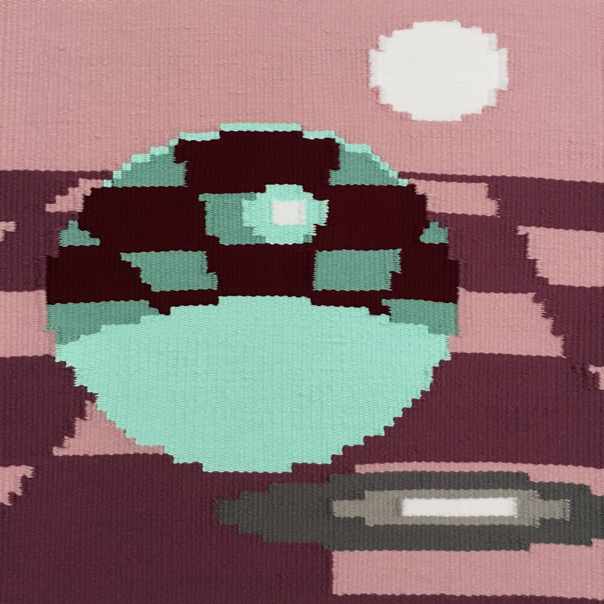
Next we revisit Sasha Baskin, who has been working on from her studio in Baltimore, MD.
Baskin shares, “Most recently, I've been discovering a new love of bobbin lace! Teaching this process [in a virtual workshop last year] through IS projects was actually my initial catalyst. I have always loved working with bobbin lace but have found it too time-consuming or technical to make cohesive work. To teach the workshop with IS projects I spent some time practicing and simplifying my bobbin lace samples to be easily explained over zoom. Something clicked and I fell back in love with the medium in a new way. I've since incorporated bobbin lace into all of my classes at Johns Hopkins and MICA and love exploring the process as a drawing and sculptural medium with my students.
I began working with pre-existing patterns and bought a book called "bobbin lace without a teacher" I soon branched off and discovered some wonderful online resources and lace Patreon accounts that helped me begin designing my own images and through those processes, I discovered how to use bobbin lace to communicate tone and value. I met up with a mathematician neighbor who developed computer programs to produce lace patterns for me out of digital images. We started with an image of Mona Lisa's eyes and I've since proceeded to explore my same bachelor imagery with this new way of making work.”

“I've included images of my initial samples, the mona lisa eyes, and my most recent piece in progress: A portrait of the soon-to-be-Bachelorette Michelle Young. I also included a photo of my desk while I'm teaching. Since all of my classes have been on zoom, I often try to work alongside my students and share my bobbin lace practice with them.”
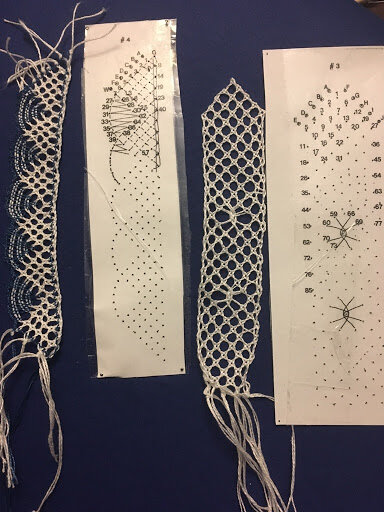
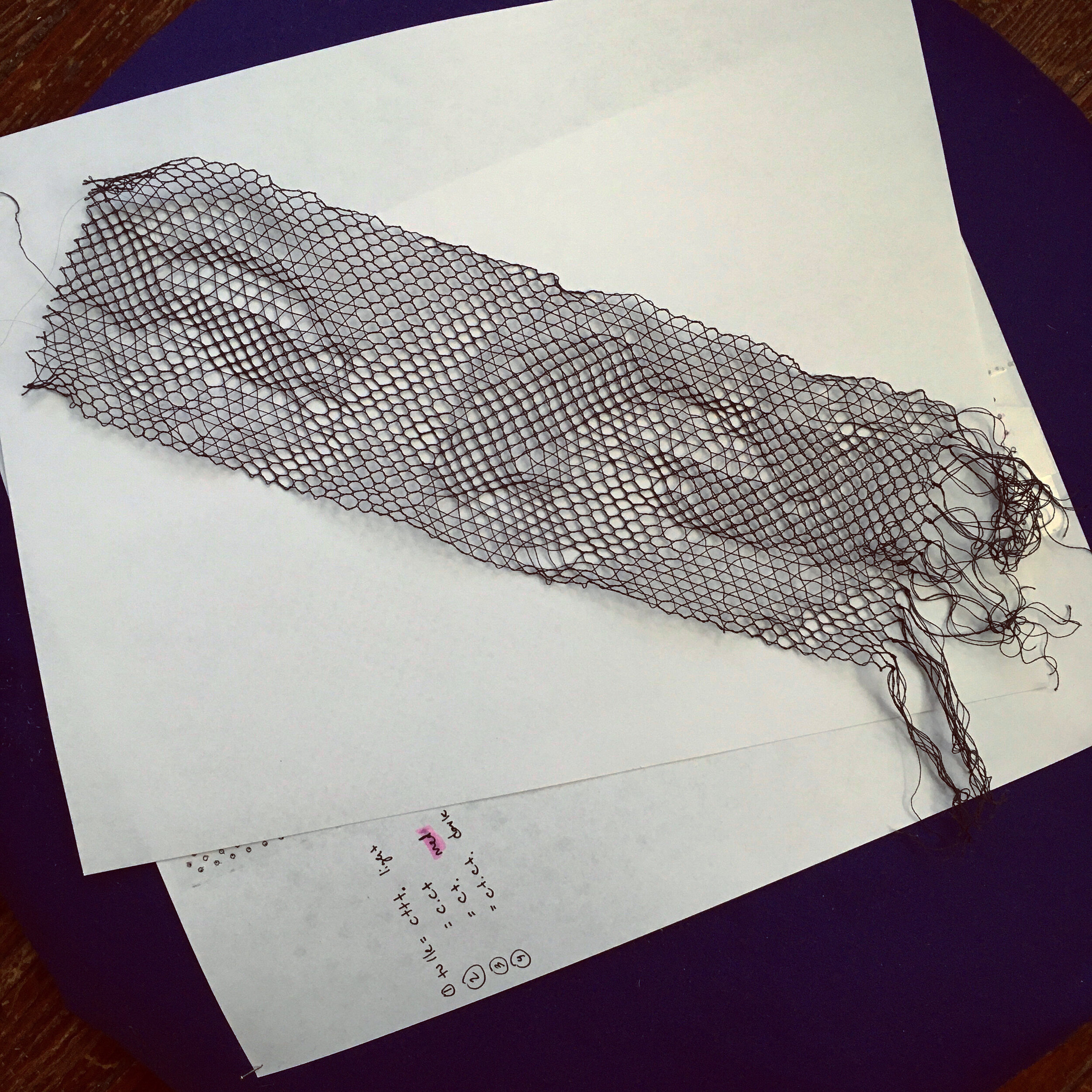
THEN
It is our pleasure to re-present Sasha Baskin and Christina Humphrey’s two-person exhibition, The Mechanical Bride, a series of textile works exploring weaving and embroidery.
As a gallery attached to a printmaking and book arts studio, we aim to feature artists with an expert sense of craft and process, regardless of the medium. This exhibition was no exception, featuring predominantly smaller-scale weaving and embroidery works by Baskin and Humphreys. With their concise and muted color palettes, each work is deceptively simple at a distance, only revealing their expansive intricacies and landscapes of thread through close and careful examination. So, let’s take a closer look, shall we?
Perhaps the ‘centerpiece’ of the exhibition is Sasha Baskin’s weaving, ‘Study for Jenny’s Departure’. By far the largest piece in the show, this work measures 40” x 30” and is comprised of digital and handwoven cotton and silk with rosette overshot patterning and natural dye. The woman depicted, along with many of Baskin’s motifs, are sourced from the reality television series, The Bachelor. According to Baskin, this work is part of a larger series addressing modern mythology through the lens of popular culture.

Dramatic (Study for Jenny’s Departure), 2018
Digital and hand woven cotton and silk,
rosette overshot patterning, natural dye
Screenshot from The Bachelor (Season 22)
40” x 30”

STUDY FOR JENNY’S DEPARTURE, DETAIL
“This image depicts a woman rejected by the lead during the second episode of the season. I was struck by her strength and resiliency in the face of reality television rejection and explored her character as a modern mythological figure. Throughout this series, I repeat a rose and woven rosette motif. This work glitches and distorts a modified rosette pattern structure (a traditional overshot weaving pattern typically used in American Coverlets). A rose is the symbol of validation on ‘The Bachelor’ and receiving a rose allows a contestant to continue on to the next week. Through the repetition and distortion of this rose-based weaving pattern, I offer the woman getting rejected a form of agency and control over her own roses.”
Roses are echoed throughout the exhibition in framed, delicate lace pieces which punctuate the gallery.

PORTRAIT OF LACY IN BLACK AND WHITE
(AFTER DA VINCI’S “PORTRAIT OF A WOMAN”), 2018
DIGITAL AND HAND WOVEN COTTON AND SILK SCREENSHOT FROM
“BACHELOR IN PARADISE” (SEASON 4)
14” X 11”
PORTRAIT OF LACY IN GOLD (AFTER DA VINCI’S “PORTRAIT OF A WOMAN”), 2018
DIGITAL AND HAND WOVEN COTTON AND SILK SCREENSHOT FROM
“BACHELOR IN PARADISE” (SEASON 4)
14” X 11”
Pictured above are two partner pieces, Portrait of Lacy in Black and White and Portrait of Lacy in Gold. “This image takes the same screenshot of a supporting character in the reality tv universe and creates an optical illusion through thread and pattern. Just as a digital image relies on perspective and the interaction of pixels and light, [Portrait of Lacy in Gold] appears and disappears based on the viewer's perspective. Due to the interaction of reflective silk and twill woven patterning, the image can become invisible and, from certain angles, the cloth appears blank.”
The Mechanical Bride takes shape through the conversation between Baskin and Humphreys’ bodies of work. The artists find common ground in examining the consumption of mass media and its manifestations in our lives. Through a series of six embroideries, Humphreys addresses her own anxieties while searching for answers on the internet and seeking truth in an abundance of conflicting information, untruths and unknowns. She conveys this by focusing on distorting recognizable symbols with heavily applied patterns in abstract compositions.

SAMPLES, 2019
EMBROIDERY ON STRETCHED CLOTH, WOOD FRAME
8.5” X 8.5”
“The embroidery designs I'm working on right now are sort of disease-like - contrasting patterns overlapping each other and distorting somewhat recognizable text and symbols. They have a certain anxiousness to them that relates to how I feel reading the news online and engaging with social media.”
Over the course of eight months leading up to the exhibition, Christina Humphreys created the works on view, each of them progressively more influenced by events that were unfolding at the time. “The ‘diseased’ patterns I was making started to take on a literal meaning beyond the metaphorical, as the world began to understand and respond to the spread of Coronavirus.”

BWR2, 2020
EMBROIDERY ON STRETCHED CLOTH, WOOD FRAME
11”X10”

BWR2, detail
The peice, BWR2, is the largest and final piece of the series combining recognizable patterns, distorted shapes and icons, and the color red as an indicator of contamination.
“The title is a reference to the riddle ‘What’s black and white and read all over?’ and the shortening to BWR takes inspiration from the nomenclature of viruses. I can’t help but see the influence of pandemic on this series, especially in these final works.”
Humphreys’ process begins with constructing a digital image, examining her marks as pixels before stitches. Then the designs are painstakingly executed through an analog process of hand-embroidery.
“I’ve increasingly felt a strong connection to the (painfully) slow process of stitching in contrast with the speed of creating patterns digitally. In some instances, I am able to make changes to the pattern after I have already started embroidering, but that is rarely the case, and I often have to commit to a design referencing events that look completely different or are already long forgotten [by the project’s completion]. In the end, the works feel extremely personal, but I sometimes don’t even recognize them.”
The Mechanical Bride was on view through June 2020. If you missed the show in person, you can still take the Virtual Gallery Tour.
Be sure to check out Christina Humphreys and Sasha Baskin for more updates and information on their work.

COVER-UP, 2019
EMBROIDERY ON STRETCHED CLOTH, WOOD FRAME
8.25” X 8”

Shop Show & Tell with CHACHI
Welcome to the third installment of ‘Shop Show & Tell’; a blog series dedicated to sharing our favorite stories, projects, and even objects from the studio. This month, we’re checking in with our Education and Production Assistant, Alexandra Riesco aka Chachi!

Welcome to the second installment of ‘Shop Show & Tell’; a blog series dedicated to sharing our favorite stories, projects, and even objects from the studio (Check out our first post). This month, we’re checking in with our Education & Production Assistant, Alexandra Riesco aka Chachi.
Chachi began as an intern with a passion for all things intaglio. She went on to become our first Key Holder Resident before being hired on in her current role assisting with commission printing and book projects while providing invaluable support to IS Projects’ educational programming. Chachi will be moving to Hanover, New Hampshire next month and will be sorely missed around the shop!
Chachi is an artist and printmaker based in Miami, FL. Her interest in the sciences and love for the outdoors feeds into her art practice, which incorporates intaglio, relief, and bookbinding techniques to explore natural processes.
Check out a few of Chachi’s original prints below and visit https://www.alexandrariesco.com/ for more info.
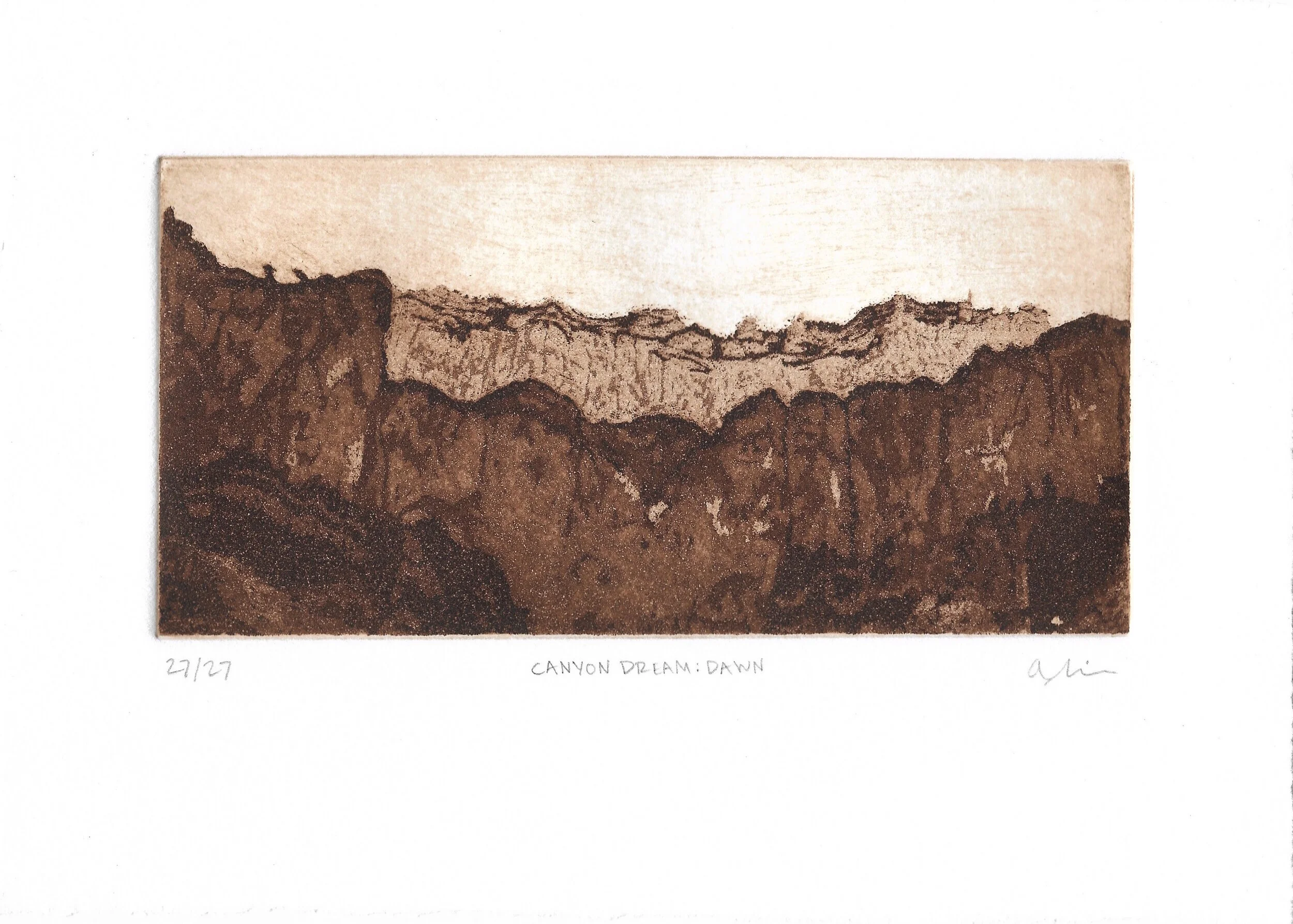
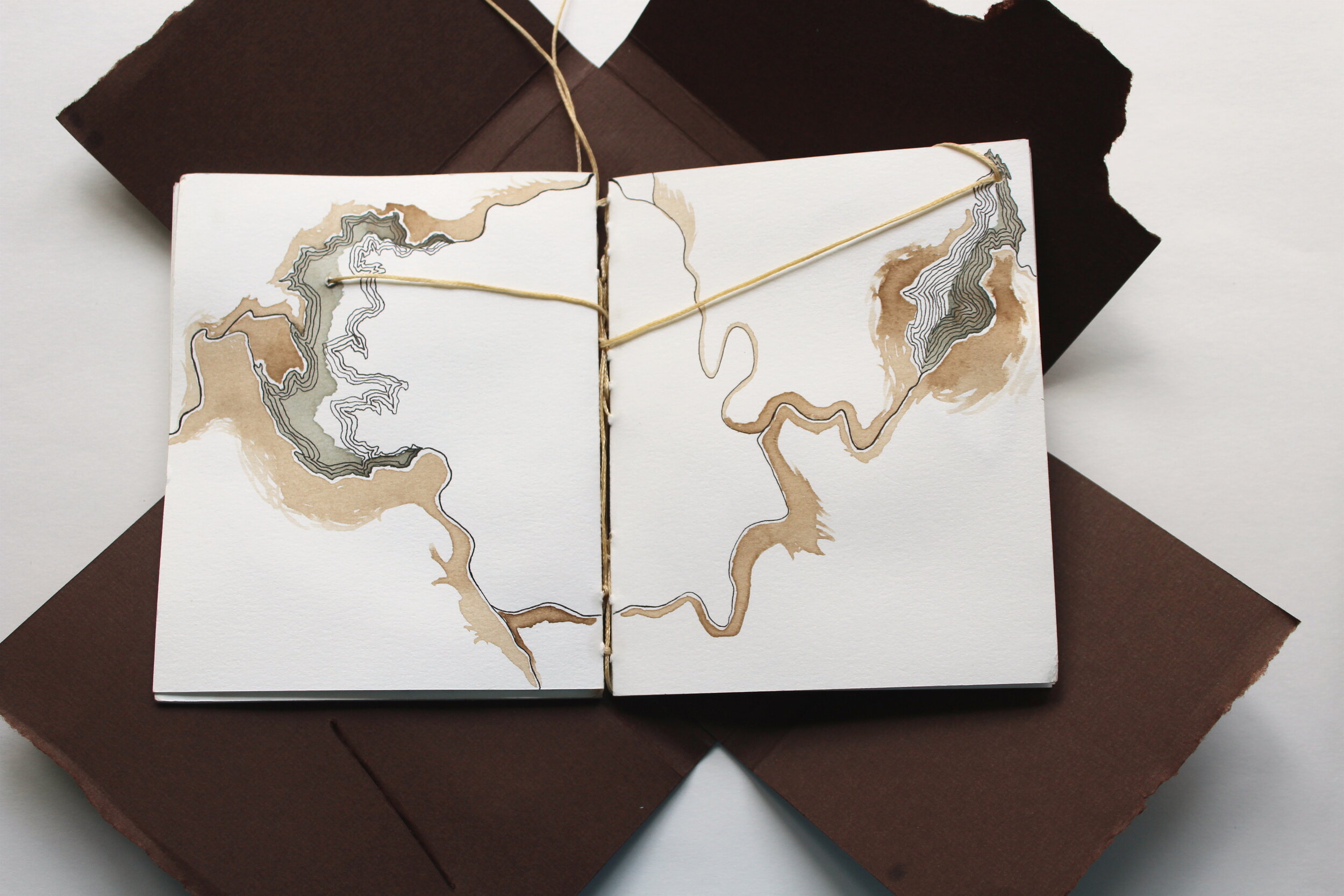
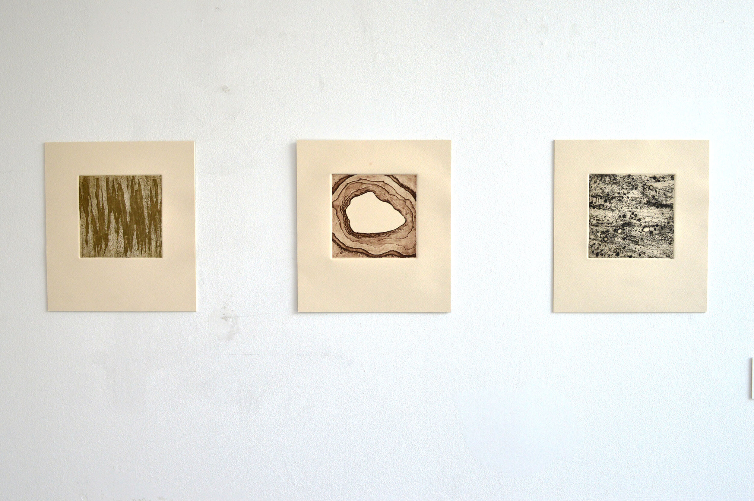
Which project have you learned the most from?
Existent books! I learned so much about bookbinding during the many steps in the process of putting together each book. It was also really interesting to see two artist’s books come together and the printing techniques they chose for their work.
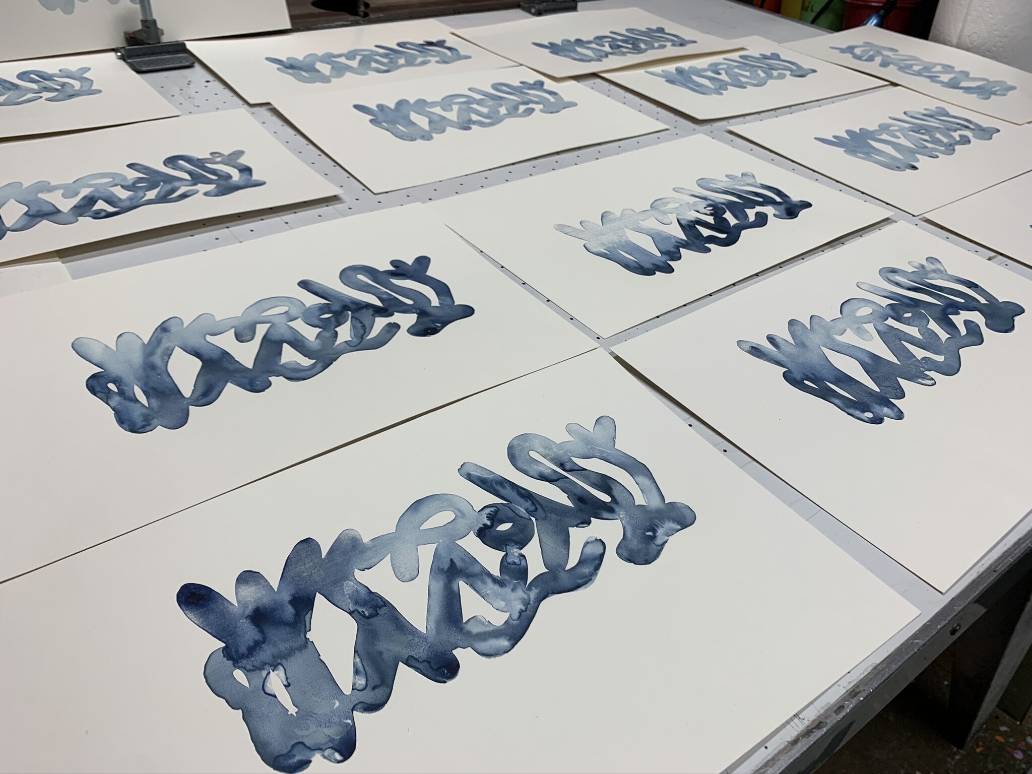
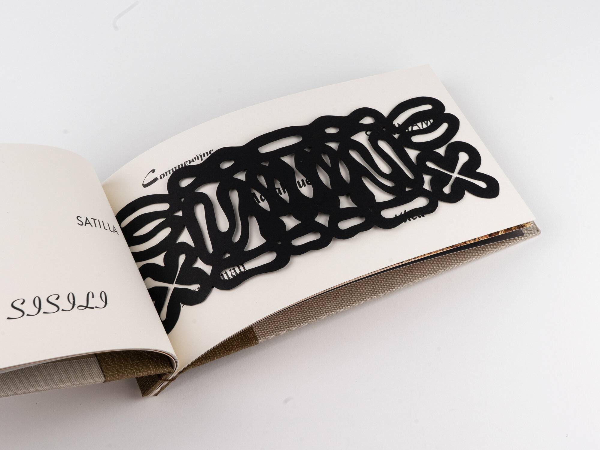
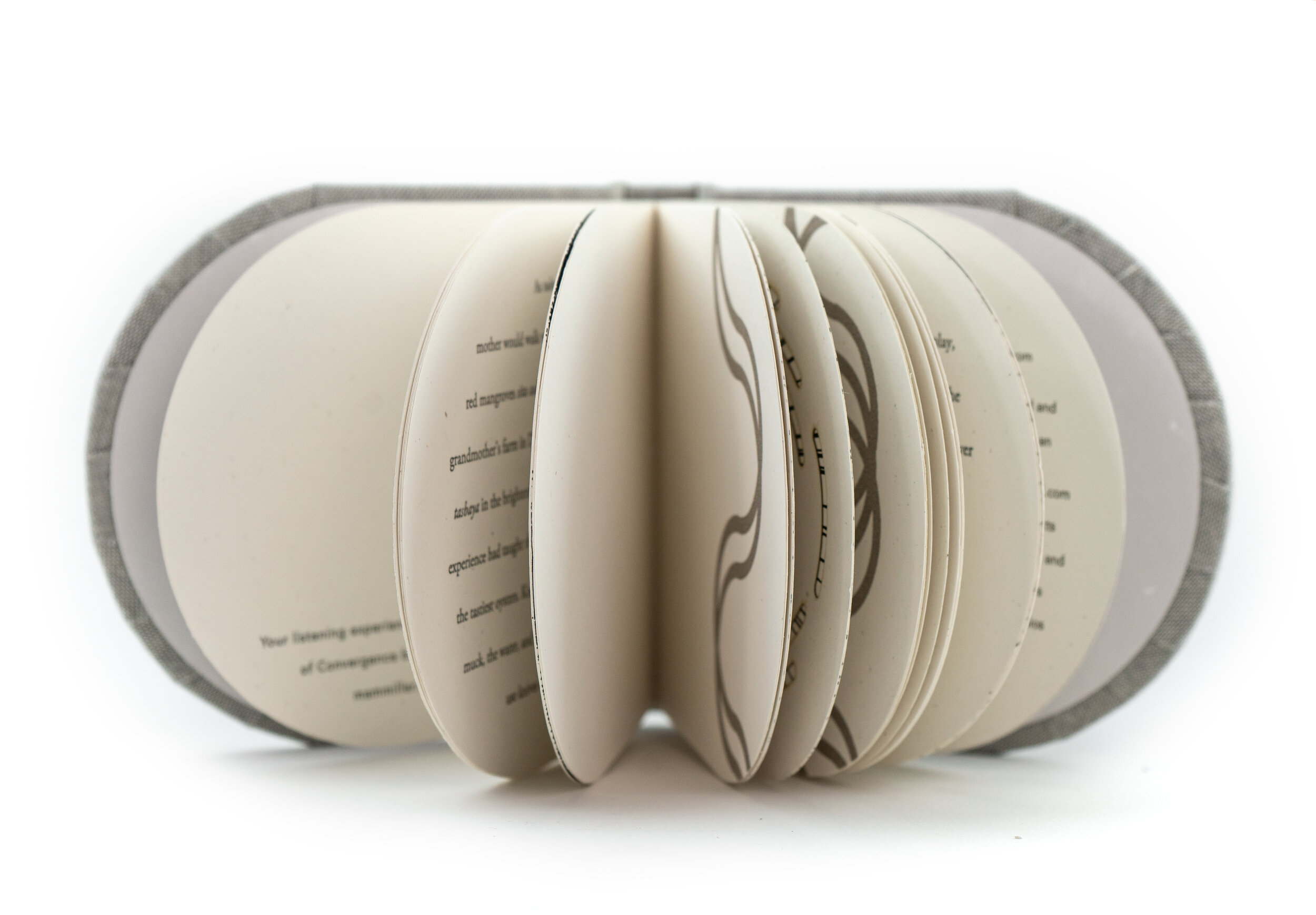
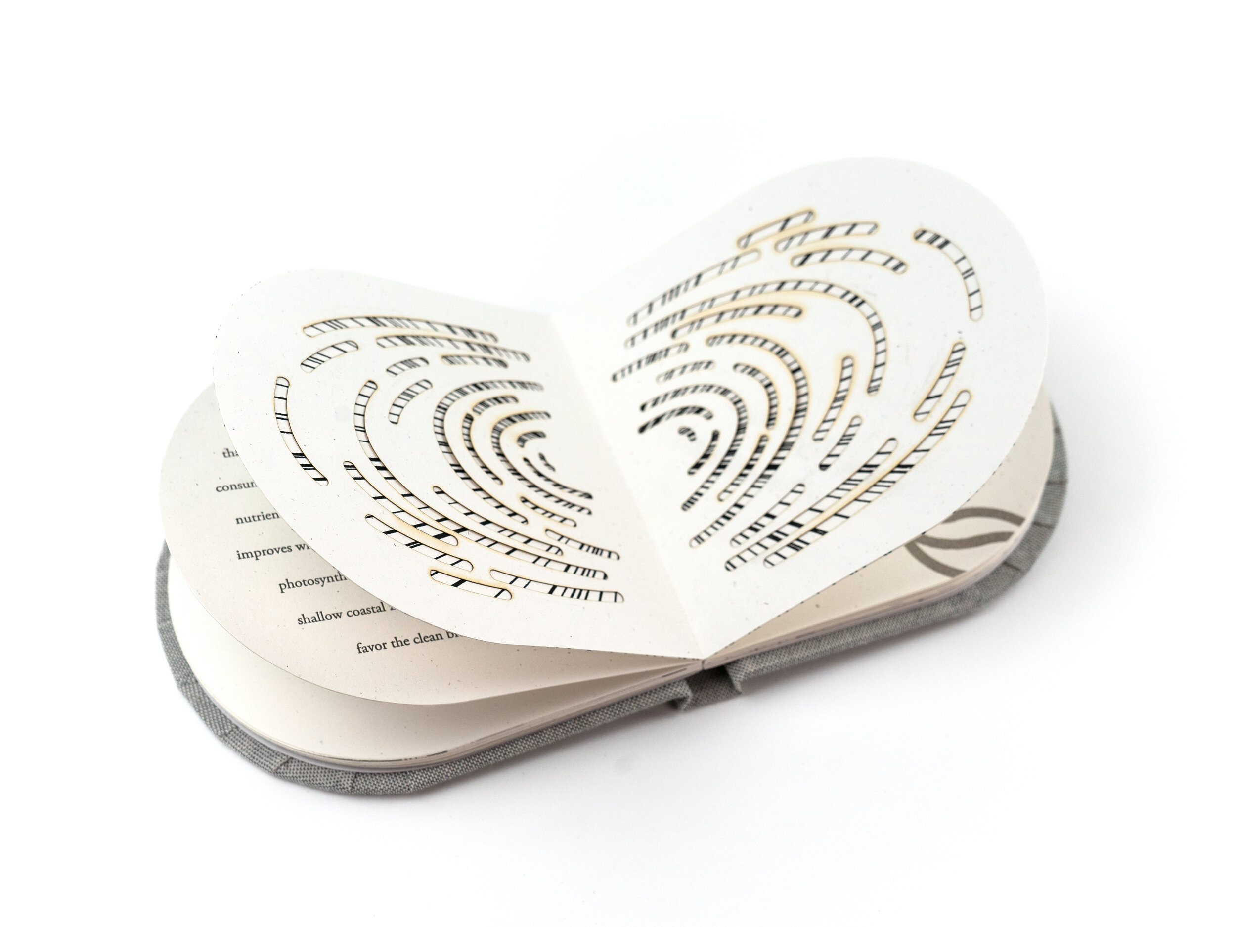
What’s your favorite press?
Easily the Praga (aka Myron), our manual etching press because it has a captain’s wheel which is my favorite way to pull prints!
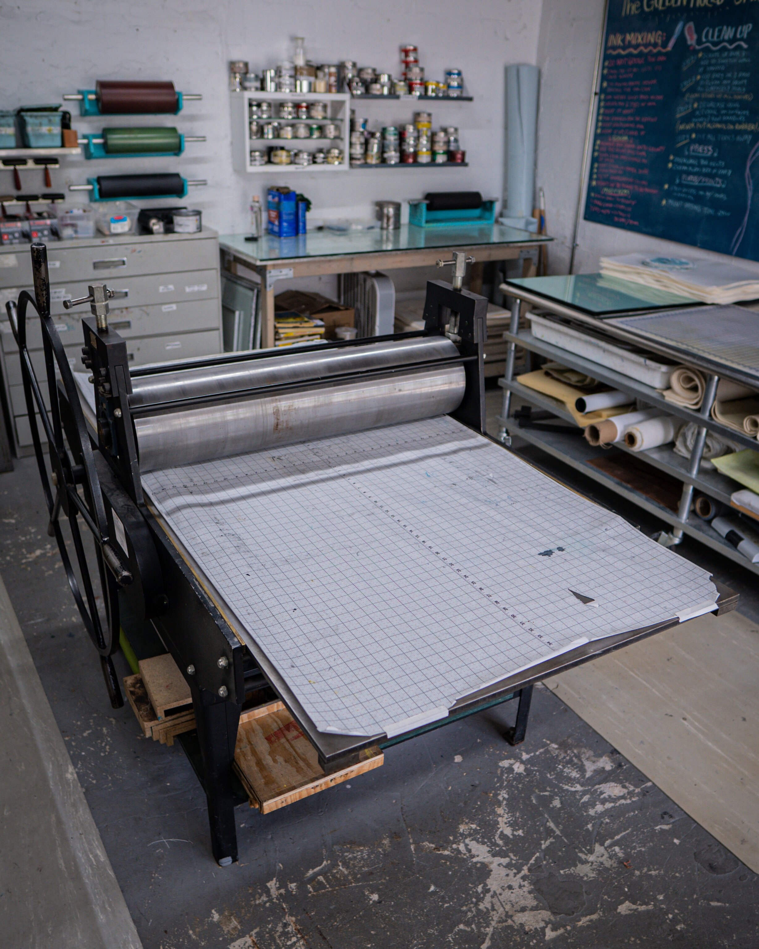
MYRON
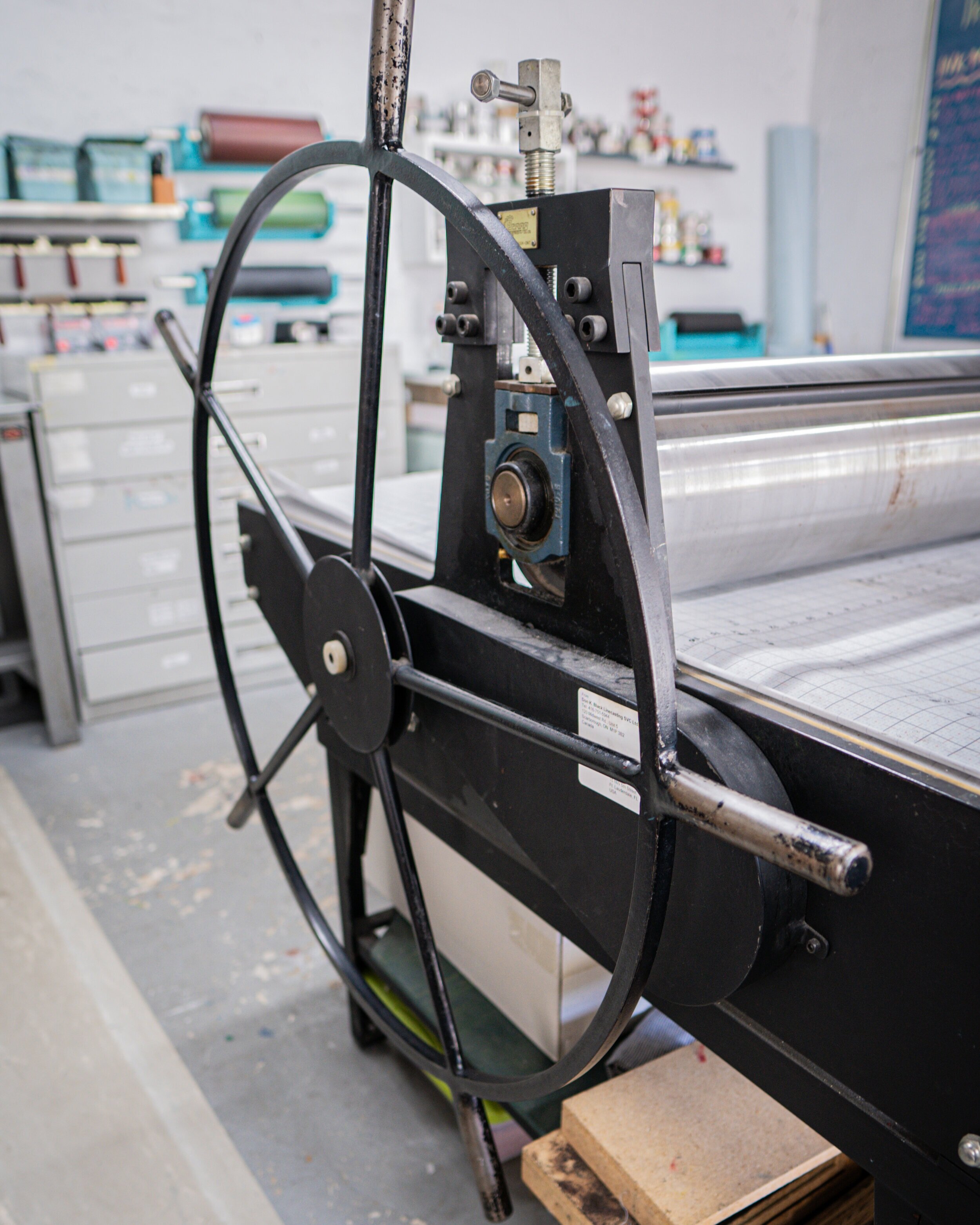

What’s your 'MVT' (Most Valuable Tool)?
I kind of love the omnigrid ruler. It’s so versatile and useful for checking if things are square since it's transparent.

A Closer Look: Time, No Longer Emptied of Presence by Jennifer D Printz
Time, No Longer Emptied of Presence is a solo exhibition by Jennifer D Printz which uses textiles as a means of reflecting on the invisible architecture of life and the ever-changing universe. It is through this ‘Closer Look’ that we more intently investigate Jennifer Printz’s work with a lens pointed right at the sky.
Time, No Longer Emptied of Presence is a solo exhibition by Jennifer D Printz which uses textiles as a means of reflecting on the invisible architecture of life and the ever-changing universe. Within the gallery hangs a series of sculptural fabric pieces, printed with photographic images of the sky, draped on, through, and around wood frames. From one work to the next, Printz invites us to witness the sky’s variable shades of blue, orange, and black as cloud fragments puff, peek around and fold into themselves.
Jennifer Printz’s exploration with the sky was born out of a series of moves across the country. “The works for this exhibition are grounded in moments of awe. The process of documenting the sky above my head grew out of a desire to record the beauty that I was suddenly surrounded by when I moved from Los Angeles to Southwest Virginia. I was overwhelmed with the quality of the sky and the cloud formations over my head. I wanted to keep each moment, afraid it would not return. This continued with my 2019 move to Miami where the skies seem even bigger and replete with billowy masses of cumulus and stratocumulus clouds.”
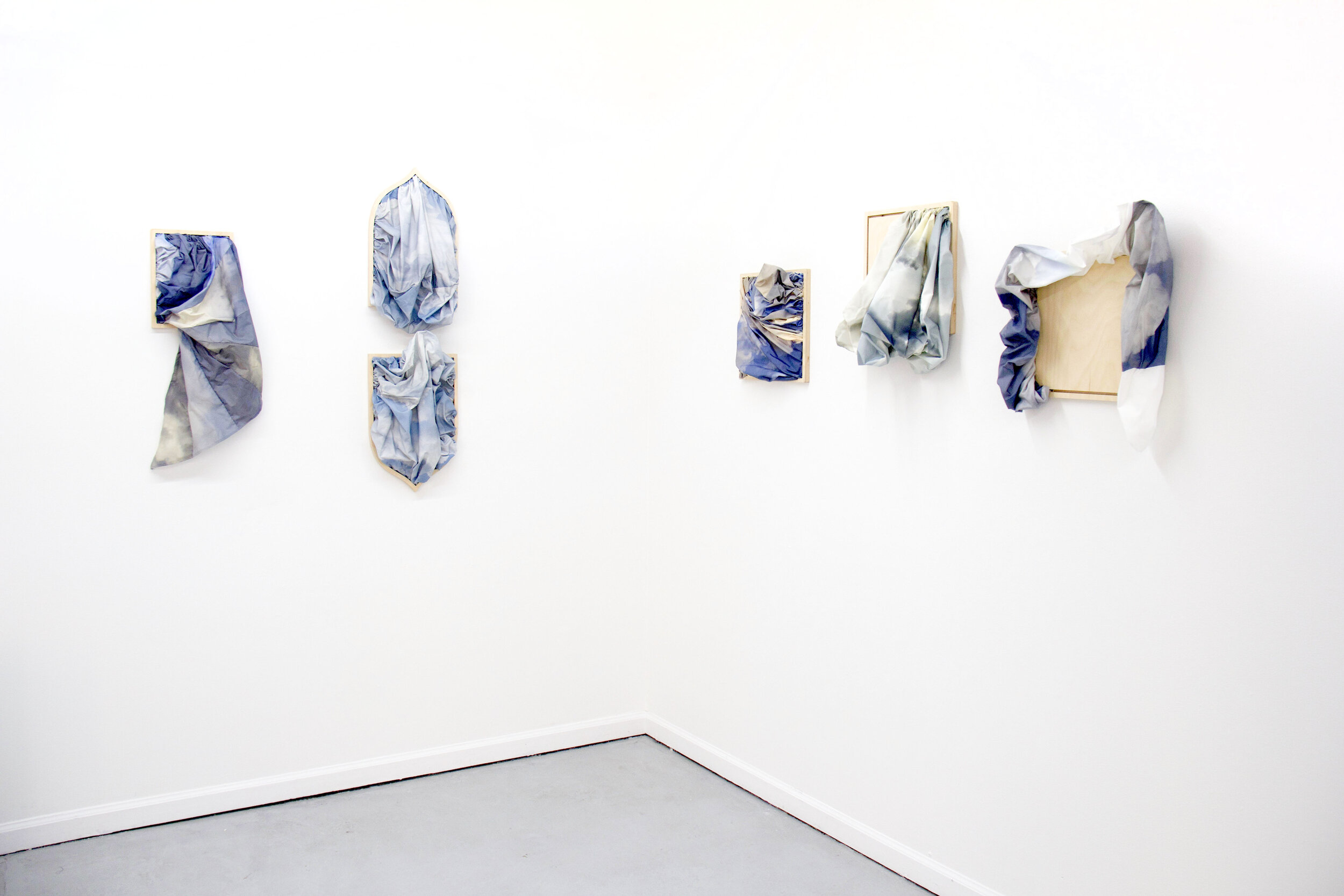
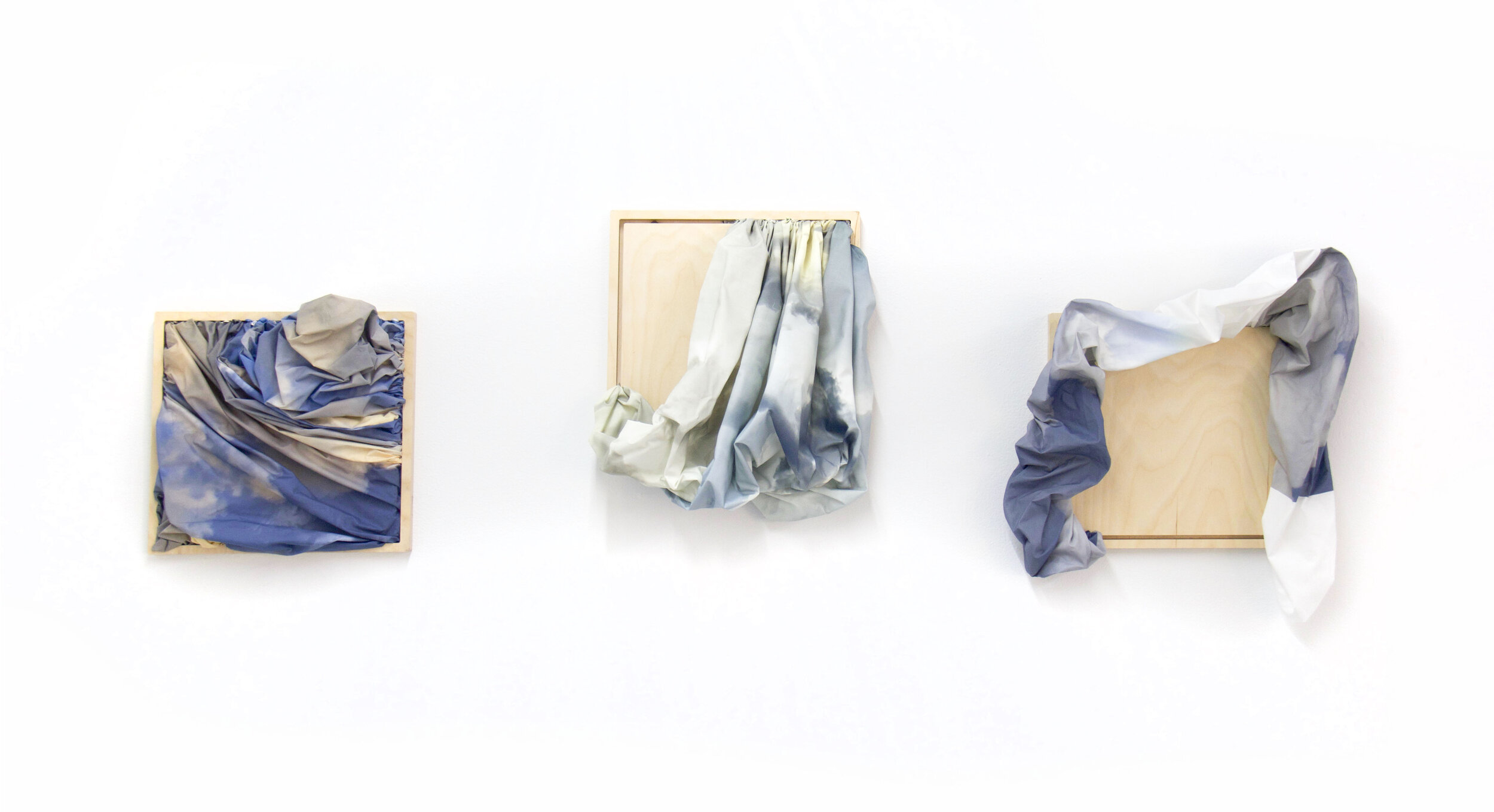
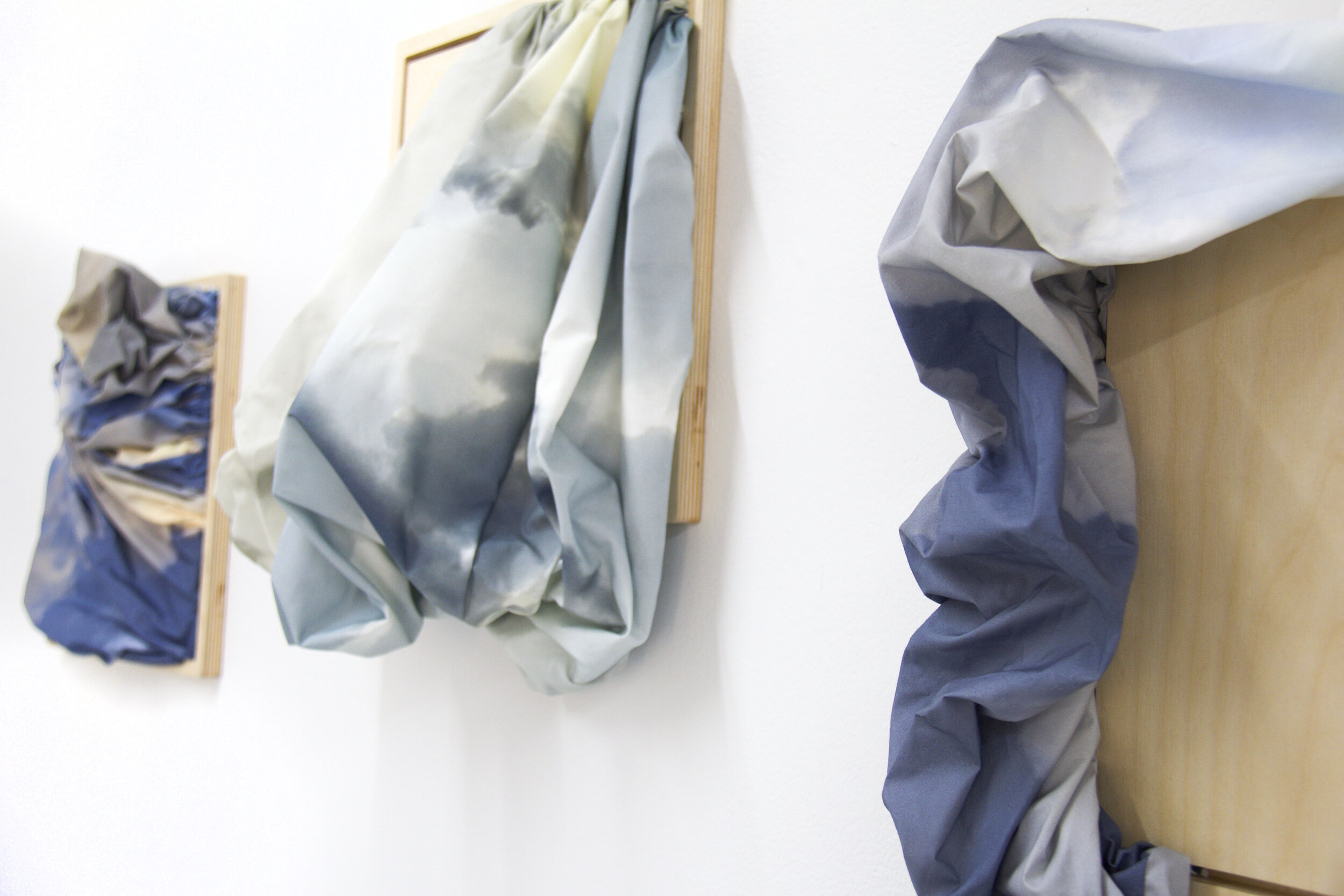
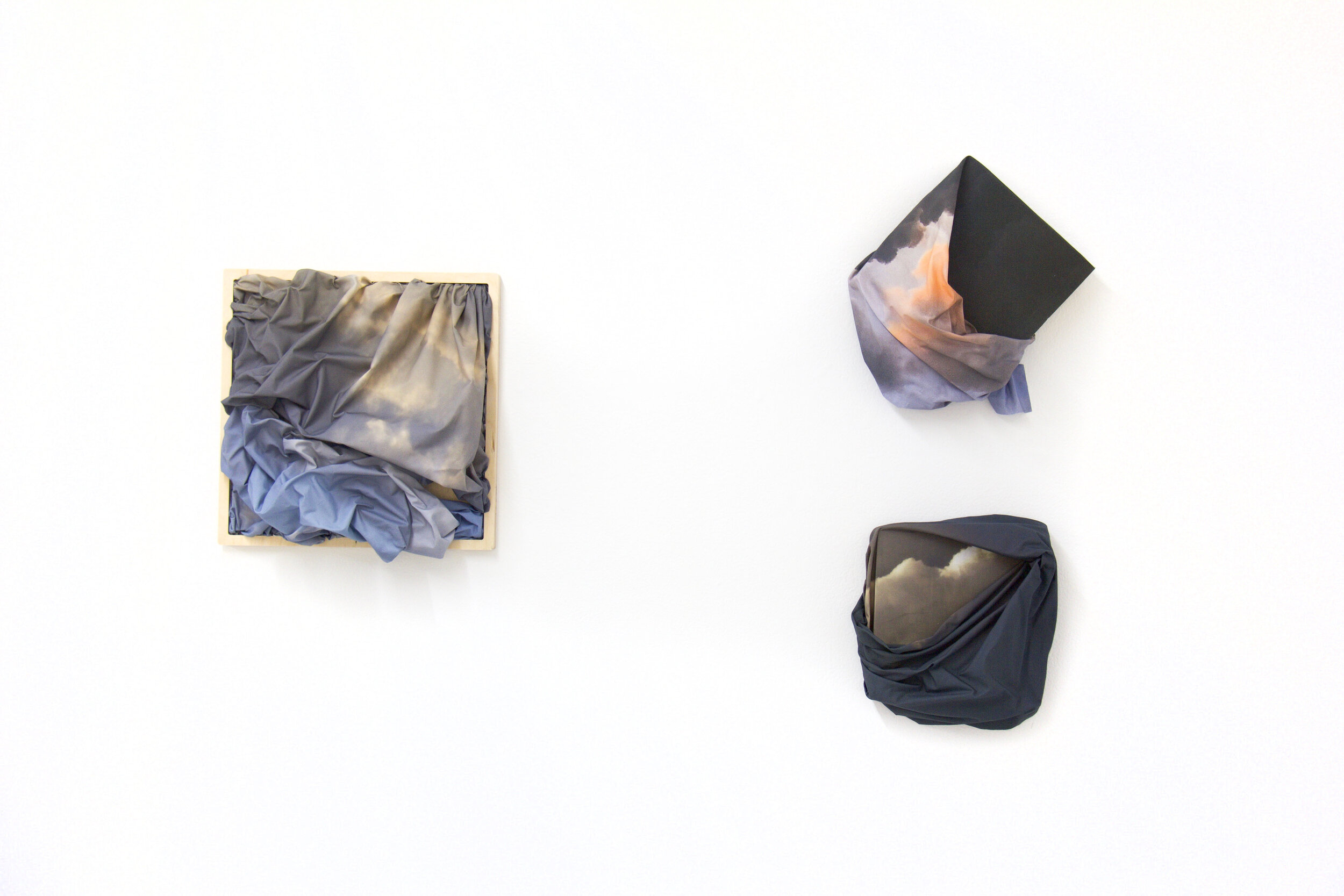
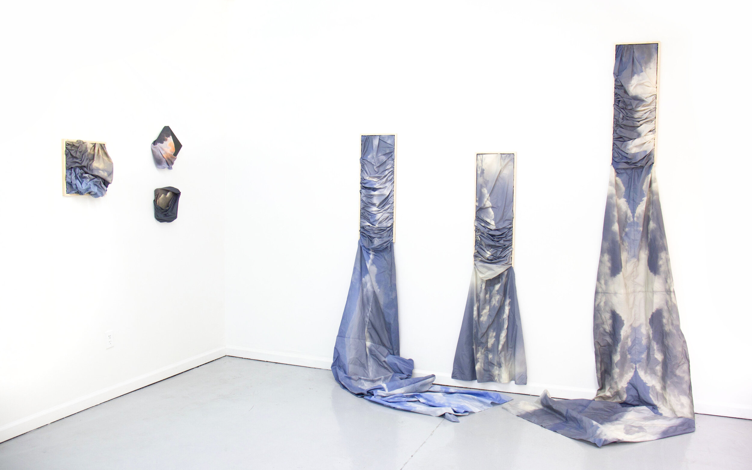
Unveiling her process, Printz shares that “This work began with the simple recording of a moment with my camera - A moment that is built upon and added to others through the physical creation of the work. The photographs are printed onto paper-backed cotton fabric using my large format inkjet printer. This backing paper is then removed, allowing me to handle the fabric like I would any other.”
For several years Printz has been incorporating these photographs into her drawings and prints on paper. While her approach to materials with this body of work is in constant flux, her gaze towards the sky is fixed. “We tend to think of the sky as a flat and smooth surface – the grid of Cartesian geometry. In these pieces, it wrinkles, pleats, and moves in multiple directions in space and it changes based on our viewpoint as represented in the dynamic nature of Einstein’s spacetime.”
Within her practice, she searches for connection with the universe, using the sky as a ready metaphor. “The ten-mile swath of gases above our head is what allows for life here on earth as it both insulates and protects us. Scientists have yet to discover a similar atmosphere in this universe. It is no wonder then that the sky has been part of human mythology since we as a species could share stories. There is a basic commonality in knowing this; we are all here on this sphere because of the blue sky overhead.” This work makes a powerful statement as we imagine Printz in her studio, holding the sky within her hands and bending it to her will.

TIME’s pounding & beyond the point
That said, it should be no surprise that gravity and time are key components in this work. “In Time’s Pounding and Beyond the Point, the sky wraps around and tucks under and over the underlying support to represent how spacetime can be curved by a massive body. The wooden panels that I have used to frame and structure many of the pieces suggest our expectations and the limitation of our vision. We see this in On Becoming Aware as the fabric from one the lower piece pulls up and towards the other. The sky breaks free from its boundaries – spilling over and out or dynamically twisting and turning – showing us it cannot be limited and just how much we have left to discover.”

on becoming aware
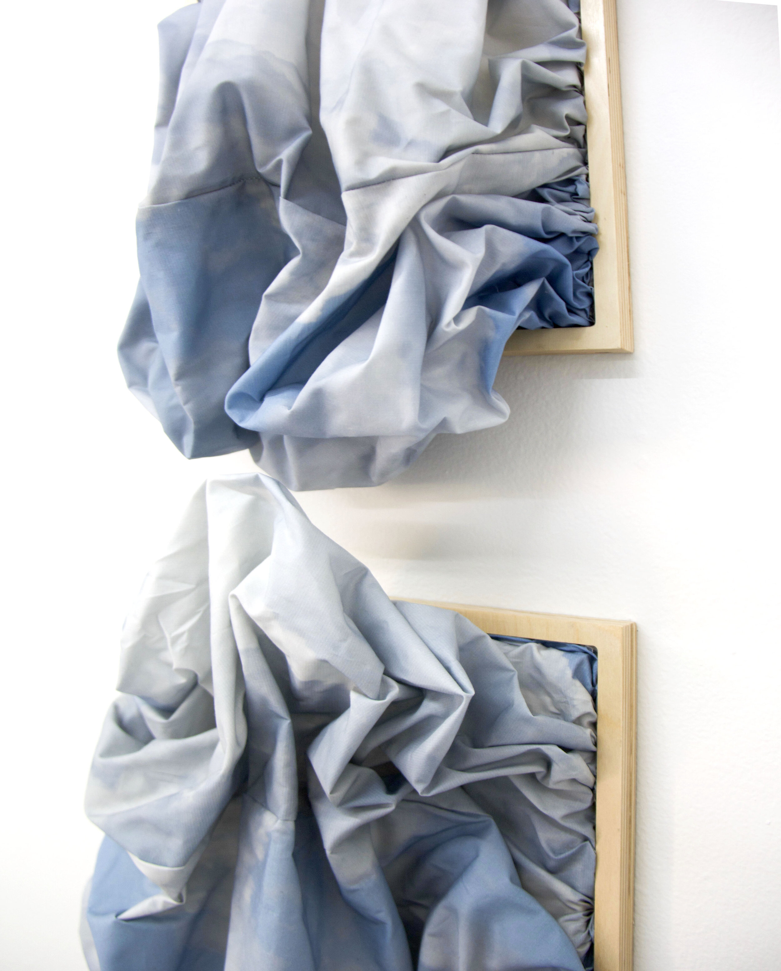
on becoming aware, detail
While Printz's exploration with the sky began several years ago, she finds the shift to working with fabric and sewing has been defining for the work. She explains, “Time is innate to the fabric as it was created through the process of weaving multiple threads, woven over and under each other together to create form. This process is a perfect metaphor for interconnectedness and the systems that exist on earth. Fabric is a pliant material giving me new ways to exploit space and form.”

Untitled
“[These connections] represent how our lives are made up of a collection of moments, hours, and days. It is up to us to reflect on how they are connected together [in order to] create meaning.”
- Jennifer D Printz
Printz stitches time together as gracefully as the fabric itself. “[These connections] represent how our lives are made up of a collection of moments, hours, and days. It is up to us to reflect on how they are connected together [in order to] create meaning.” This act is explored most prominently through the piece, Untitled, as it was made by instinctively stitching together the cut-offs from the fabric used to make the largest work in the show, a triptych, Awed and Perfect Obedience. “These long triangles of differing blues and purples, some with and many without clouds, fit together perfectly to create a billowing shape that breaks free of the frame [as it] arches down towards the floor.”
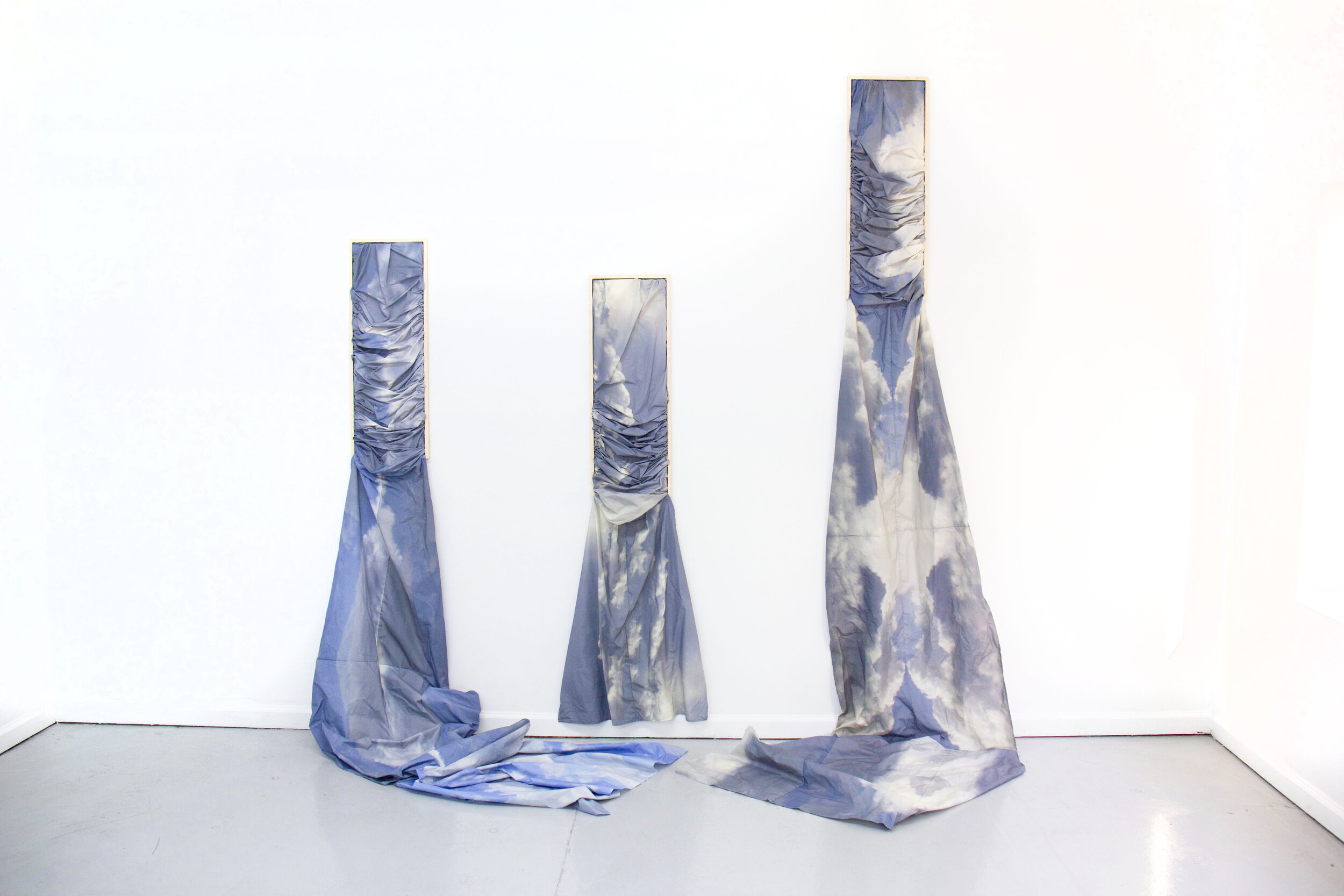
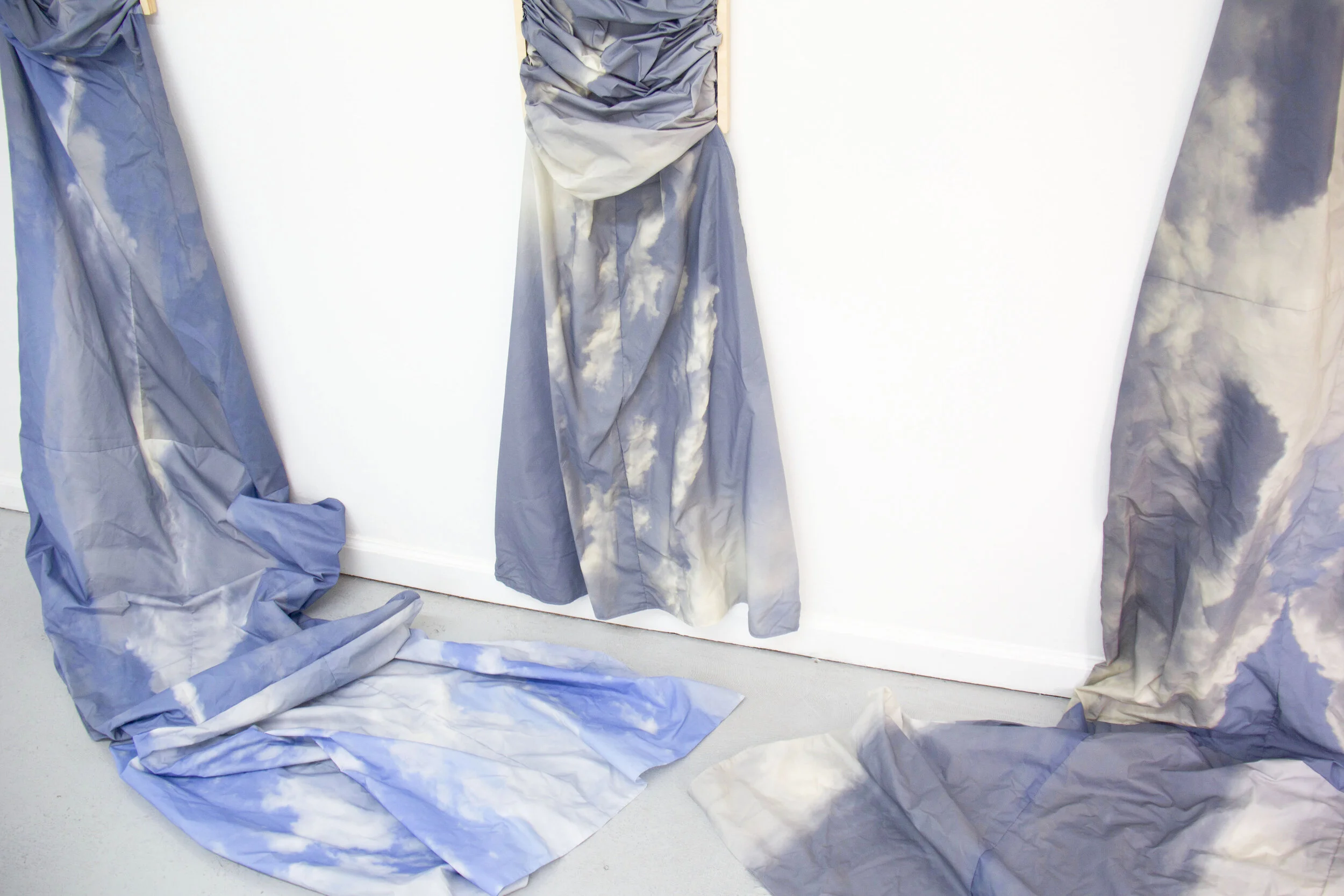
While Printz’s personal and teaching practice has been positioned in drawing and printmaking for some time, this shift into textiles feels like a homecoming for the artist. “It reminds me of the hours I spent at my grandmother’s antique Singer sewing machine. She was a quilter who never wasted any material, often making quilts from old clothing and assorted scraps. I learned to sew at a very young age and went on to sew my prom gown and my sister’s wedding dress. [However,] this is the first time I have used those skills in my studio practice.”
It may come as no surprise that this work was generated during the pandemic. Printz explains, “In this past year, I have found that paying heed to the sky brings me both focus and ease. It has reminded me again and again of the bigger picture of time and space and to let go of my worries over little things […] The title of the exhibition Time, No Longer Emptied of Presence pulls all of these ideas together. Time becomes of value when we are mindful and fully present to what we are doing and who we are with. This is the attitude I want to have with all of my life and my work. It was what led me to stop and photograph a beautiful cluster of clouds for the first time in Virginia and what helps me see the potential in something that might be discarded.”
In making these works, Printz is often reminded of a line from one of her favorite poems, and words that she’s scribbled again and again in personal sketchbooks:
“And whether or not it is clear to you, no doubt the universe is unfolding as it should.”
As this exhibition comes to a close over the next couple of weeks, please reach out to schedule a viewing or stop by the gallery during this month’s FATVillage Artwalk on Saturday, April 24th, 7-10pm. We will leave the gallery lights on 24 hours so that our local audience can safely access the exhibition through our large storefront windows. We also invite you to view the works more closely through our Virtual Gallery Tour.
For pricing and additional information on the works in the show, please visit our Gallery Shop and feel free to reach out via email with any inquiries at sammi@isprojectsfl.com
For more information on Jennifer Printz and her work, visit her website.

Shop Show & Tell with LEAH
Welcome to the second installment of ‘Shop Show & Tell’; a blog series dedicated to sharing our favorite stories, projects, and even objects from the studio. This month, we’re checking in with our designer and printer, Leah Roobin! She has been our design lead since January 2020, adding a fresh take to IS Projects and Nocturnal Press branding, invitations, show posters, and more!
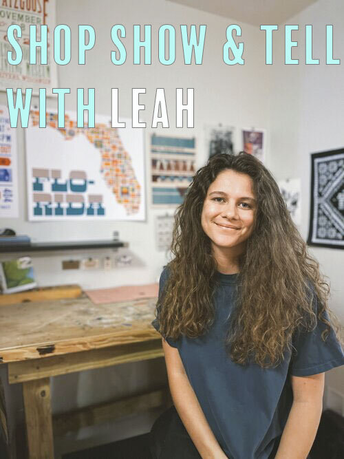
Welcome to the second installment of ‘Shop Show & Tell’; a blog series dedicated to sharing our favorite stories, projects, and even objects from the studio (Check out our first post). This month, we’re checking in with our designer and printer, Leah Roobin. Leah began as an intern while studying graphic design at FAU, looking to explore all things letterpress. She has been our lead designer since January 2020, adding a fresh take to IS Projects and Nocturnal Press branding, artists’ books, invitations, show posters, and more.
Leah Roobin is a graphic designer based in Fort Lauderdale, Fl, originally from a small town in Jacksonville, Fl called Atlantic Beach. She received her Bachelor of Fine Arts in Graphic Design from Florida Atlantic University in 2019.
In her own practice, she explores how digital and analog processes can work in symbiotic ways. Utilizing the strengths of computer-generated work as well as the tactile experience of physical material, she seeks to understand how to unpack and intersect the different technologies and techniques in hopes to elevate both digital and physical media into new immersive experiences.
Check out a few of Leah’s original designs and prints below and visit www.leahroobin.com for more info.
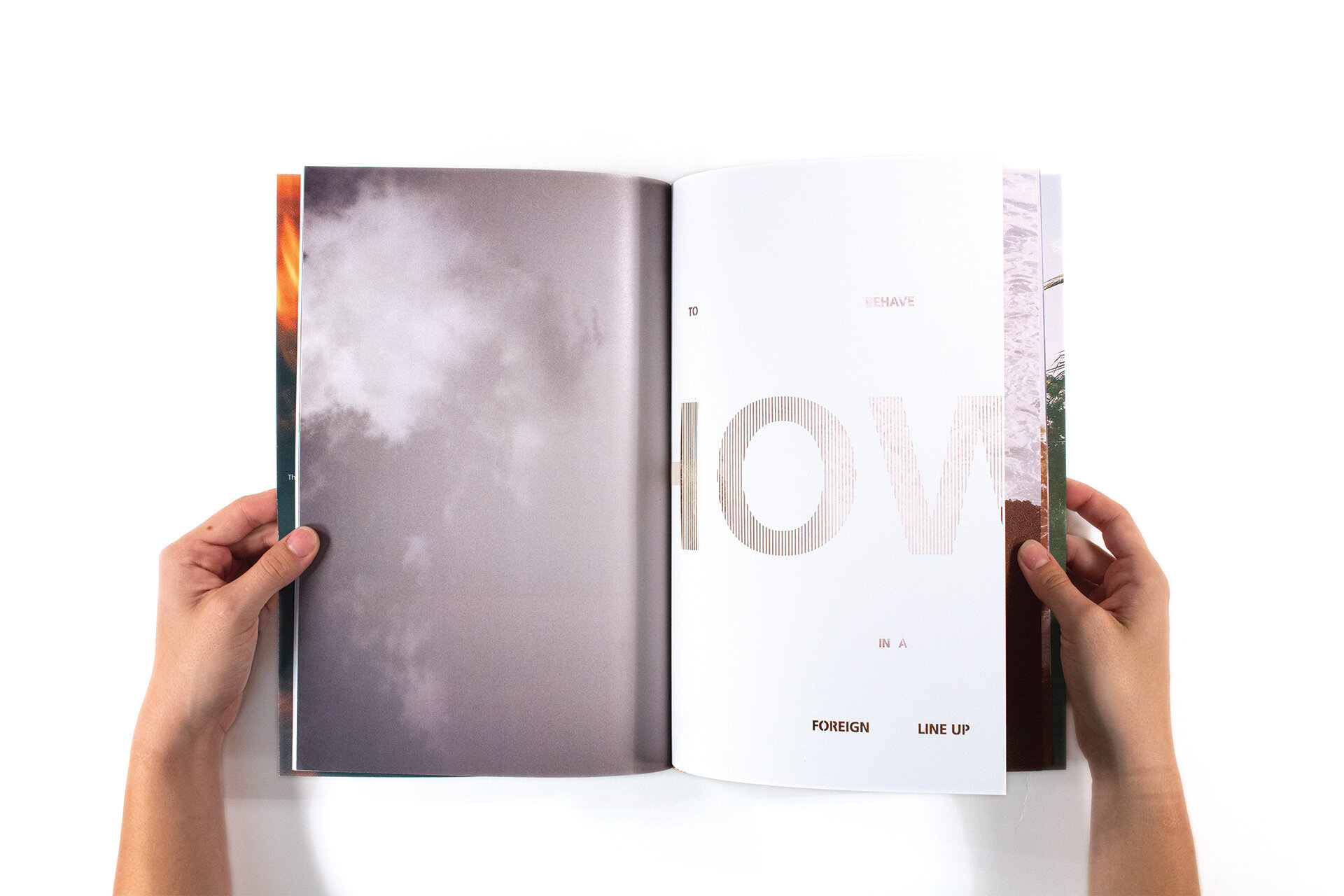
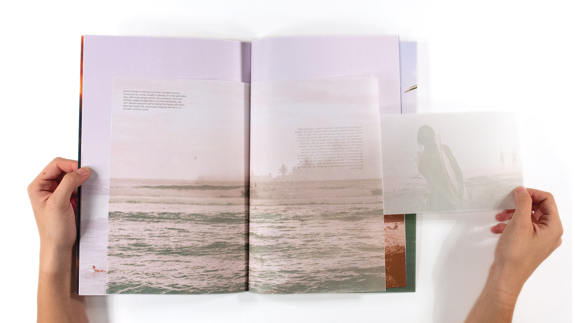
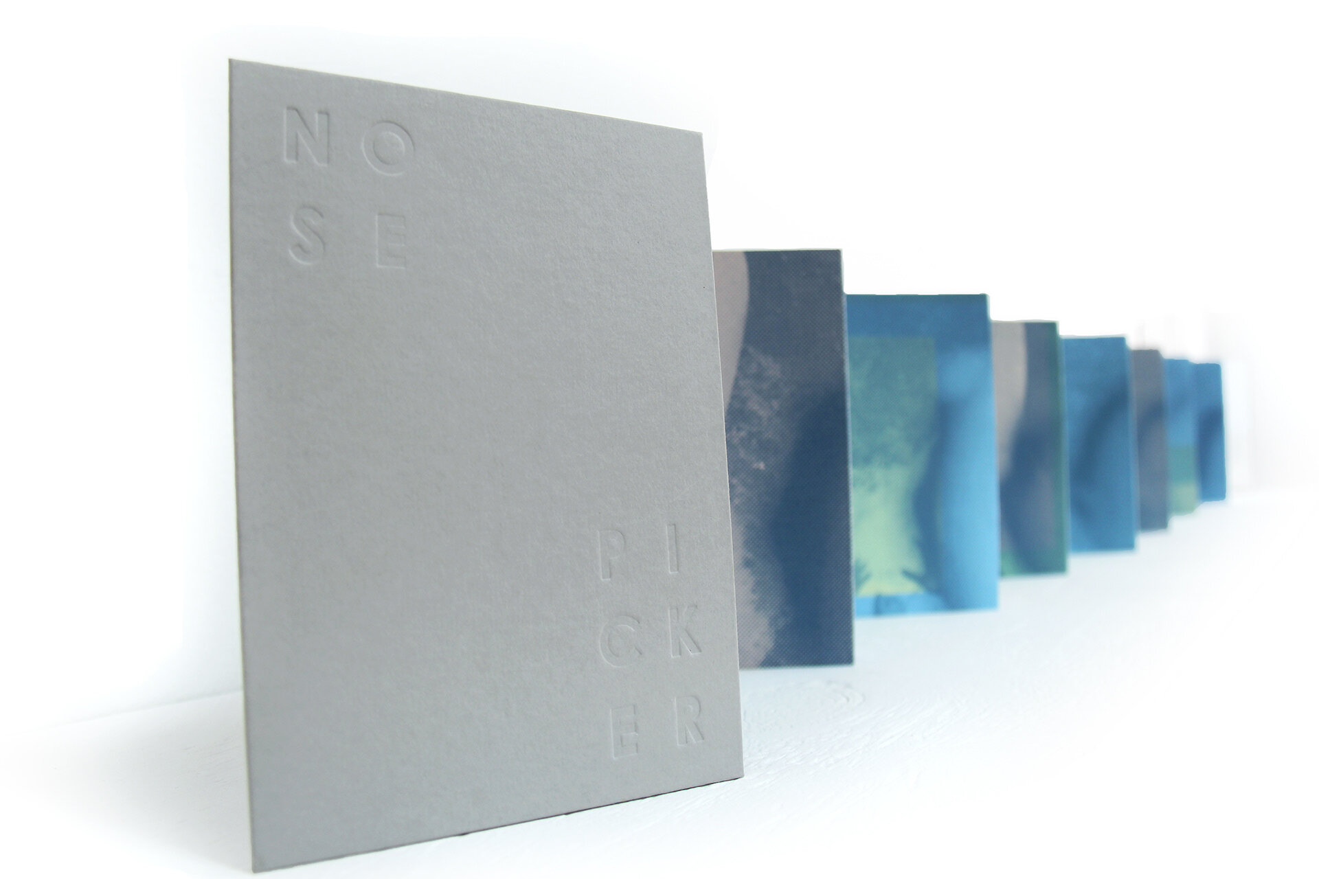
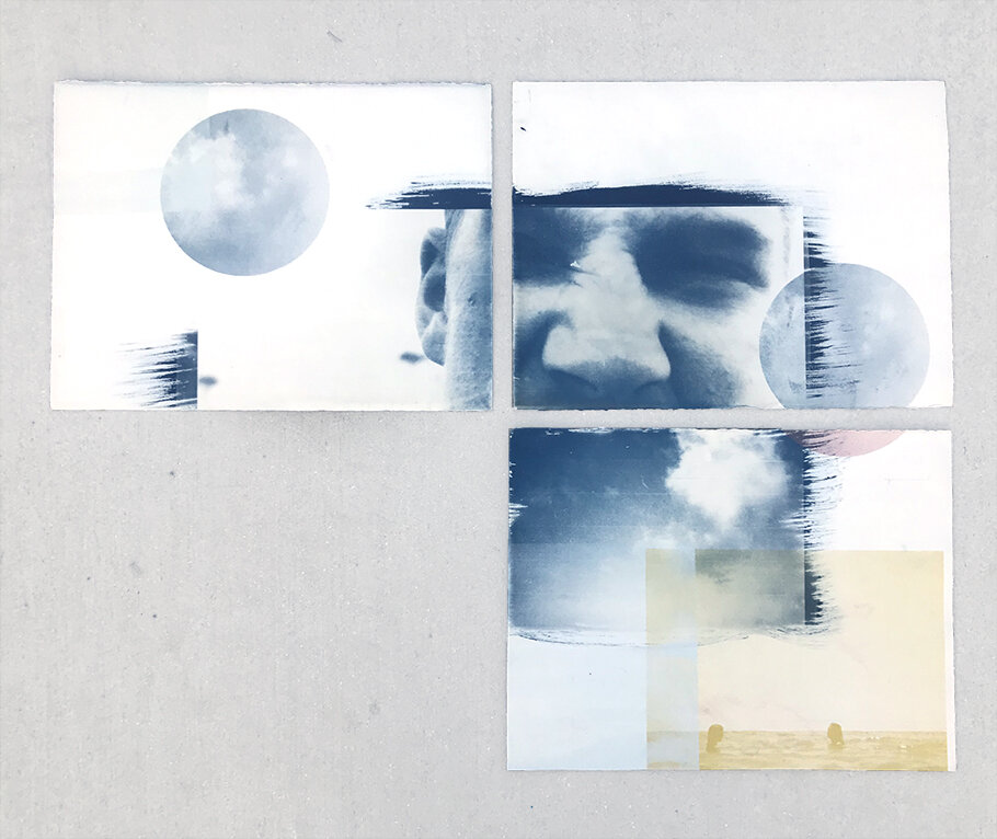
Which project have you learned the most from?
“A personal project - My keep on trucking postcards.
Lessons learned:
- Don't lift a form onto a galley trey, no matter how tight you think the string is
- The color will not print the same as your drawdown so just get it on the press already
- If you're going to use photoshop as a registration tool, make sure the scan is scaled correctly
- It will always take longer than you think”
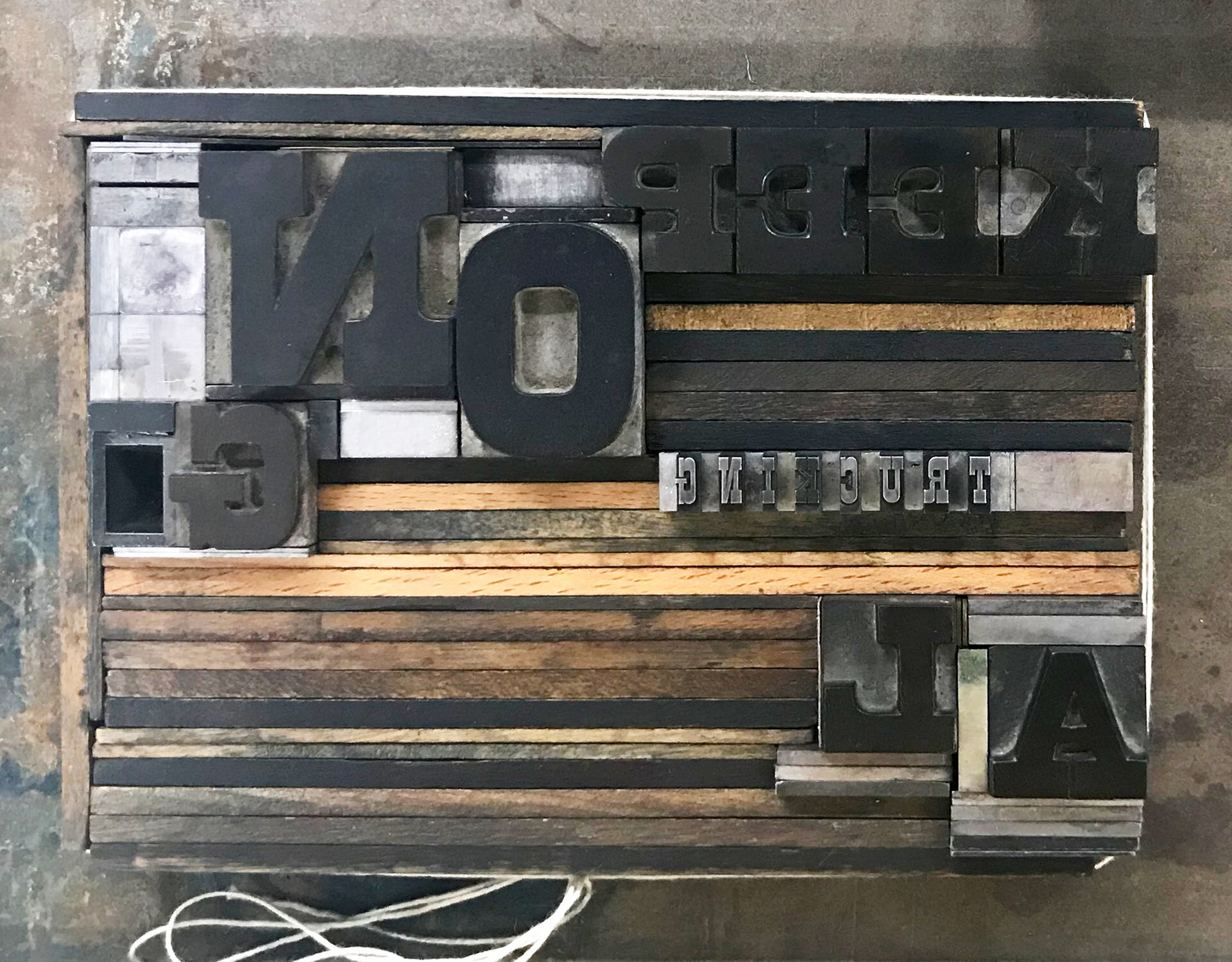
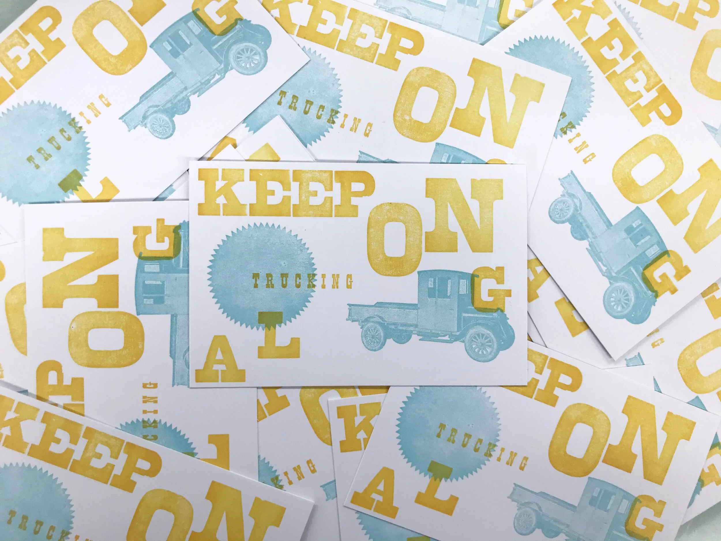
What’s your favorite press?
“Sam, our SP20 - Because he believes in me even when I don't.”

SAM
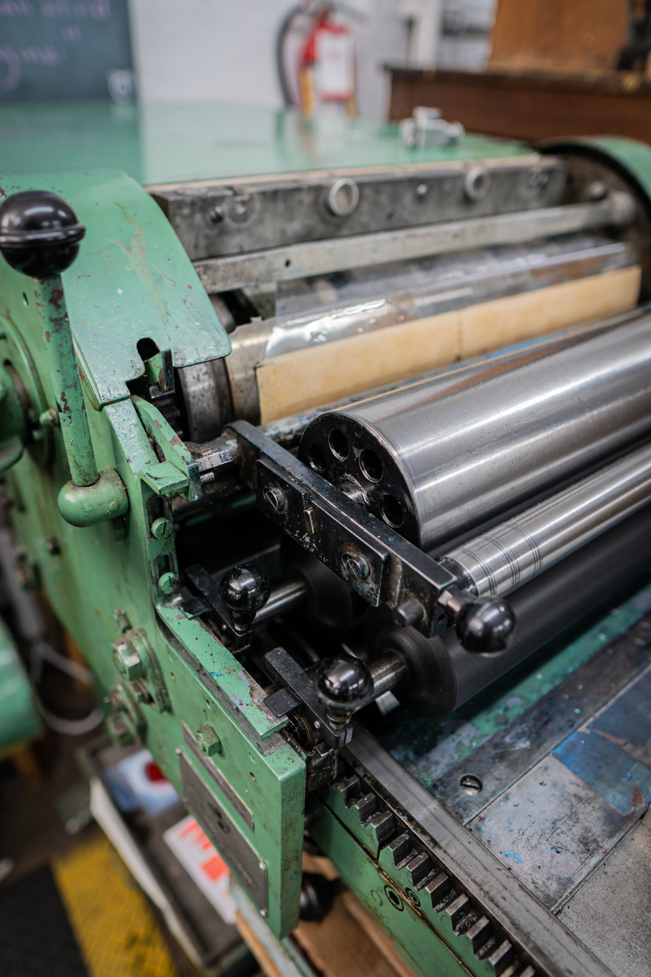
What’s your 'MVT' (Most Valuable Tool)?
“The Pica Pole because it keeps me in check”

If you were an IS Projects typeface, what typeface would you be?
“I’d be Mansard (No. 121) because its got European flare with some southern charm to it”

What's your favorite print hanging up in the shop?
“The Tuscan Extended Poster because the colors and typeface are just too good. Also, I get lost every time I try to follow the type spiral.”

What's your favorite image cut from the letterpress collection?
*Bonus: what would you print with it and why?
“There's this cut that's a photo of a boy playing baseball that I’d use to make a Father’s day card with.”

(Now & Then) A Closer Look: Copy of the Original by Rachel Livedalen
During the pandemic, we decided to start writing articles on our exhibitions to provide a “closer look” for collectors. We recently decided to unearth these articles from the archive in order to share them on our blog for all to enjoy. In revisiting these articles, we’ve also taken the opportunity to check back in with our artists, asking them how their work has developed since their show at IS Projects and what upcoming projects they’d like to share. We begin with Rachel Livedalen and her exhibition, Copy of the Original, exhibited July - Sept of 2020.

Our 2020 exhibitions will always hold a special place in IS Projects history as they marked the gallery’s virtual pivot during the pandemic. In an unexpected turn of events, we found ourselves connecting even more with our exhibiting artists as we developed new opportunities to deep-dive into their work through virtual gallery tours, our gallery shop, virtual artist talks, and additional programming. During this time, we also decided to start writing articles on our exhibitions to provide a “closer look” for collectors. We recently decided to unearth these articles from the archive in order to share them on our blog for all to enjoy.
In revisiting these articles, we’ve also taken the opportunity to check back in with our artists, asking them how their work has developed since their show at IS Projects and what upcoming projects they’d like to share. We begin with Rachel Livedalen and her exhibition, Copy of the Original, exhibited July - Sept of 2020.
NOW
Before we revisit Rachel’s exhibition, Copy of the Original, we first want to share what Rachel has been working on from her studio in Texas.
Rachel shares, “Recently in the studio, I've been creating paintings on inkjet printed canvas. First, I create collages on a scanner bed that features a variety of sources and references. These collages are blown up and printed onto canvas and then combined with hand-painted layers. I use a lot of stenciling techniques in my paintings to incorporate graphic elements that reference the printed source materials. The references in the works include cultural ephemera from both fine art and pop-cultural sources like art history textbooks, stickers, makeup palettes, confetti, and album covers.”
If you’d like to hear more about Rachel’s current art practice, she will be giving an artist talk via Zoom for the Mulvane Art Museum on Thursday 3/25 at 6pm Central. Anyone can register and watch at this link: https://washburn.zoom.us/meeting/register/tJAucO2pqzkuHdXApx1cLN2-eiRbbJVyXykj
Rachel also has another solo show on the horizon, opening April 10 at Ivester Contemporary in Austin, TX. The show is called it's kinda like that and features the following new works on panel.
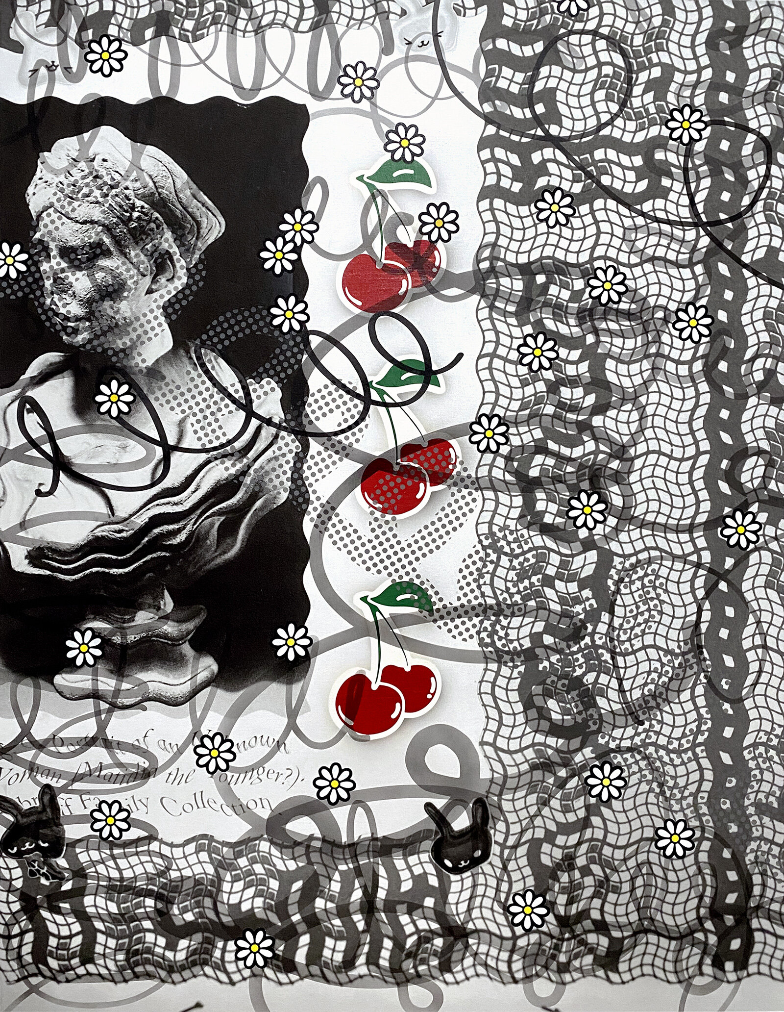
Cherry Bomb
acrylic on archival inkjet printed canvas
50" x 38"
2021

Three Things With Commas
acrylic on archival inkjet printed canvas
50" x 38"
2021

Deluxe Beginner
acrylic on archival inkjet printed canvas
50" x 38"
2021
THEN

It is our pleasure to re-present Rachel Livedalen’s solo exhibition, Copy of the Original, a series of works on panel that combine screen printed layers of Greco-Roman textbook pages (Page 56 Parts I - IV) with airbrush and gouache. Structured information depicted in these works relate to the construction and continuation of the art history canon and the way in which we understand visual culture. Textual information appropriated from the same art history text book page surfaces throughout the works and installation. The text is stretched, morphed, or veiled, then layered with different modes of visual information like coded symbols, colorful shapes, or erased gestures. The goal of the work is to question our understanding of visual information both from academic art history and popular culture as it relates to beauty, feminine representation, and artifice. Specifically, these paintings analyze the Knidian Aphrodite, the first sculpture of a female nude in Greek art that now only exists as a Roman copy. This canonical work from western art history thus embodies ideas of representation and reproduction throughout history.
Livedalen’s approach to painting is unmistakably informed by printmaking and often blurs the line between the two disciplines. In the piece, Page 56 Part III, paint is applied to the surface of her panel through careful layering. Livedalen expounds, “Page 56 Part III features a cropped view of the original art history book page, but all the text is masked by layers of black airbrush paint. Superimposed on top are colorful gouache shapes, further obscuring the information presented in the screen printed text layer of the painting.”

Page 56 Part I features a more gestural and loose black airbrushed mark, obscuring screen printed text and further pushing its illegibility. While the text is seemingly inaccessible, Livedalen leaves a thread of clues for the viewer. “In this work, colorful shapes are painted on top of each letter of the text and are coded so that each letter is given a specific color and shape.” This code of colorful shapes is carefully painted through a stencil, mimicking screen printing


The exhibition progresses to two more paintings, Revisions and To Dovetail, which continue to explore the layering and concealment of Livedalen’s symbols and text. Livedalen adds, “[these works] build off of the visual language explored in Page 56 Parts I-IV. […] They both use stenciling techniques to control the boundaries of these layers, exploring restraint of both material and visual reference.”


A large mural of gray text dominates the exhibition space and provides a familiar backdrop for Livedalen’s paintings. “This text excerpt again borrows from [the same text] as the paintings. This page records the beginning of a paragraph titled ‘The Female Nude A New Theme in Greek Art’.” The text is morphed as it waves across two adjoined walls in the gallery space and is adhered to the wall in a pale gray adhesive vinyl.

“The text is meant to transform the exhibition space beyond the neutral white gallery cube. It calls back to the reference explored in the paintings and provides a physical and symbolic background for the artworks.
The image of the Knidian Aphrodite is also represented in wall vinyl, but unceremoniously turned on her side and tucked under the gallery window.”


Copy of the Original was on view through September 2020. If you missed the show in person, you can still take the Virtual Gallery Tour.

Shop Show & Tell with CARO
Welcome to ‘Shop Show & Tell’; a blog series dedicated to sharing our favorite stories, projects and even objects from the studio (Think of this as the “Staff Picks” section of a book store - only the print studio edition!). This month, we’re kicking things off with the newest member of the team, Caro Gutierrez.

Welcome to ‘Shop Show & Tell’; a blog series dedicated to sharing our favorite stories, projects and even objects from the studio (Think of this as the “Staff Picks” section of a book store - only the print studio edition!). This month, we’re kicking things off with the newest member of the team, Caro Gutierrez. Caro began as an intern with some serious illustrating chops and an interest in all things screenprinting and zines. After proving to be a huge asset to the studio, we recently welcomed her on as the new Sales and Fulfillment Associate for Nocturnal Press!
Caro is a multidisciplinary artist and designer born in Barranquilla and living in Miami. Prior to joining the Nocturnal Press team, she worked in art direction, product development, and is also a freelance illustrator, printmaker, and graphic designer. She graduated in 2017 from Emerson College, where she focused on Global & Post-Colonial Art & Film History, and conducted research for Boston's Museum of Fine Arts in 2018.
Her love for music, art history, and cooking are all driving themes in her illustrative work. When she is in the studio working on her practice, she is usually screen printing or doing letterpress and when she is not in the studio, she can be found writing dreamy songs in Spanish or riding her bike into the sunset. Check out a few of Caro’s original screenprints below and visit www.caro-gutz.com for more info.
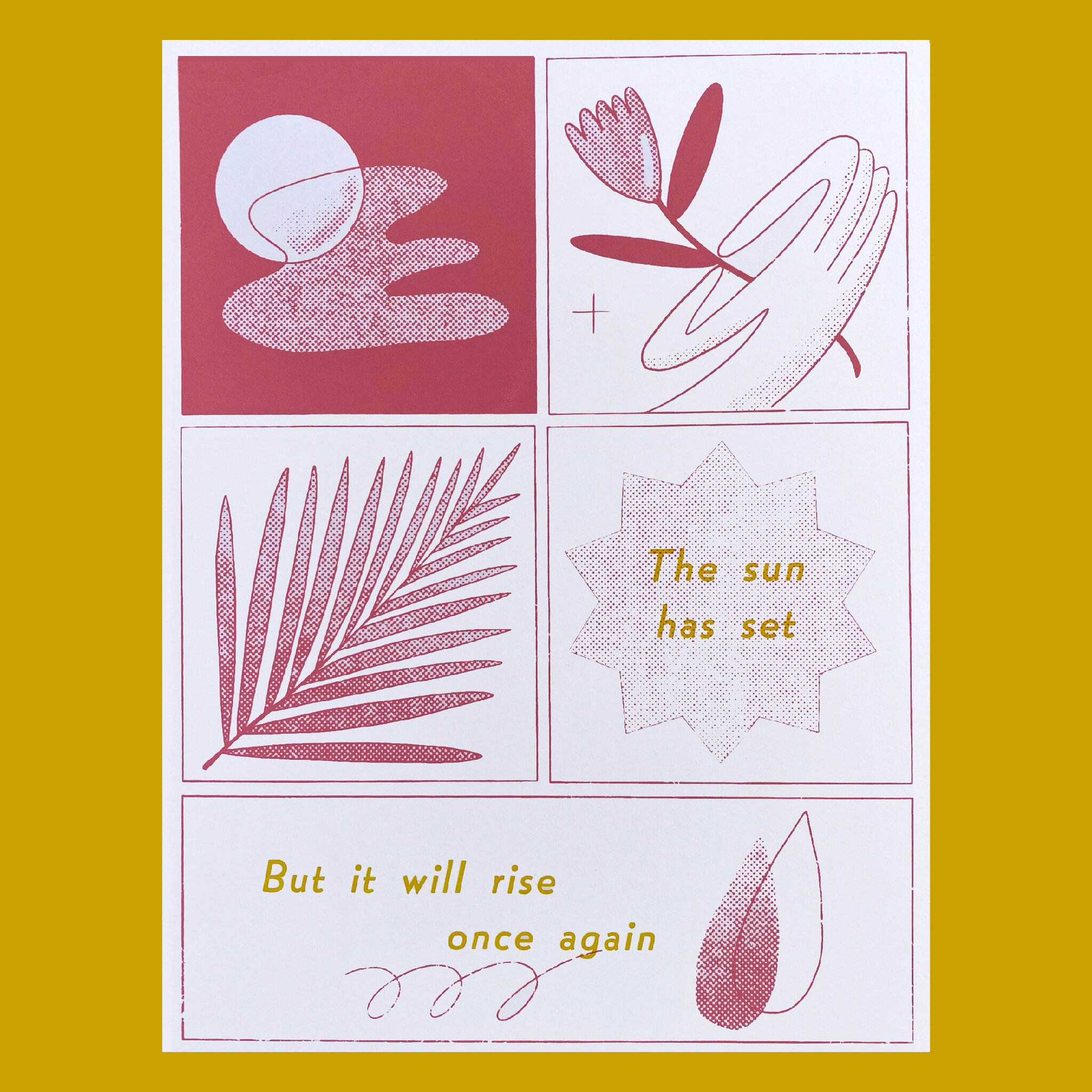
Which project have you learned the most from?
“A couple of months ago I was getting some work done in the studio and Ingrid had mentioned a client would be coming in later that day to print his negatives and drop off some stuff. He came in towards the end of the day with a large item rolled up and I didn't think much of it, we had some small talk, and I eventually left the studio to go home.
The next morning, I saw there was a humongous painting rolled out on the gallery floor of a mandala with a VERY complex Persian rug pattern. I told Ingrid I had read about an artist from Miami who painted these crazy detailed Persian rug-inspired pieces a long time ago somewhere on the internet and had even blogged about his work. As I pulled up the article that I had read about him years ago, Ingrid mentioned that it was the client I had spoken to the night before! I ended up working with Ingrid on this ridiculously high-stakes screen printing project, watching her problem-solve in real time blew my mind. The solution to getting this guy printed right required an intricate and unusual setup and had little to no room for error. It was an honor not just to see and touch one of Jason Seife's pieces, but to see Ingrid's crazy critical thinking printing expertise be applied to an unusual format.
I ended up getting ink on my shoes, on my phone, we stayed late at the studio working on it for a couple days, but seeing the canvas stretched out and the painting hung up at a show at a gallery in London felt gratifying and very mind blowing. Sometimes when I wear the shoes that I stained working on this project I think ‘crazy to think the rest of this ink is hung up on a gallery somewhere’.”
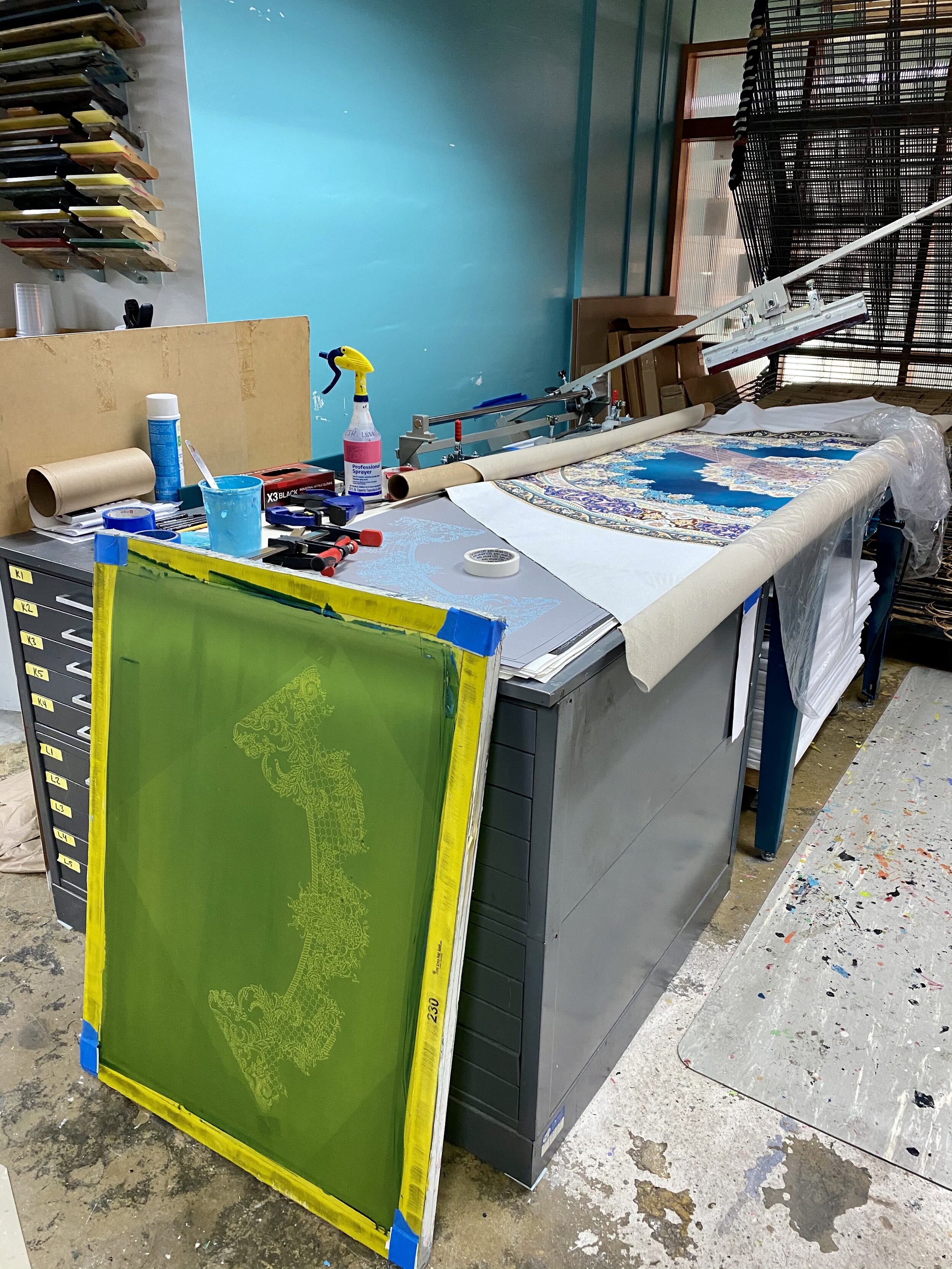
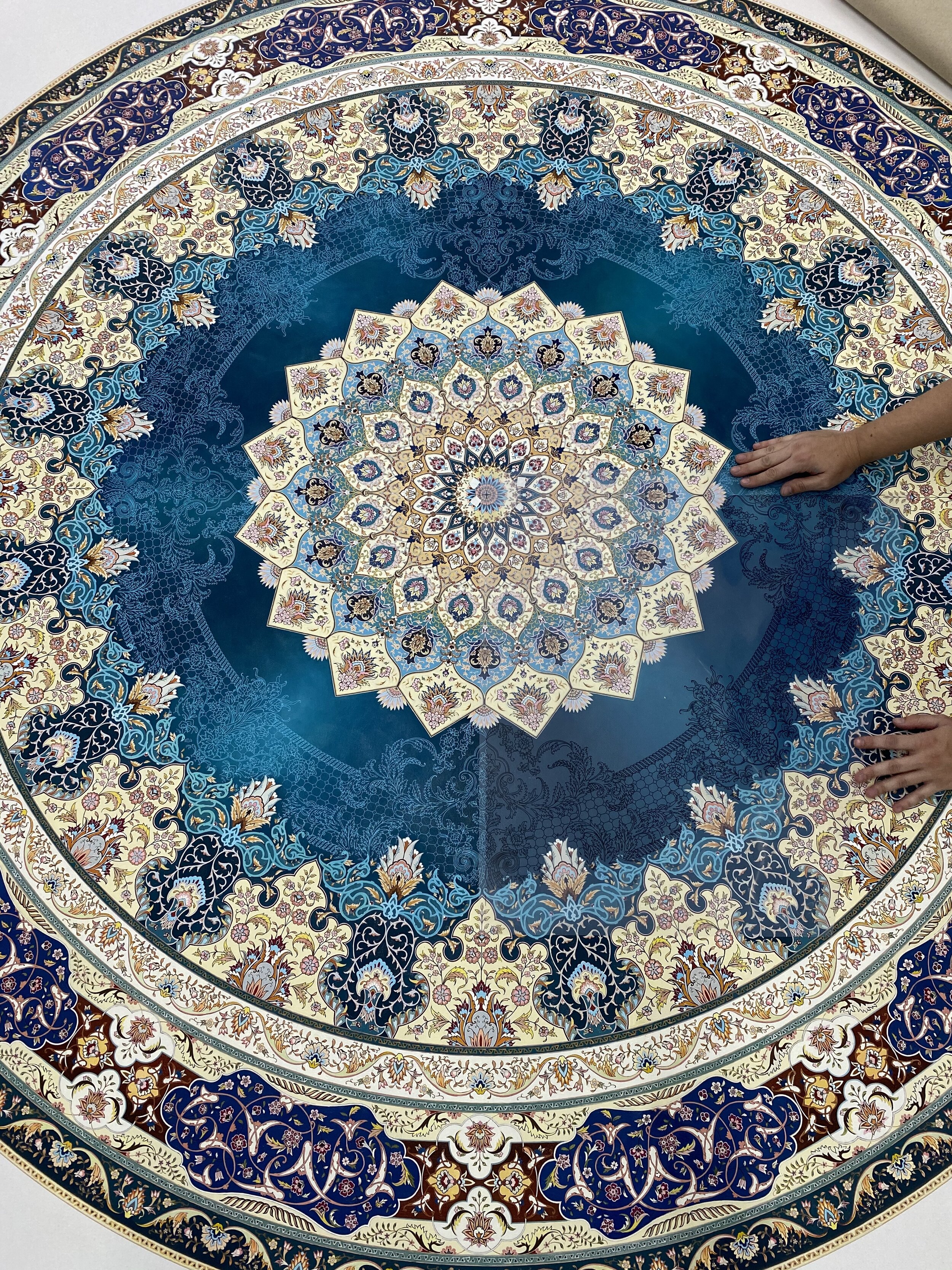
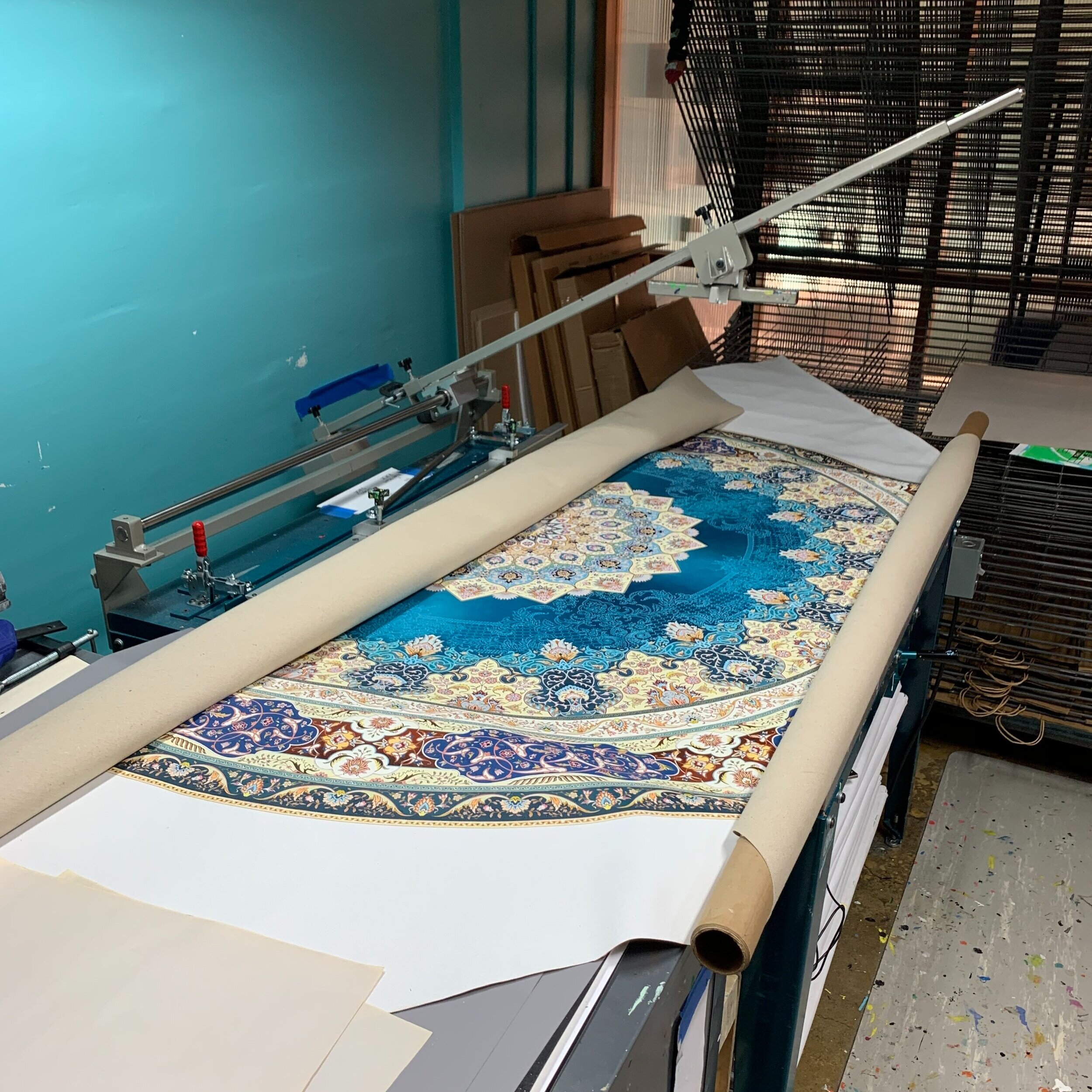
What’s your favorite press (and why)?
“Close call between both Vandercook presses in the studio! CB has been the press I've spent most time with working on production and Sam has seen me through difficult times while trying to improve my letterpress game. Although screen printing is my personal fave, the Vandies have a special place in my heart forever and always.”

CB

SAM
What’s your 'MVT' (Most Valuable Tool)?
“100% my sketchbook, I use it for everything and I bring it with me everywhere and it's the only place where I feel like I can let my creativity run unabashedly free and unsupervised. Some of my favorite pieces have come from little doodles that I've made in my sketchbooks that eventually turn into well polished pieces of work. I am also constantly flipping through them when making new work, they serve excellently as catalogs of thoughts and ideas that I can look back on.”

What is Nocturnal Press?
Curious about our origin story? It all started with Nocturnal Press, founded in the summer of 2012 after Ingrid Schindall graduated from the Maryland Institute College of Art with a Bachelor’s Degree in Printmaking and Book Arts. We print everything from business cards to high-end art prints, wedding invitations to gig posters, and whatever else our clients bring to us. We have made custom books for celebrities, artists, locals, designers, architects, billionaires, writers, poets, festivals, and universities. The best way to sum up the difference is that IS Projects will help you make it yourself and Nocturnal Press will make it for you.
Late Night Origins
Nocturnal Press was founded in the summer of 2012 after Ingrid Schindall, hereafter referred to as “I”, graduated from the Maryland Institute College of Art with a Bachelor’s Degree in Printmaking and Book Arts. In school I was notorious for pulling all-nighters and spending the darkest hours of the night in the printshop. So much so that my letterpress instructor and mentor, Mary Mashburn, cracked the joke, “If you ever start a shop you should call it Nocturnal Press” and so it was. I started selling handmade journals during my time at MICA and continued to do so from my living room. I bartered a very nice, custom leather sketchbook for a proper logo from a graphic designer friend of mine and Nocturnal Press became official.
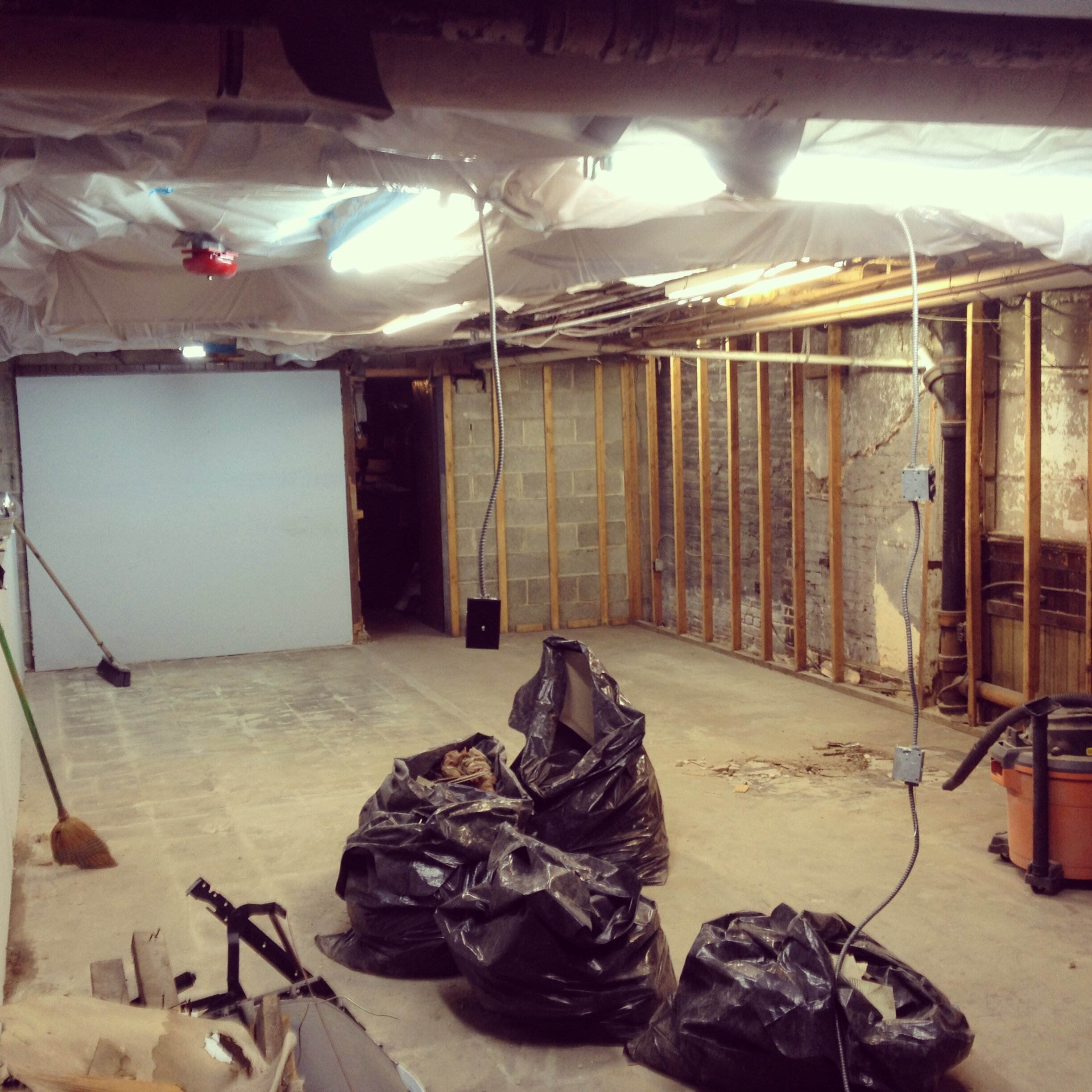
The next two years were spent setting up a studio in Mount Vernon, Baltimore in a sketchy basement that found several exciting ways to flood throughout the year and a half Nocturnal Press resided there. The studio was not pretty. It was a basement that had been a church space in the 80s and had been used for storage ever since. My friend and studio-mate, Mollie Little, and I spent a month or two making the space habitable. We stapled plastic sheeting to the ceiling to keep the crumbling insulation from falling on us, we tore out a wall in the middle of the room and harvested the drywall to cover the uncovered walls in the rest of the space, we ripped up linoleum tile and covered the crumbling fireplace with a spare wall leftover from our other studio-mate’s recent art exhibition. It was hard work to set up the space but it was a useful lesson in the idea that with friends, and perhaps an unhealthily amount of optimism, anything is possible.

Bound for the tropics
Through the months of selling journals and working other jobs to pay the bills, I missed printing desperately. Unfortunately, the time I was able to spend volunteering at MICA for the Globe Collection and Press wasn’t enough to fill the need. So I started dreaming of a bigger space that would be more visitor-friendly and, ideally, less vulnerable to pipes bursting and frequent flooding. I started to research available printing presses and surveyed local areas and nearby cities to gauge their need for a community printshop. It was clear that Baltimore had a fantastic print scene with several established and friendly printshops. Philadelphia and DC seemed to be in a similar position. I tried lugging my suitcase full of books to different markets along the east coast to find a suitable market and happened upon an artist district called FATVillage not too far from where I grew up in Fort Lauderdale, FL. South Florida has the distinct advantage of abstaining from anything resembling winter, and as a summer-loving wears-a-jacket-when-it’s-70-degrees type of creature, that was a big plus. I dug into the internet and local arts magazines, I asked friends from back home and professors at MICA, to find out what was going on in the South Florida print scene. I came to the conclusion that a small, letterpress focused, community print shop would find a great home in Fort Lauderdale. The dream became a bit bigger than what the Nocturnal Press moniker could hold, so I decided on the broad name of IS Projects to allow for whatever evolution and pivots were awaiting me.

So IS Projects became the umbrella under which Nocturnal Press operates. IS Projects handles all of our public programming, workshops, residencies, gallery exhibitions, artists’ book publishing, artists’ talks and so on, while Nocturnal Press remains active as our boutique printshop, retail space, and bindery. A major portion of our revenue stream is commissioned printing and all of that falls under Nocturnal Press.
Nocturnal Press Today
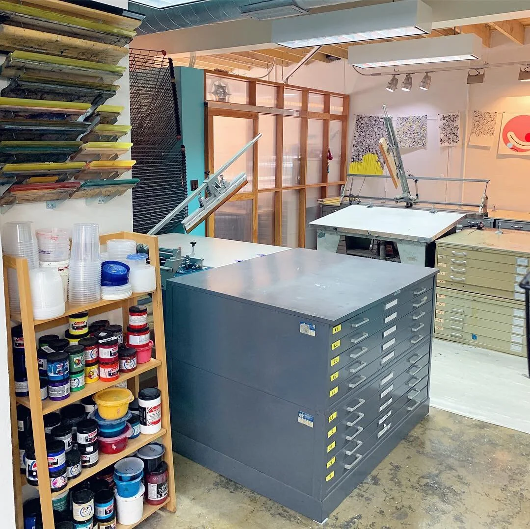
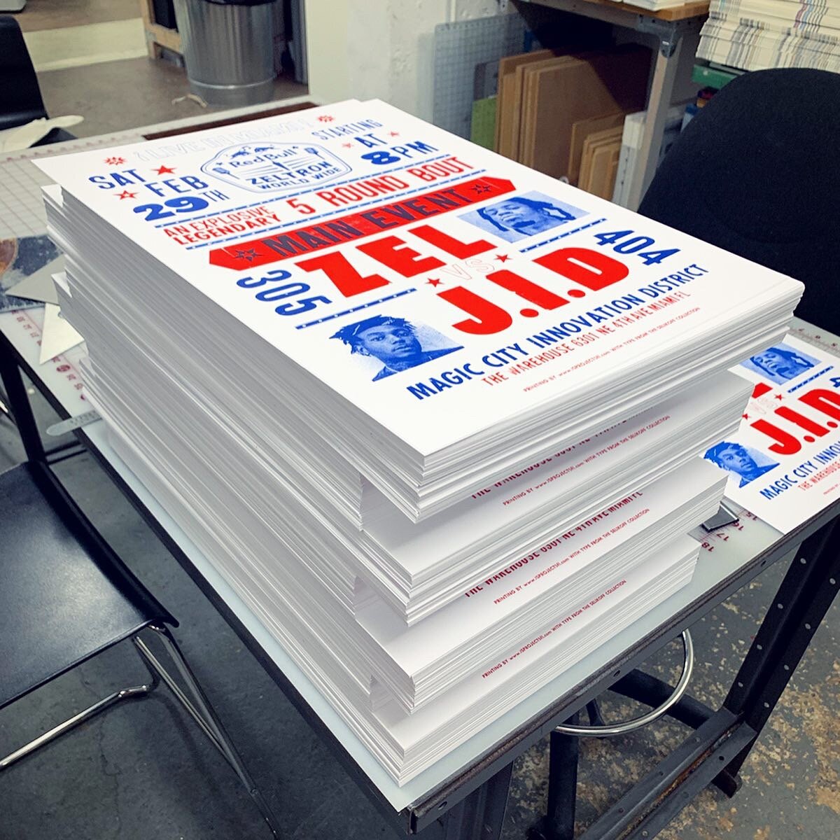
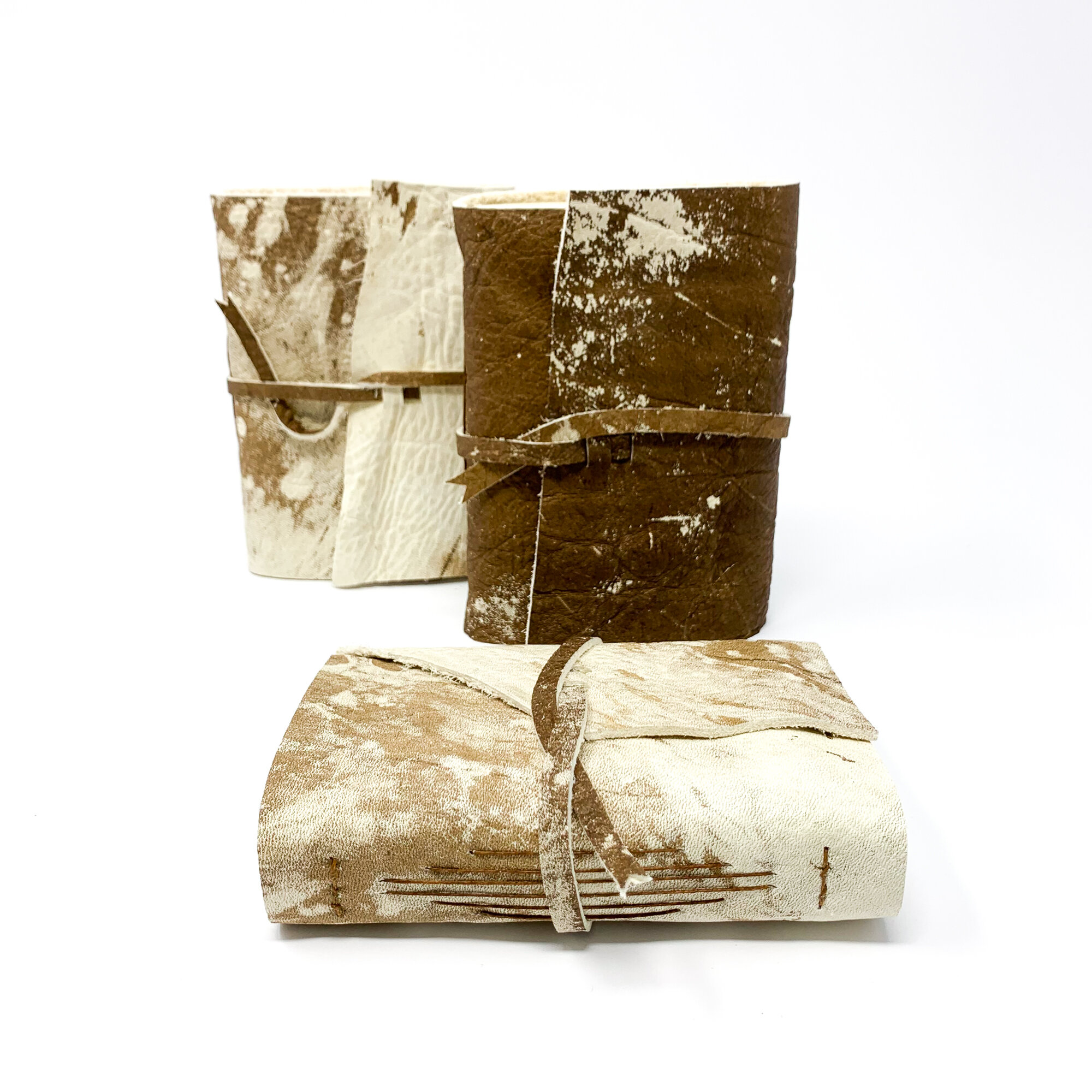
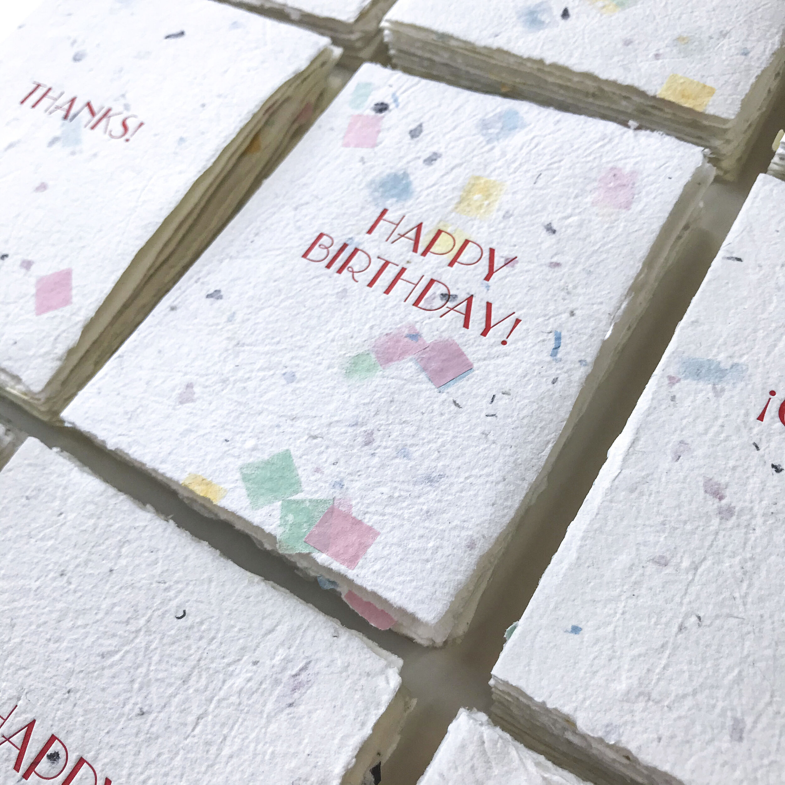
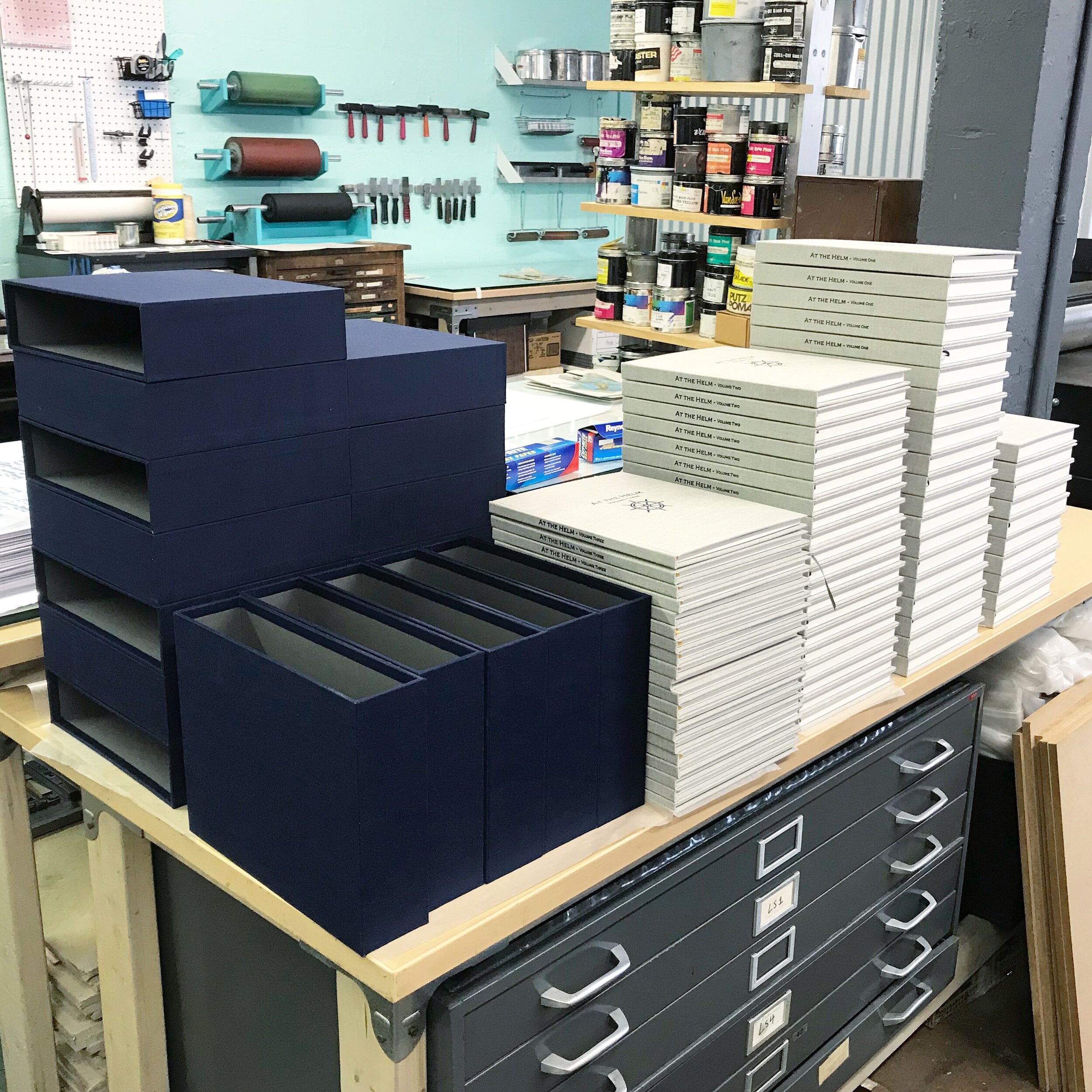
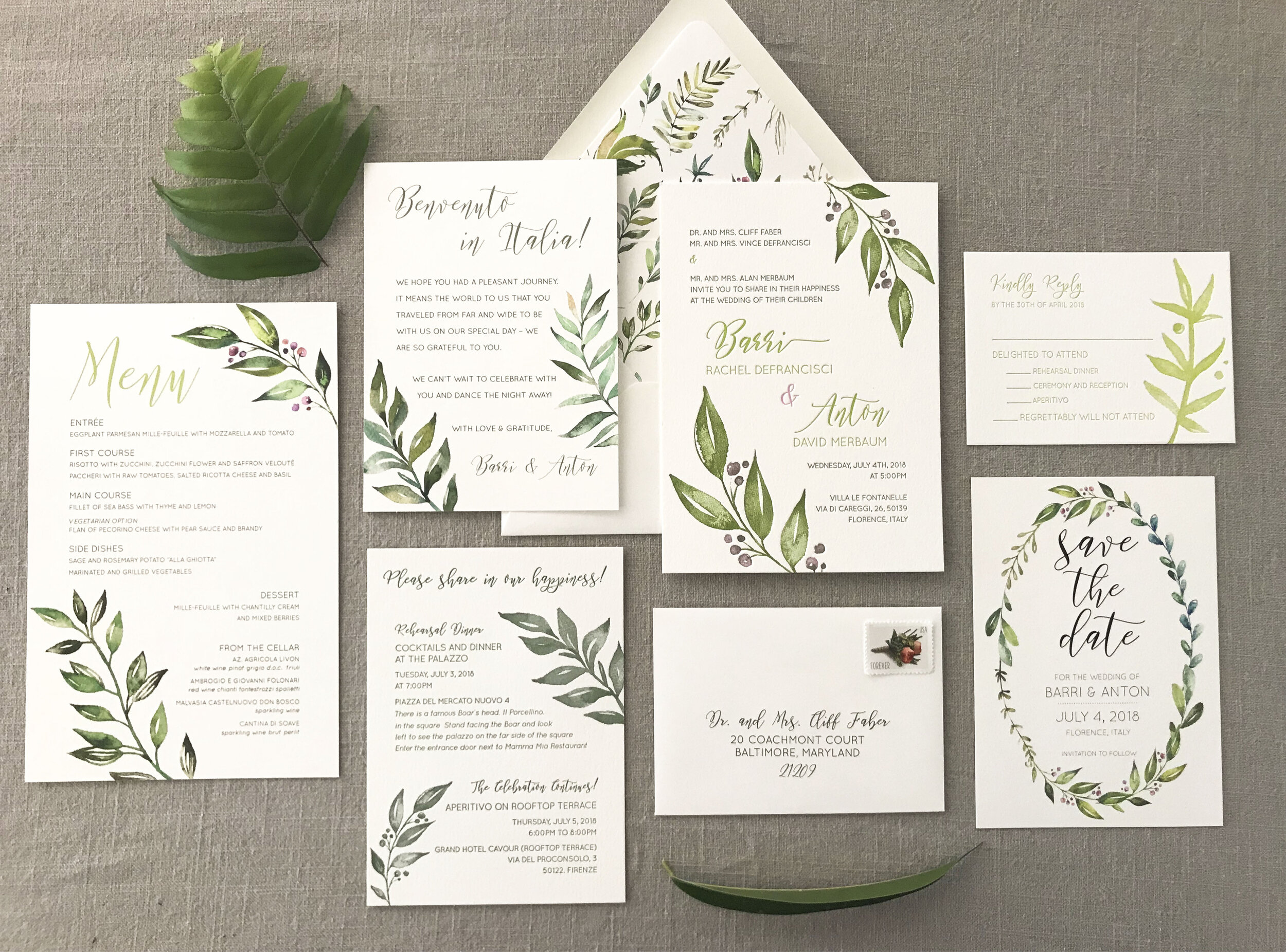
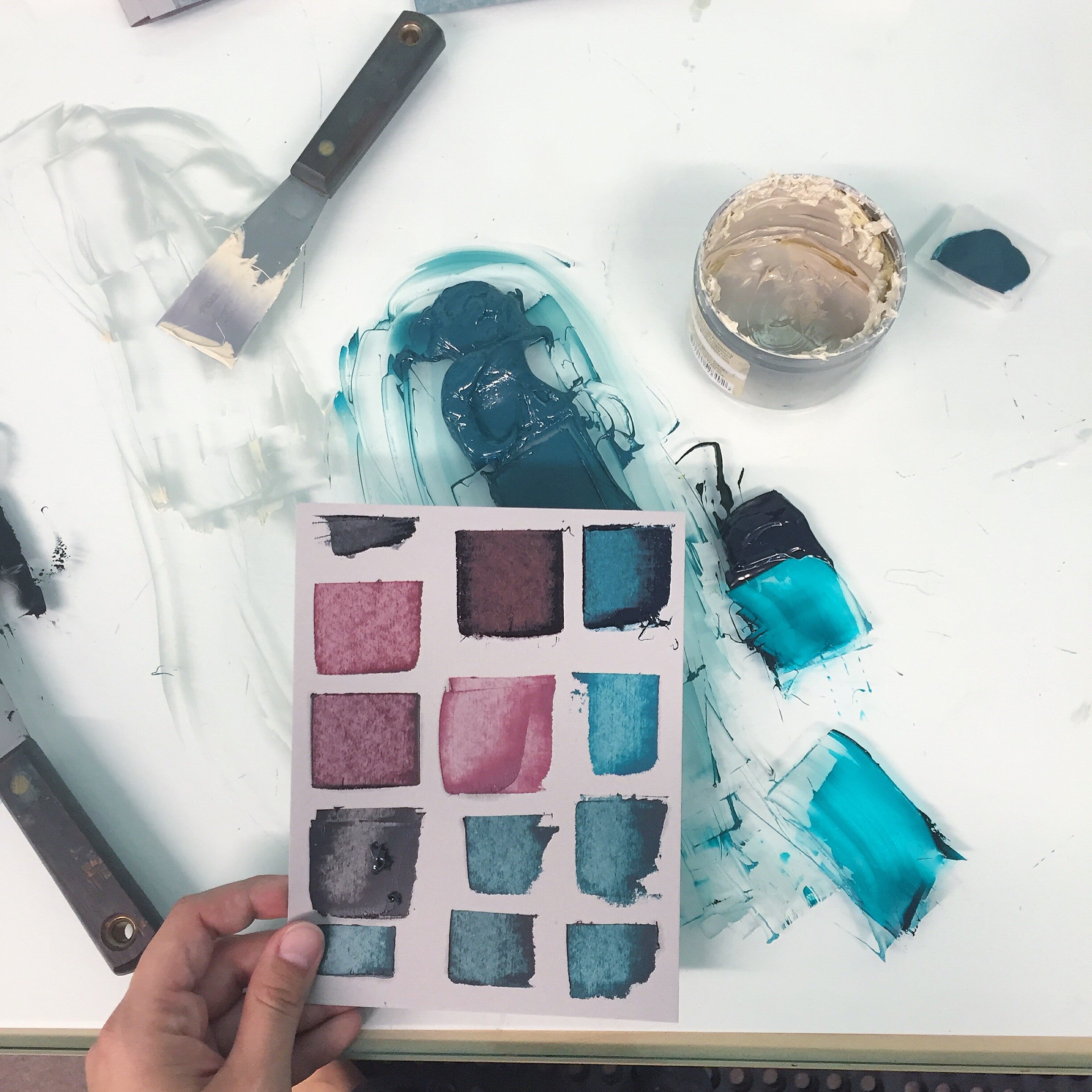
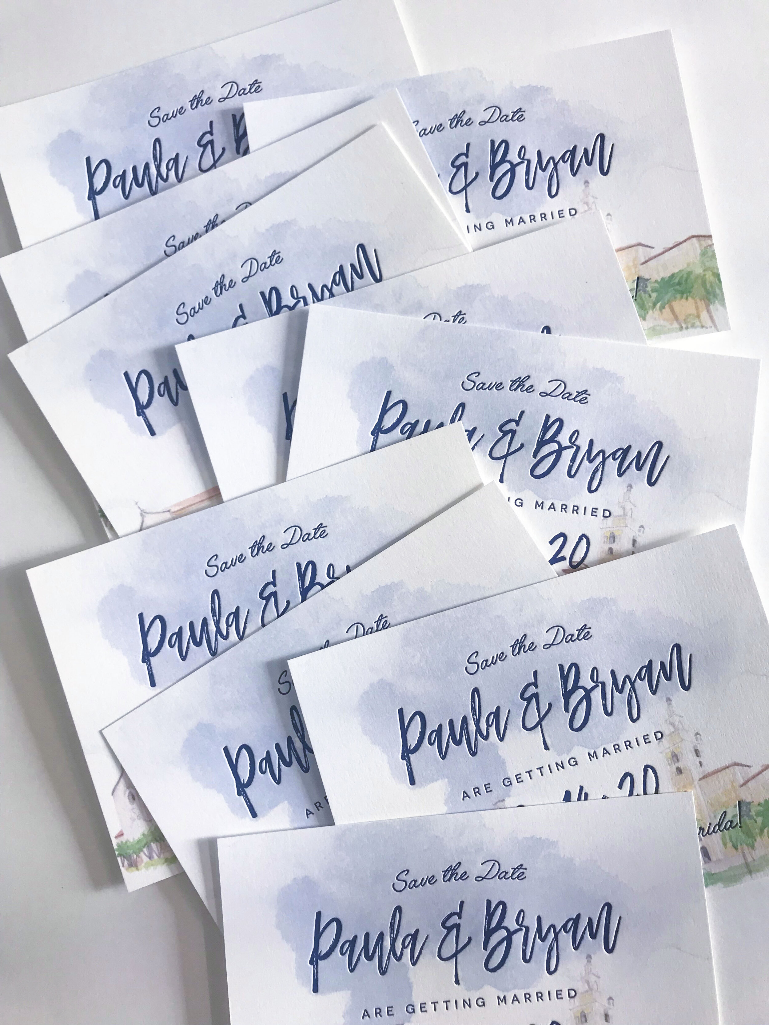
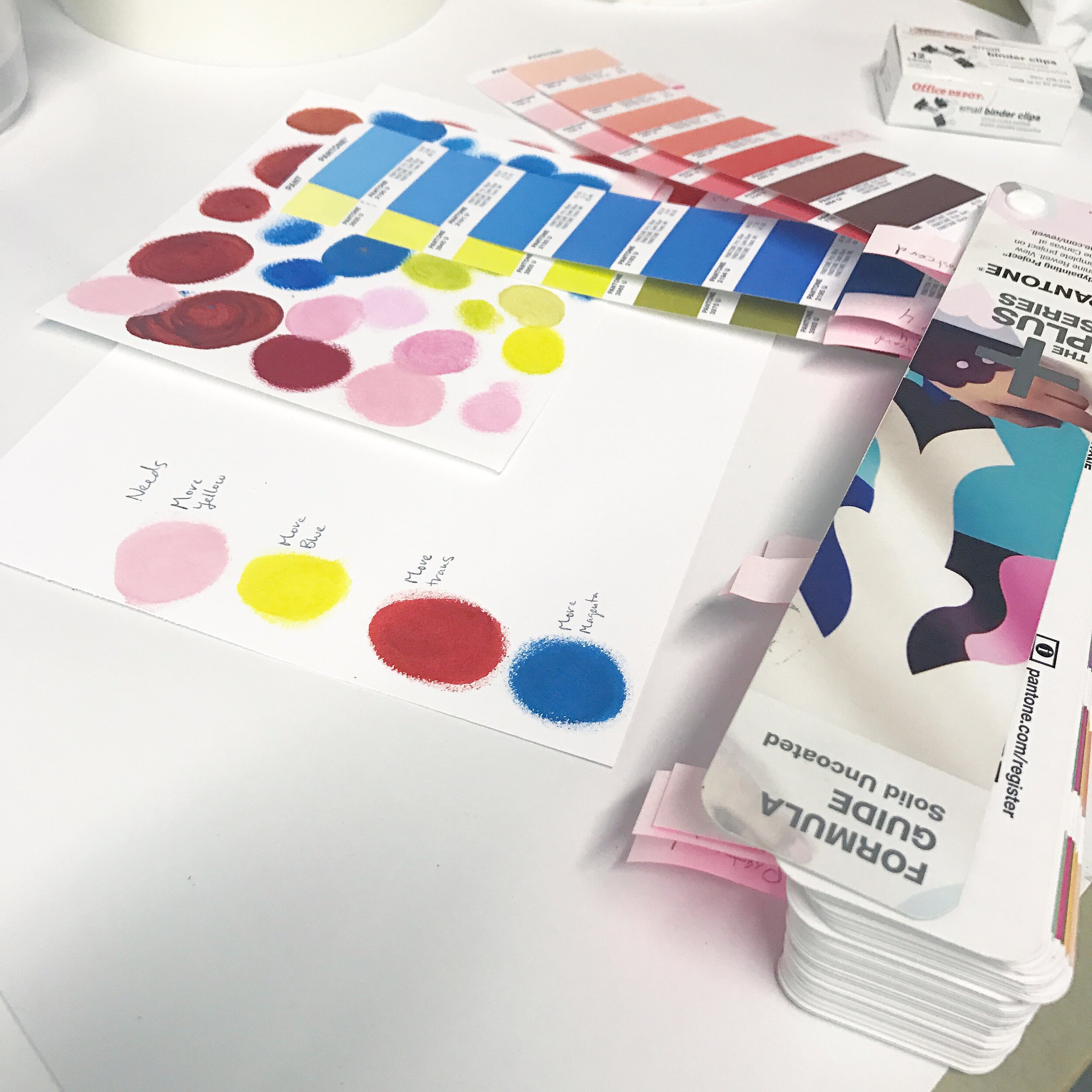
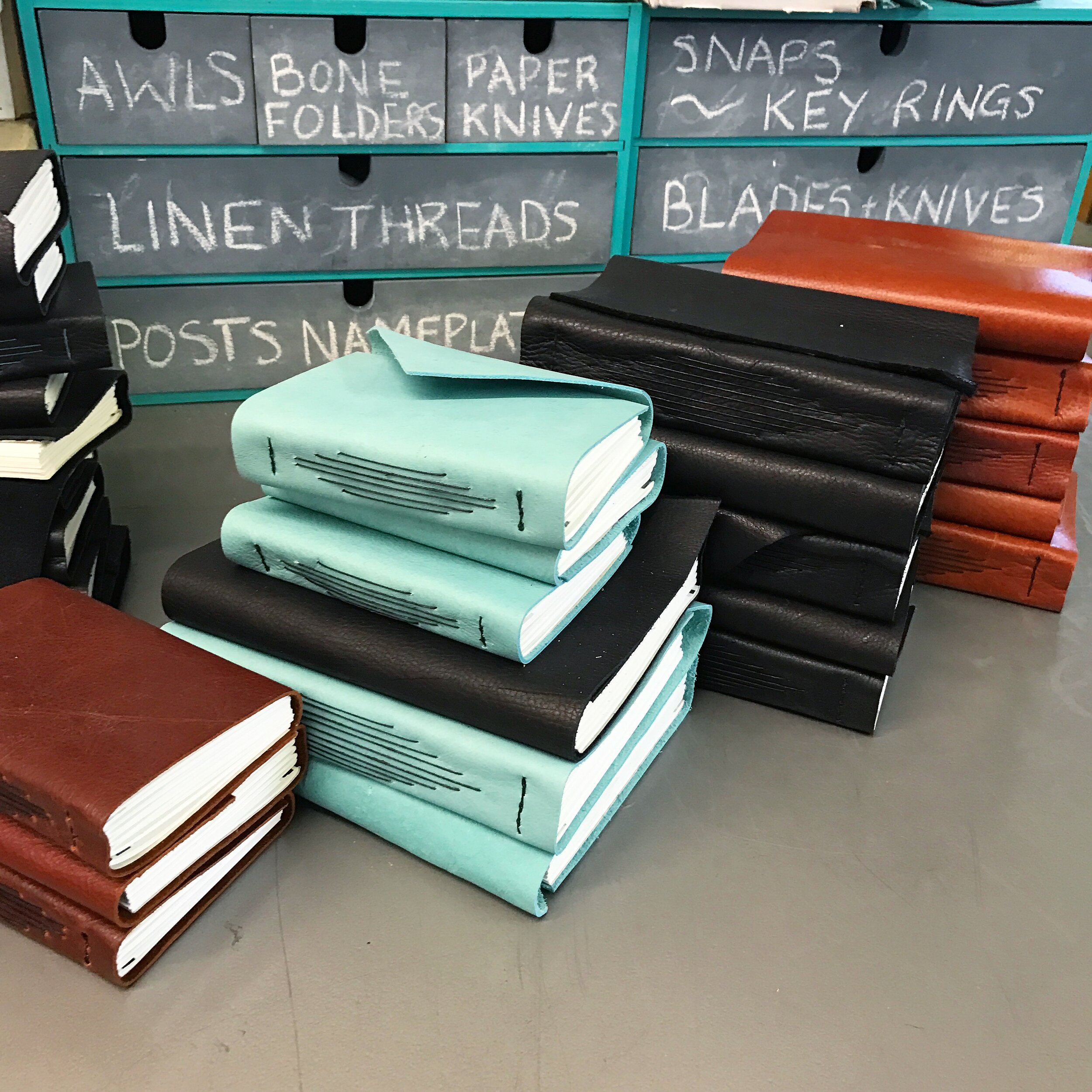
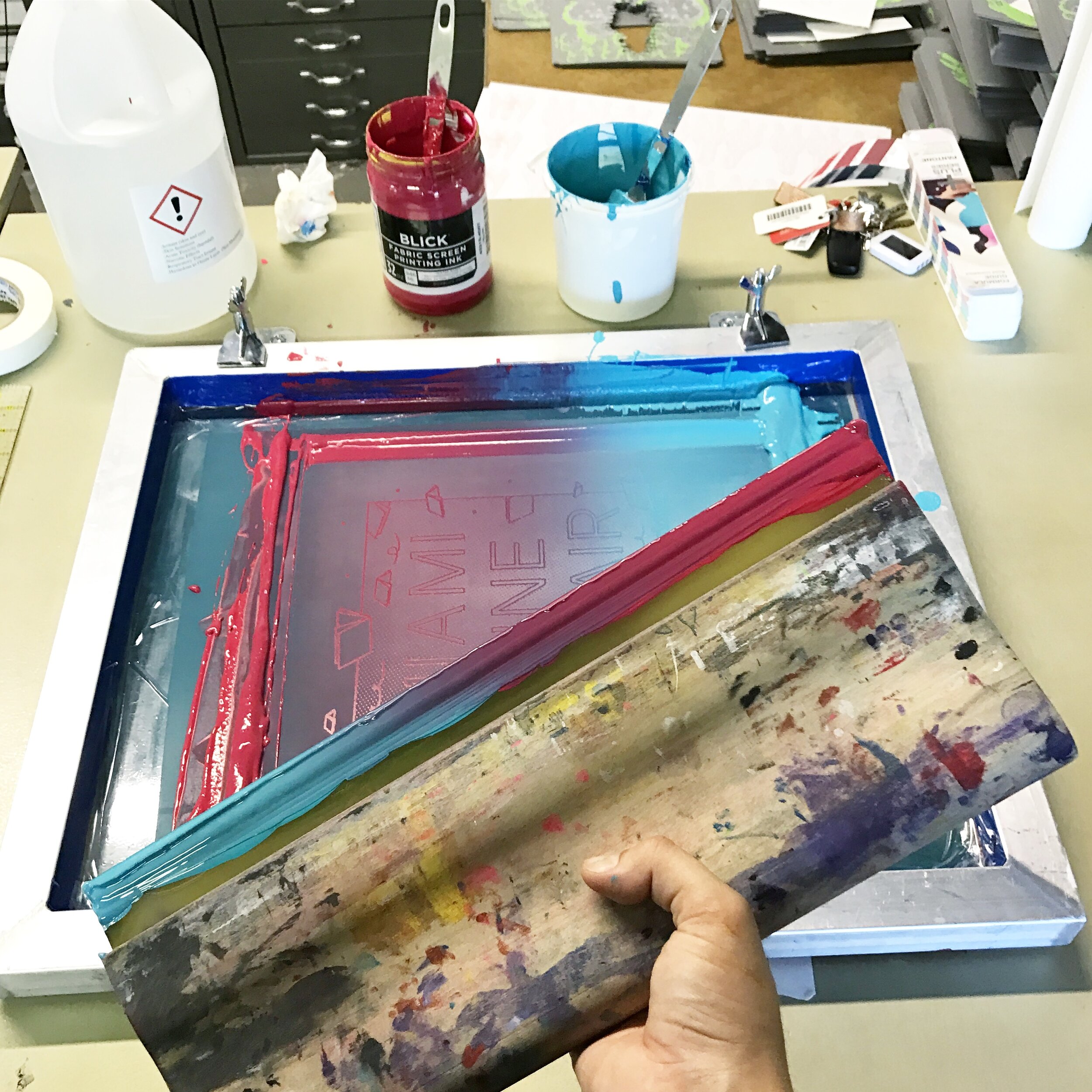
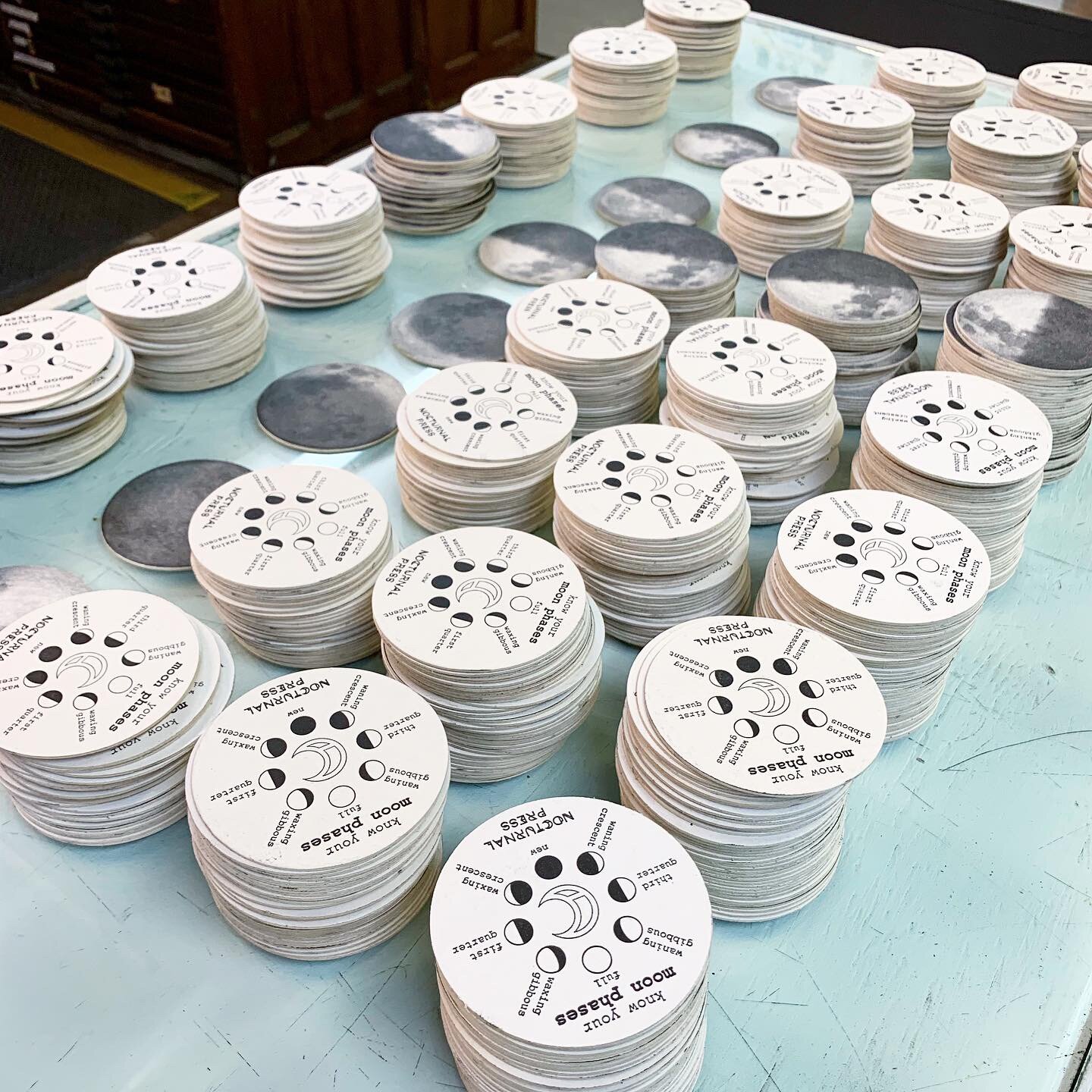
Nocturnal Press specializes in letterpress printing, screen printing, fine binding, and custom design work. We print everything from business cards to high-end art prints, wedding invitations to gig posters, and whatever else our clients bring to us. We have made custom books for celebrities, artists, locals, designers, architects, billionaires, writers, poets, festivals, and universities. We enjoy every step of the process from the first consultation to putting the finishing touches on freshly bound books. IS Projects and Nocturnal Press make a great team and many of the projects we work on require resources from both entities like when we create items for an event and run a live printing demonstration or a corresponding workshop. The distinction between the two companies is not always obvious from the shop because they share the same space and a very similar mission. The best way to sum up the difference is that IS Projects will help you make it yourself and Nocturnal Press will make it for you. If you’re looking for fine printing on paper check out www.Nocturnal.Press and we’ll make sure you make the right impression!

Collaborations: Society of the Four Arts x IS Projects
When Rebecca Dunham, head curator of visual arts at the Society of the Four Arts, reached out with a chance to work together again on a bookbinding exhibition, we jumped at the opportunity. Between Ingrid’s training in traditional bookbinding techniques and the studio’s vested interest in developing artists’ books, this project was another match made in heaven for us print, paper, book nerds.
Over the last six years, being situated firmly between Palm Beach and Miami-Dade Counties has allowed us to collaborate on some exciting projects with major institutions from the tri-county area. Our relationship with The Society of the Four Arts began in 2019, when the new head curator of visual arts, Rebecca Dunham, reached out to us with an exciting opportunity to collaborate on an upcoming exhibition marking the 350th anniversary of Rembrandt’s death, Rembrandt: The Sign and the Light. In a serendipitous encounter, Rebecca heard an interview with Ingrid air on the radio and immediately reached out to discuss the potential of collaborating on educational displays for the show to illuminate the process behind the exhibited etchings. This marked our first major museum partnership for the studio and gave us the opportunity to deep dive into Remabrandt’s world. For more information on that project, you can visit our special projects page.
When Rebecca reached out with a chance to work together again on a bookbinding exhibition, we jumped at the opportunity. Between Ingrid’s training in traditional bookbinding techniques and the studio’s vested interest in developing artists’ books, this project was another match made in heaven for us print, paper, book nerds. We had all of the equipment needed to demonstrate how books would have been bound in the late 18th century to the mid 19th century after an incredible donation from Harriette Yahr in 2016. Rebecca was also interested to have more virtual friendly content so we produced a video going through the entire process of binding a tight-back, rounded spine, raised cord, full leather, hard cover binding. We spent a good chunk of the COVID shut down diving heavy into exhibition preparation and binding research to be sure the details were as close as possible. For example, did you know there is a difference between rounding and backing a book? Rounding is the process of making the spine of a book round while backing is the process of hammering the rounded spine so the outer signatures will fold over to make an indent where the cover boards will fit. All backed books are rounded but not all rounded books are backed!
The exhibition, titled, In God We Trust: Early Bible Printings and Founding Documents from the David M. Rubenstein Americana Collection, features 18 books marking the first of their kind. Whether it be the first Bible printed in America or the first American book of music printed from type, this exhibition showcases some of the most technically impressive book specimens we’ve seen in person. We accompanied the exhibition with educational displays, a process film and handset letterpress playbills for the show.
The show is on view January 30 - February 28, 2021. We invite you to read on for more information on the exhibition and our collaboration.
About the Exhibition
From Society of the Four Arts:
“In God We Trust: Early Bible Printings and Founding Documents from the David M. Rubenstein Americana Collection is an extraordinary exhibition of historic American Bibles and religious texts, many of which have rarely been displayed.
The exhibition features 18 books from the Americana Collection of Mr. Rubenstein, a prominent American businessman and philanthropist. Organized by the New-York Historical Society in collaboration with Mr. Rubenstein’s library consultant, In God We Trust presents the stories of these books and the ingenuity and diversity of the early Americans who made them.
Books are among the most important evidence of what citizens of a particular nation find meaningful to them. In the early decades of the American colonies, it was the Bibles and other sacred works printed, sold, and purchased by settlers that were treasured above all. In God We Trust is at once the story of these first American printed books and the tremendous will of the early Americans who produced them. The exhibition’s centerpiece, “The Bay Psalm Book,” was America’s first book, produced by English settlers who brought a printing press across the ocean to be able to print in their new land. In God We Trust is a story of American diversity, with examples of Bibles printed in what is now the U.S. in a variety of languages such as English, German, Hebrew, and Algonquian, reflecting the range of religious denominations present in America from early on. The exhibition also tells the story of unique American traditions, like the use of a Bible for presidents to swear the oath of office on Inauguration Day, and of the nation’s evolution towards greater inclusivity, with the first Bibles printed and translated by women.
Presented in beautiful custom-built display cases, the books are accompanied by rich narratives about their writers, printers, bookbinders, and publishers. Visitors to the exhibition will also enjoy listening to music from one of the books. This is hymn music, recorded by students from Palm Beach Atlantic University’s School of Music & Fine Arts, from the first American book of music printed from type.
The exhibition includes displays about letterpress printing and the art of bookmaking created by IS Projects, a public access printmaking and book arts studio in Ft. Lauderdale, Florida.”
About our Collaboration
1. Book Binding Process Display Cases
IS Projects created display cases in the exhibition showcasing the different stages of the binding process: Paper Prep, Sewing, Backing and Finishing. Each display case features various tools, materials and descriptive texts for the audience. The 360 video below offers you an opportunity to virtually preview the exhibition and layout, including our four major display cases. The center of the room displays antique books in glass vitrines with accompanying descriptions.
2. Process Video
Additionally, IS Projects collaborated with videographer, Johnny Zhang, to create a process video showing the entire binding process. The book bound in the video is on display for attendees in the final ‘Finishing’ display case. Below is a short preview of the video on display and a series of stills taken from the film.
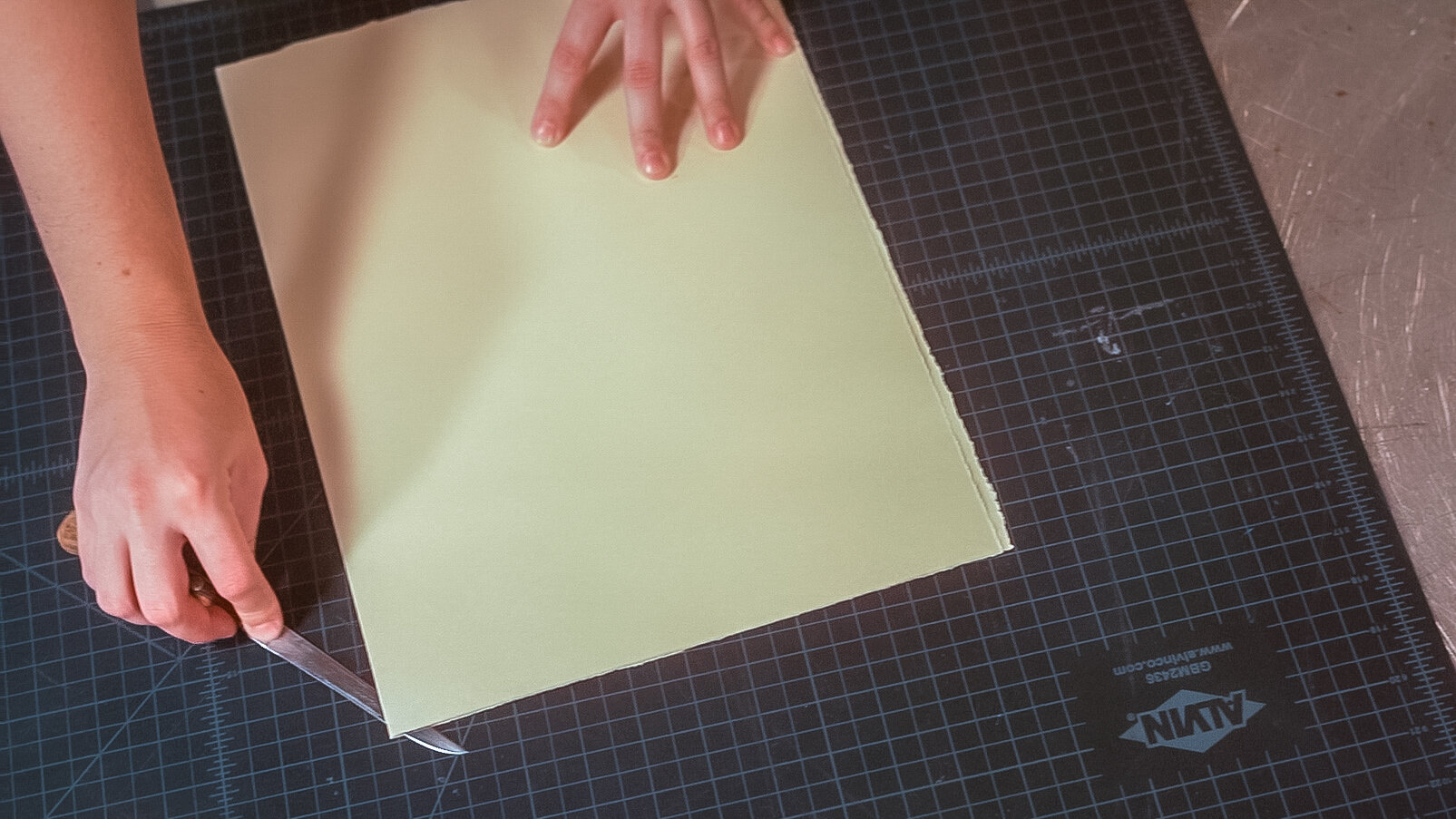
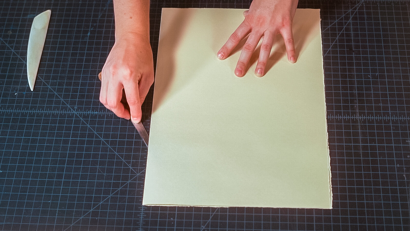
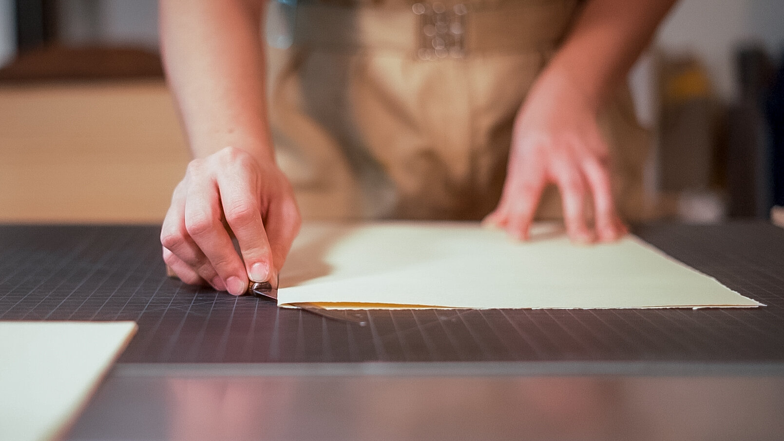
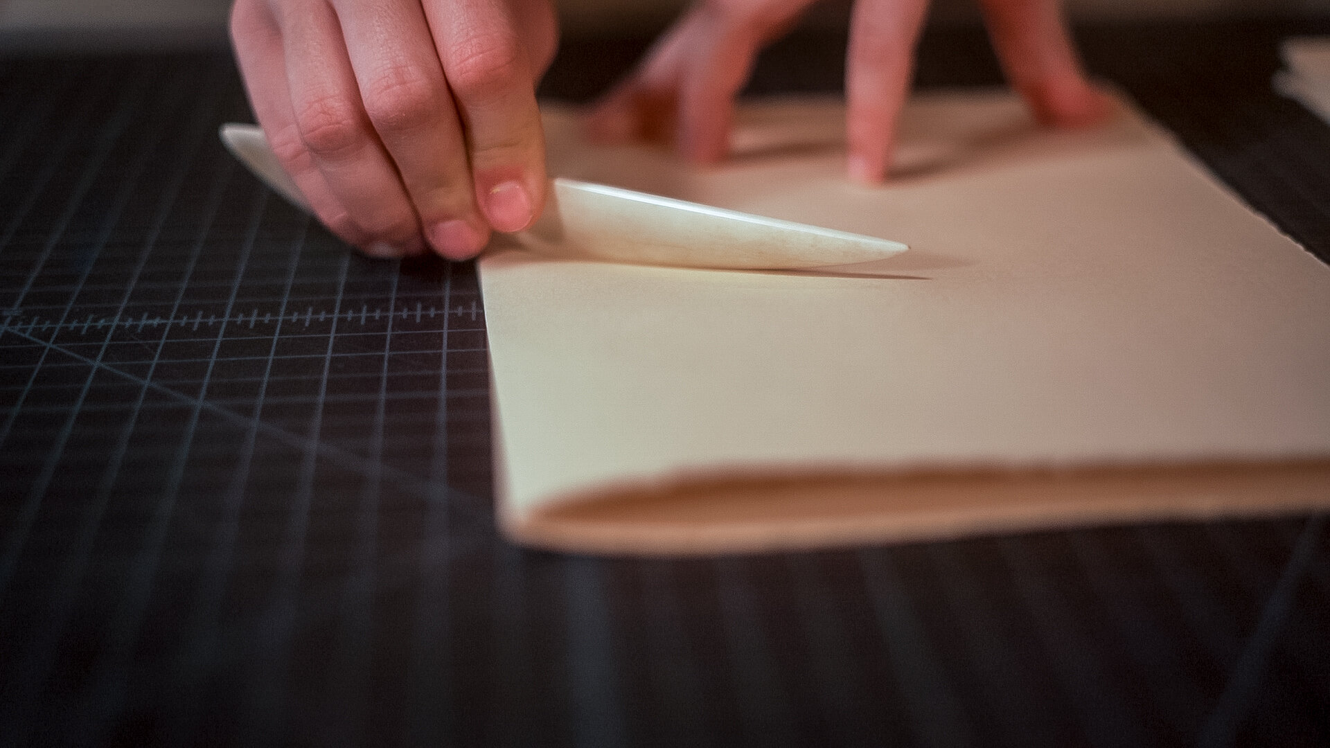
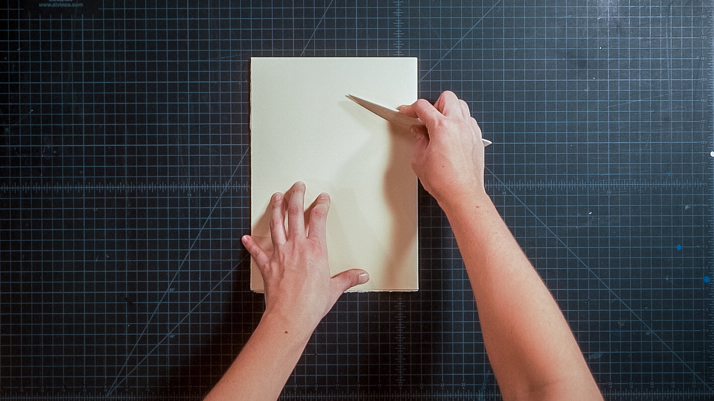
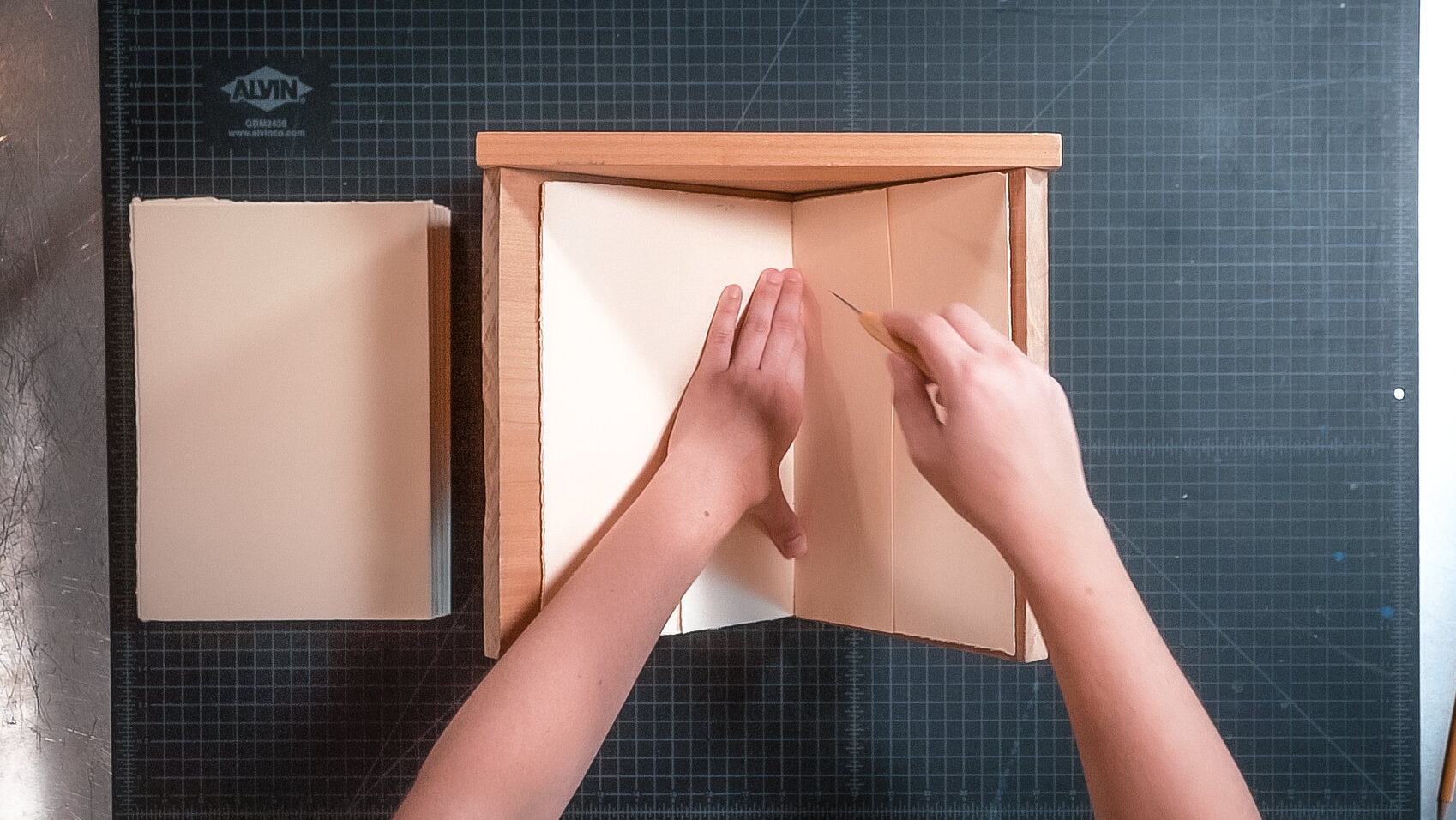
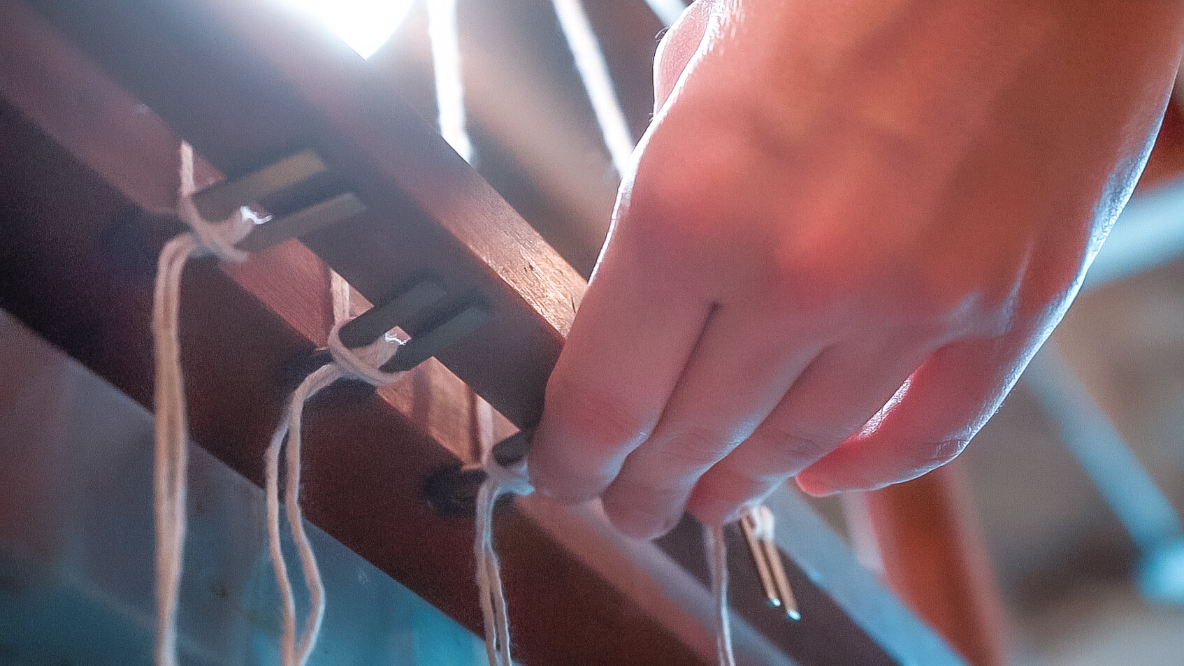
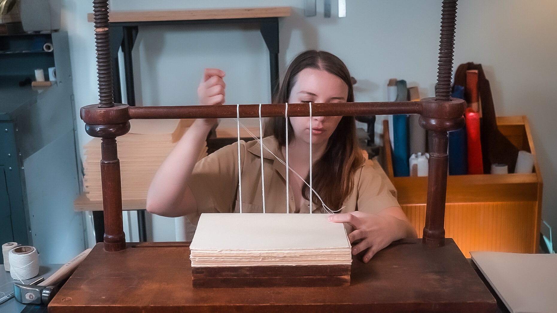
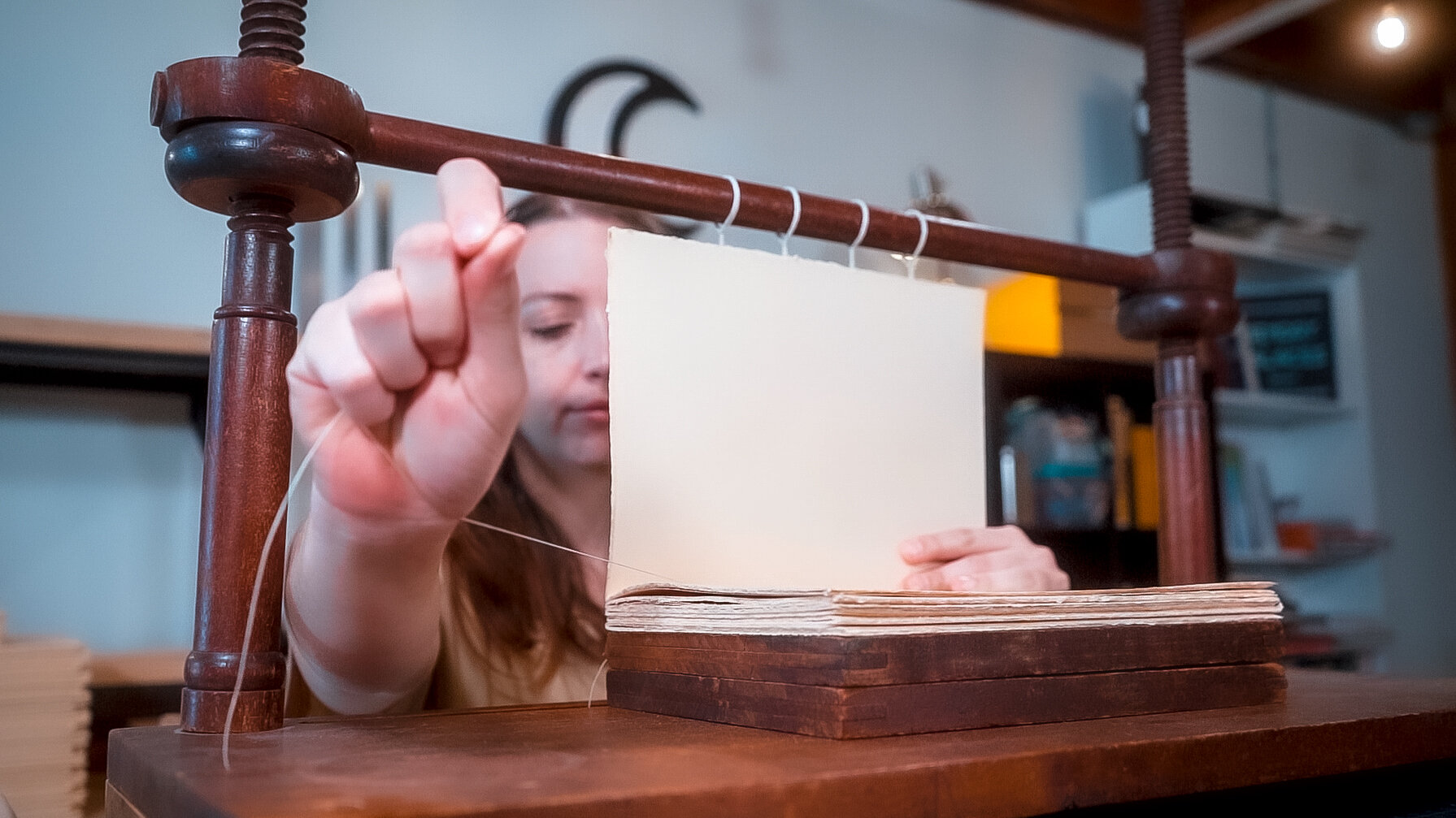
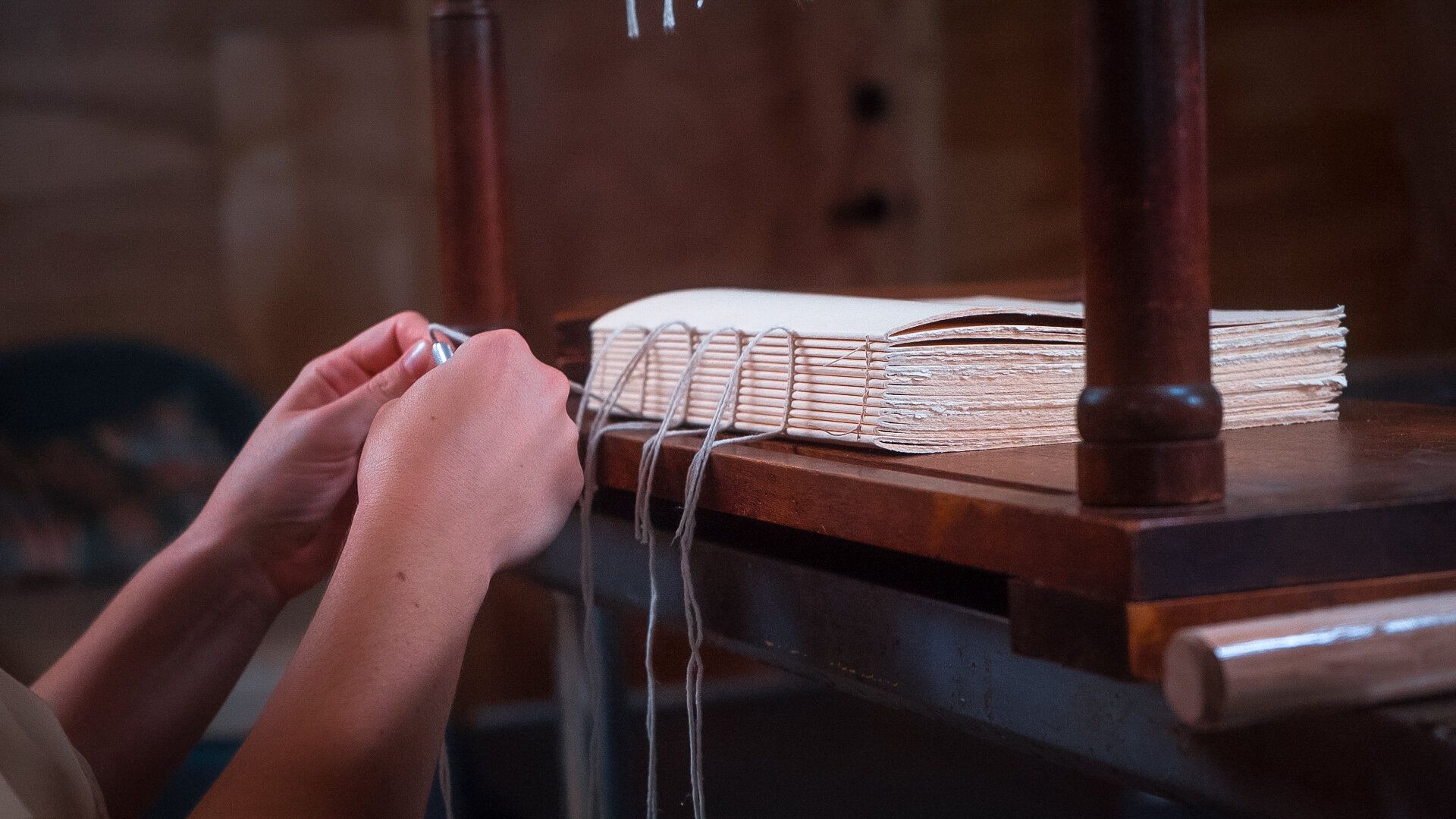
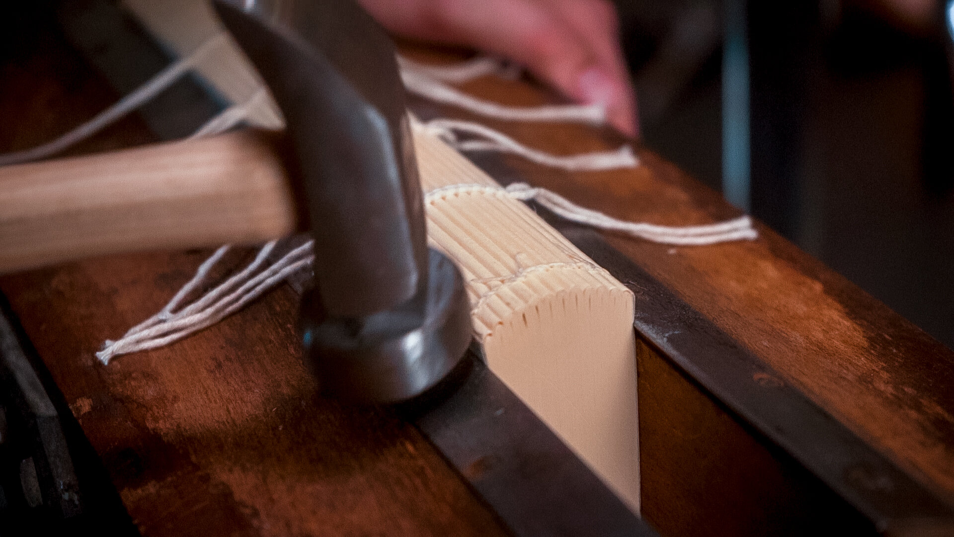
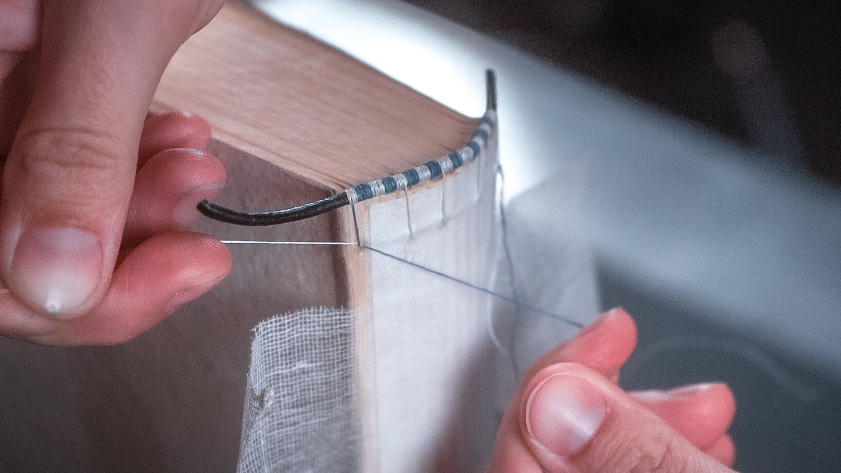
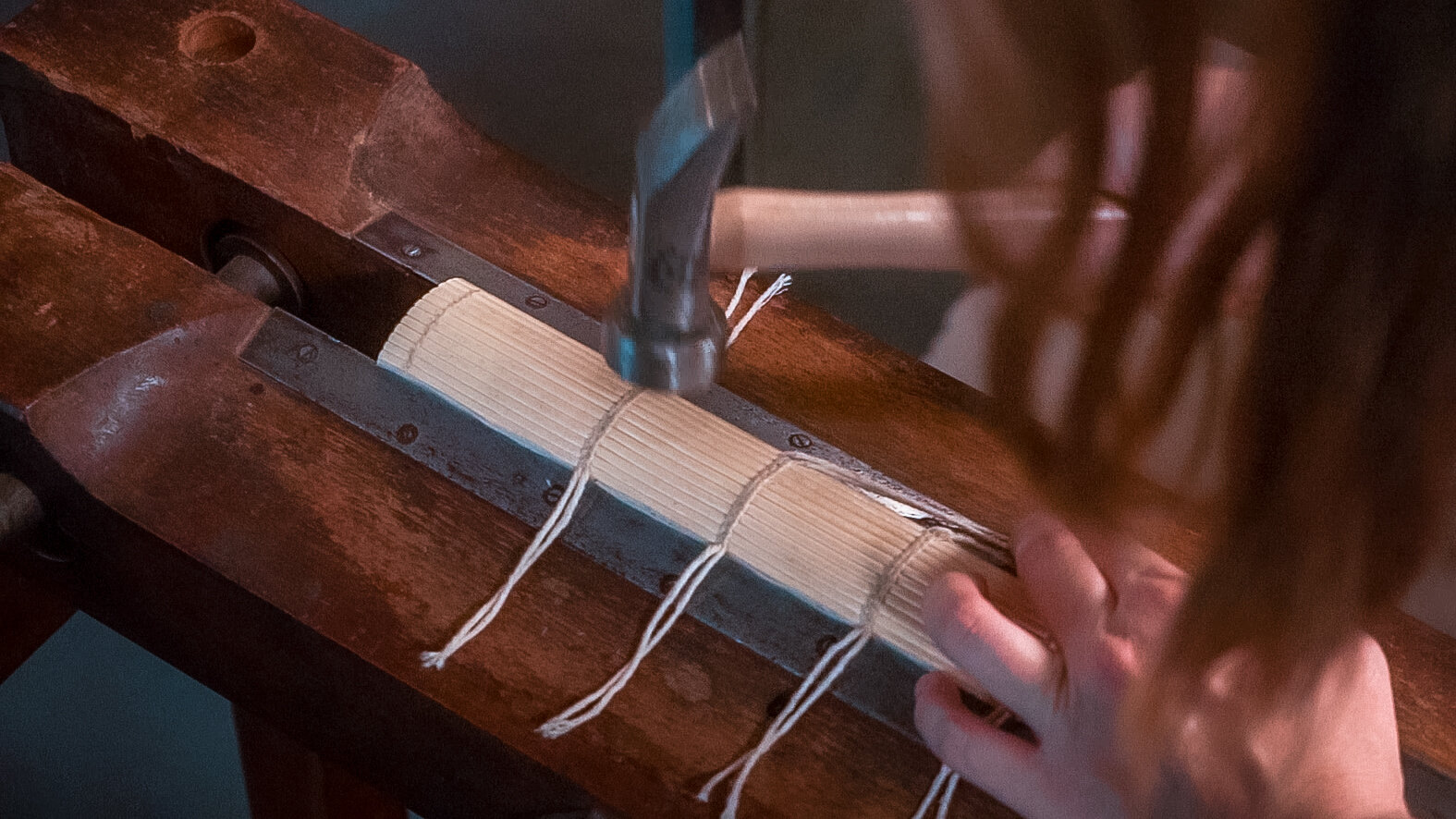
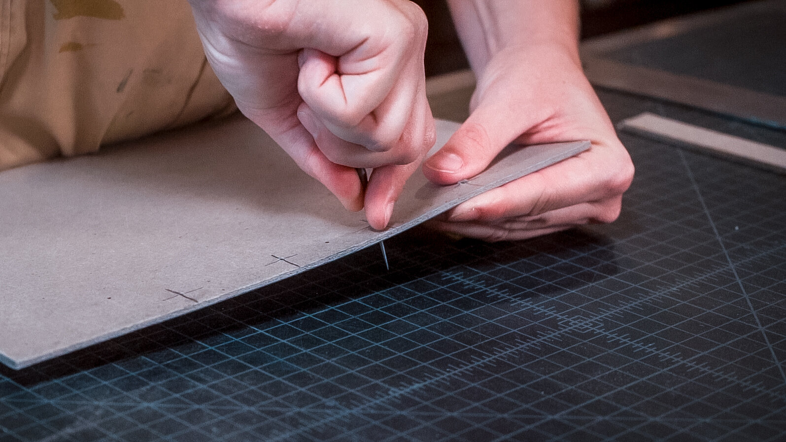
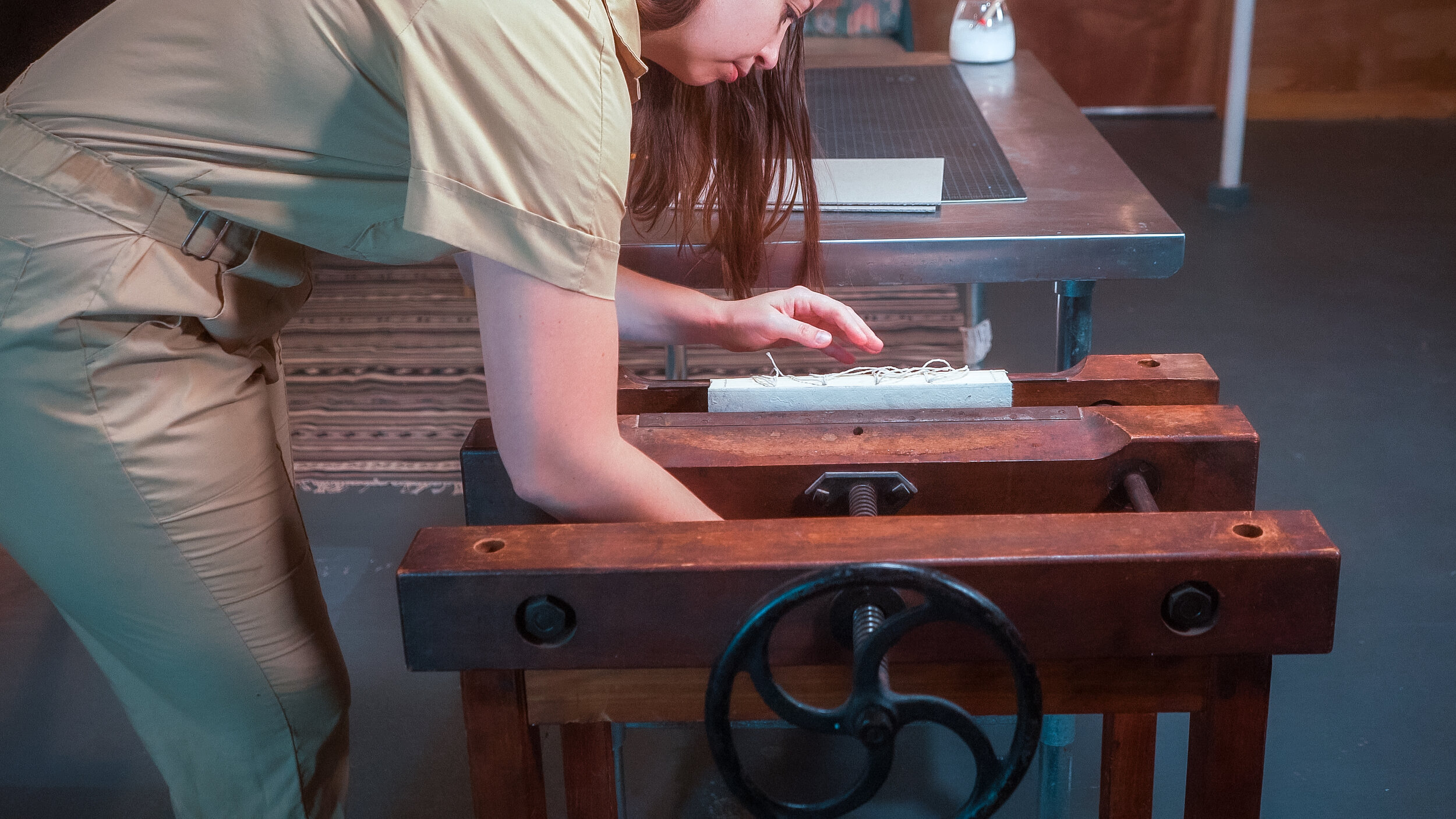
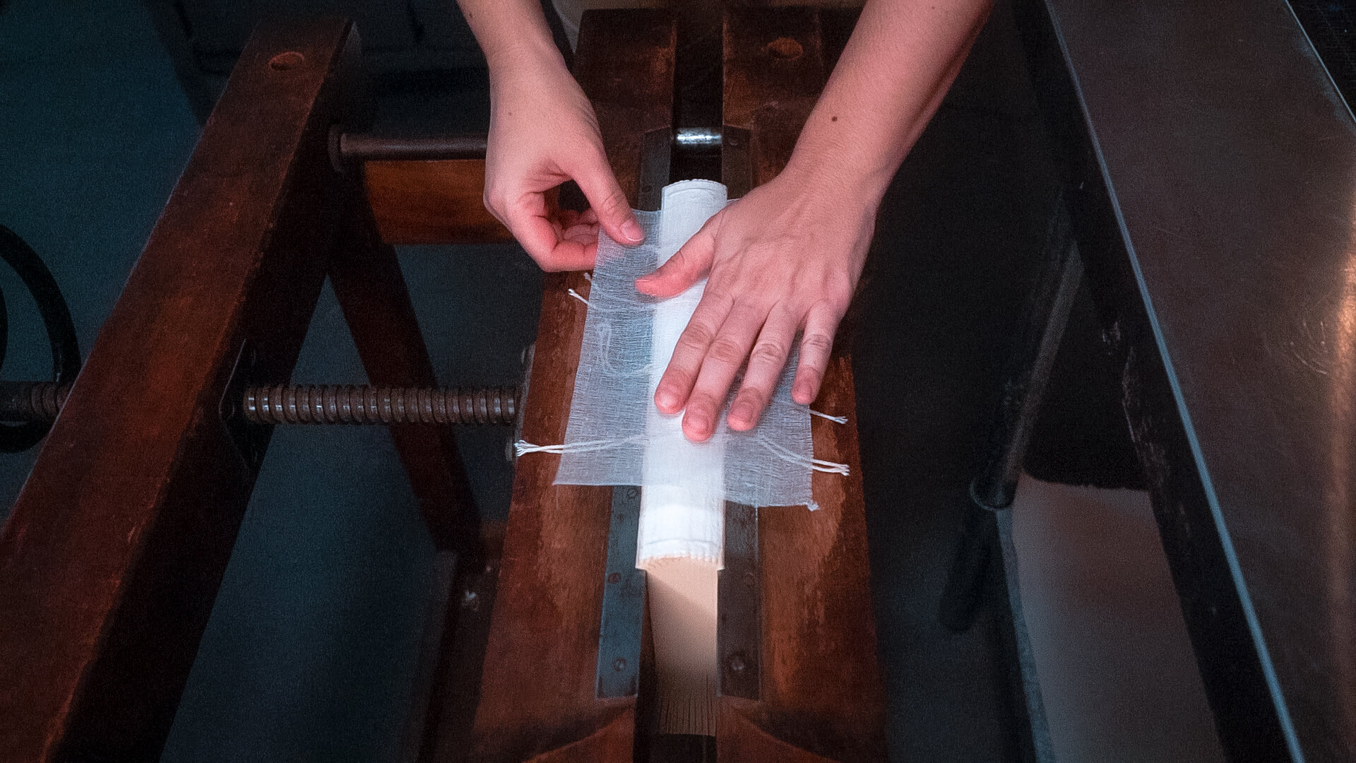
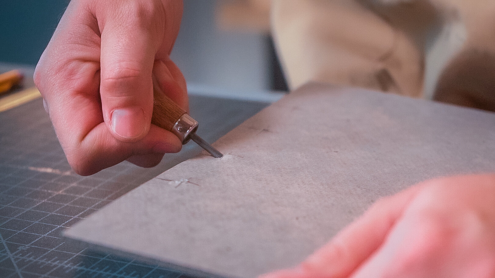
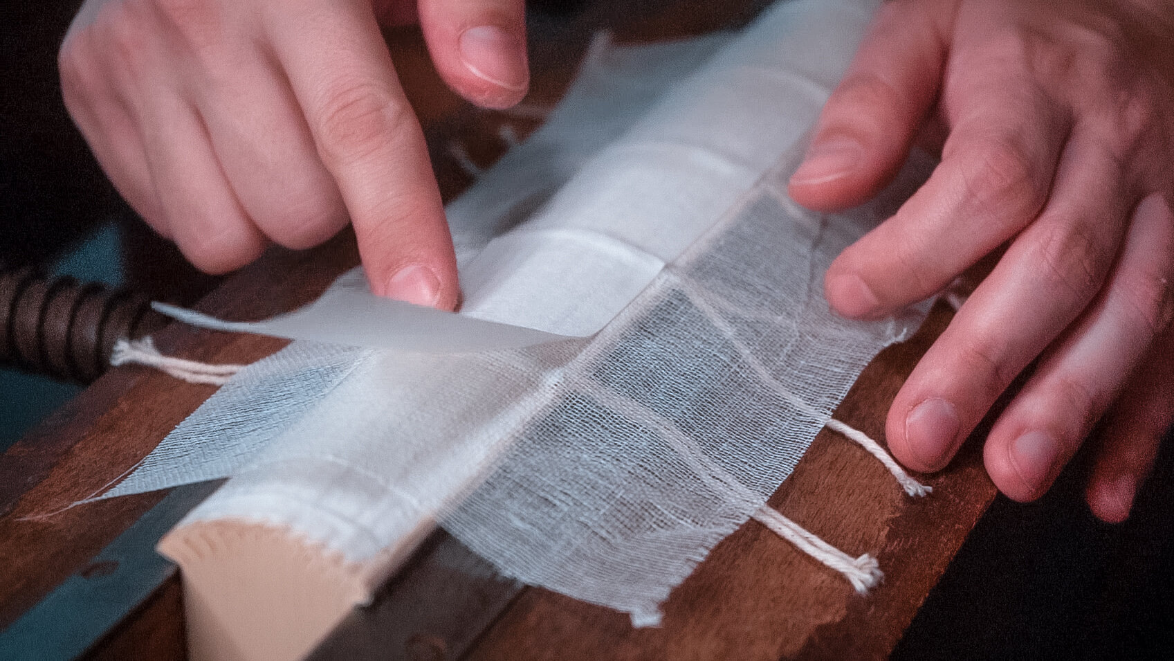
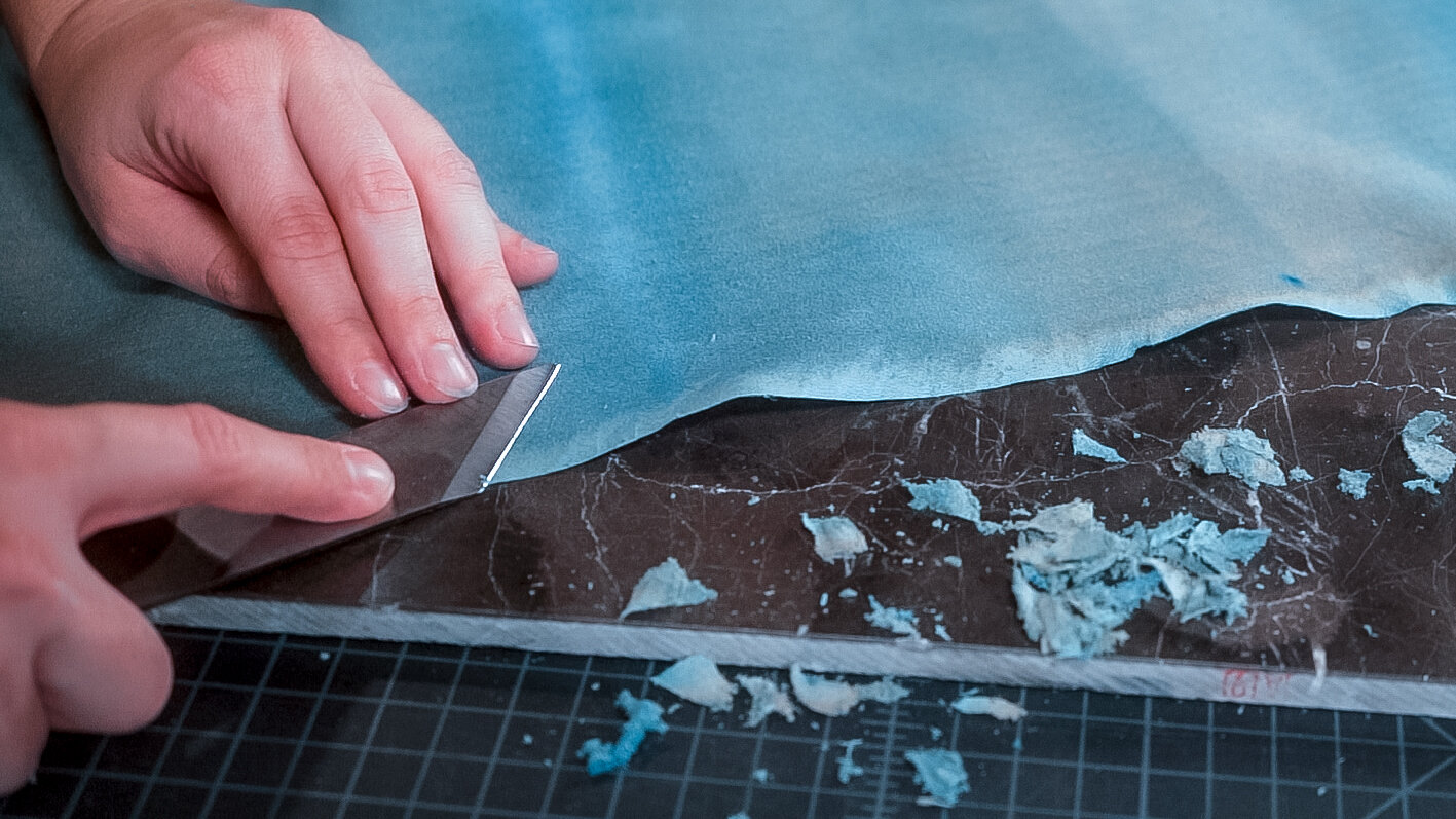
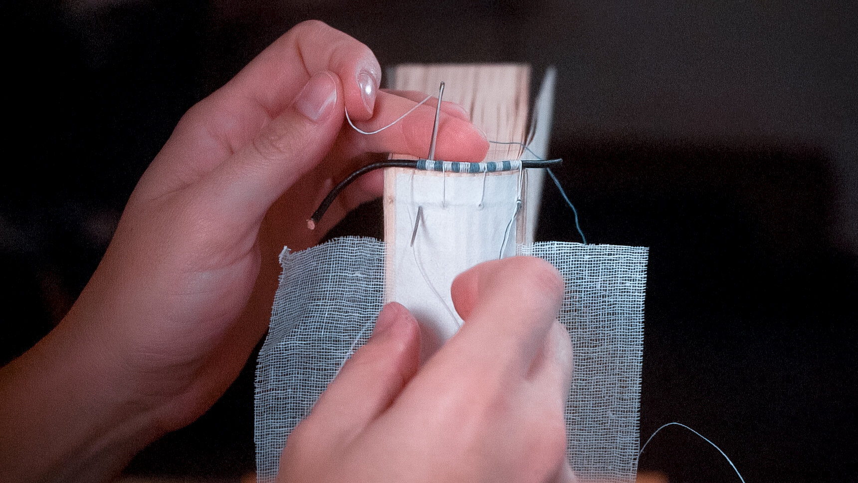
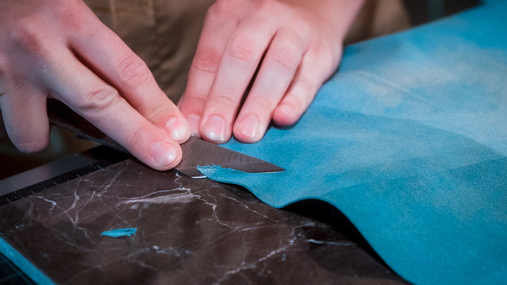
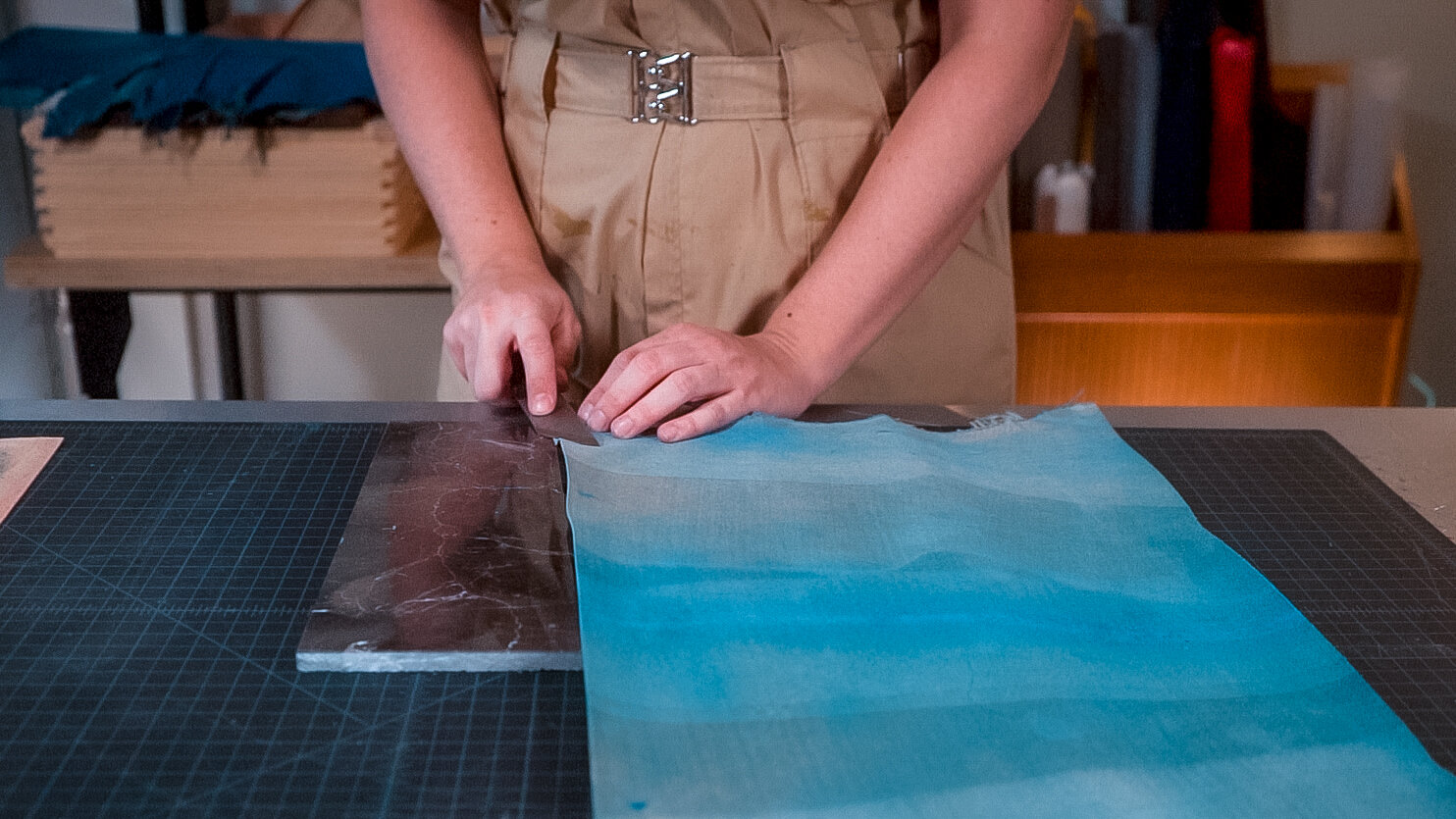
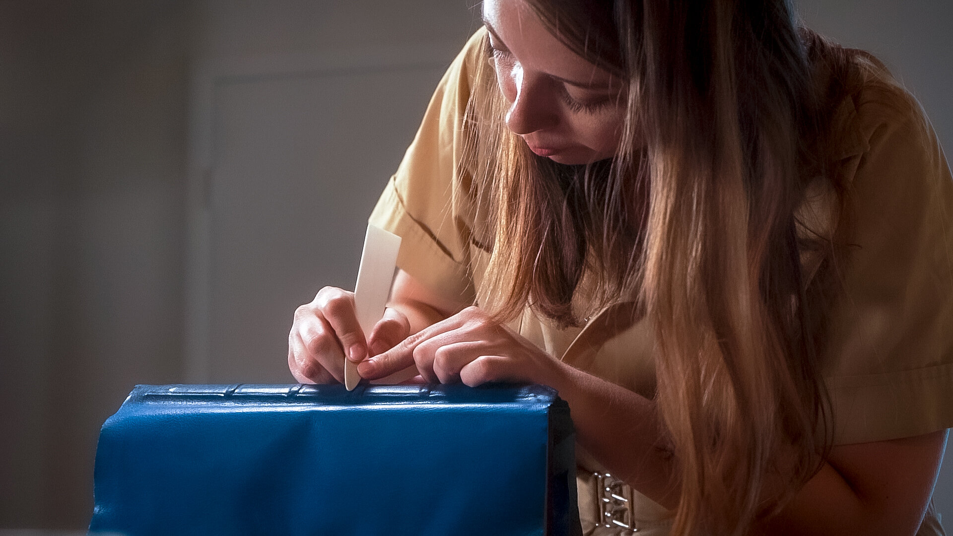
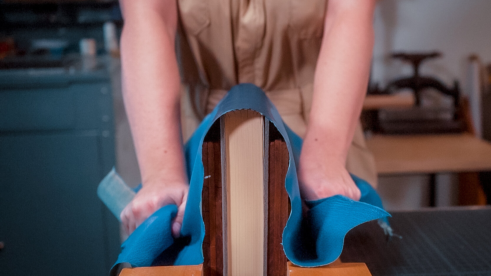
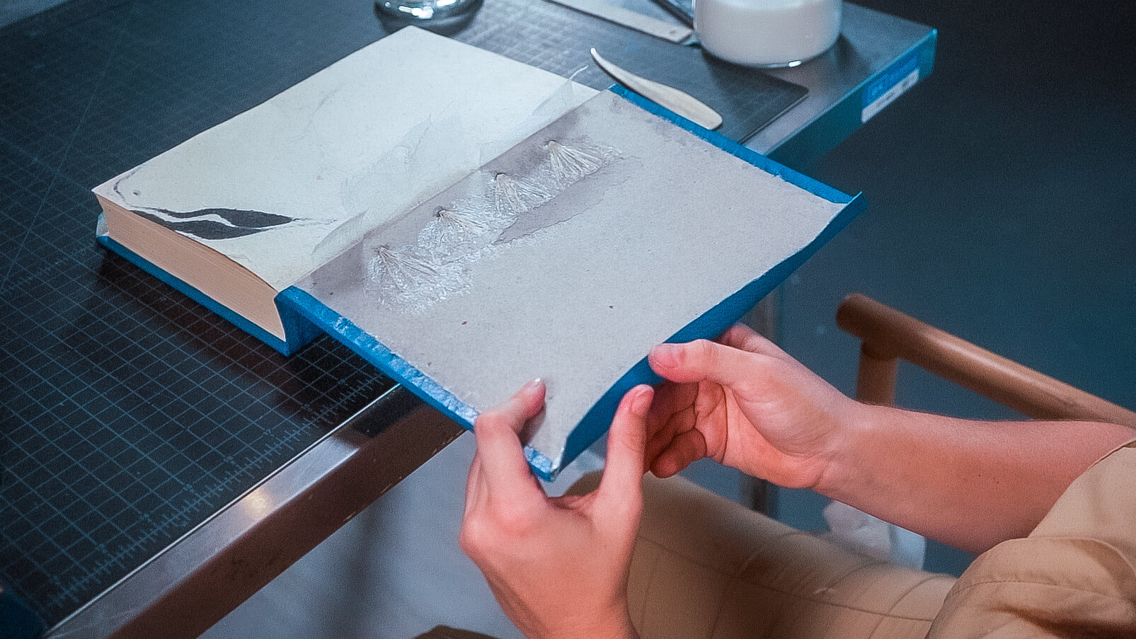
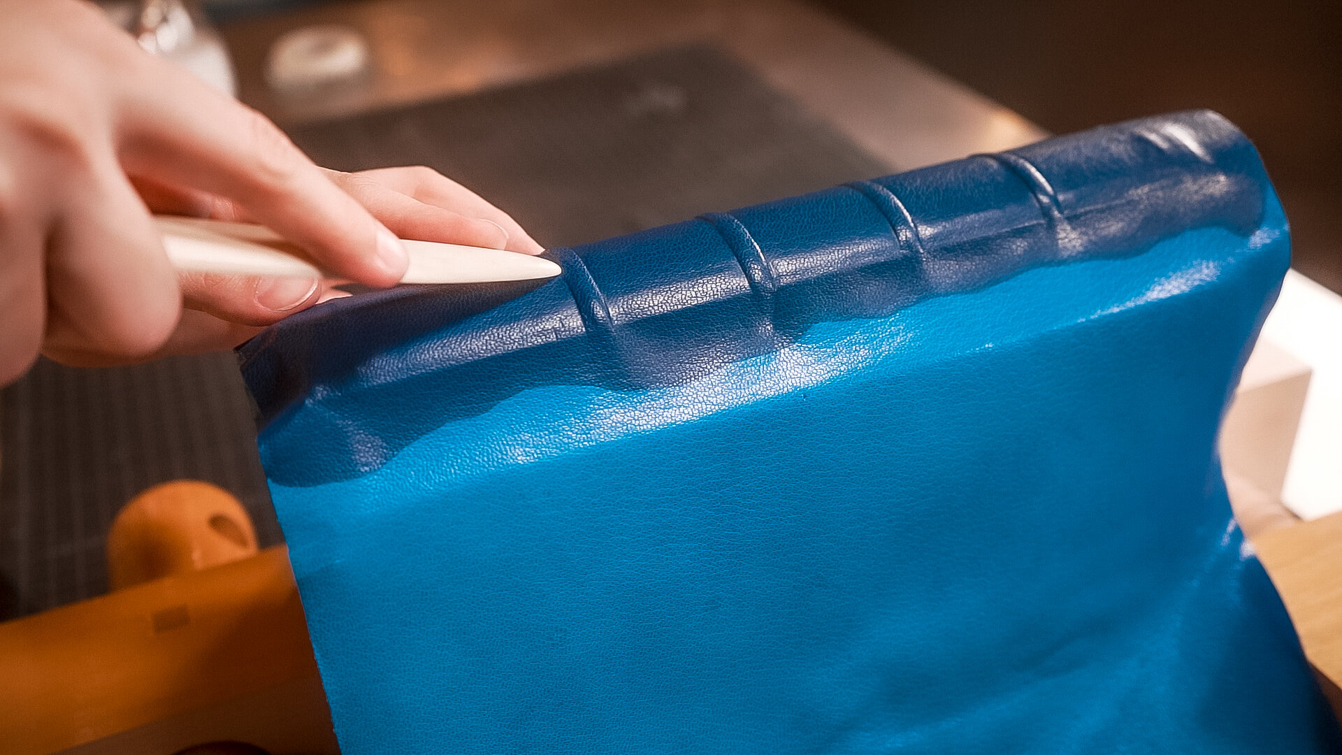
3. Handset Letterpress Cards
Lastly, IS Projects created a letterpress playbill with information on the exhibition using handset antique lead type and ornaments from our collection. Attendees are invited to take a playbill (while supplies last) and view the lock-up of type alongside our 5x8" Kelsey Excelsior Model P circa 1965 on display.


Visit the Exhibition
In God We Trust: Early Bible Printings and Founding Documents from the David M. Rubenstein Americana Collection will be on display at:
The Society of the Four Arts
East Gallery of the Esther B. O’Keeffe Gallery Building
102 Four Arts Plaza
Palm Beach, FL 33480
November 14, 2020 – January 17, 2021 and January 30 – February 28, 2021.
The gallery is open Monday, Wednesday – Saturday, 10 am - 5 pm and Sunday, 1 to 5 pm.
Tickets are $10; no charge for Four Arts’ members
Purchase or reserve tickets through The Four Arts mobile app, on their website, by calling (561) 655-7226, or visiting The Four Arts’ Box Office.